Croster! WHMCS Theme
Documentation
Get started with Croster WHMCS Theme, Its not just a theme its a framework for building unique sites for service providers who use WHMCS for their billing system.
Get started with Croster WHMCS Theme, Its not just a theme its a framework for building unique sites for service providers who use WHMCS for their billing system.
Make a Full Backup - We cannot stress enough how important it is to *always* take a full backup before attempting any kind of upgrade/install. Both for WHMCS and any other software you use. A full backup should be taken of both the WHMCS files and the database.
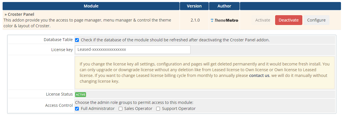
If you don't want to active during development you may access the theme by using below link and once your website is production ready you can active them.
https://yourwhmcs.com/index.php?systpl=croster&carttpl=croster_defaultWatch the video and let's see how easy to install Croster WHMCS CMS Theme.
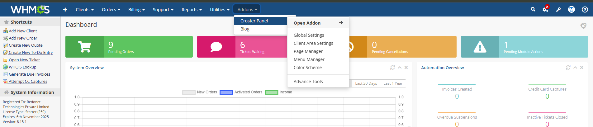
After completing the installation, you may encounter errors or blank products on pre-created or pre-made templates pages. To resolve this, we recommend configuring your new Croster WHMCS Theme.
By following these steps, you’ll ensure your Croster WHMCS Theme is fully functional and optimized for visibility and usability.
Let's see how easy it is to update Croster WHMCS Theme from any old version. updating the Croster WHMCS Theme is very easy and can be completed in just a few steps.
It is very simple you can update easily by using following below simple steps.
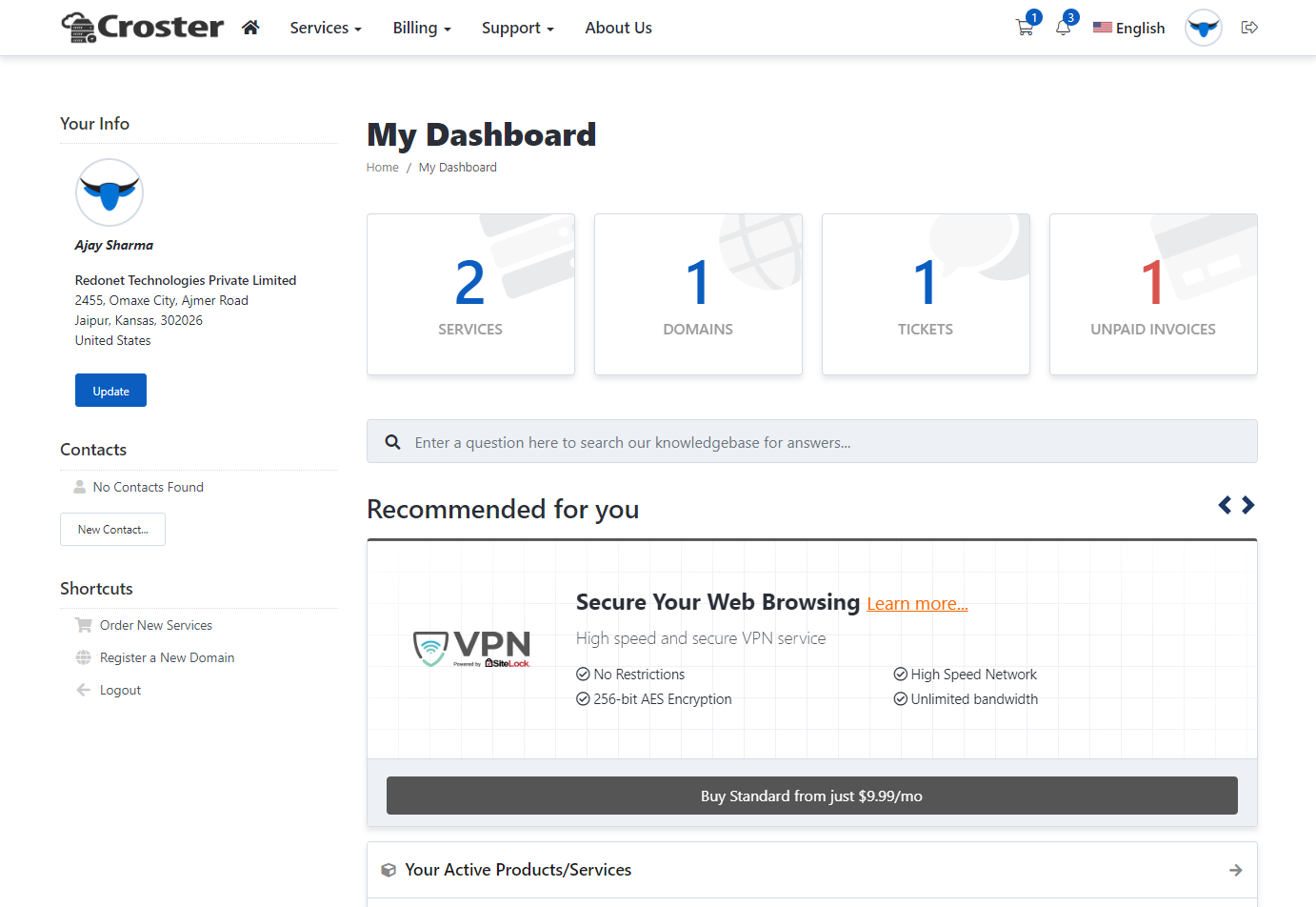
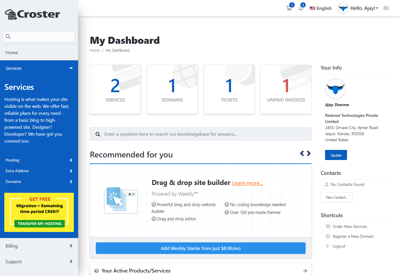
There are two types of layout options, 'Default' and 'Left', available to use according to your preference.
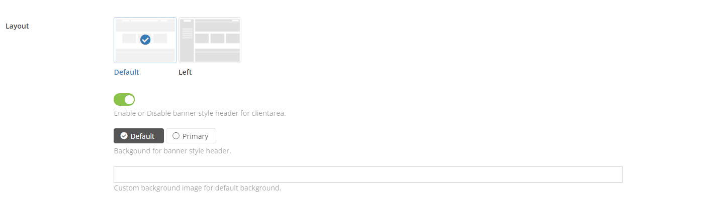
Default
Left
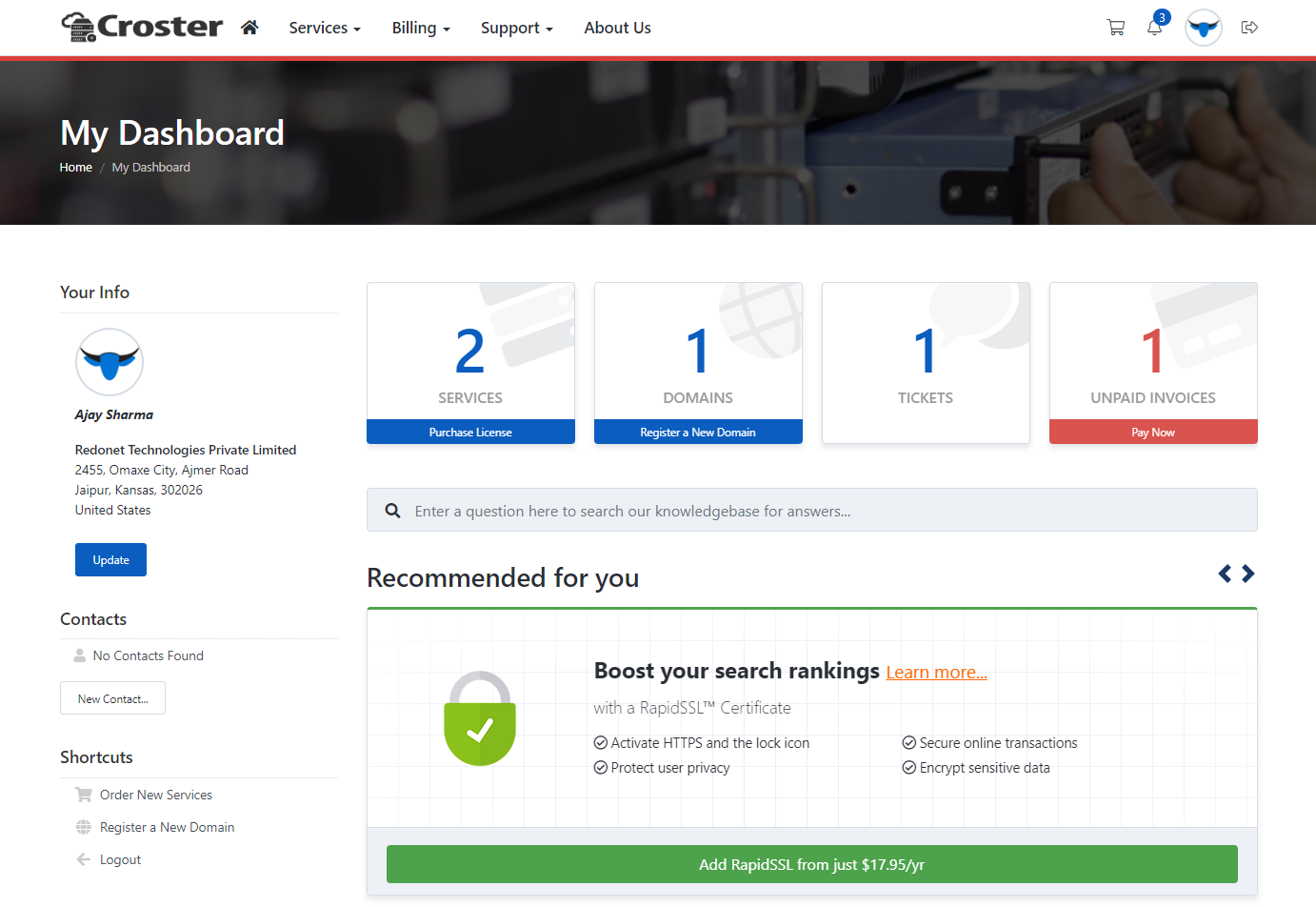
In both layouts, you can enable a banner-style header for the client area, as shown in the screenshot below. Once enabled, you will have the option to choose between 'Default' and 'Primary' styles for the banner background. In the 'Default' background style, you can easily change the header image.
Default
Primary
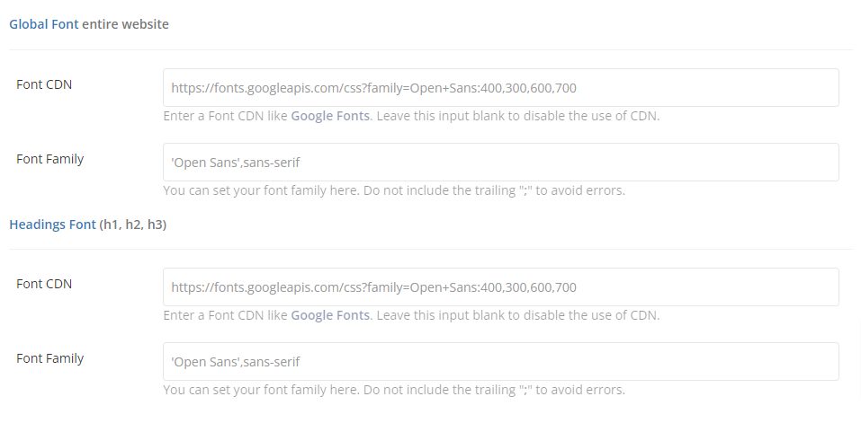
By enabling this option, you can access settings to add and change fonts for the Croster WHMCS Theme.

Now, you just need to add a custom font family CDN URL from Google Fonts in the inputs below to change the website's fonts.
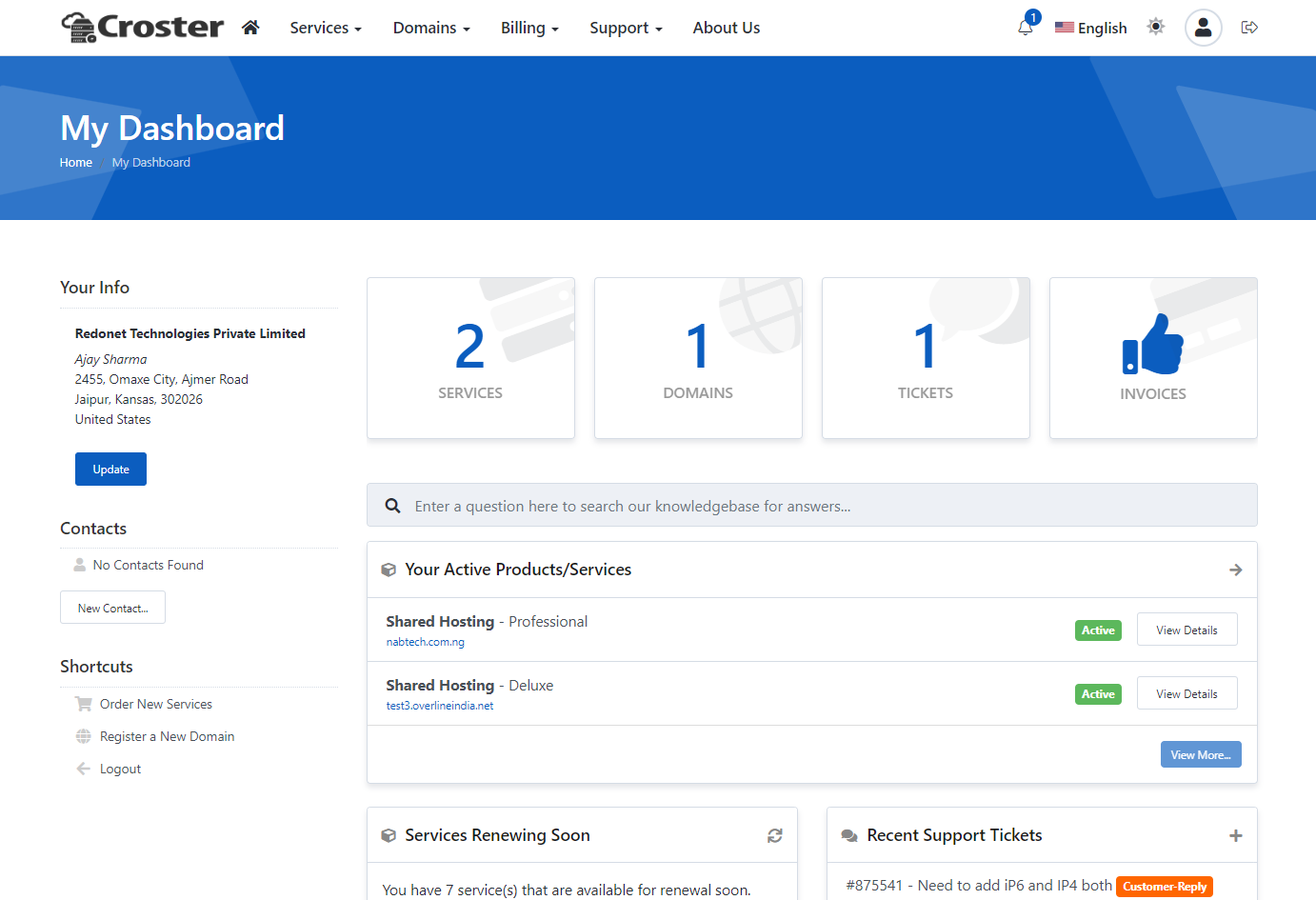
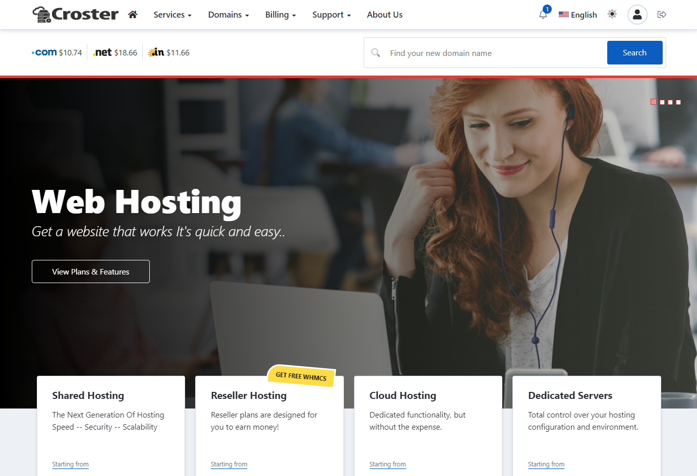
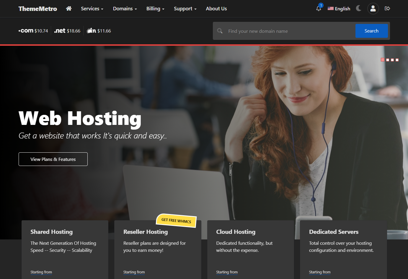
By enabling this option, your users can switch between Light and Dark modes using the theme switcher on the website header.


Light Mode
Dark Mode
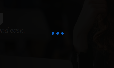
Enable the Pre Loader to display a loading animation on the website while the page reloads.

You can enable or disable Shadow and border radius for entire website by using belwo options.

When enable, this will show Friendly SEO URL opton for each pages in Page Manager.

If you are using LiteSpeed server, you have to be aware that this type of servers require server restart after every change/added in SEO-Friendly URLs, which implement changes to the htaccess file.
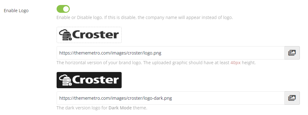
If you disable this option, the company name will appear as text instead of a logo.
You can easily upload the Light and Dark versions by clicking the image icons. For the best results, please use the horizontal version of your brand logos. The uploaded graphic should have a minimum height of 40px.
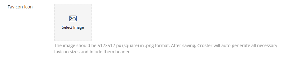
Uploaded graphics should be in the shape of a square and have at least 512x512px size. It is recommended to use the PNG or JPG graphic format. Croster will automatically generate different required sizes of a favicon logo and assign the required code to the Croster WHMCS Client Theme <head> tag.

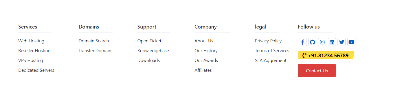
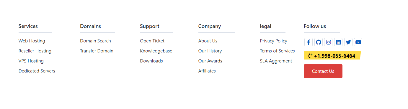
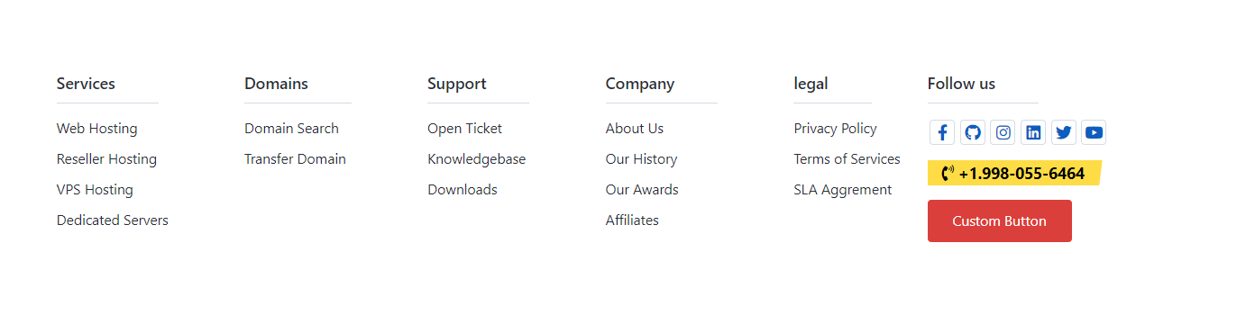
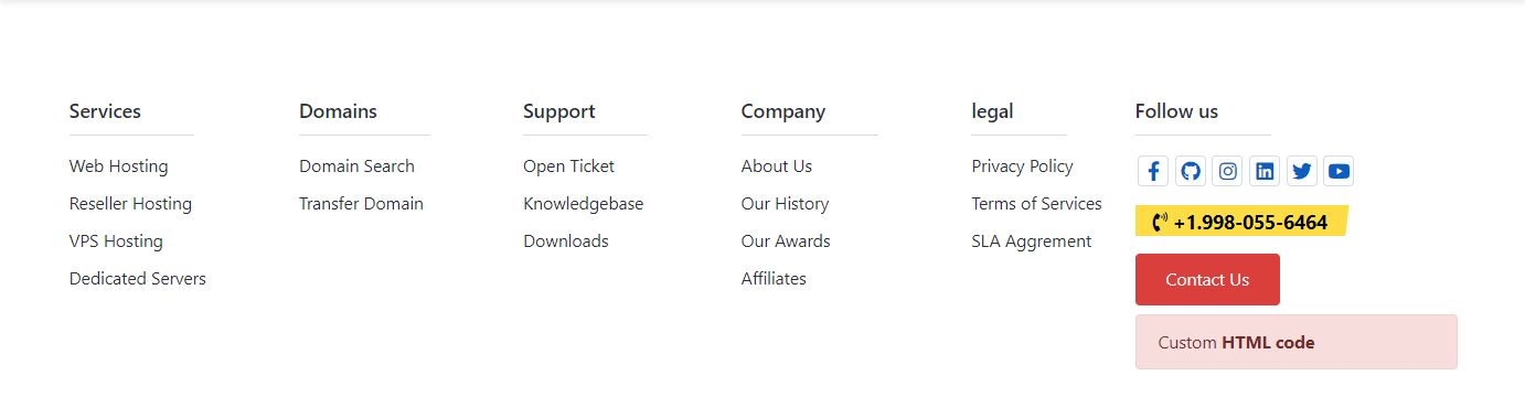
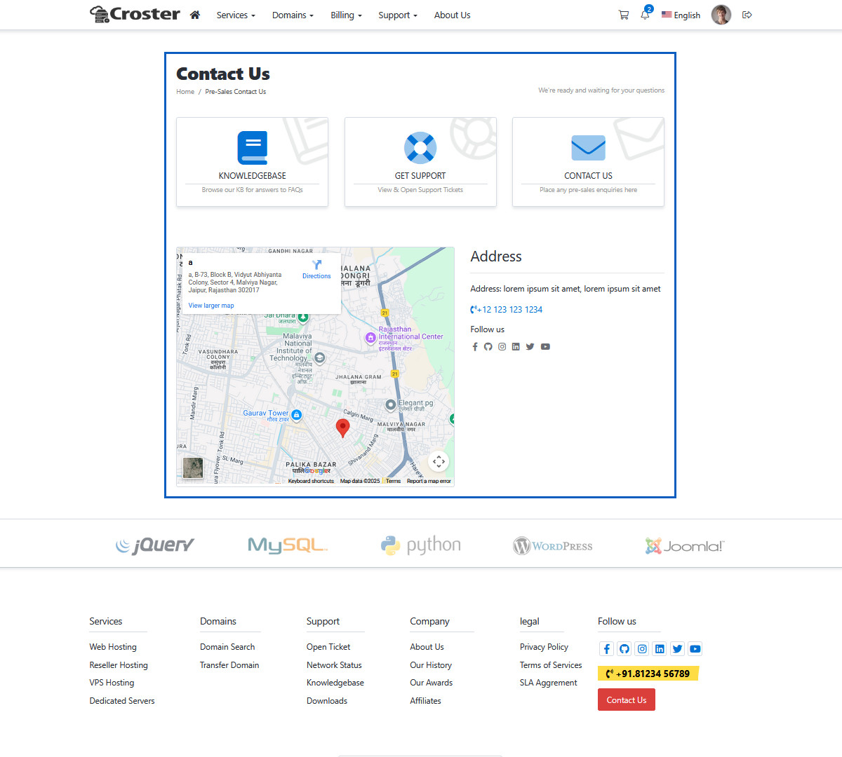
These will be displayed in the Pre-header, Two Column footer, and the Modern styled 'Contact Us' page if these options are enabled.

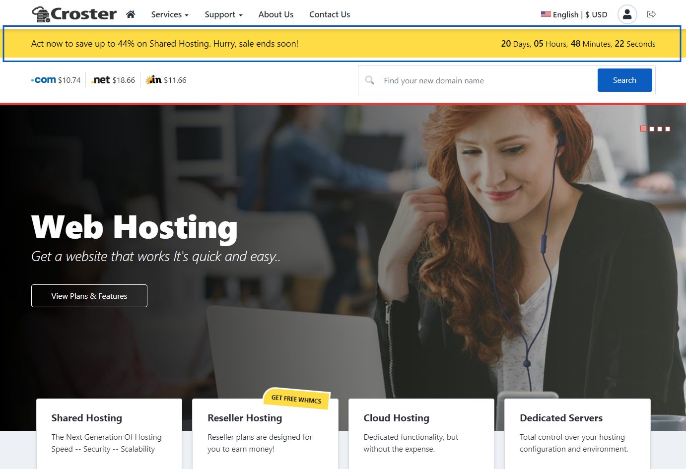
Enable this option to show a promotion banner under the website header area to inform your offer. You can configure its visibility, set an end date with a counter, change the banner colors, and it supports multiple languages.
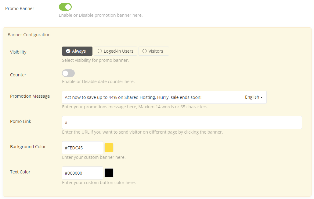
When enabled, this option will show a promotion banner under the website header area, as shown in the preview below:
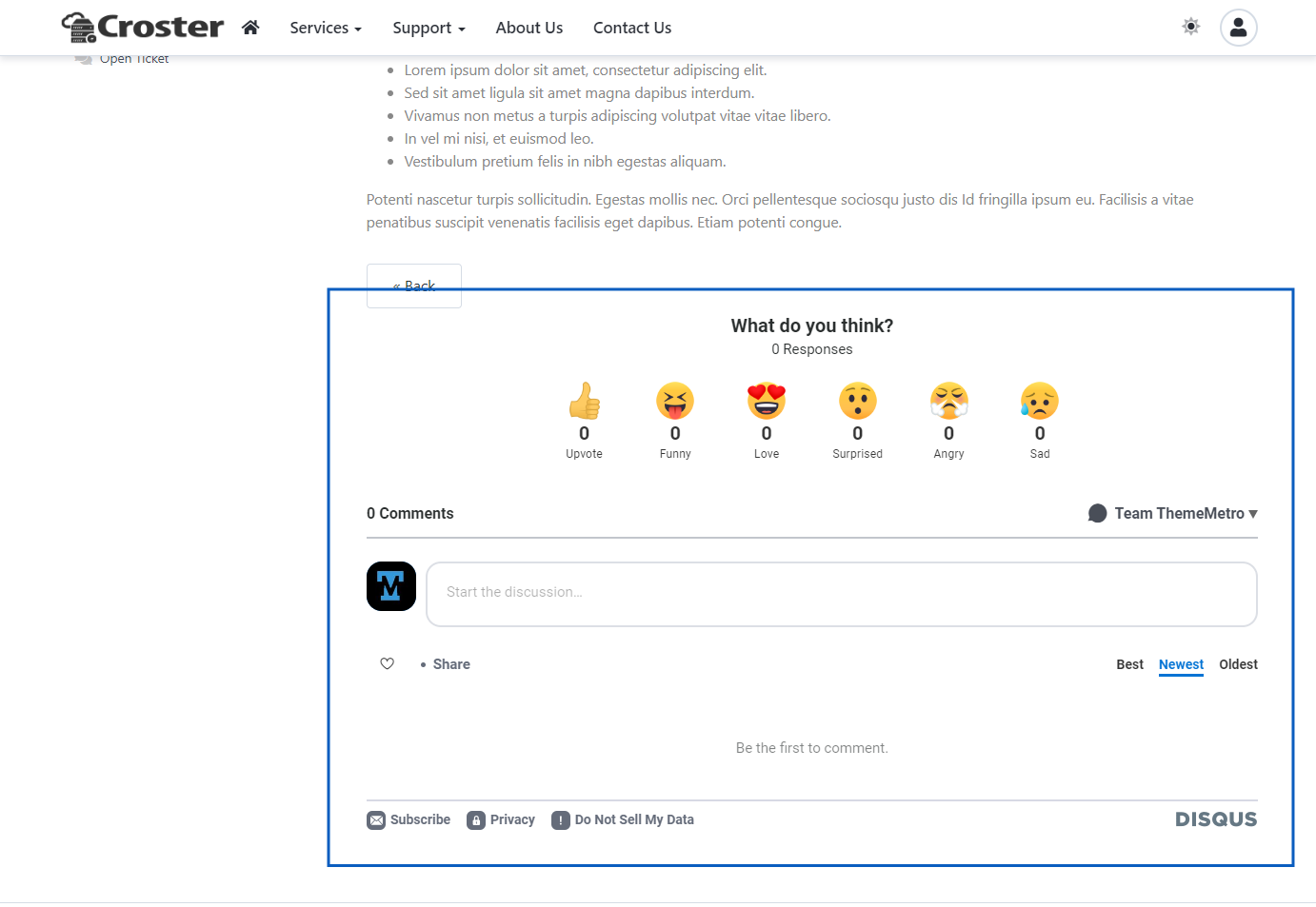
Add your Disqus username to enable the Disqus comments section in WHMCS Announcements and Knowledgebase articles.

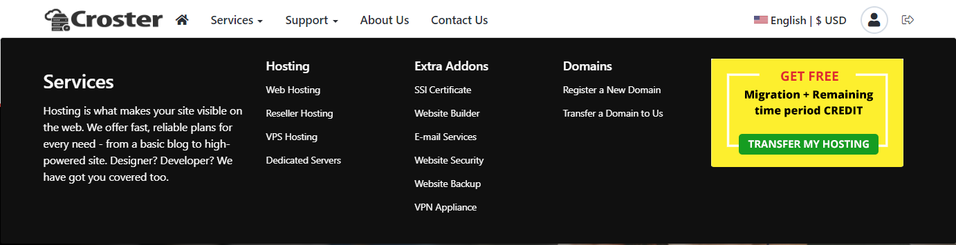
You can choose one of the three included options for the main menu background color.

Default

Primary

Dark

You can enable or disable Sticky Menu in website. While scrolling page header will appear at the top.

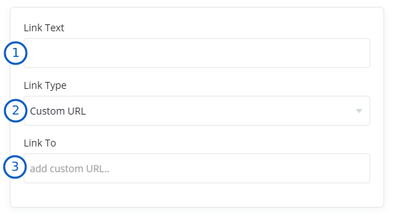
If you want to use Croster for the client area only and want the Home icon and Logo to link to your main website, you can add a custom URL in this input field. For logged-in users/clients, the Home icon will still navigate to the client area dashboard.

Enable this options, If you'd like remove Home icon from primary menu, It will not hide for loged in user/client and mobile menu.


If you want to Menu in right side, then simply Enable this option. (Only for default layout)


If you want to disable shadow simply enable this option to make flat bordered menu.

Preview: No Shadow Header

Preview: With Shadow Header

You can easily select sub menu style for primary menu.

Default

Style 1

Style 2
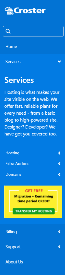
You can easily select a style for the side menu, which will also change the mobile menu across all layouts.

Default Side Menu
Primary Side Menu
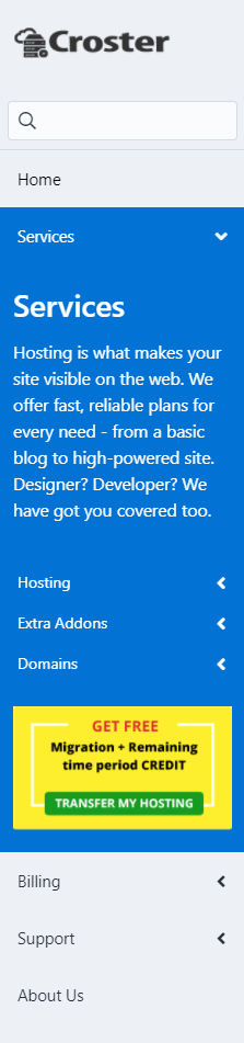
Dark Side Menu
When you enable this option, Register and Login buttons will be show in place of user icon in secondary menu.


You can also enable/disable pre header for Main Menu and choose the style as per your choice from 3 background colors. by default its disabled.

Default

Primary

Light

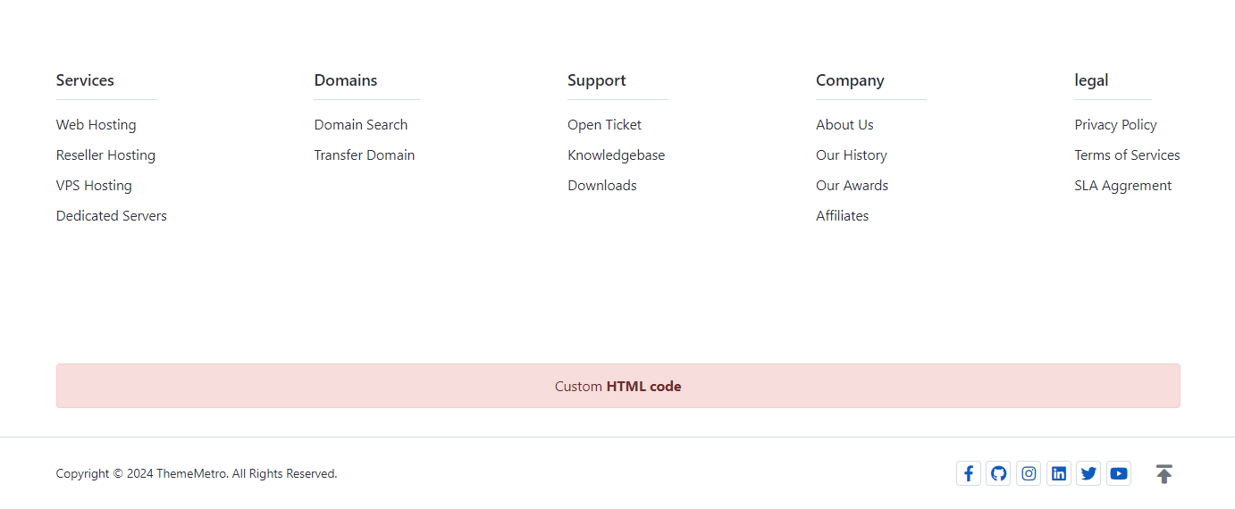
If you want to enable simple small footer like WHMCS default themes. It will remove Footer Slider, Footer Menus. You can still use Payment Logos, Custom HTML code and Sub Menu Items in copyright section. There are 3 options availabe for simple footer. You can enable this for entier website OR just for client area OR only for loged in clients only.


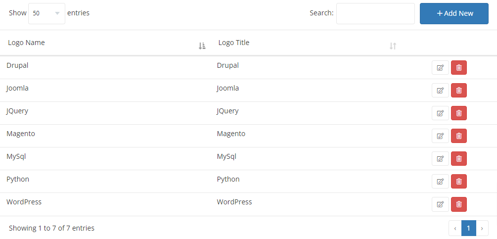
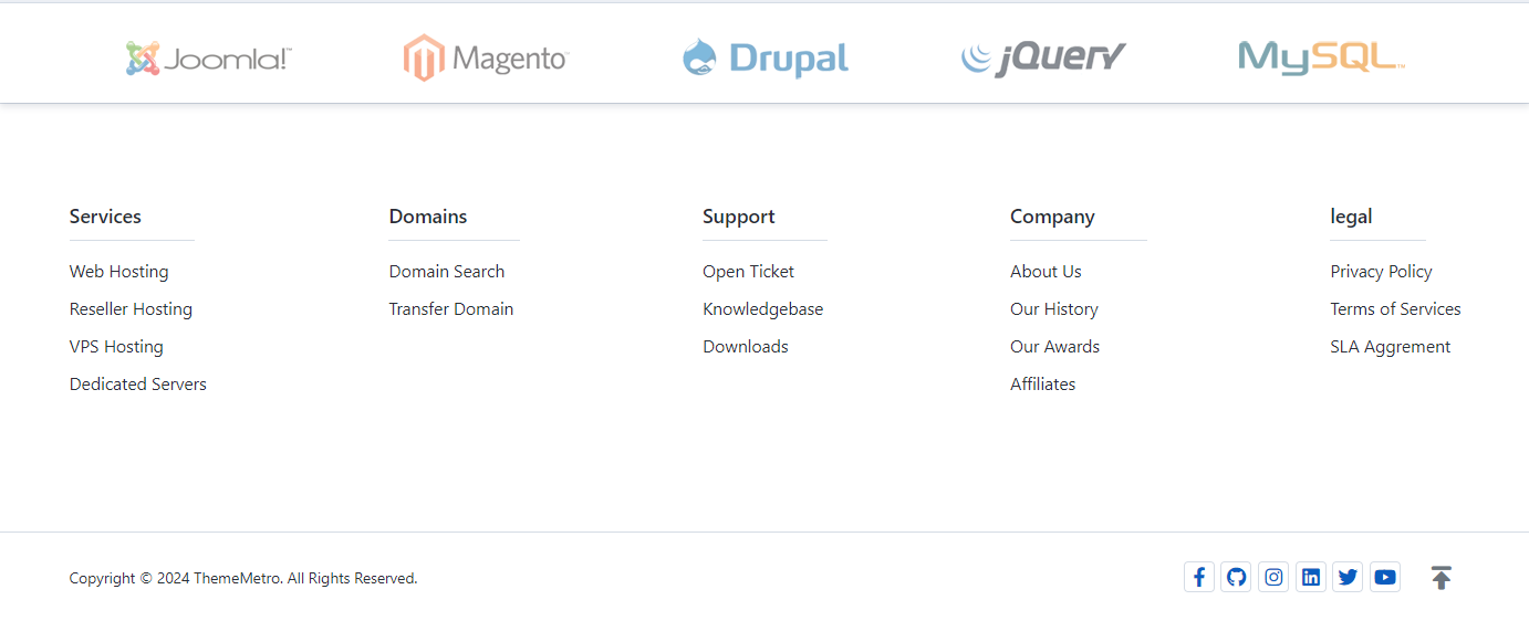
If you wish can disable the footer logo list section, which is enabled by default. You can also disable the shadow effect of the slider section. To manage the logo images, click on the 'Manage Logos' button.


When you click on the 'Manage Logos' button, you will be redirected to the Manage Logo section, as shown in the screenshot below. Here, you can manage the logo images in the slider.
By clicking the 'Add New' button, you can add more logo images. You can also edit or remove any existing images by using the icons from the list.
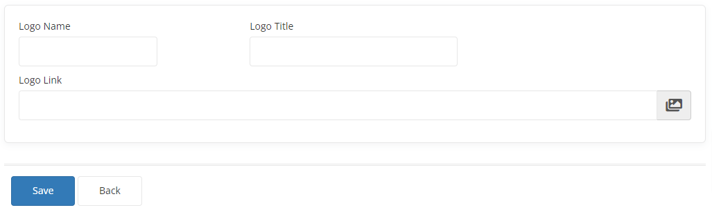
By clicking the 'Add New' OR button, you will be redirected to the screen shown below to upload a logo image.
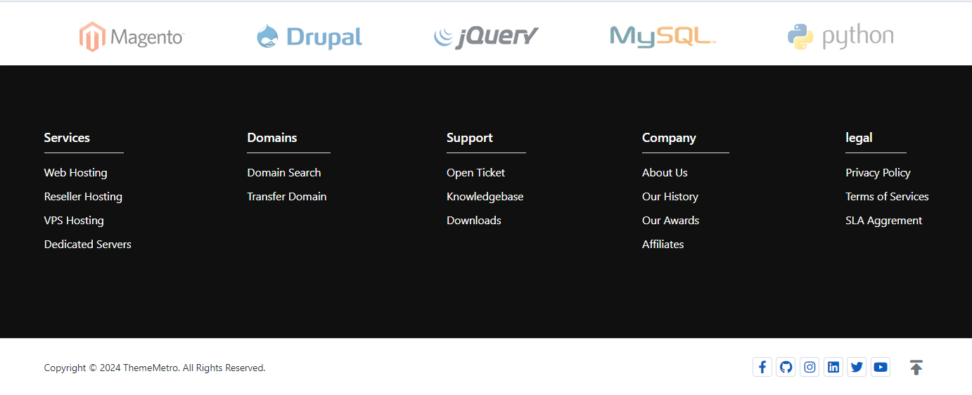
In the Footer Colors section, three types of background colors are available for the footer, allowing you to choose according to your preference.

Default
Primary
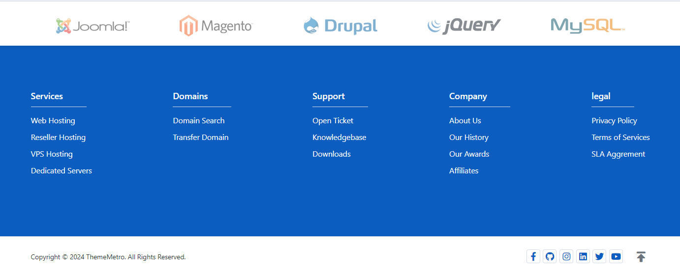
Dark
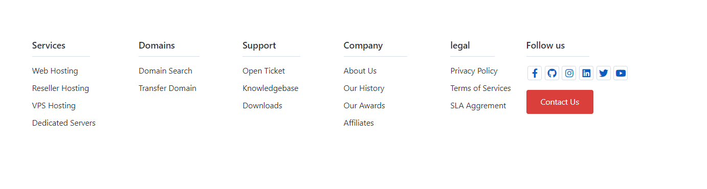
In the Footer Column options, two types of layouts are available: 'Single' and 'Two' columns, allowing you to choose according to your preference.

Single
Two
When you select the 'Two' column option, you will see some advanced configuration options, as shown below:
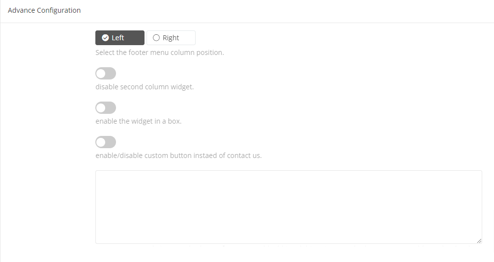
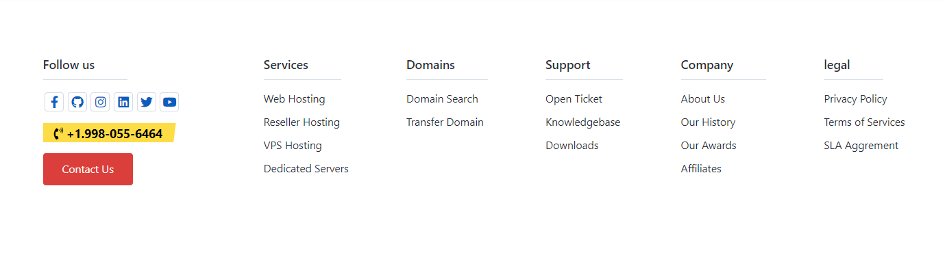
Using this option, you can set the position of the columns.

Left
Right
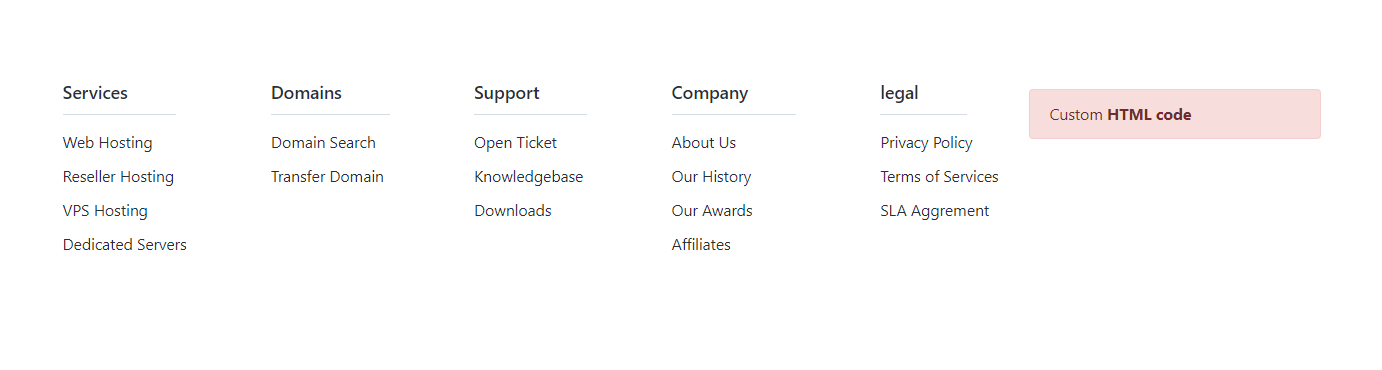
If you want to add custom HTML code instead of the pre-designed widget, enable this option.

Enable this option to wrap the widget in a border.

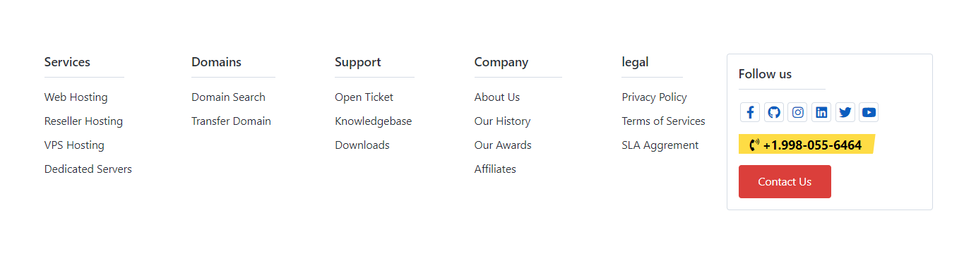
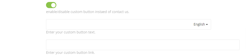
Using this option, you can change the default 'Contact Us' button to any custom button in the widget.
If you want to add additional elements in the second column, you can add your HTML code in the textarea. You can use Bootstrap 4.x CSS classes.

<div class="alert alert-danger mt-2">Custom <b>HTML code</b></div>In Footer Configuration HTML Field you can add custom html code for display in second column.
Enable this option if you want to display payment option icons in the footer. You can also use custom HTML code by adding it in the textarea input field if you prefer not to use the default logos.

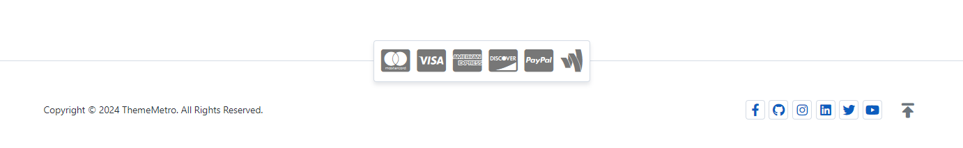
If you prefer not to use the default logos, you can use the example HTML code below for logos by using Font Awesome icons.
<ul class="border-0 no-shadow p-0">
  <li><i class="fab fa-cc-mastercard"></i></li>
  <li><i class="fab fa-cc-visa"></i></li>
  <li><i class="fab fa-cc-amex"></i></li>
  <li><i class="fab fa-cc-discover"></i></li>
  <li><i class="fab fa-cc-paypal"></i></li>
</ul>If you want to add more custom HTML code in the footer, either 'Before' or 'After' the Copyright section, use this textarea input field.
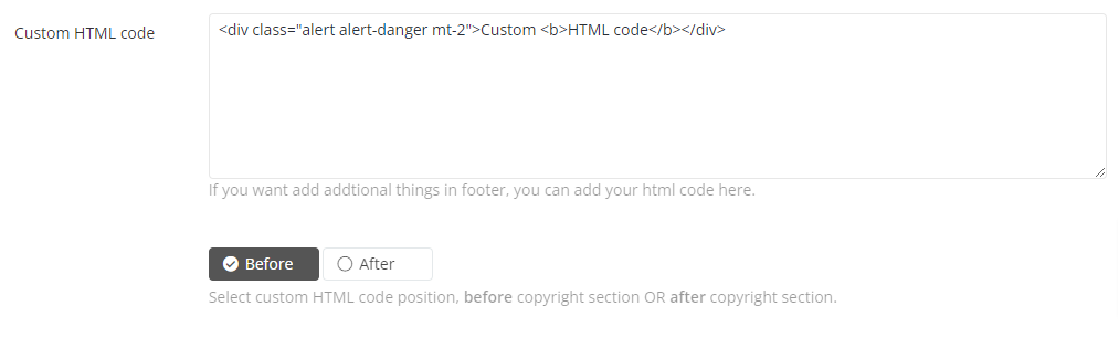
<div class="alert alert-danger text-center">Custom <b>HTML code</b></div>Before
After
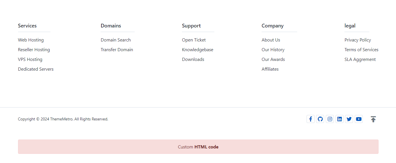
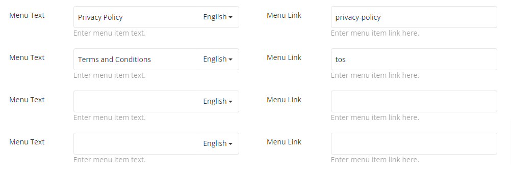
When you enable this option, fields to add sub-menu items (e.g., Terms of Conditions, Privacy Policy, etc.) will appear. You can add up to four items, which will appear in the footer copyright section.


Profile Grpahics
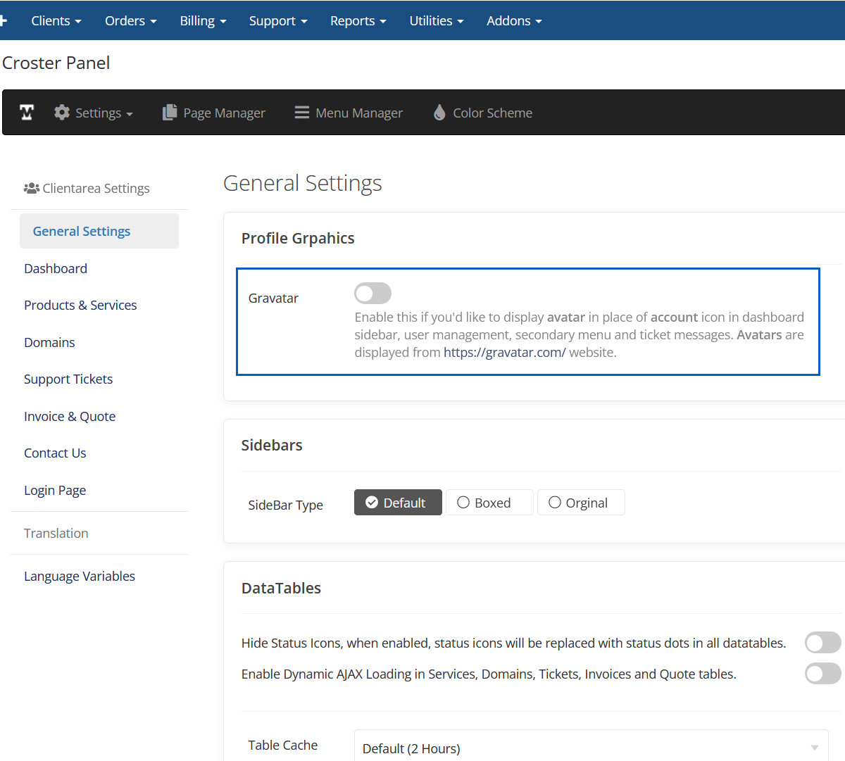
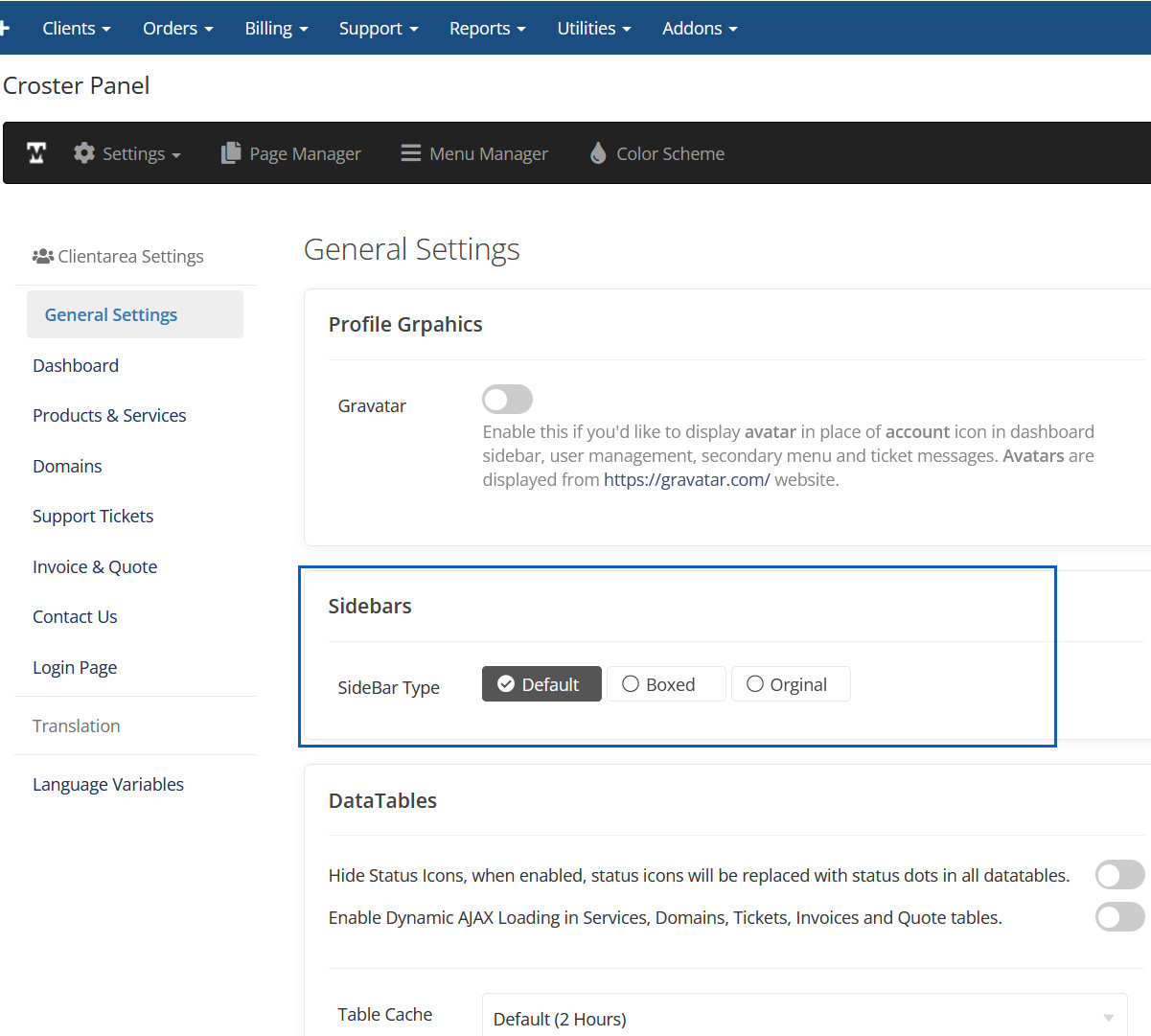
Sidebars
DataTables
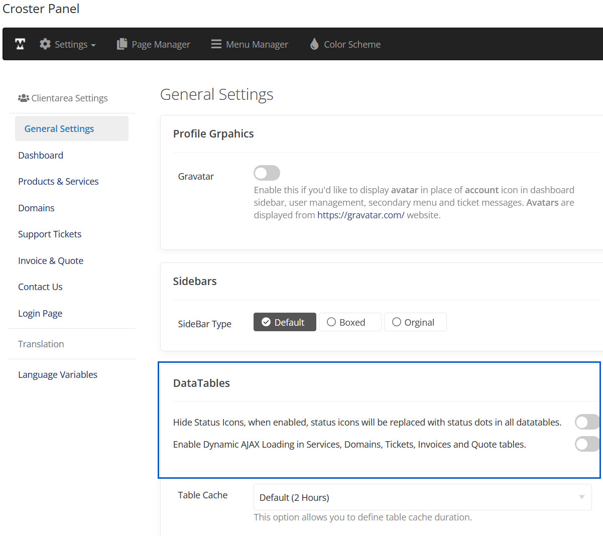
Enable this if you'd like to display avatar in place of account icon in dashboard sidebar, user management, secondary menu and ticket messages. Avatars are displayed from https://gravatar.com/ website.
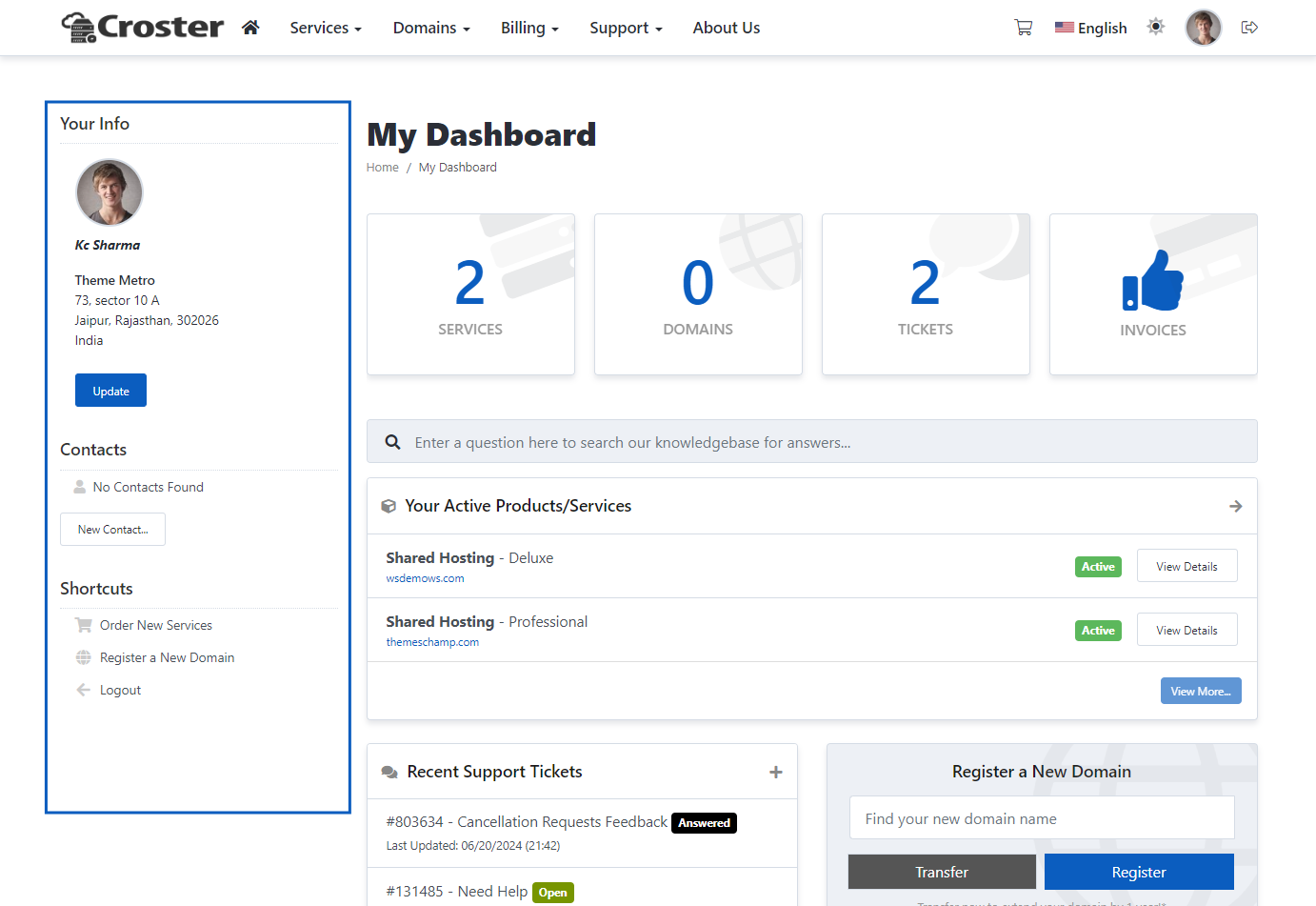
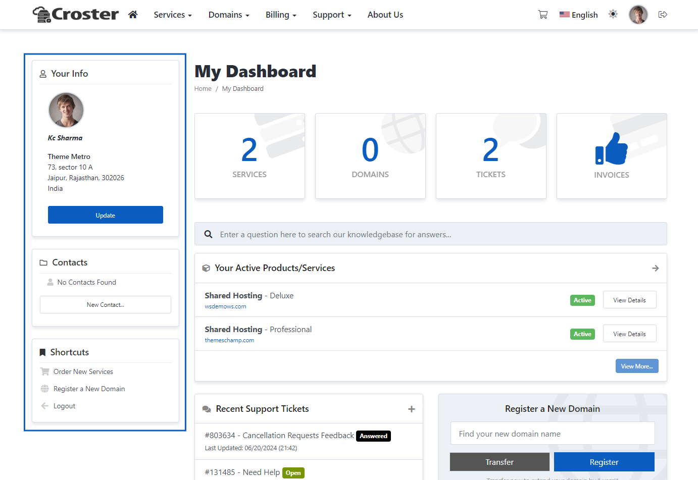
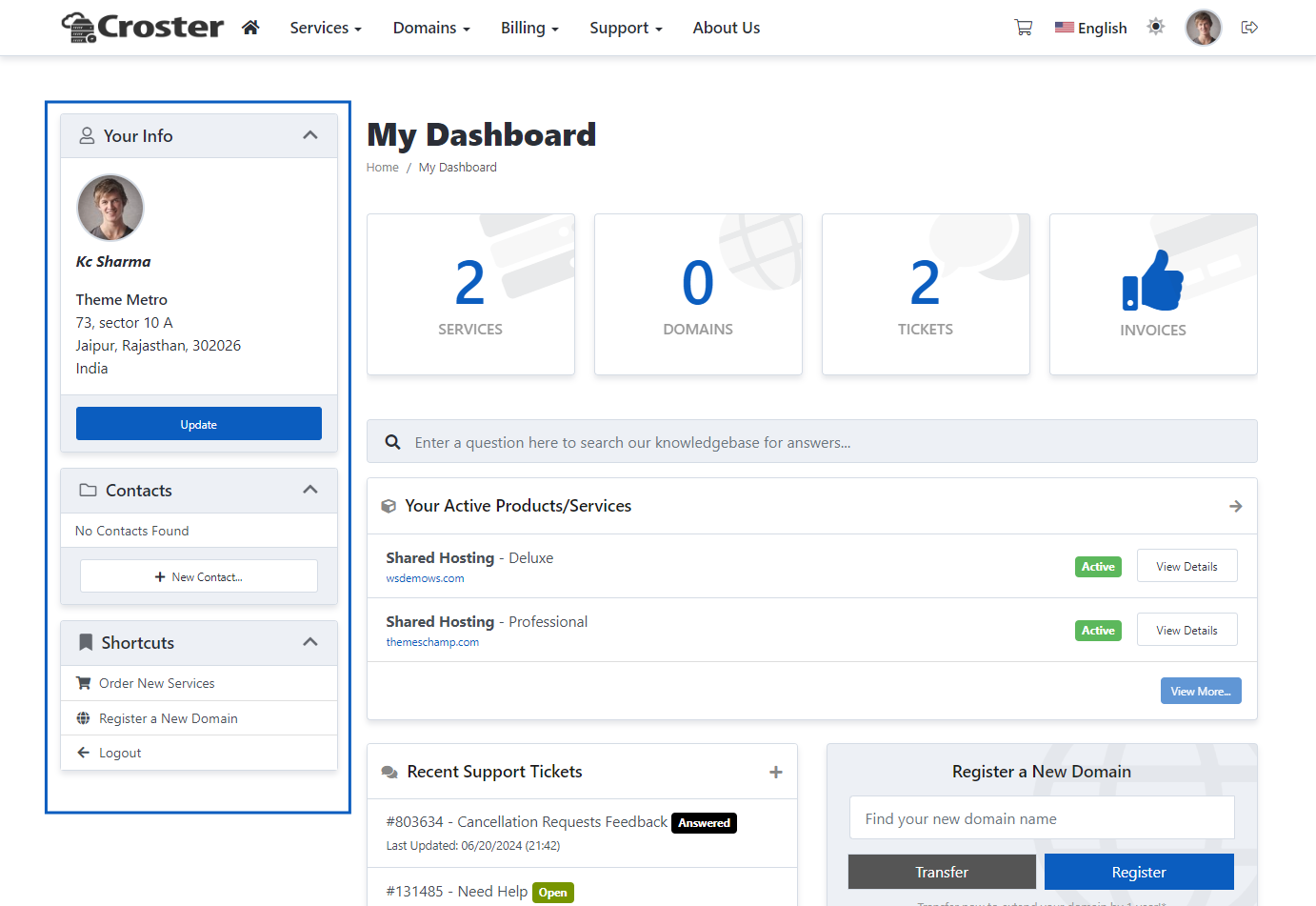
There are three types of sidebars included: 'Default', 'Boxed', and 'Original'. You can choose according to your preference.

Default
Boxed
Orignal
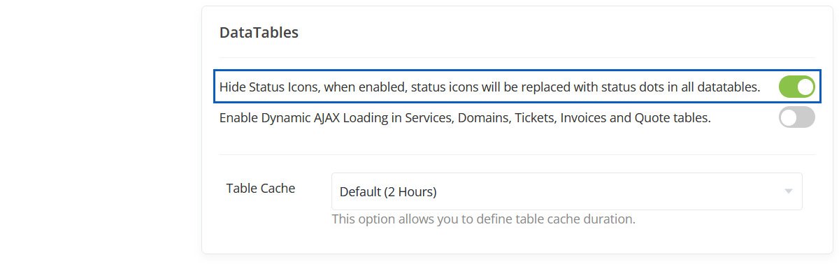
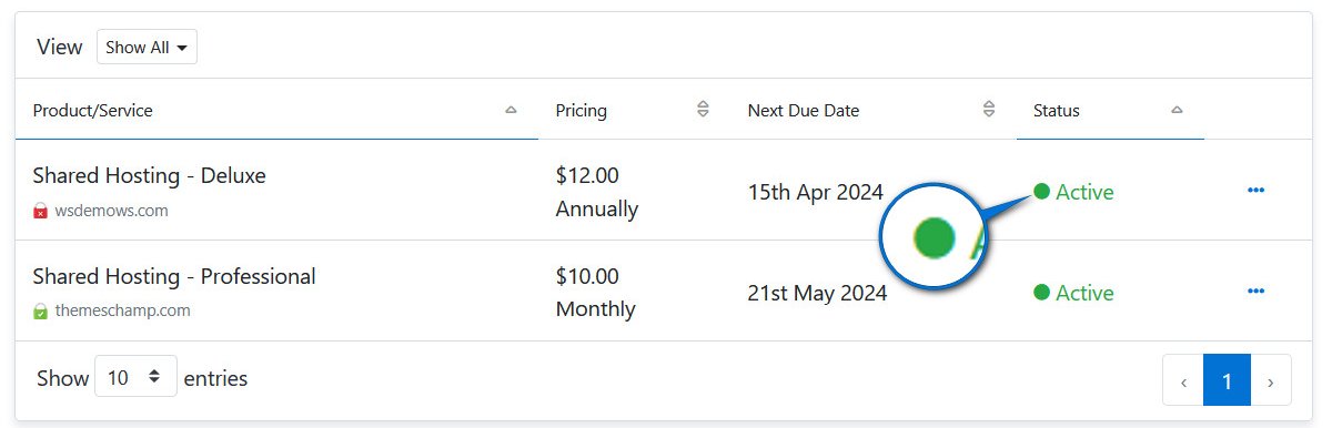
Hide Status Icons
When enabled, status icons will be replaced with status dots in all datatables.
Hidden Status Icons
This Table Status Icons will be hidden.
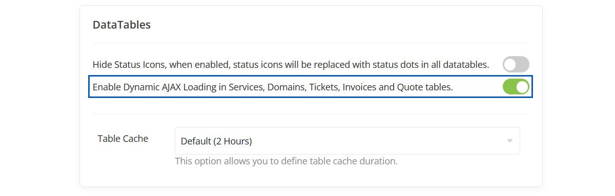
Enable Dynamic AJAX Loading for Data Tables
This feature enhances the speed and responsiveness of your client area by dynamically loading data tables using AJAX. This means data for items like domains, tickets, invoices, or any other services is only loaded as needed.
Consider you have 2000 domains listed in the client area. Typically, loading such a table could take 20-60 seconds because WHMCS loads all data simultaneously. However, with the "Enable Dynamic AJAX Loading for Data Tables" feature activated, only the first 10 domains are initially loaded, reducing the load time to less than 1 second.
This improvement not only speeds up the interface but also makes it more responsive, especially when handling large datasets. Actions like filtering domain names, sorting ticket entries, or searching for specific invoices become smoother as the data updates dynamically without needing to reload the entire page.
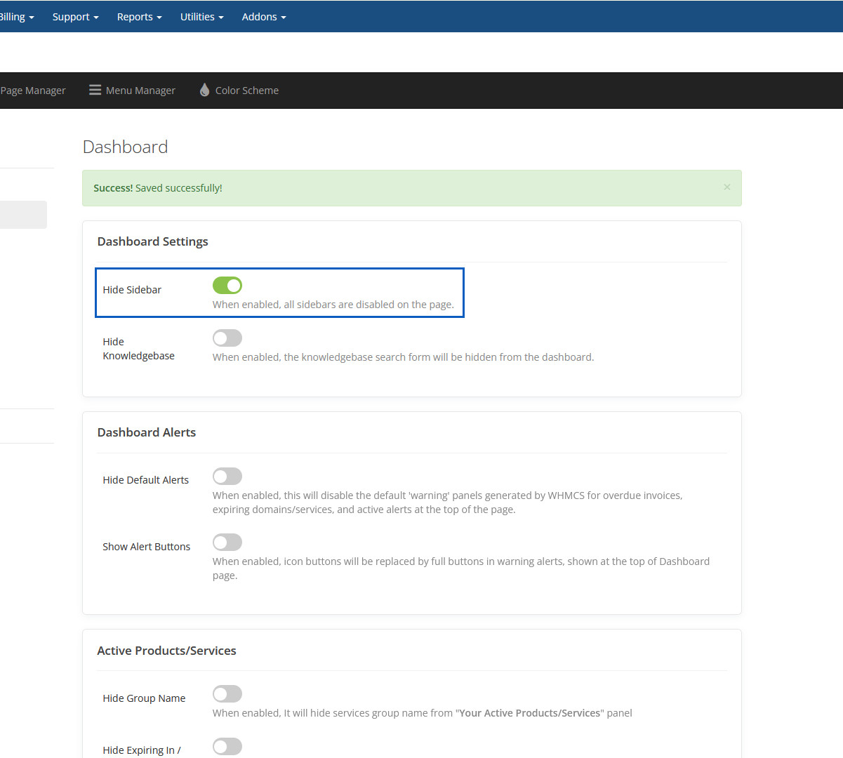
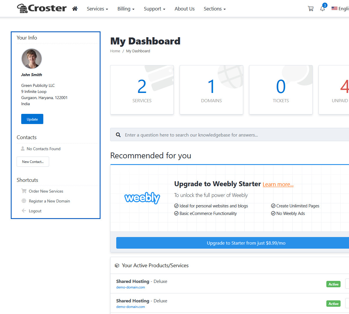
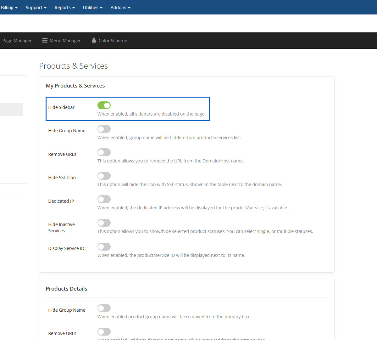
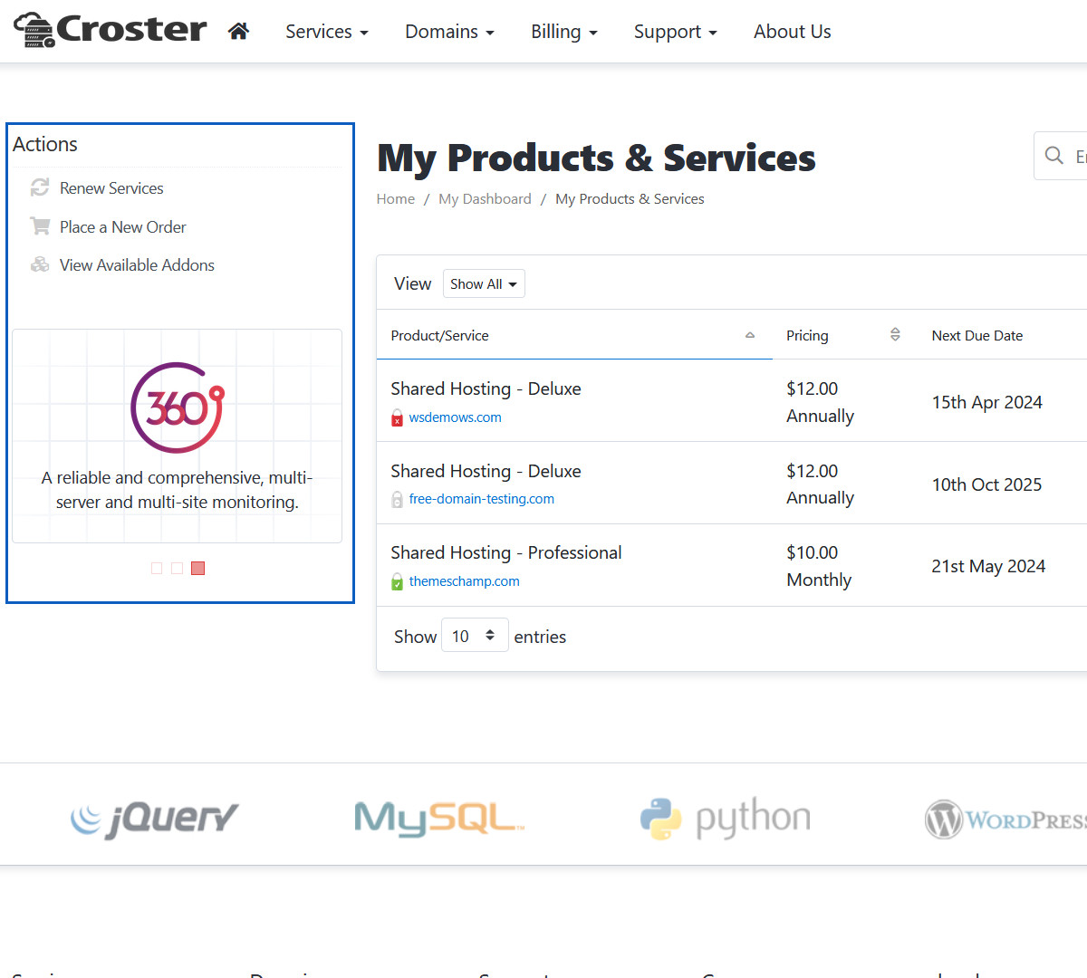
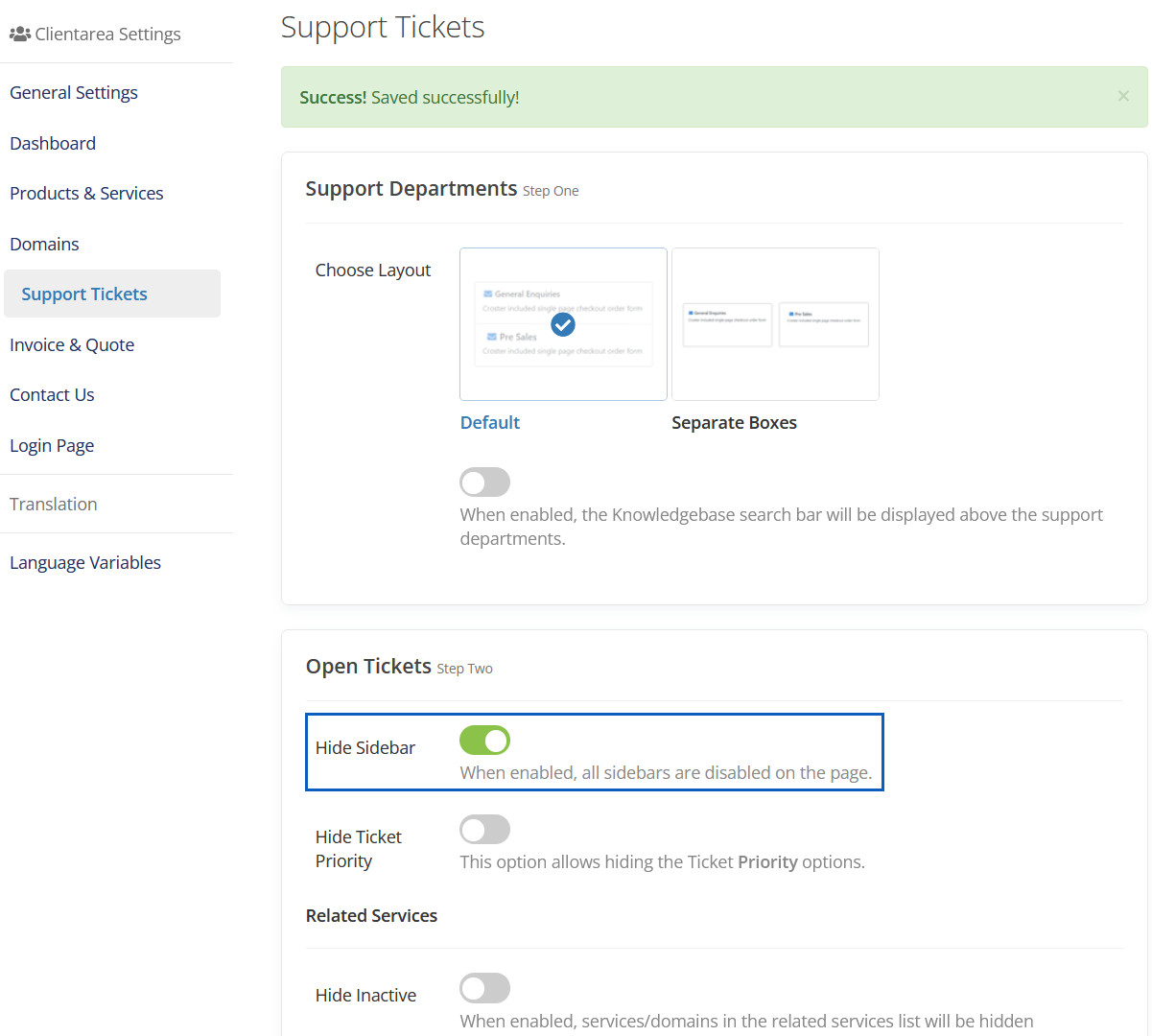
Hide Sidebar
When enabled, all sidebars are disabled on the page.
Hidden Sidebar
This Sidebar will be hidden.
Hide Knowledgebase
When enabled, the knowledgebase search form will be hidden.
Hidden Knowledgebase
This Knowledgebase will be hidden.
Hide Default Alerts
When enabled, this will disable the default 'warning' panels generated by WHMCS for overdue invoices, expiring domains/services, and active alerts at the top of the page.
Hidden Default Alerts
This Default Alerts will be hidden.
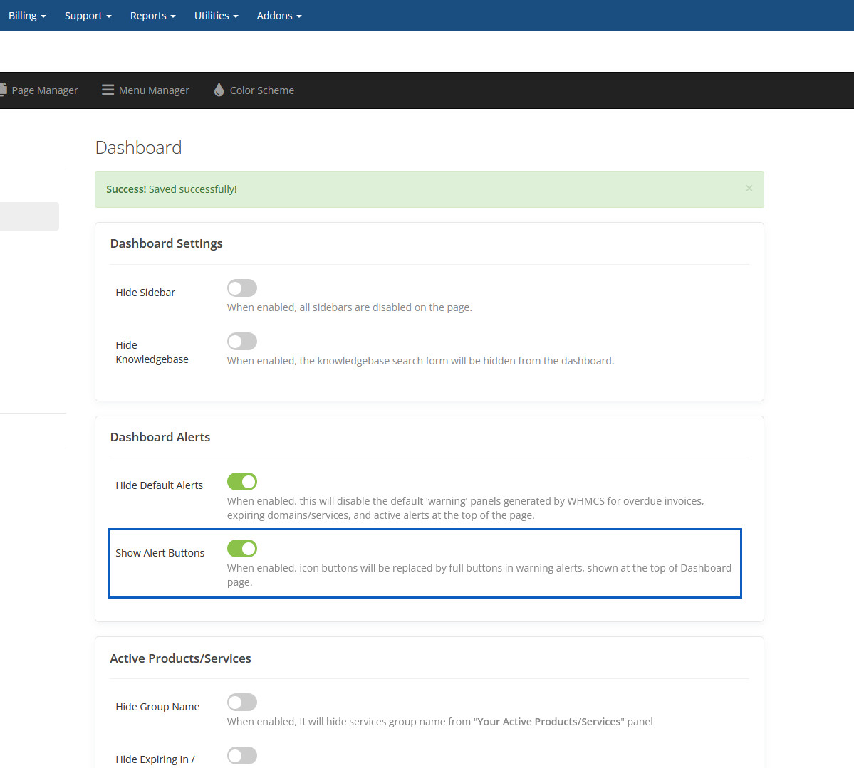
Show Alert Buttons
When enabled, icon buttons will be replaced by full buttons in warning alerts, shown at the top of Dashboard page.
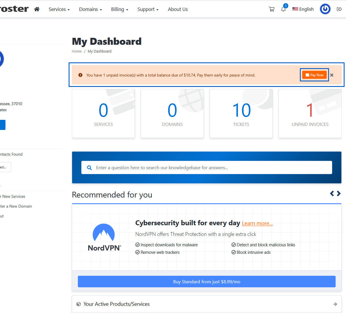
Visible Alert Buttons
This Alert Buttons will be show.
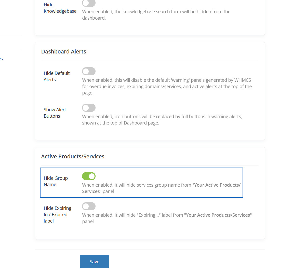
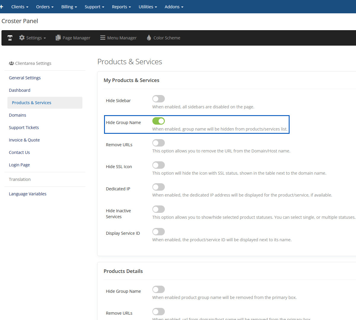
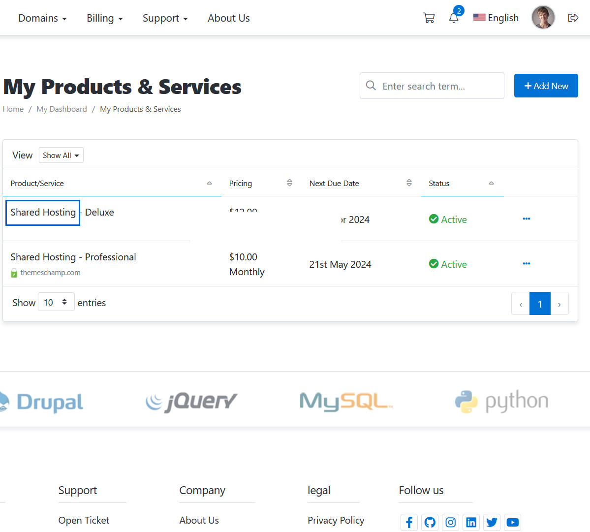
Hide Group Name
When enabled, It will hide services group name from "Your Active Products/Services" panel
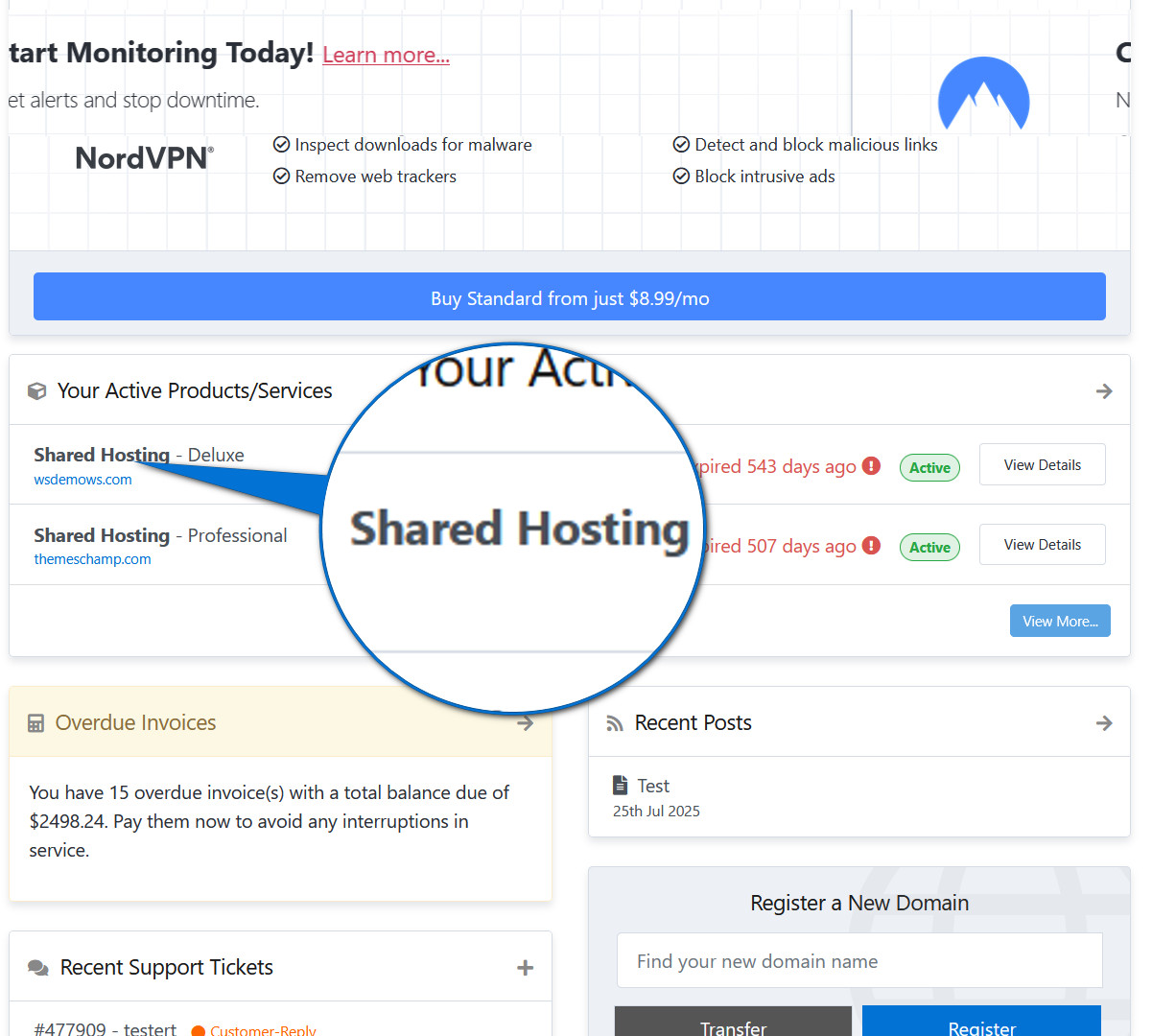
Hidden Group Name
This Group Name will be hidden.
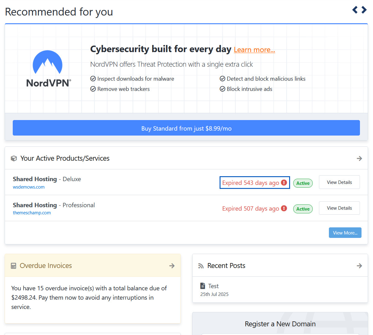
Hide Expiring In / Expired label
When enabled, It will hide "Expiring..." label from "Your Active Products/Services" panel
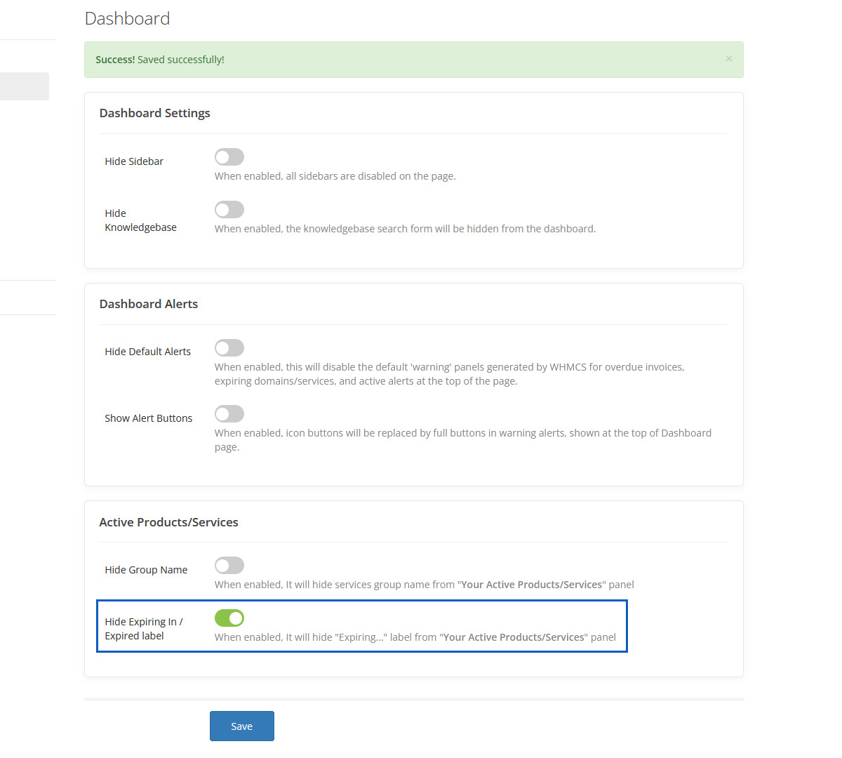
Hidden Expiring In / Expired label
This Expiring In / Expired label will be hidden.
Hide Sidebar
When enabled, all sidebars are disabled on the page.
Hidden Sidebar
This sidebar will be hidden.
Hide Group Name
When enabled, group name will be hidden from products/services list.
Hidden Group Name
This group name will be hidden.
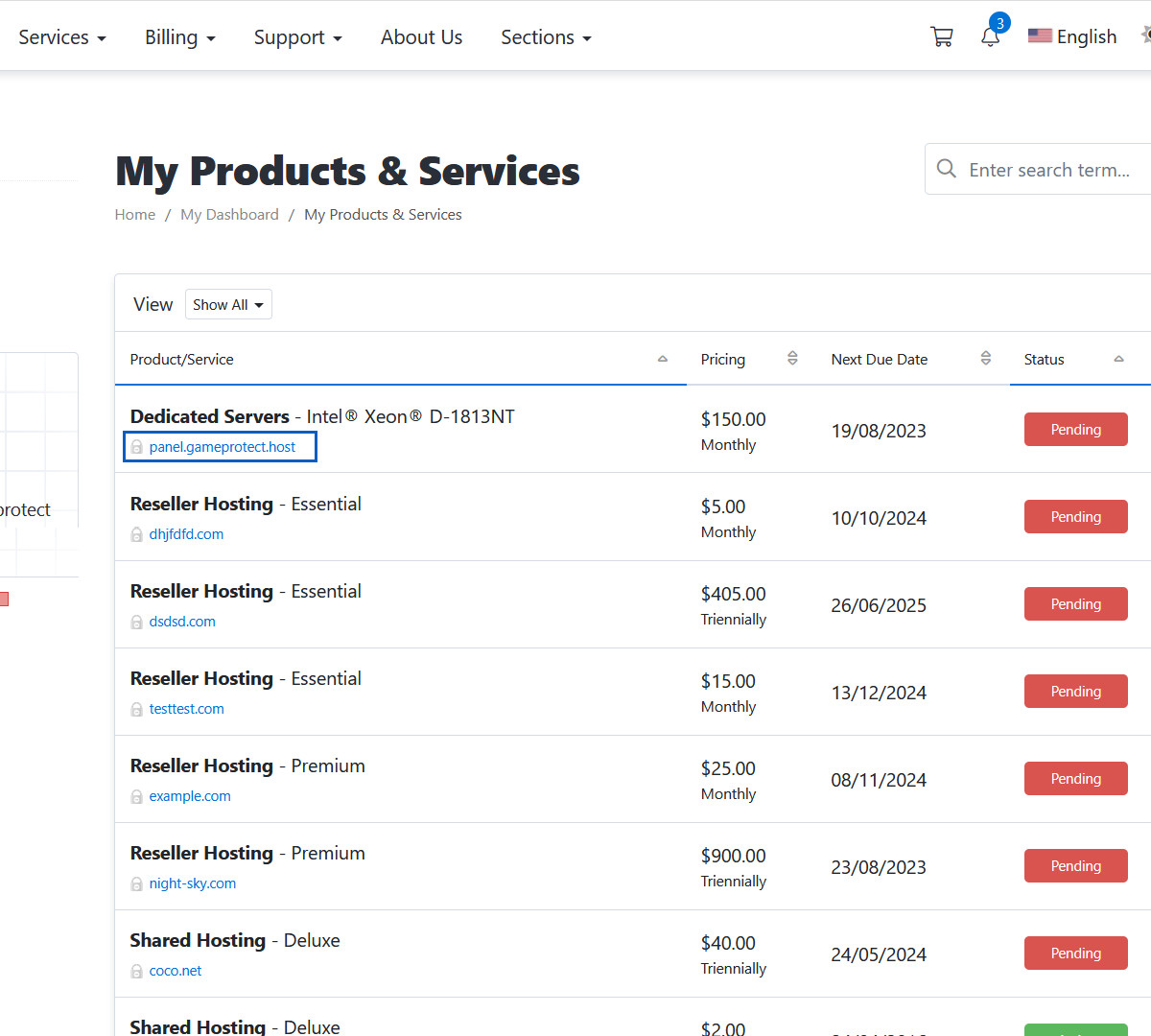
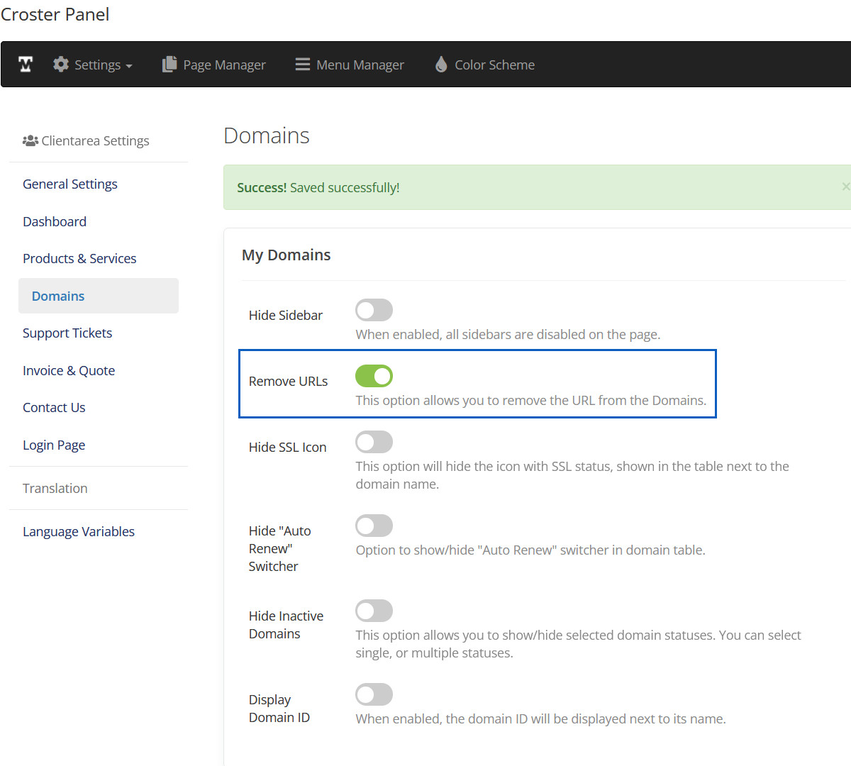
Remove URLs
This option allows you to remove the URL from the Domain/Host name.
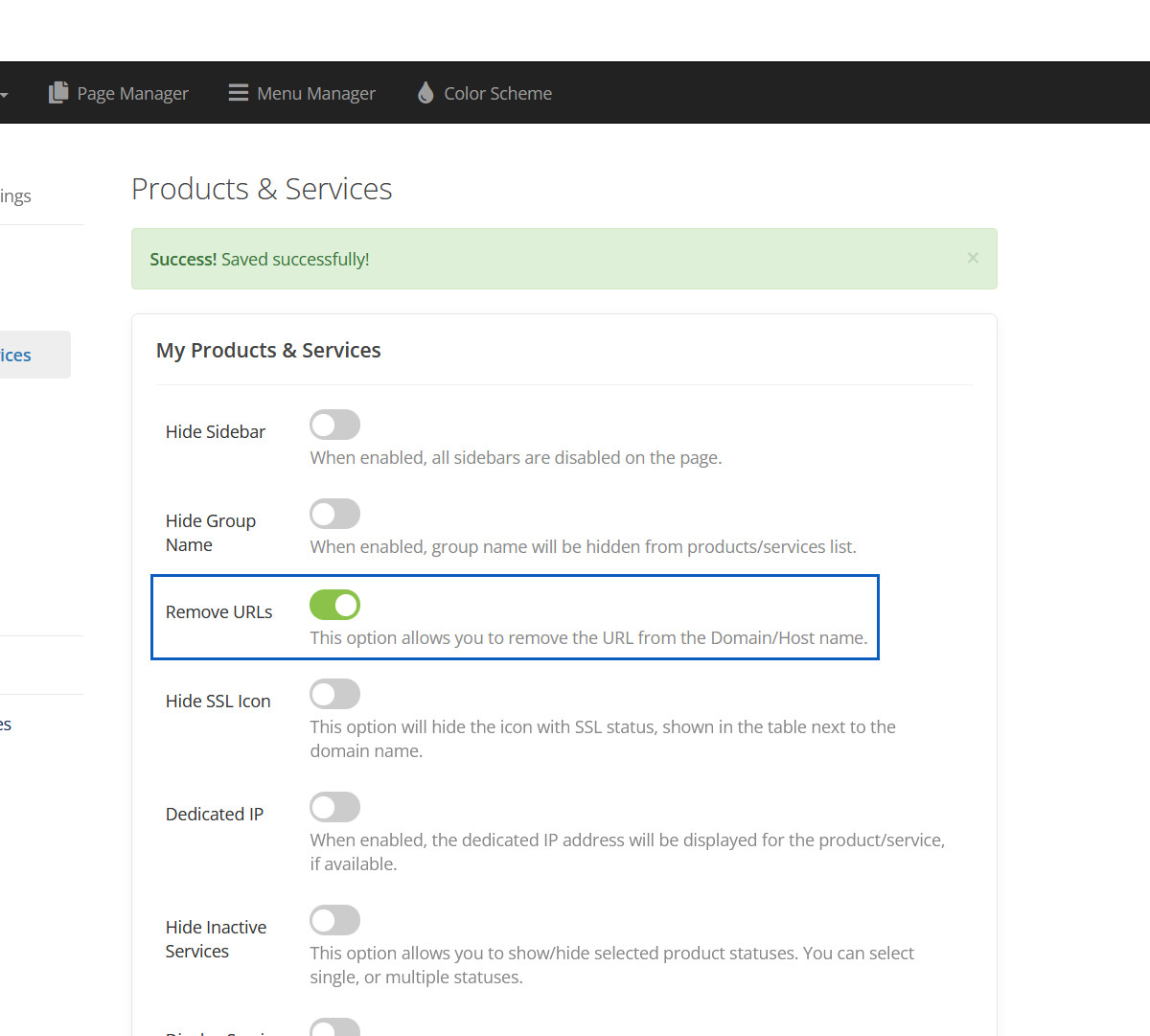
Removed URLs
This URLs will be removed.
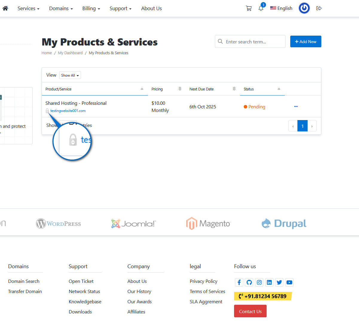
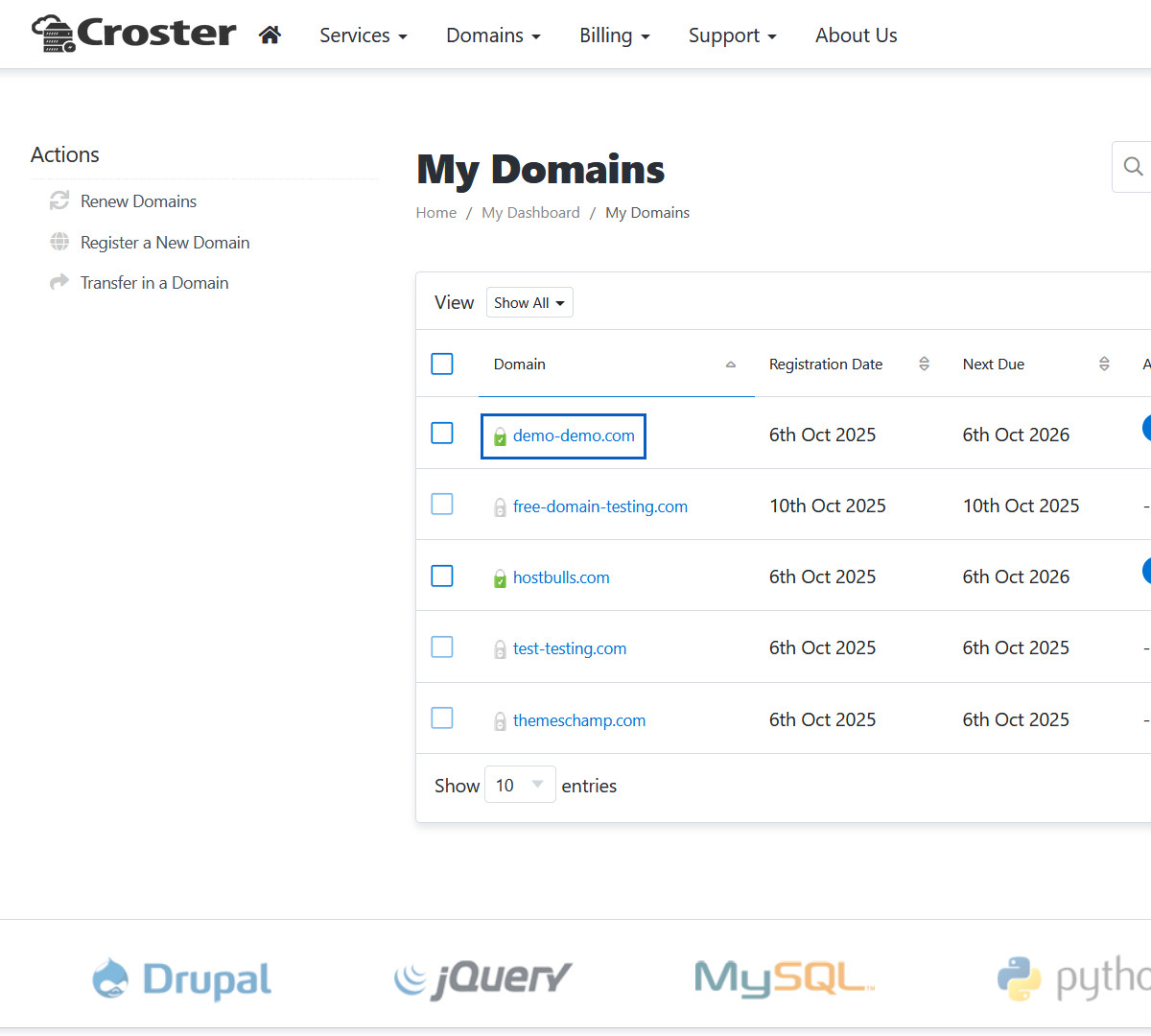
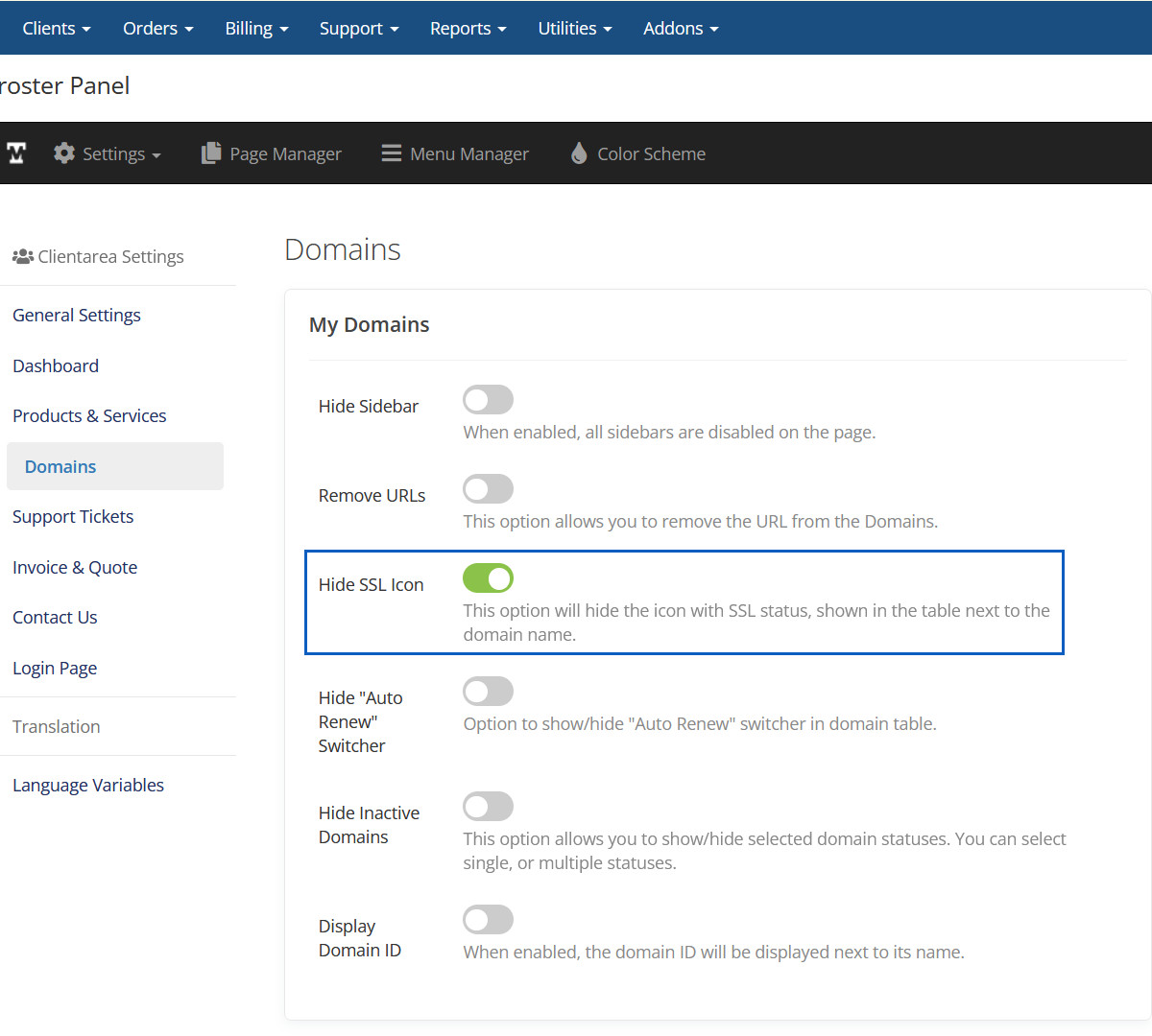
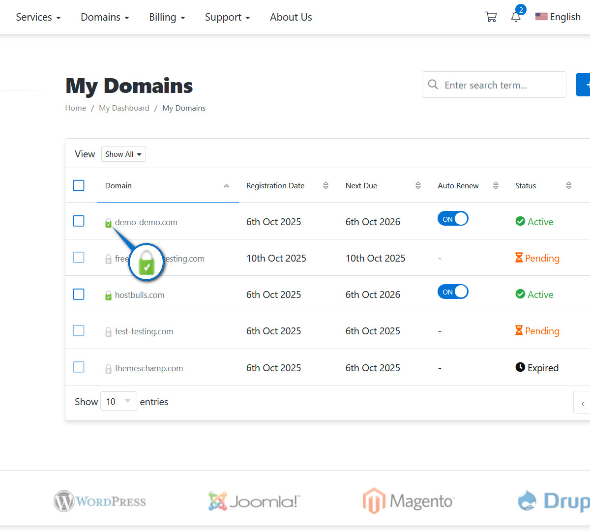
Hide SSL Icon
This option will hide the icon with SSL status, shown in the table next to the domain name.
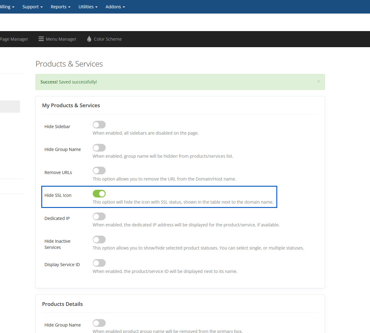
Hidden SSL Icon
This SSL icon will be hidden.
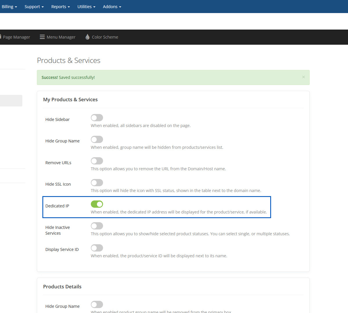
Dedicated IP
When enabled, the dedicated IP address will be displayed for the product/service, if available.
Hide Inactive Services
This option allows you to show/hide selected product statuses. You can select single, or multiple statuses.
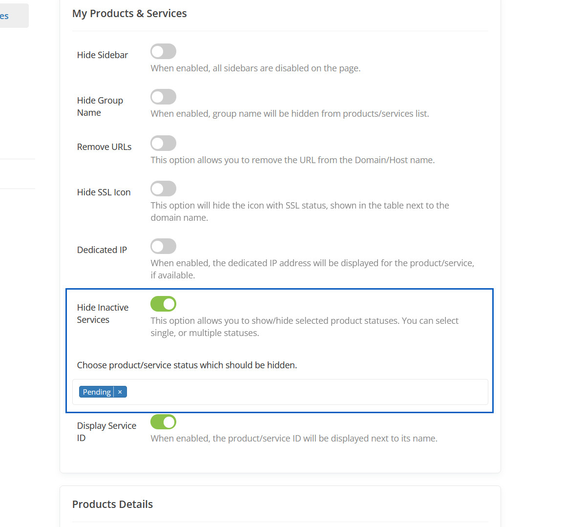
Hidden Inactive Services
This inactive service will be hidden.
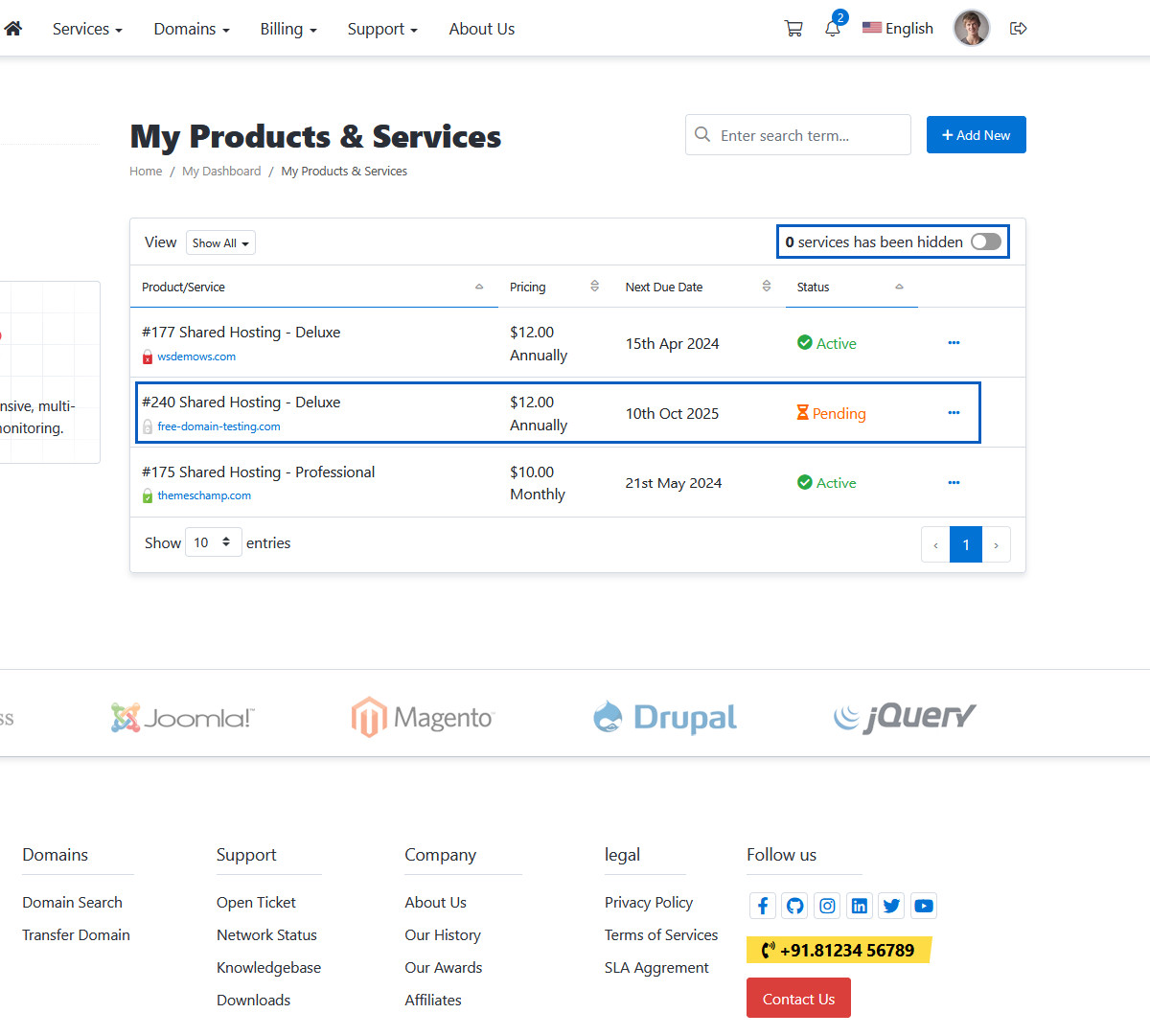
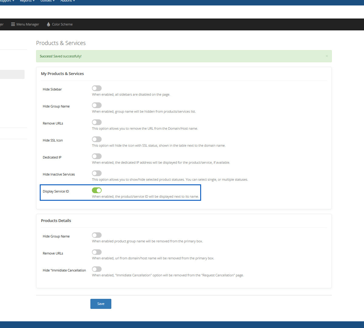
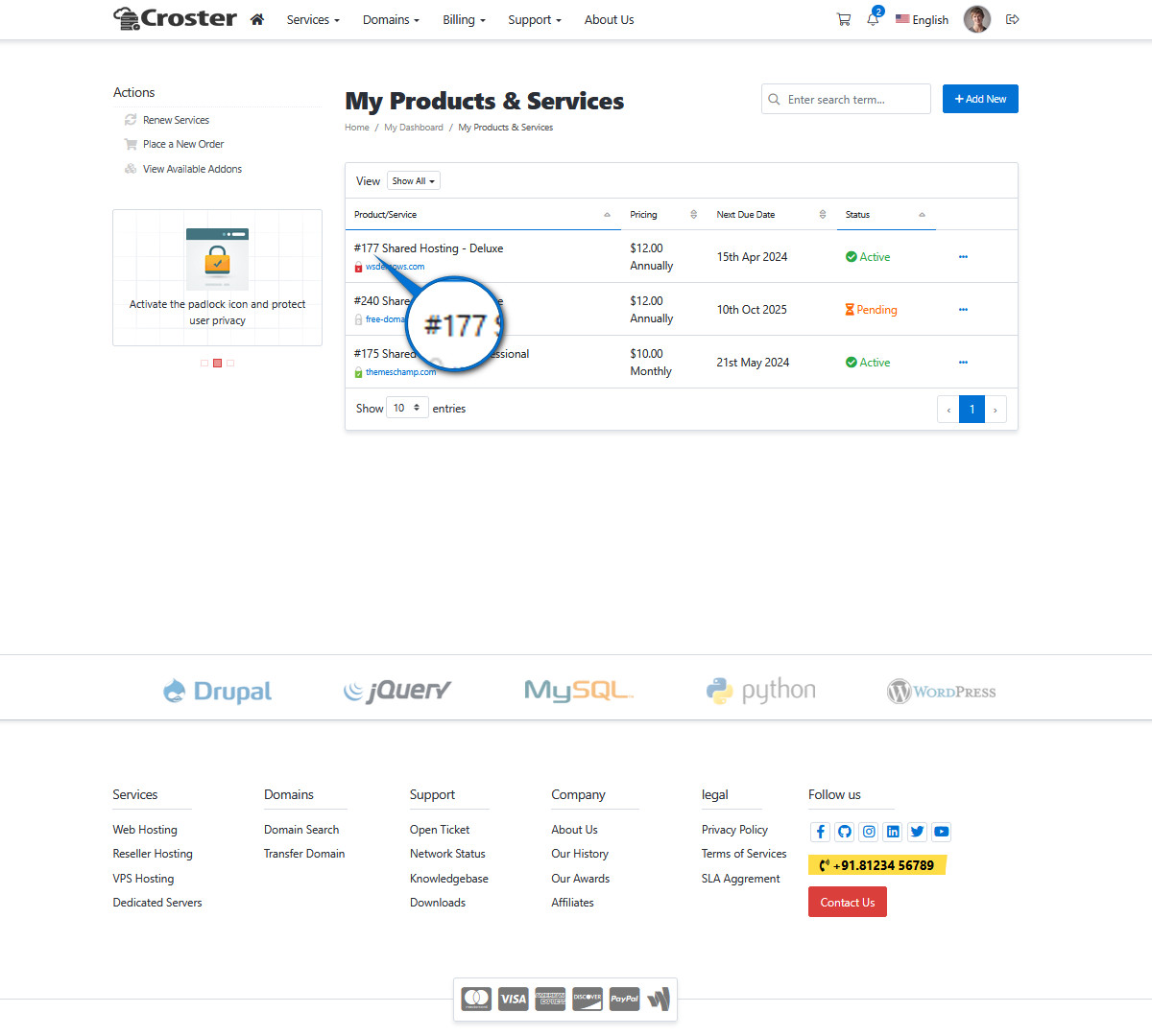
Display Service ID
When enabled, the product/service ID will be displayed next to its name.
Displayed Service ID
This service ID will be displayed.
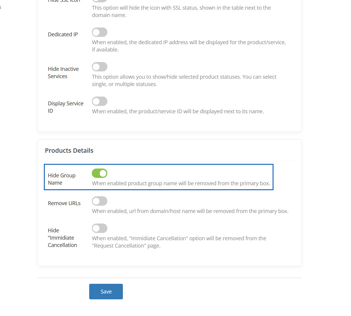
Hide Group Name
When enabled product group name will be removed from the primary box.
Hidden Group Name
This Group Name will be hidden.
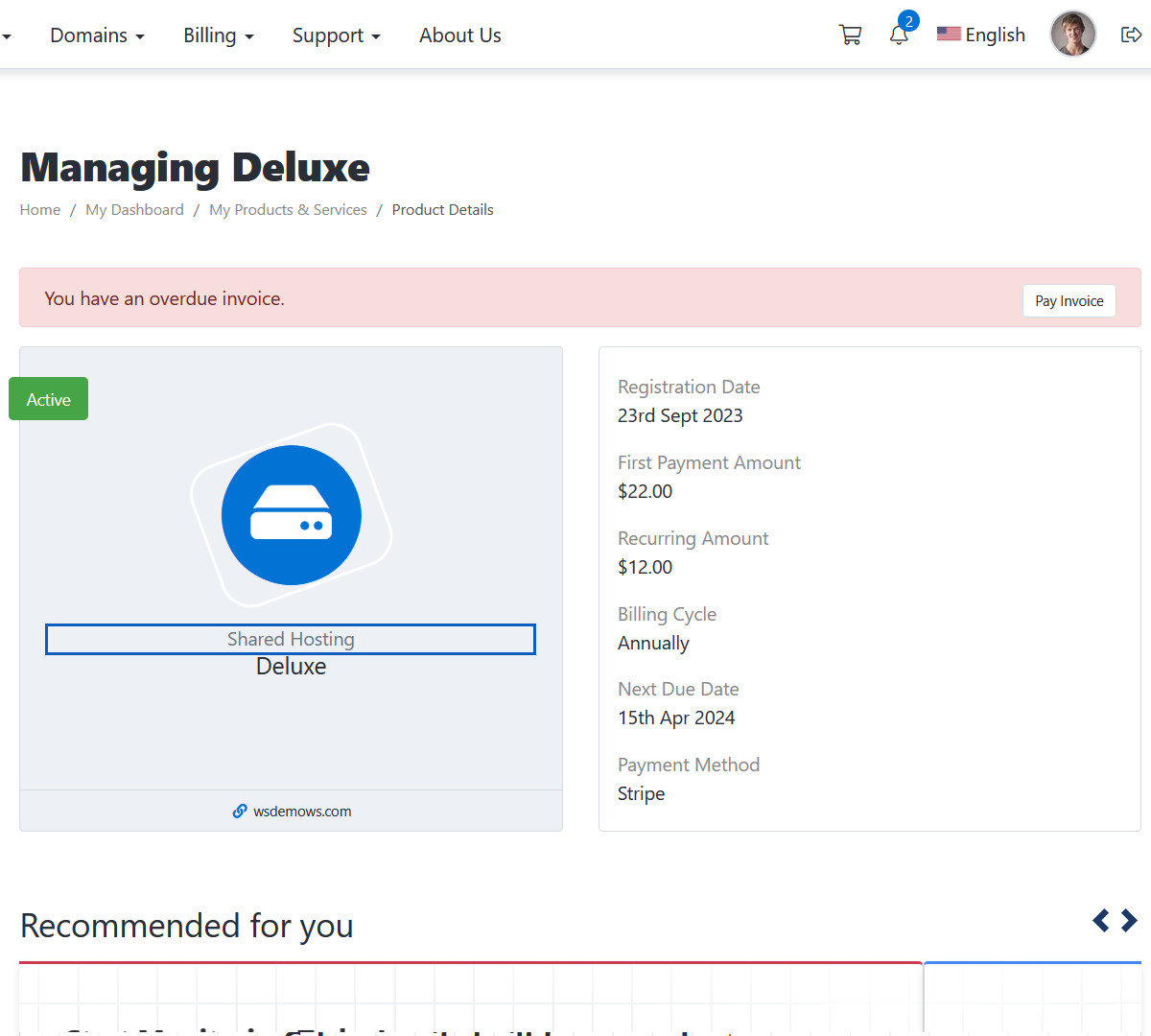
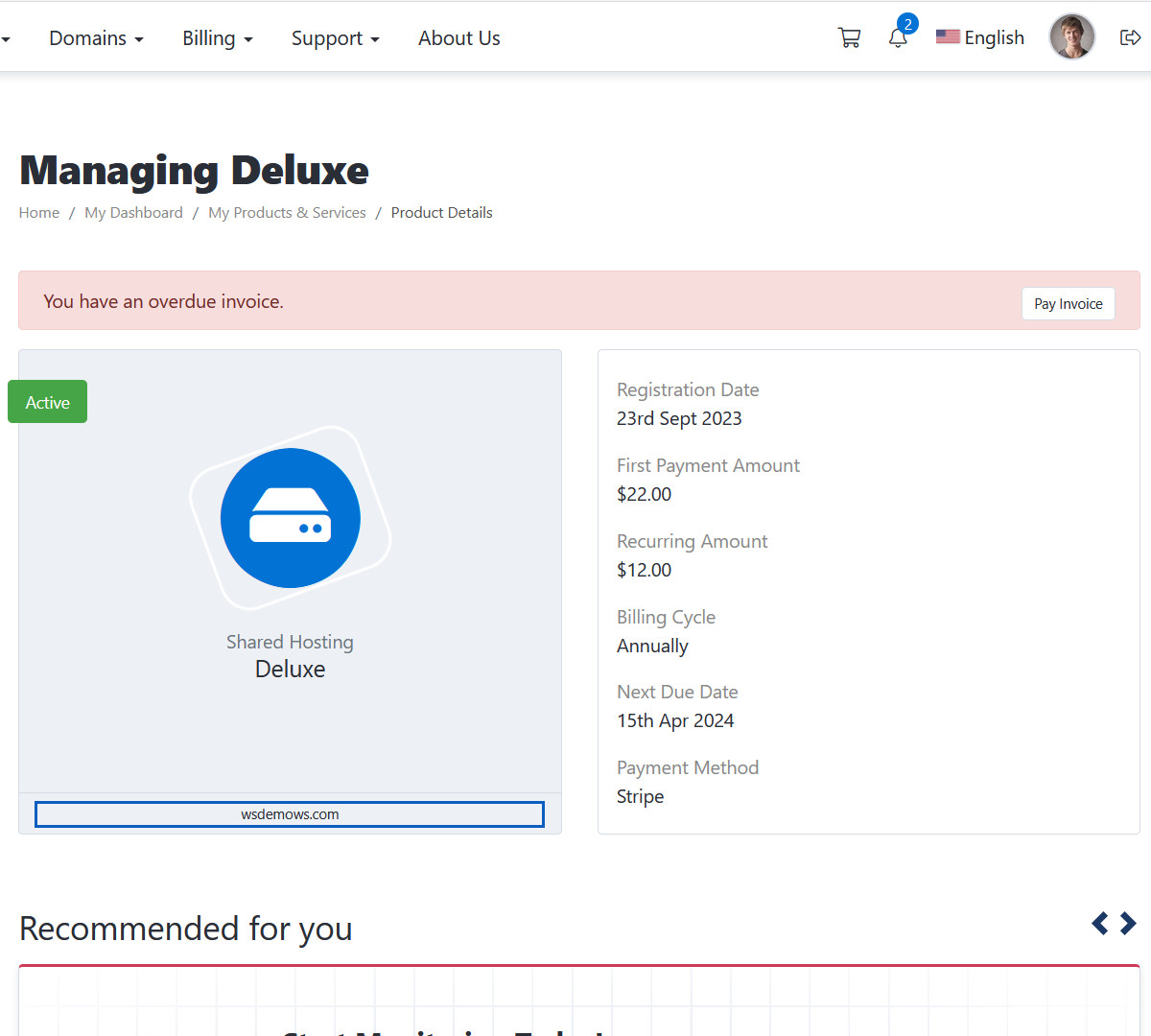
Remove URL
When enabled, url from domain/host name will be removed from the primary box.
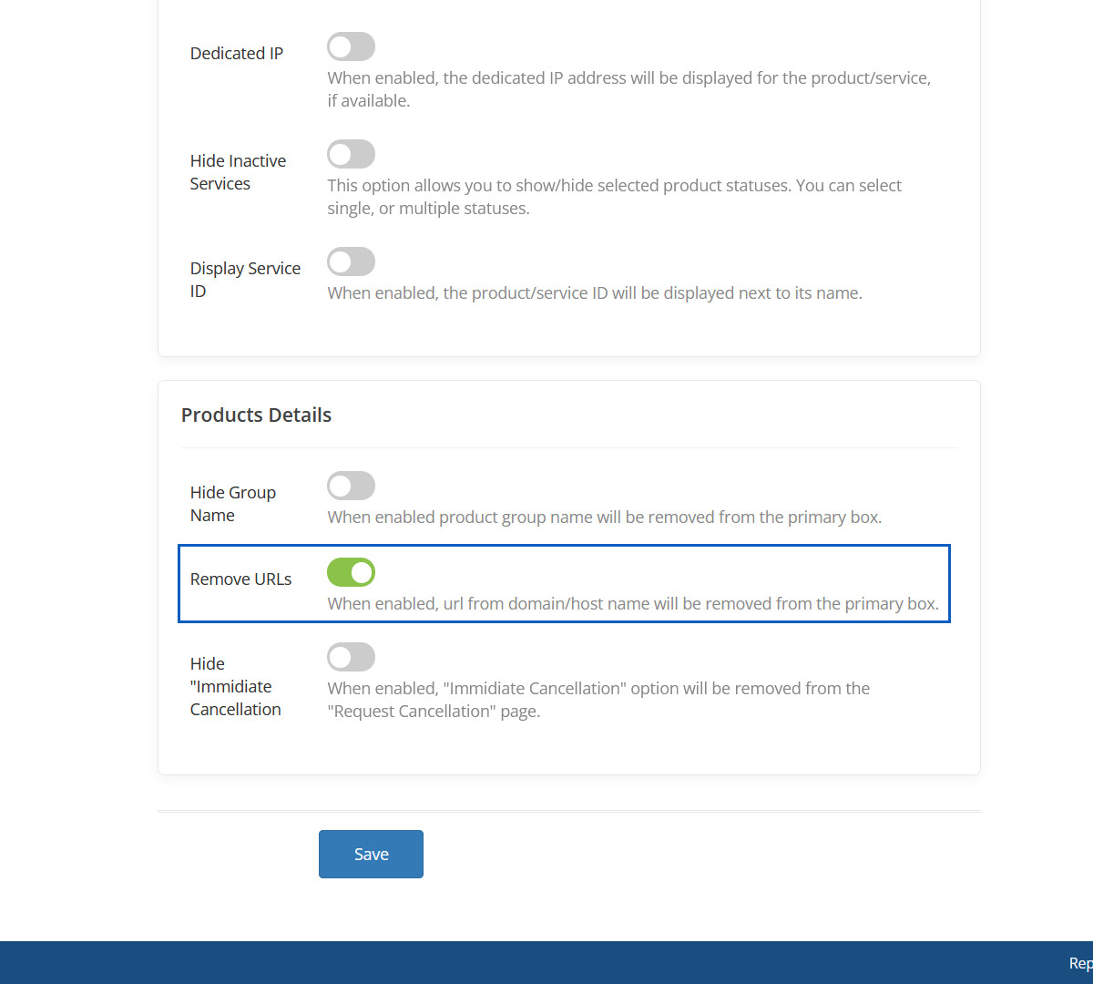
Removed URL
This URL will be removed.
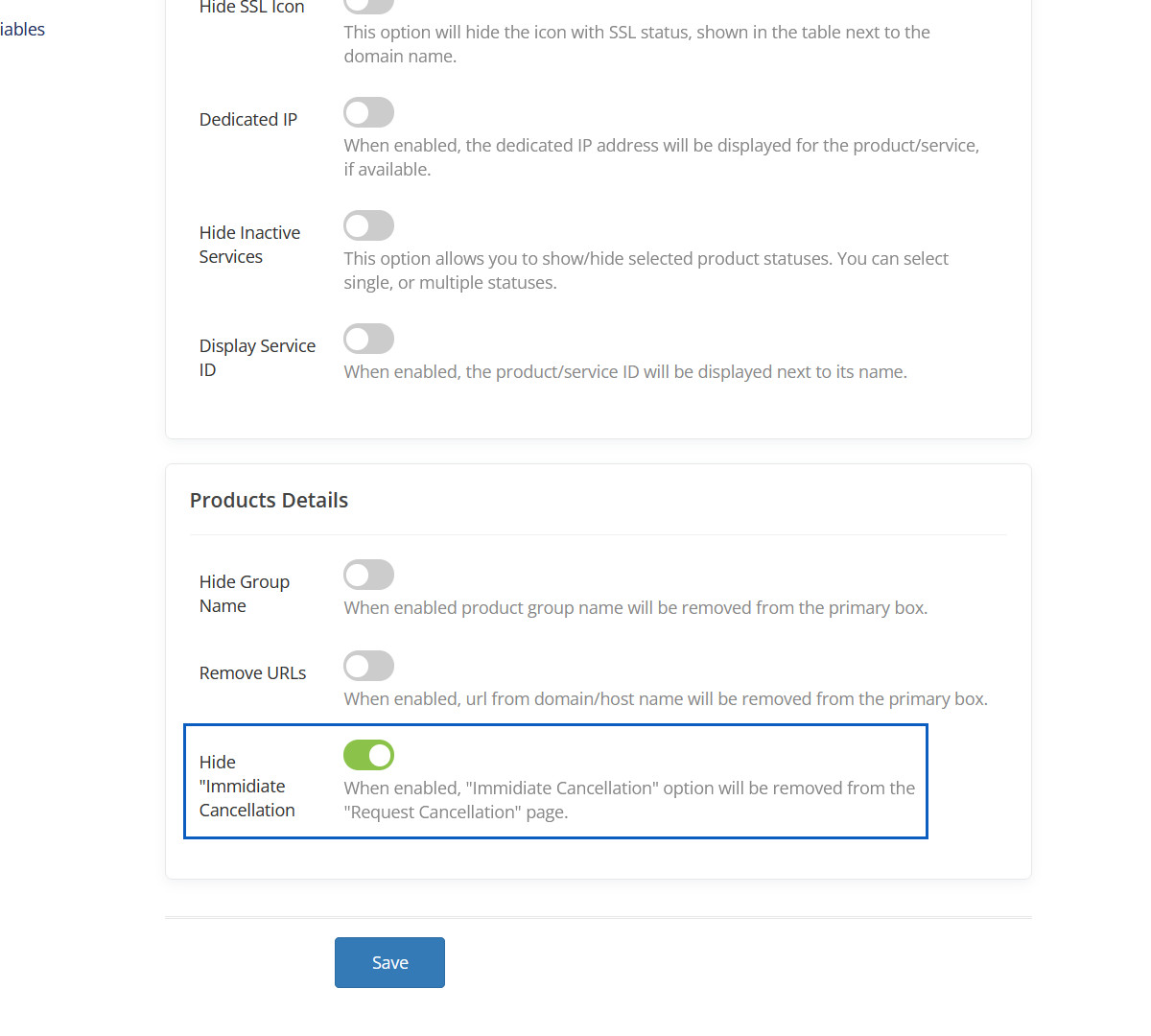
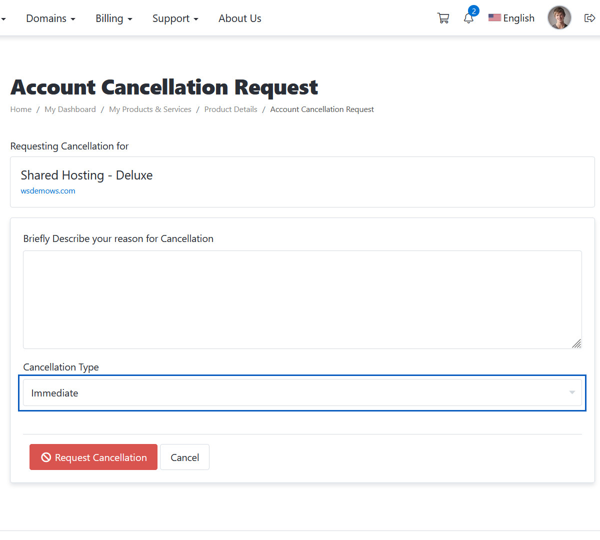
Hide "Immidiate Cancellation
When enabled, "Immidiate Cancellation" option will be removed from the "Request Cancellation" page.
Hidden "Immidiate Cancellation option
This "Immidiate" option will be hidden.
Hide Sidebar
When enabled, all sidebars are disabled on the page.
Hidden Sidebar
This sidebar will be hidden.
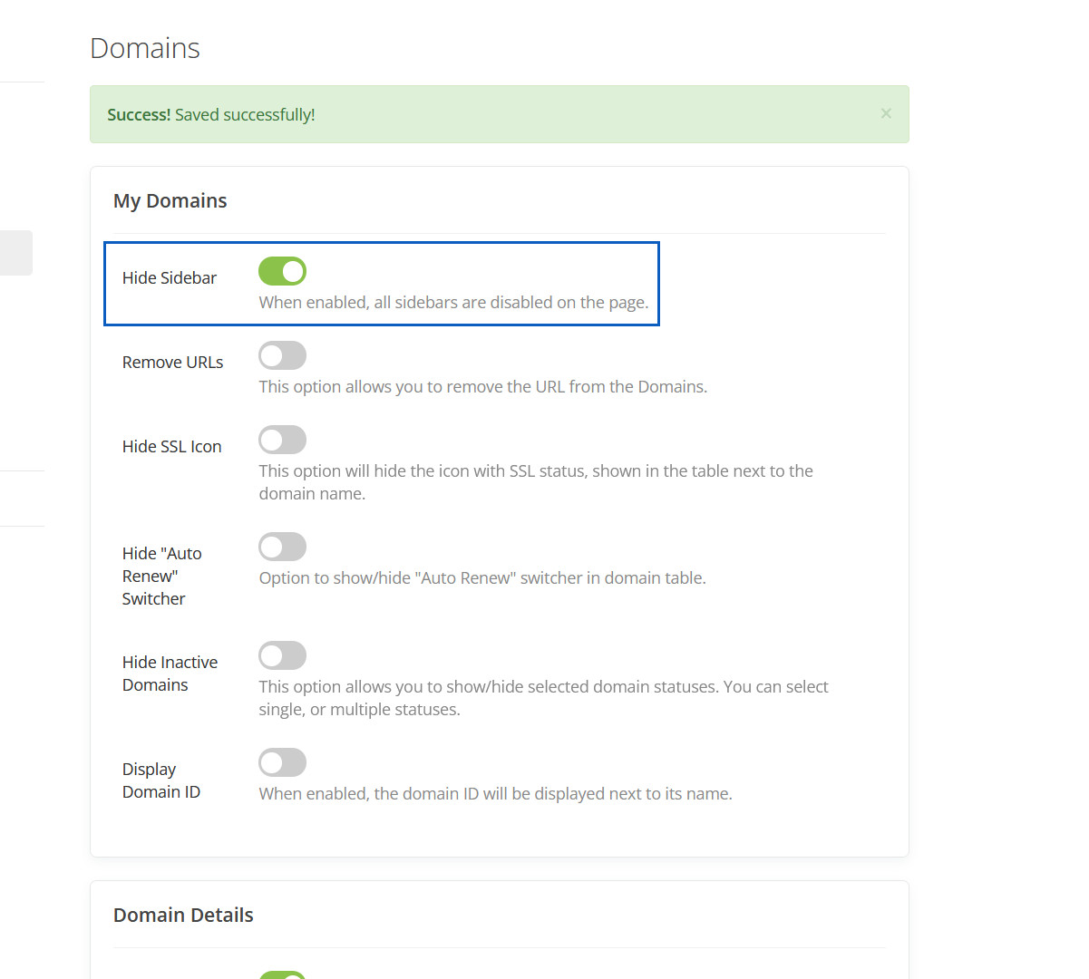
Remove URLs
This option allows you to remove the URL from the Domains.
Removed URLs
This URL will be removed.
Hide SSL Icon
This option will hide the icon with SSL status, shown in the table next to the domain name.
Hidden SSL Icon
This SSL Icon will be hidden.
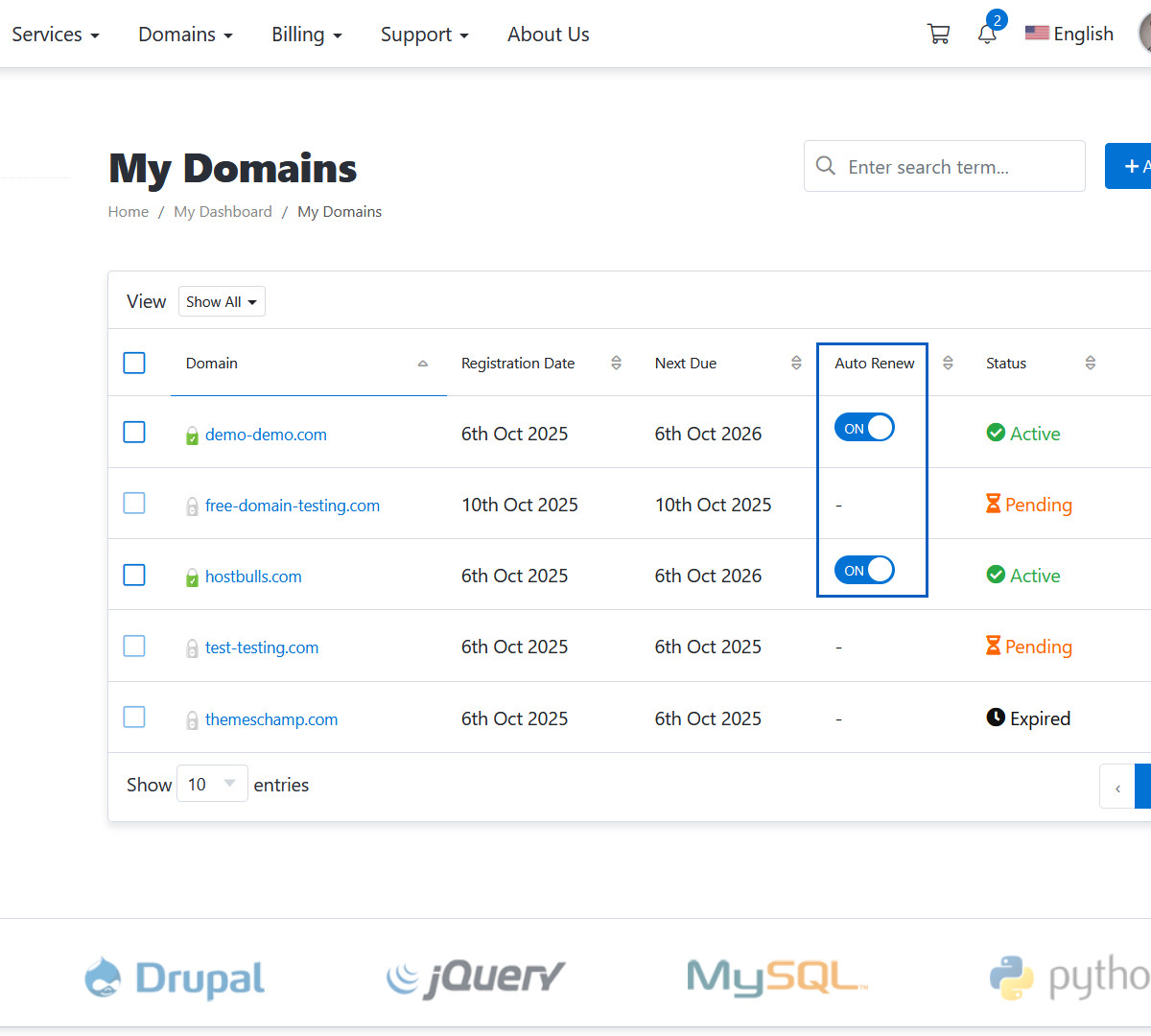
Hide "Auto Renew" Switcher
Option to show/hide "Auto Renew" switcher in domain table.
Hidden "Auto Renew" Switcher
This "Auto Renew" Switcher will be hidden.
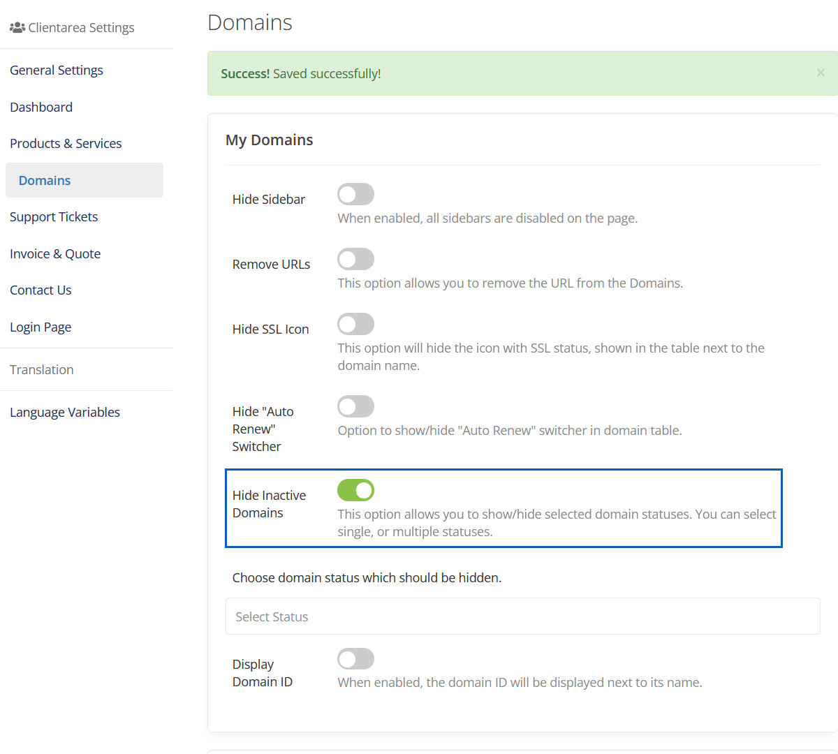
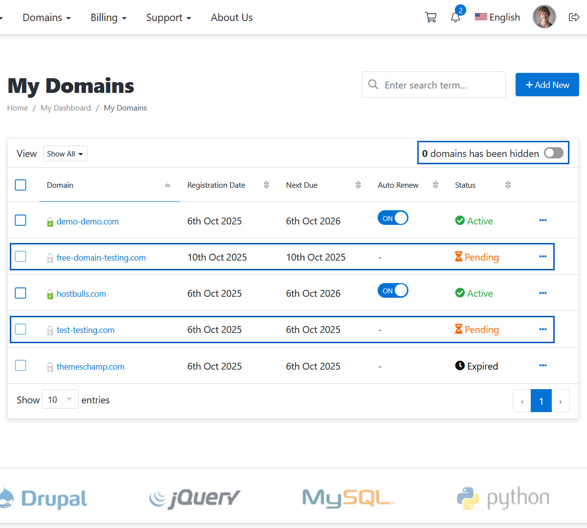
Hide Inactive Domains
This option allows you to show/hide selected domain statuses. You can select single, or multiple statuses.
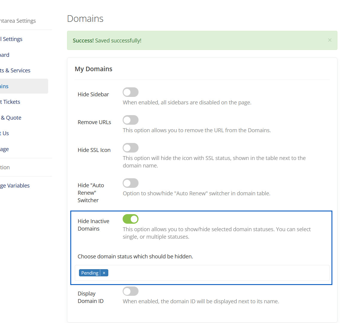
Hidden Inactive Domains
This inactive domains will be hidden.
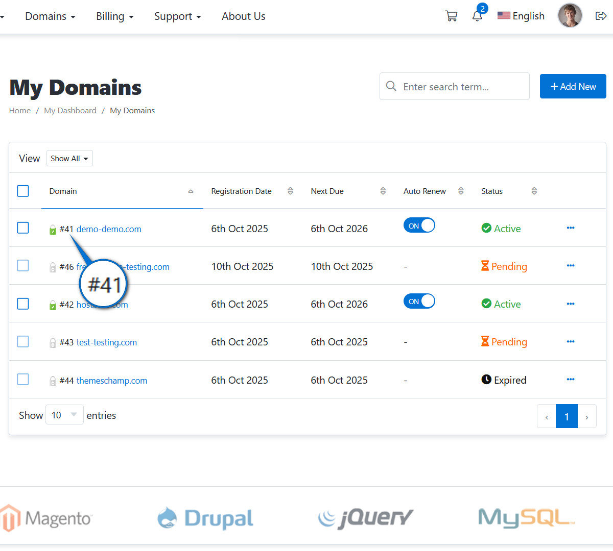
Display Domain ID
When enabled, the domain ID will be displayed next to its name.
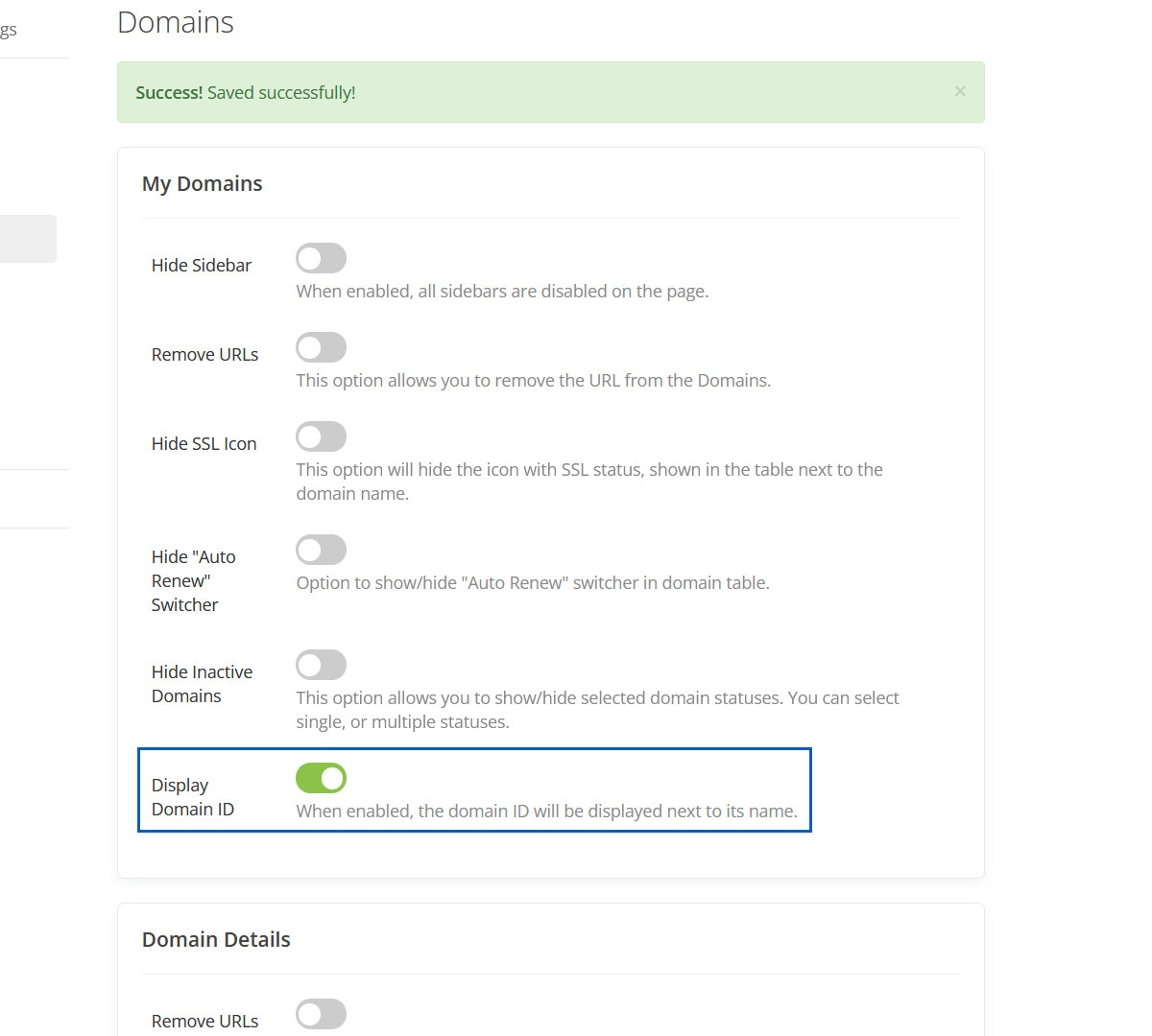
Displayed Domain ID
This domain ID will be displayed.
Remove URLs
When enabled, url from domain name will be removed from the primary box.
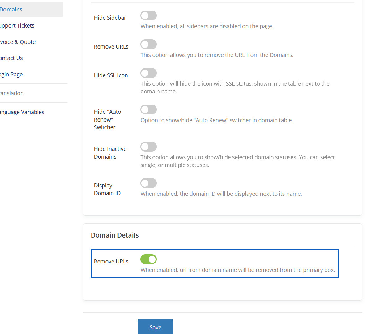
Removed URLs
This URL will be removed.
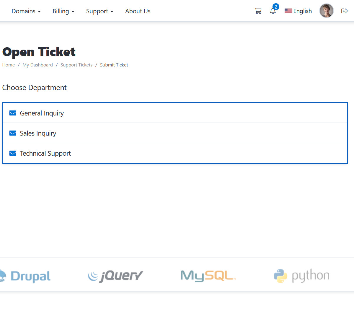
Default Layout
Default Layout Preview
Separate Boxes
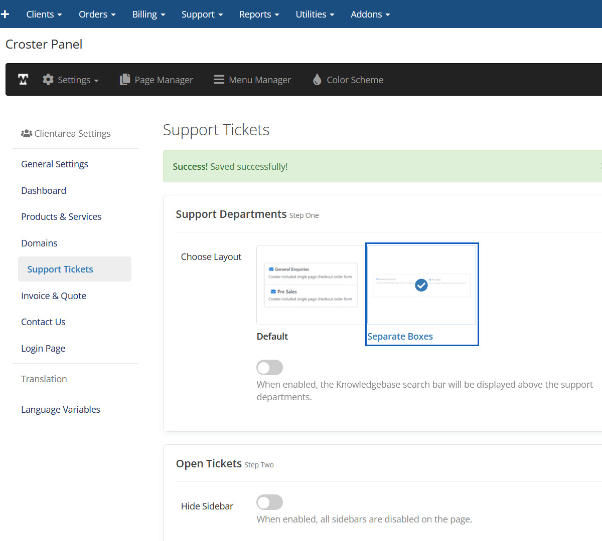
Separate Boxes Preview
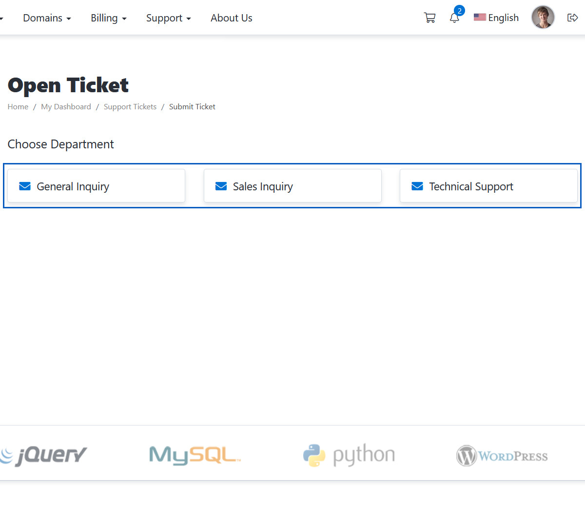
Knowledgebase Search Bar
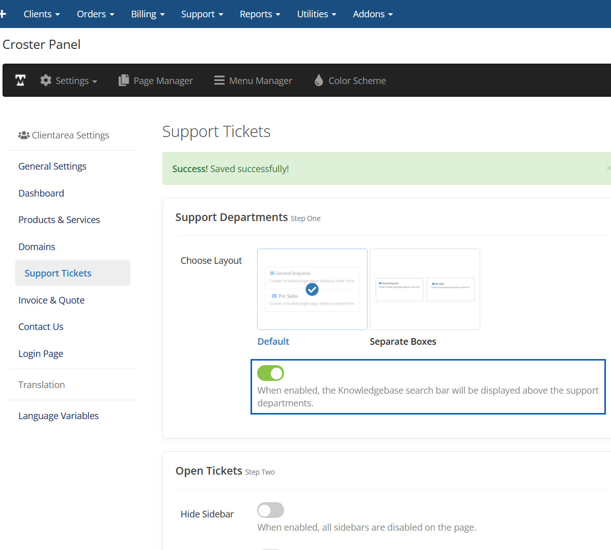
Knowledgebase Search Bar Preview
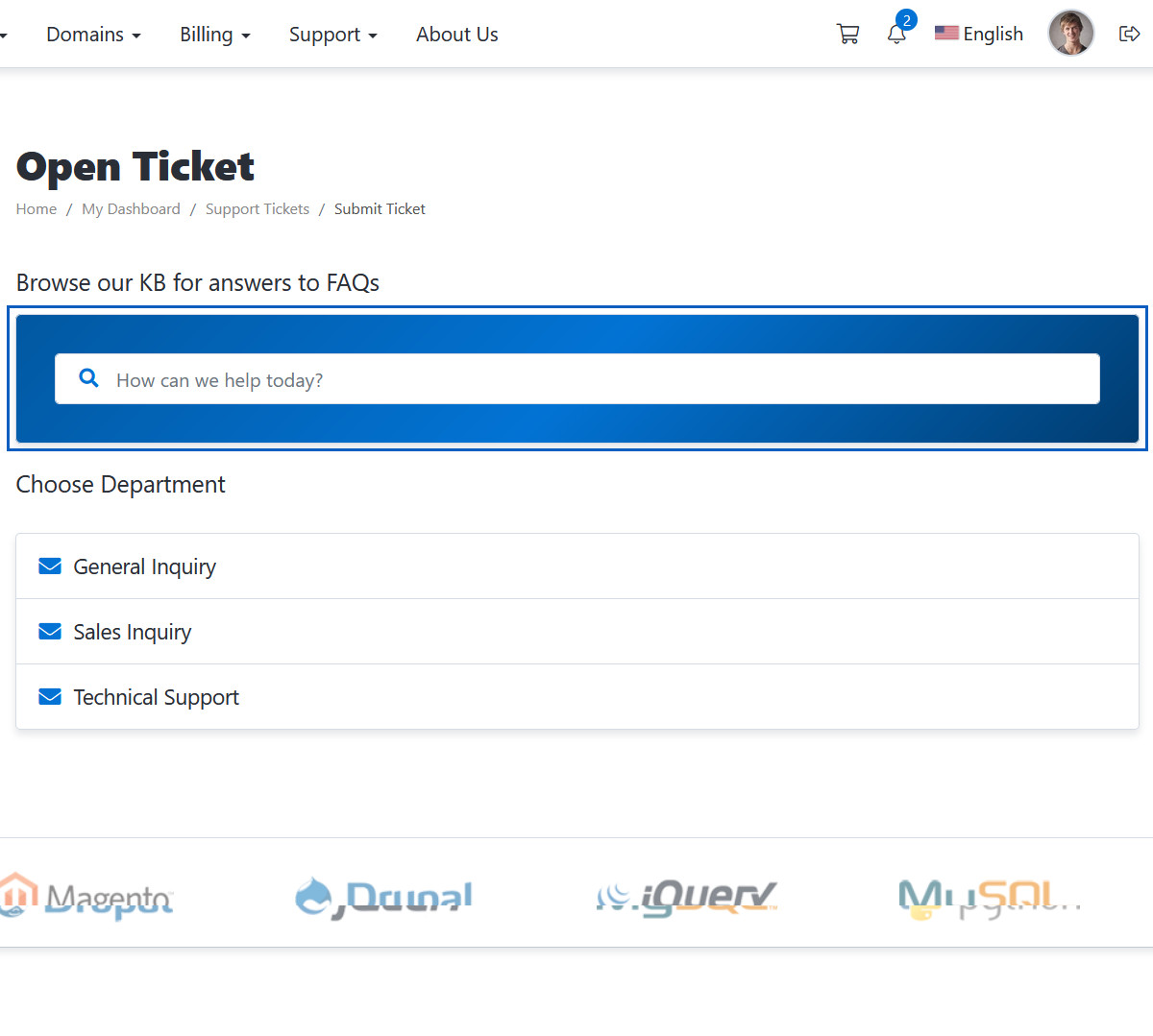
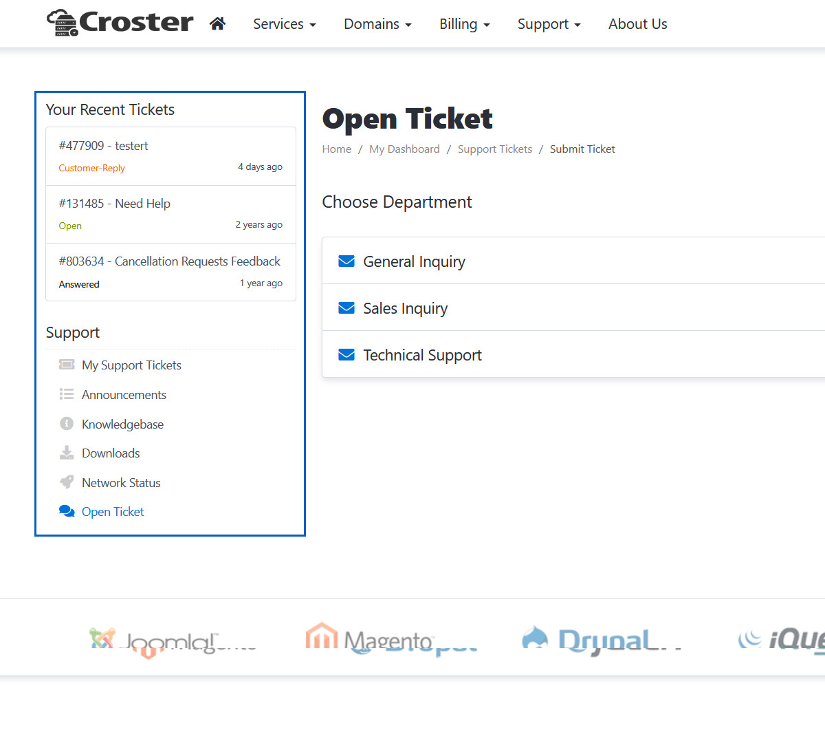
Hide Sidebar
When enabled, all sidebars are disabled on the page.
Hidden Sidebar
This sidebar will be hidden.
Hide Sidebar
When enabled, all sidebars are disabled on the page.
Hidden Sidebar
This sidebar will be hidden.
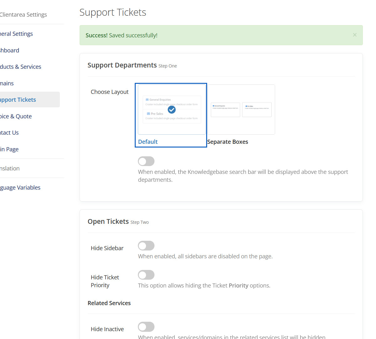
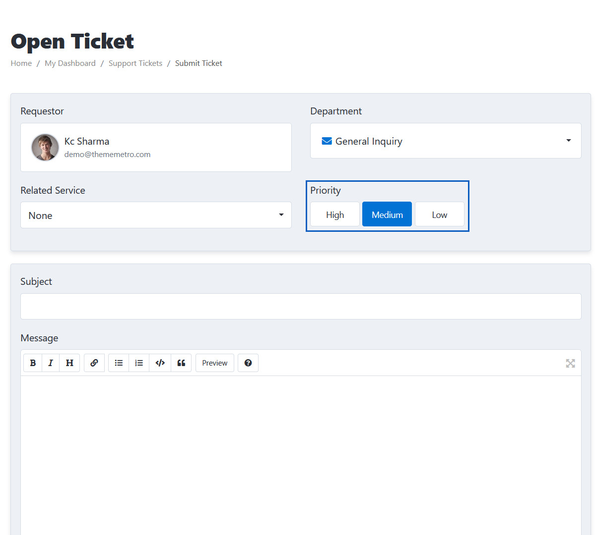
Hide Ticket Priority
This option allows hiding the Ticket Priority options.
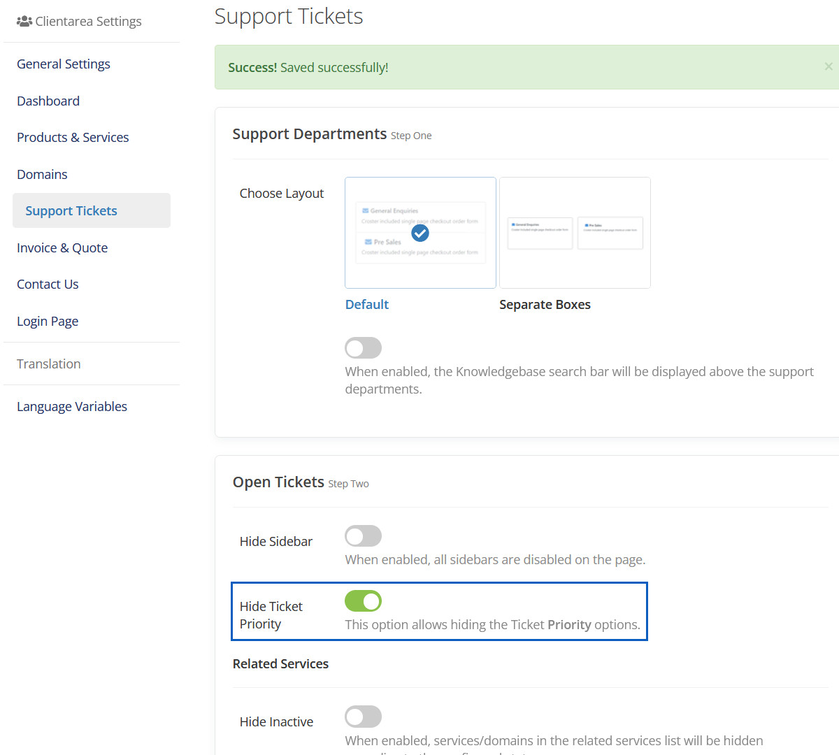
Hidden Ticket Priority
This Ticket Priority will be hidden.
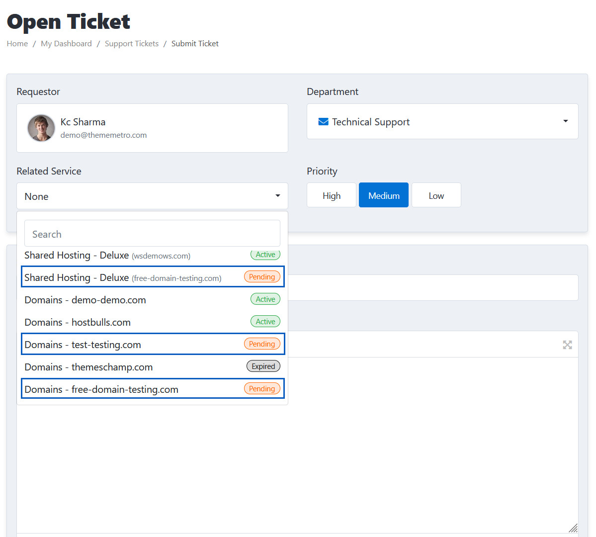
Hide Inactive
This option allows hiding the Ticket Priority options.
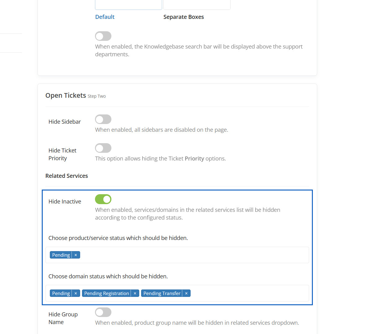
Hidden Inactive
These "Pending" options will be hidden.
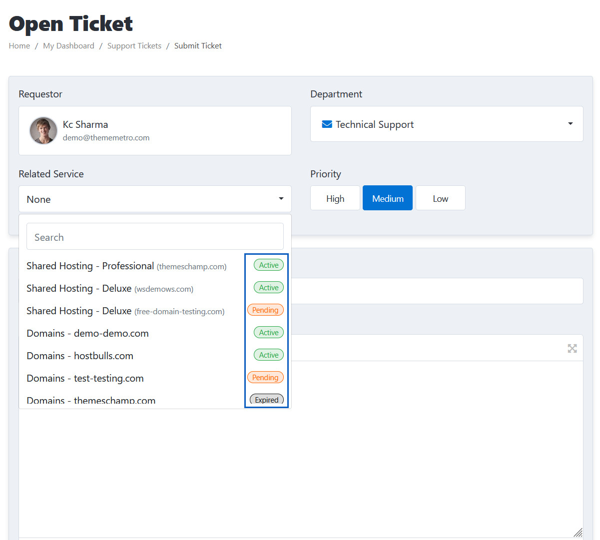
Hide Group Name
When enabled, product group name will be hidden in related services dropdown.
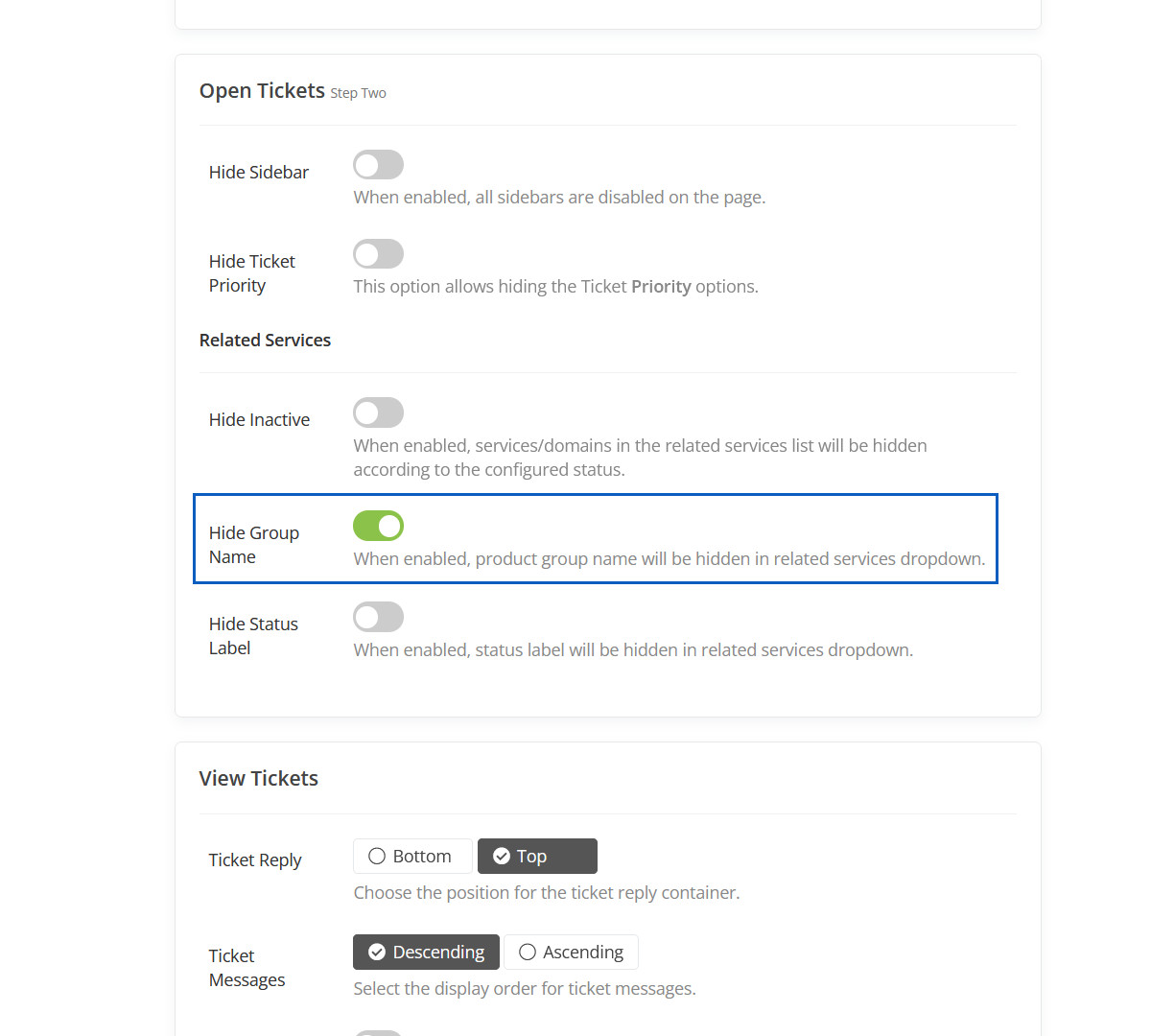
Hidden Group Name
This group name will be hidden.
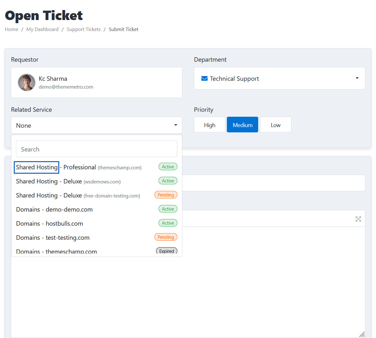
Hide Status Label
When enabled, status label will be hidden in related services dropdown.
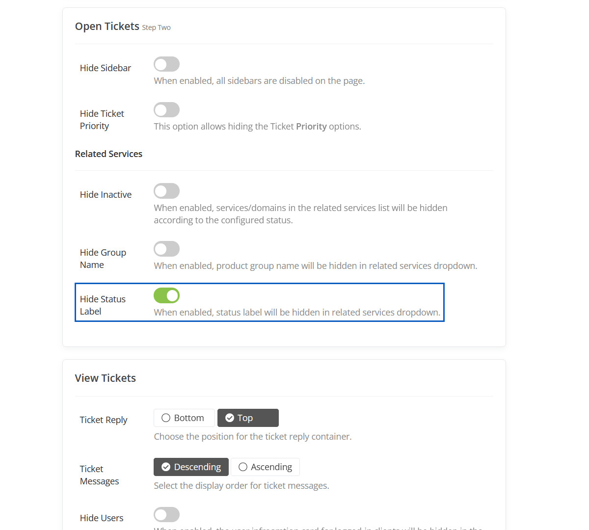
Hidden Status Label
These status labels will be hidden.
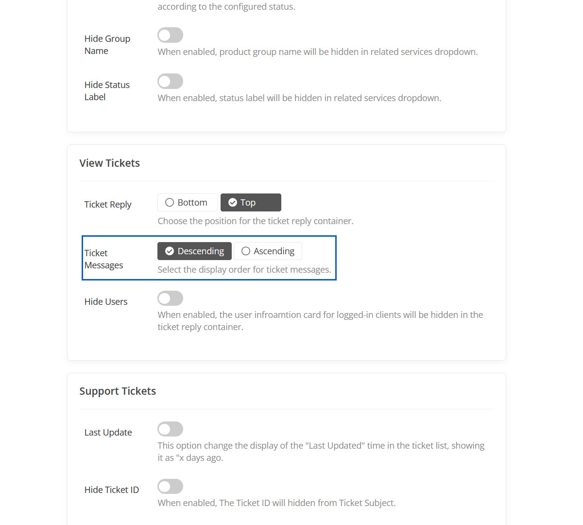
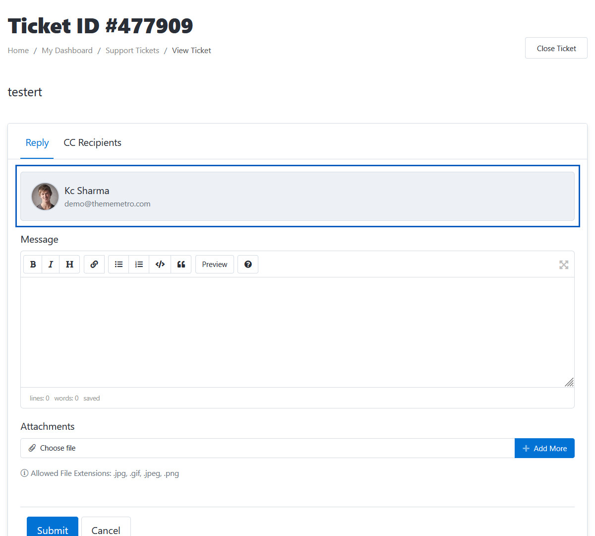
Ticket Reply
Choose the position for the ticket reply container.
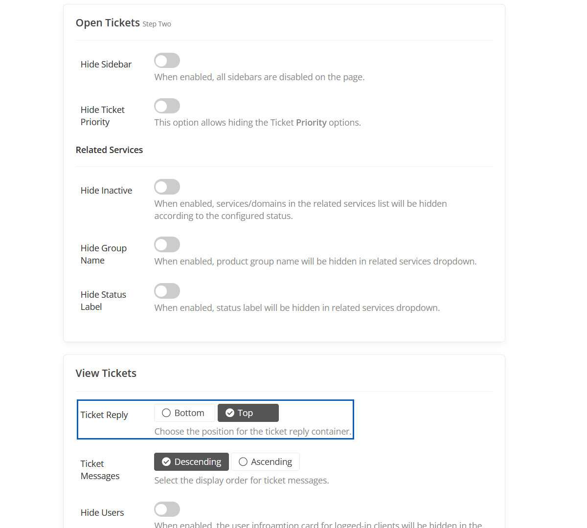
Ticket Reply Preview
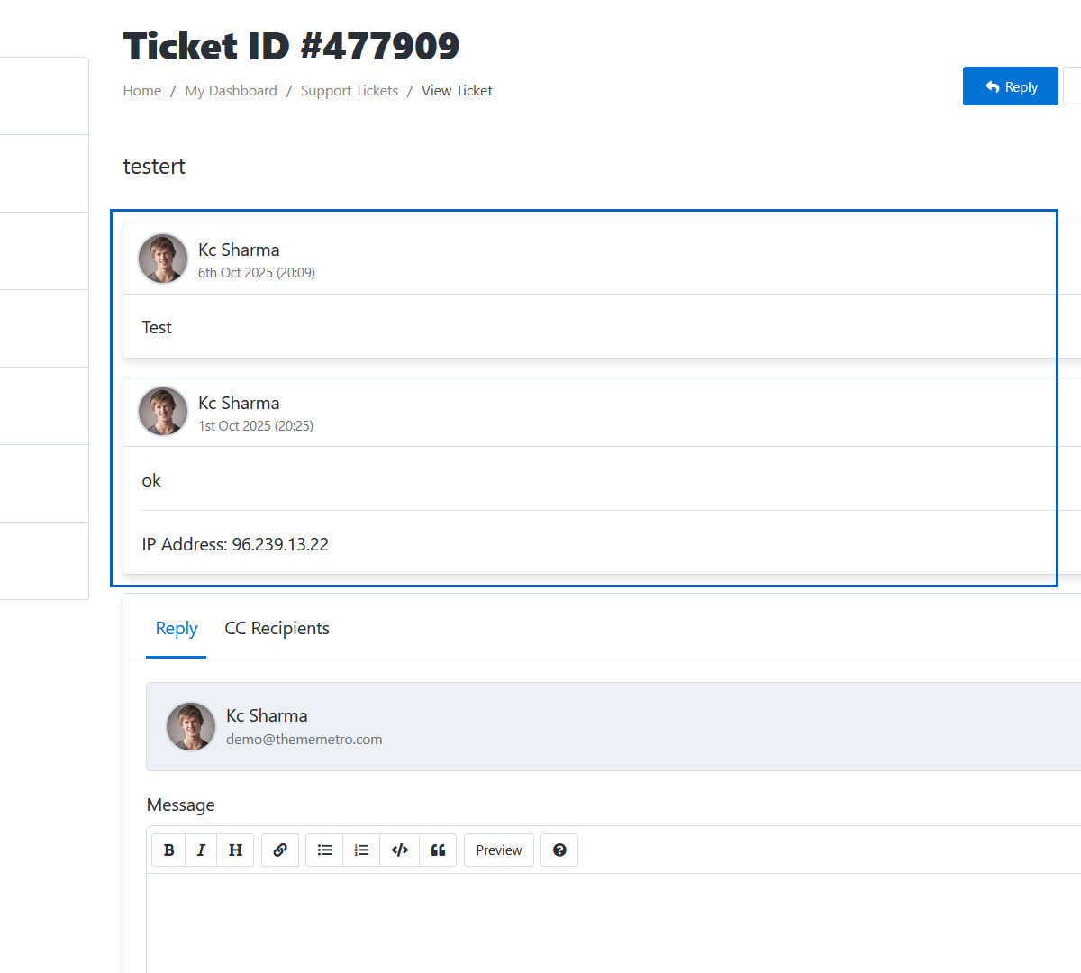
Ticket Messages
Select the display order for ticket messages.
Ticket Messages Preview
Here ticket order will be display in "Descending" order.
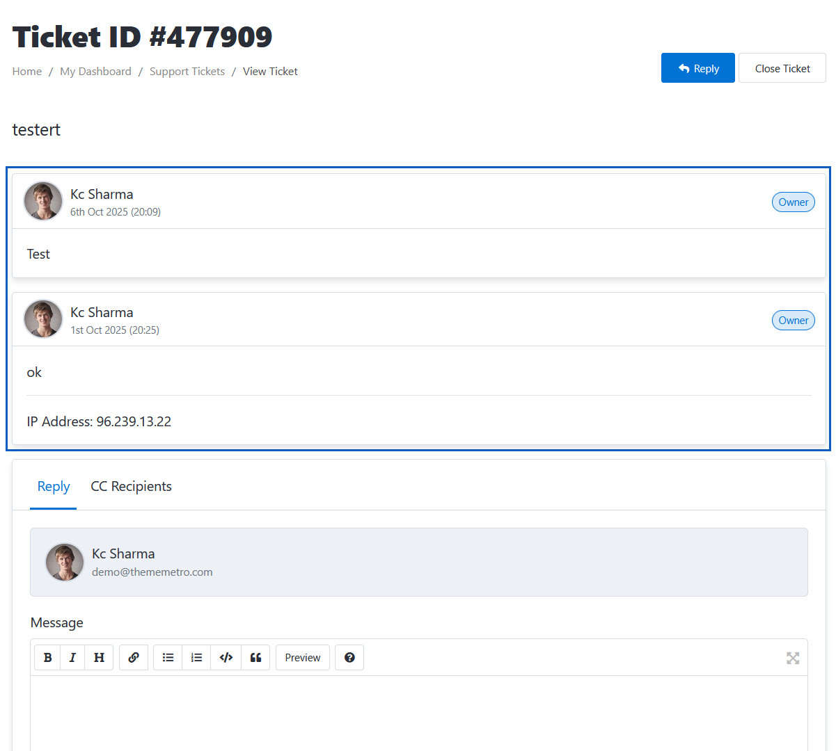
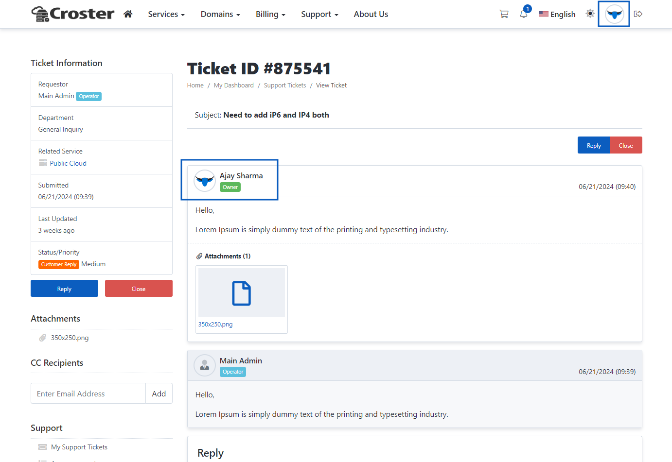
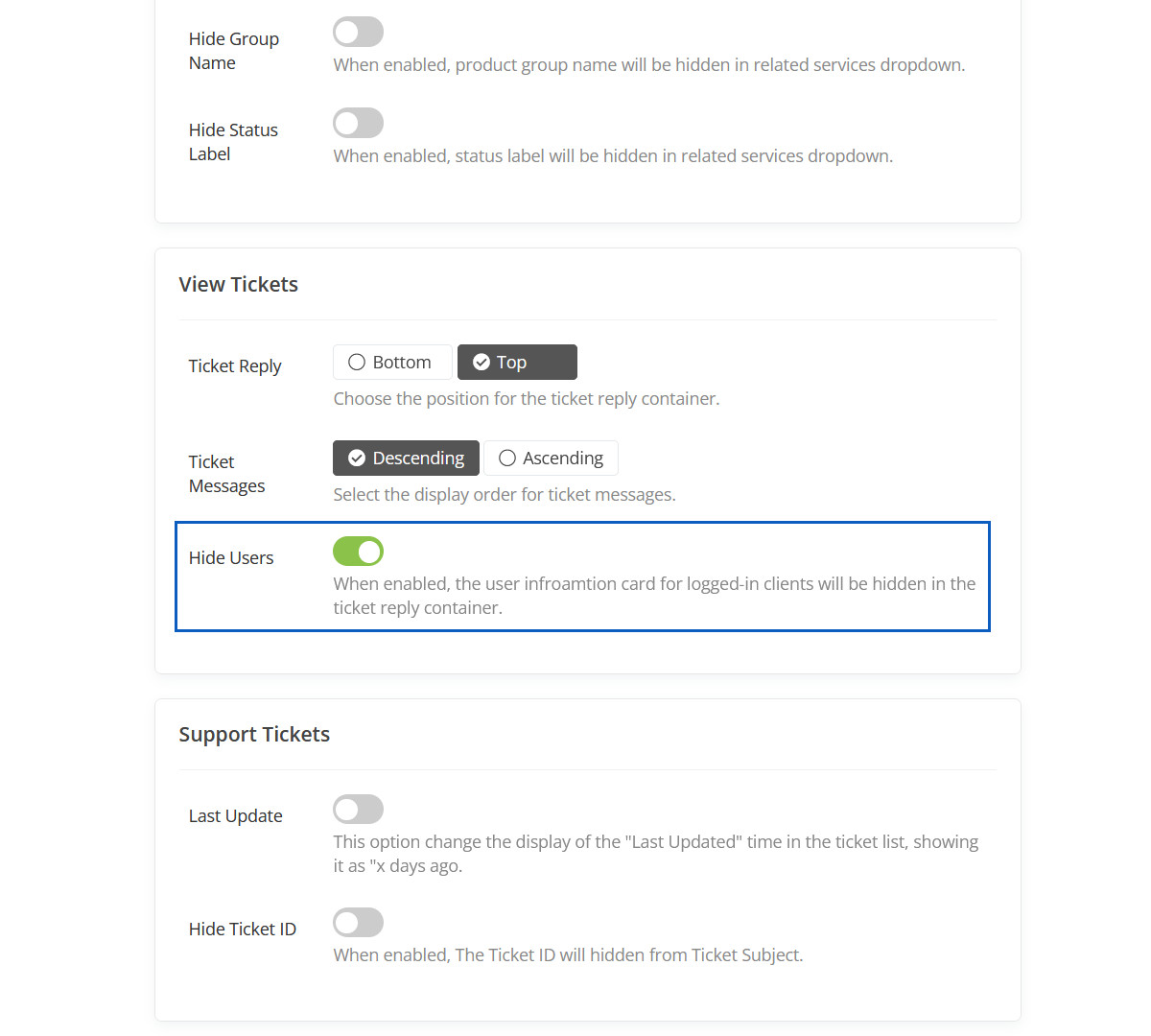
Hide Users
When enabled, the user infroamtion card for logged-in clients will be hidden in the ticket reply container.
Hidden Users Preview
This user will be hidden.
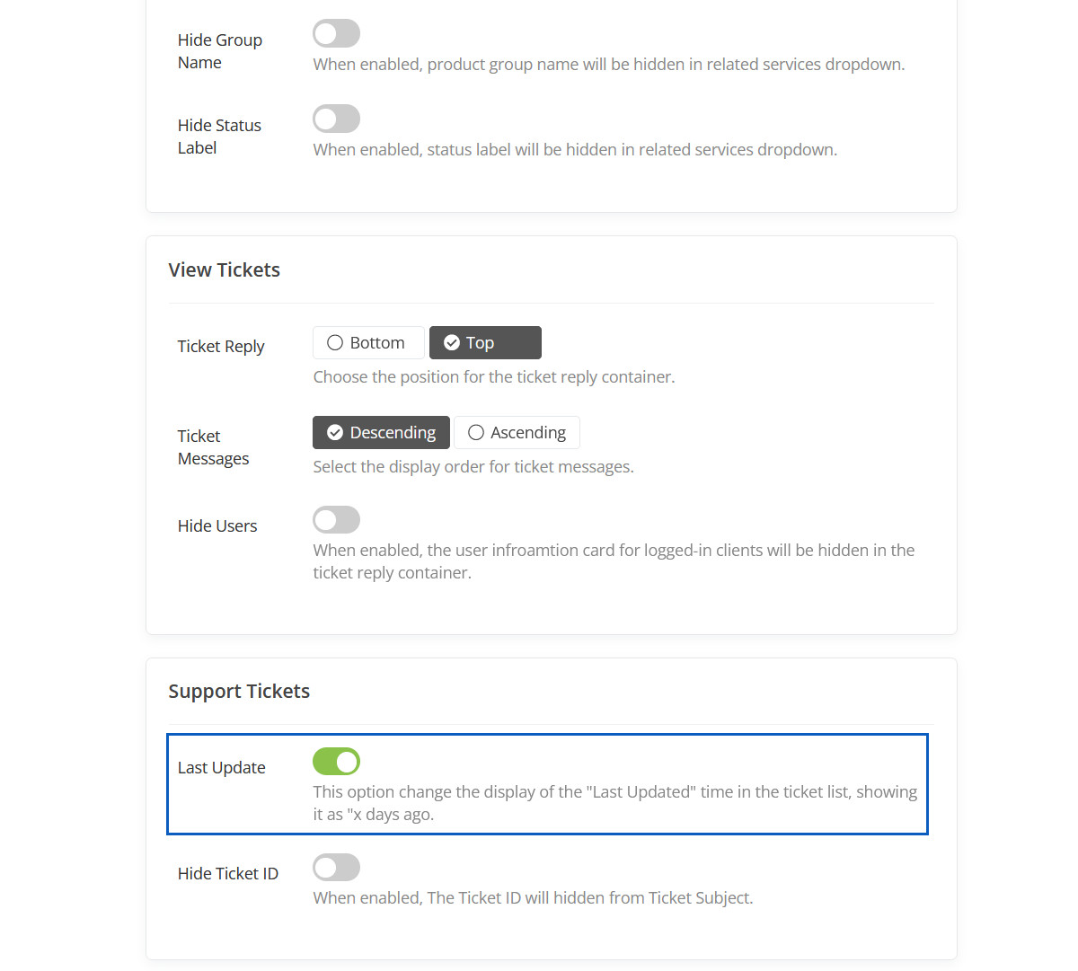
Last Update
This option change the display of the "Last Updated" time in the ticket list, showing it as "x days ago.
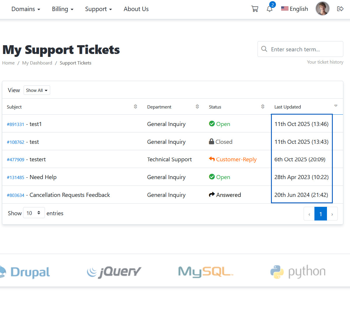
Last Update Preview
The "Last Updated" time will be displayed like this.
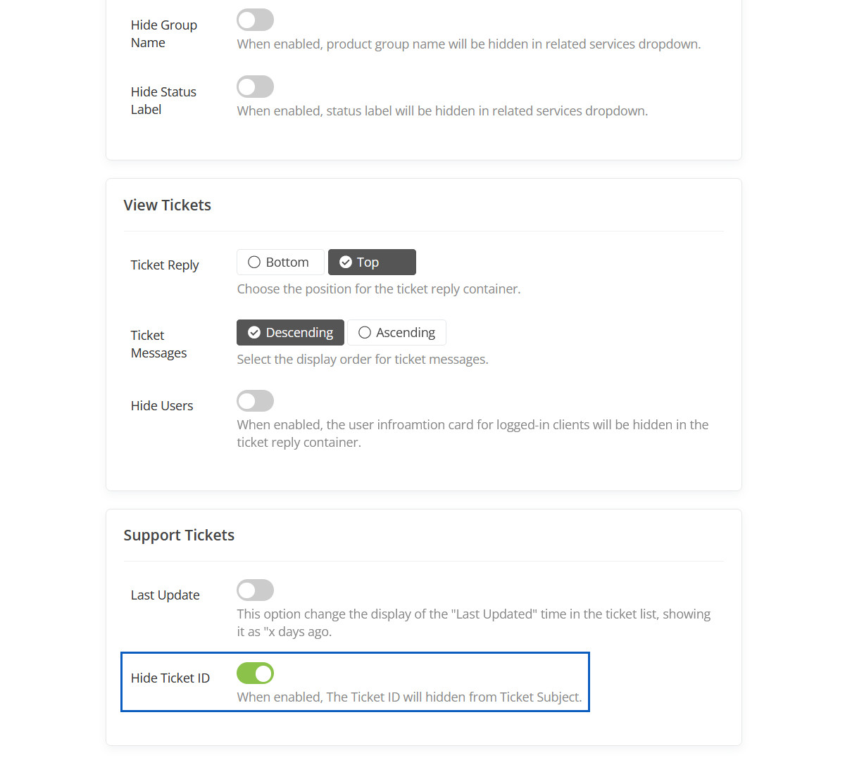
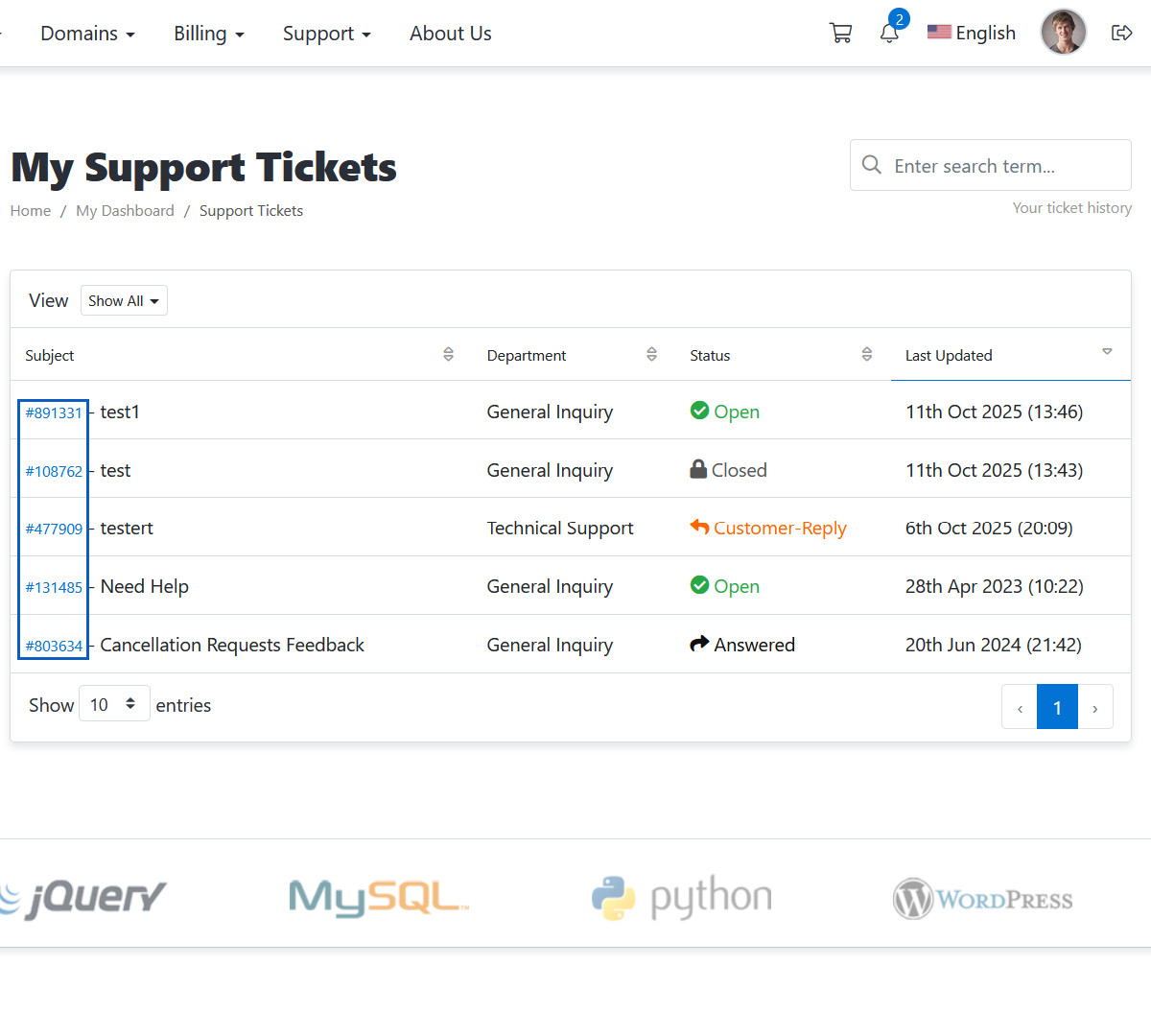
Hide Ticket ID
When enabled, The Ticket ID will hidden from Ticket Subject.
HIdden Ticket ID
This Ticket ID will be hidden.
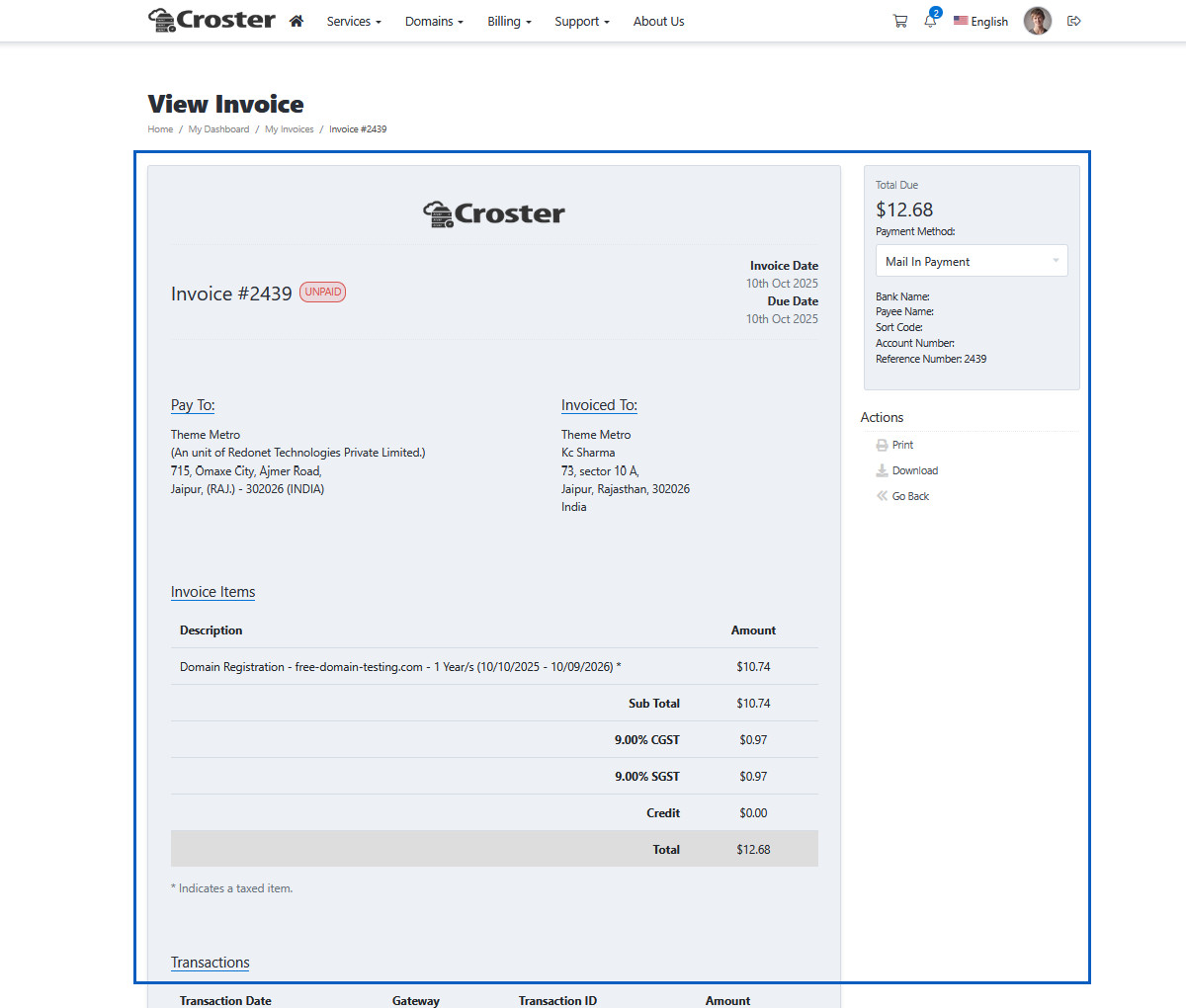
Layout type 1
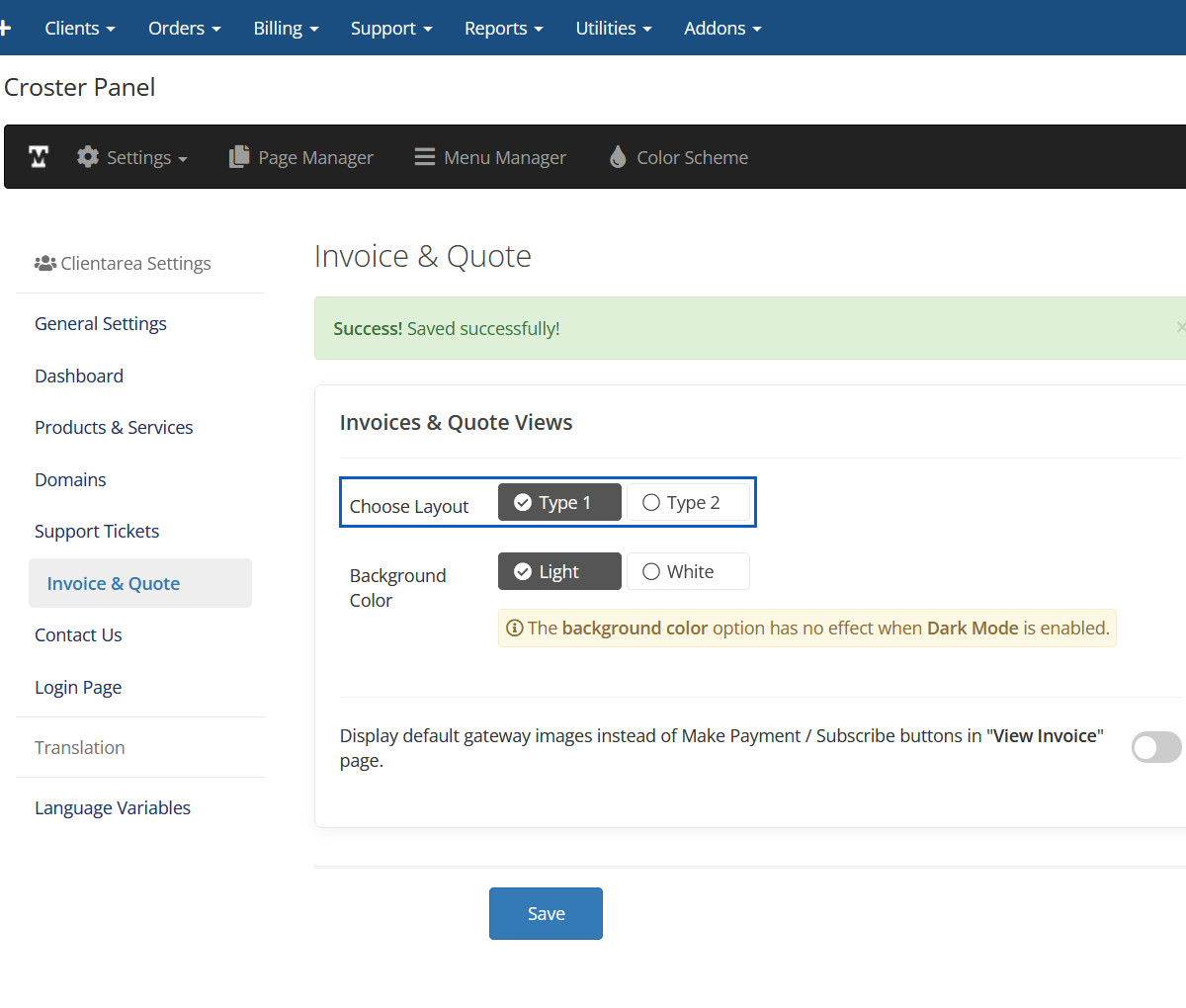
Layout type 1 Preview
Layout type 2
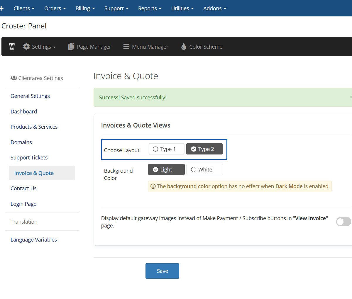
Layout type 2 Preview
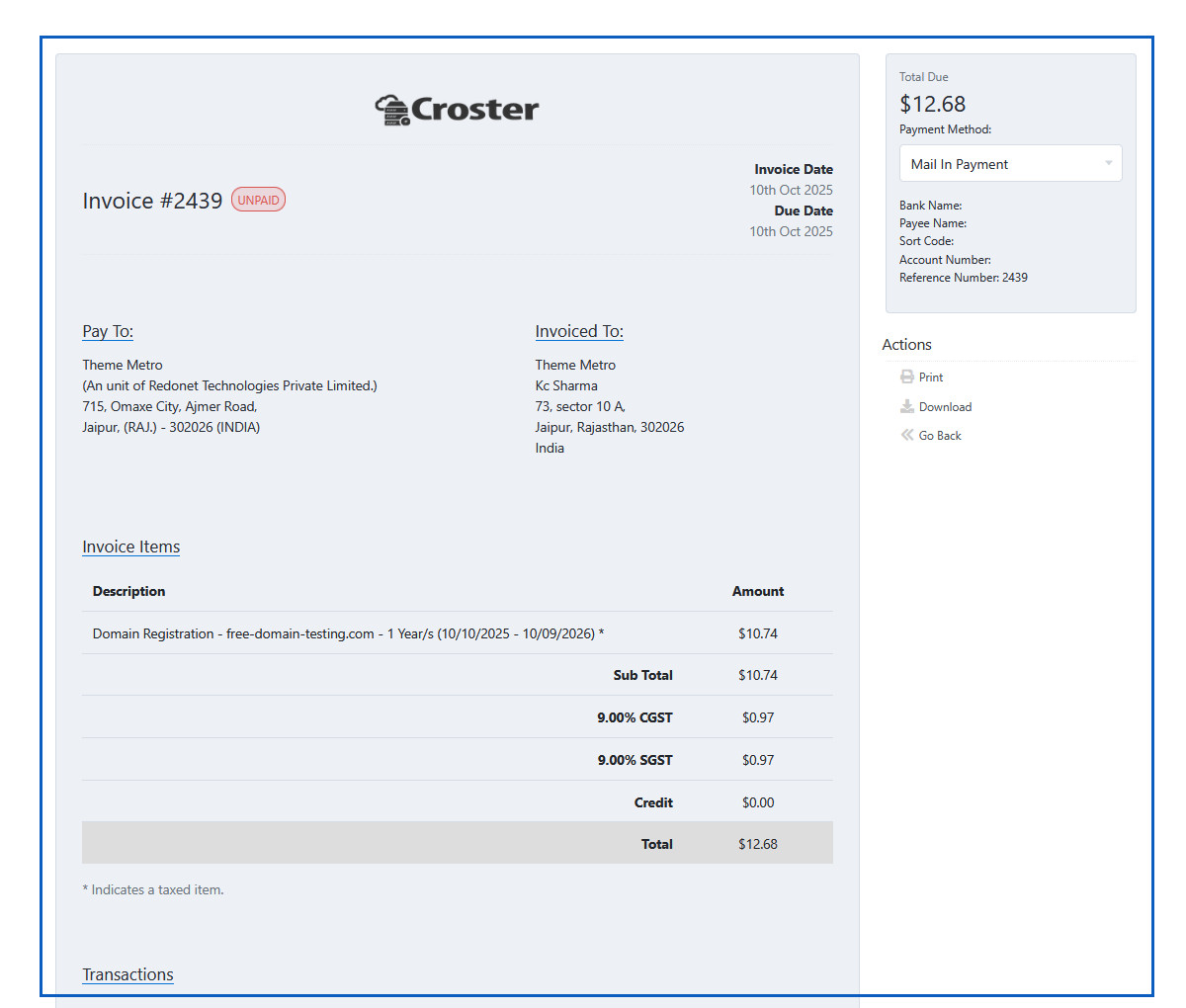
Background Color Light
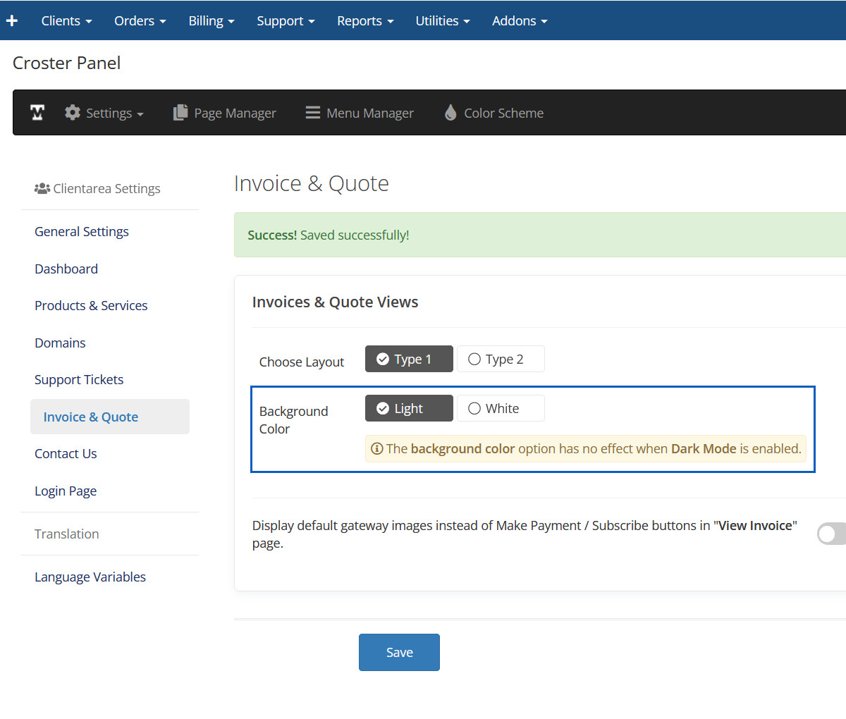
Background Color Light Preview
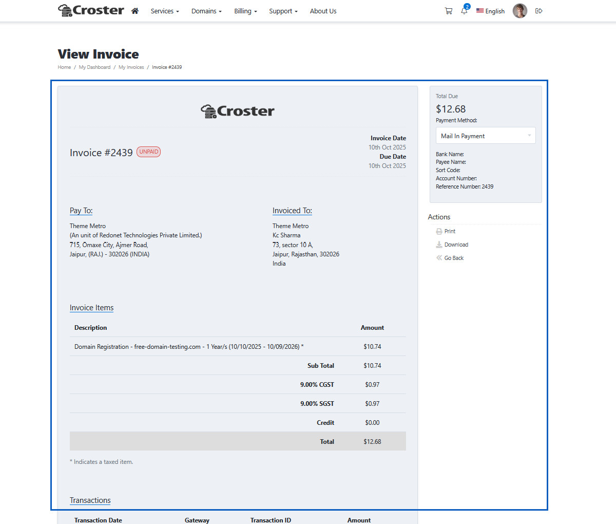
Background Color White
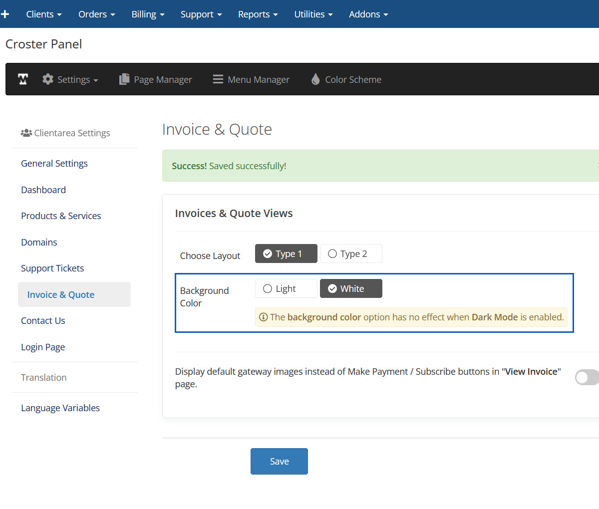
Background Color White Preview
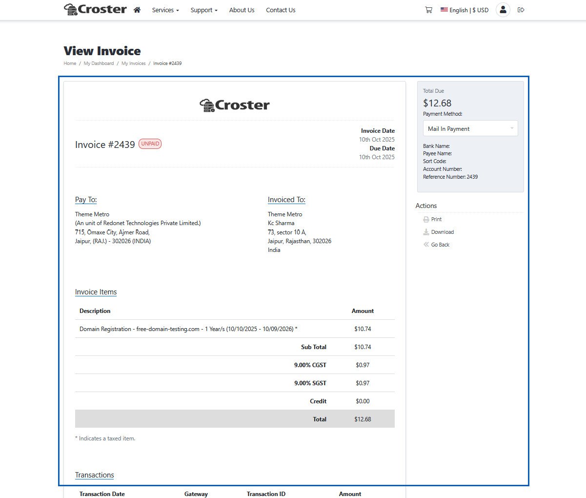
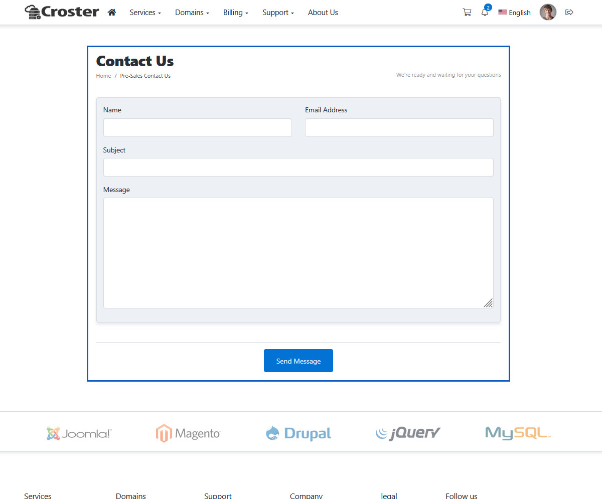
Page Type Default
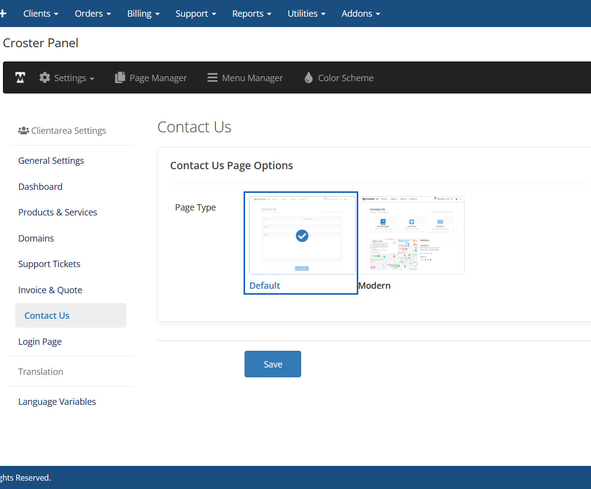
Page Type Default Preview
Page Type Modern
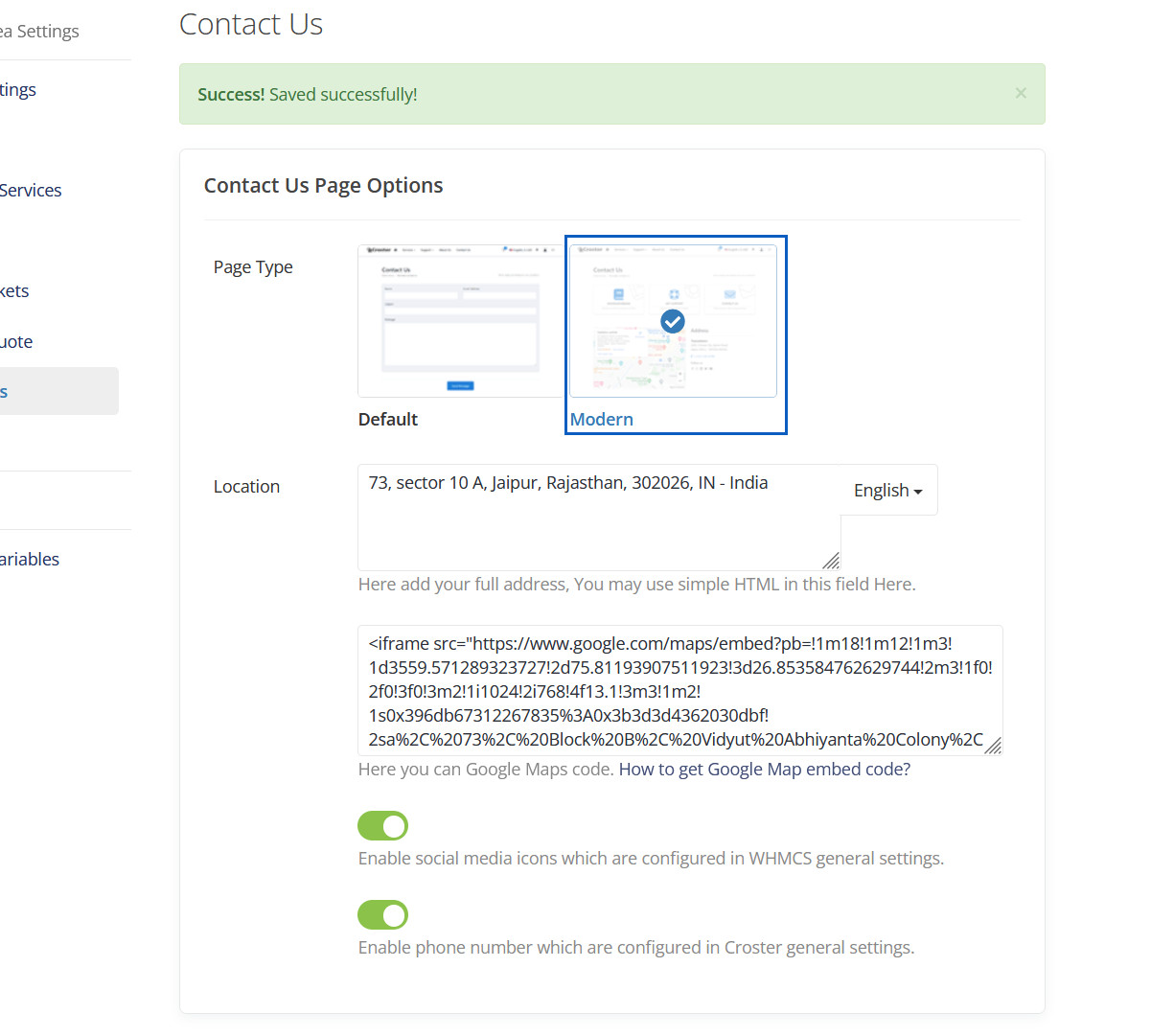
Page Type Modern Preview
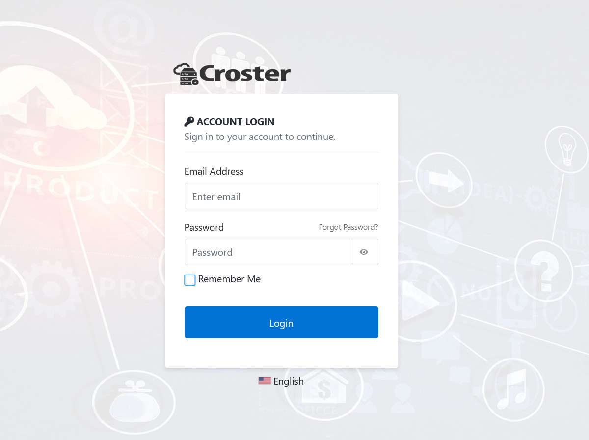
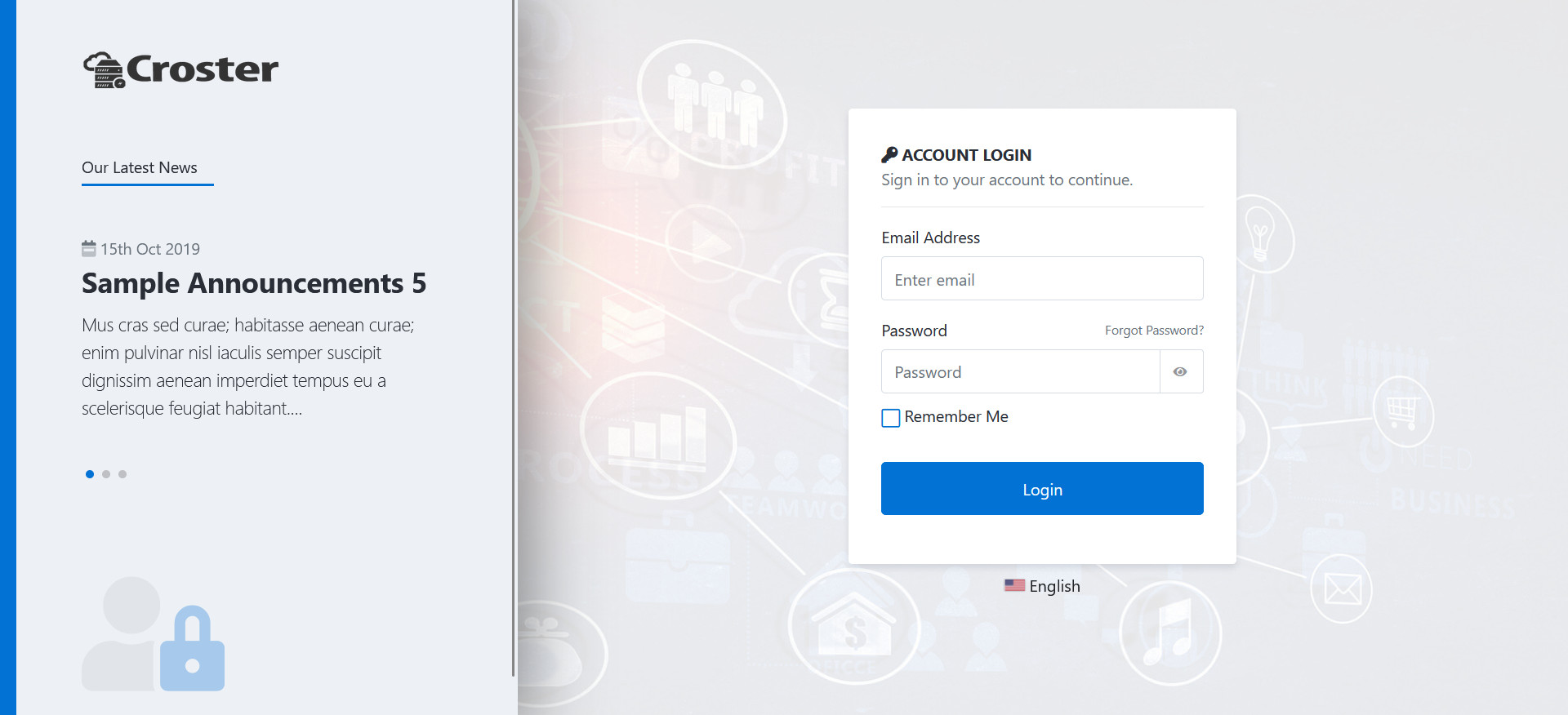
Login Page Type Default
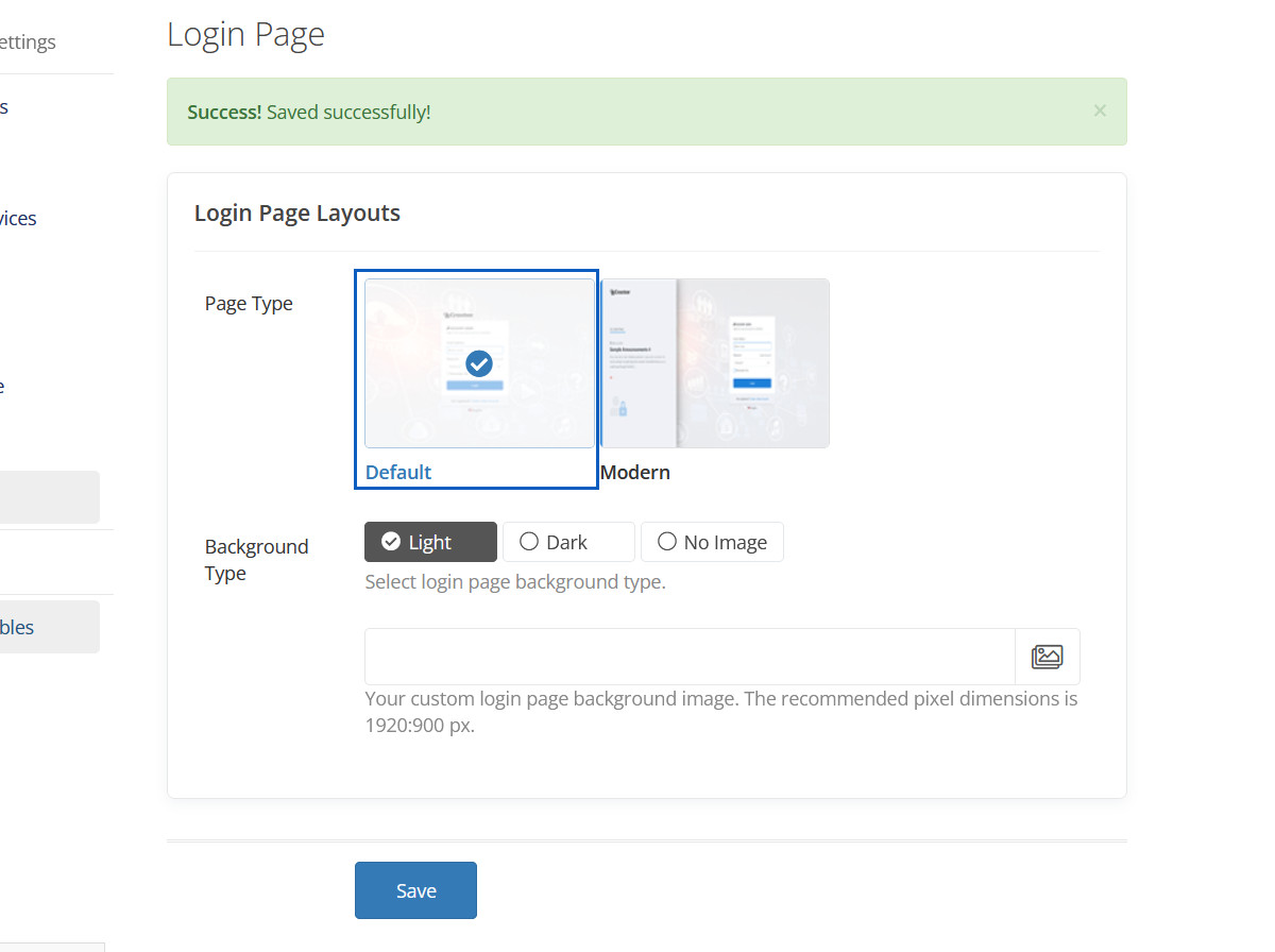
Login Page Type Default Preview
Login Page Type Modern
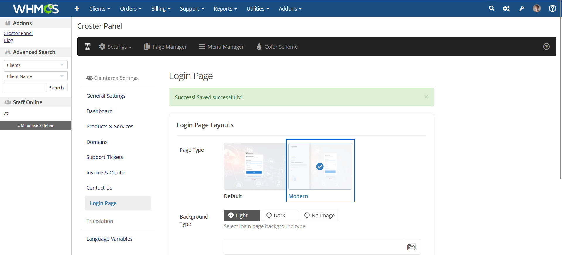
Login Page Type Modern Preview
Background Type Light
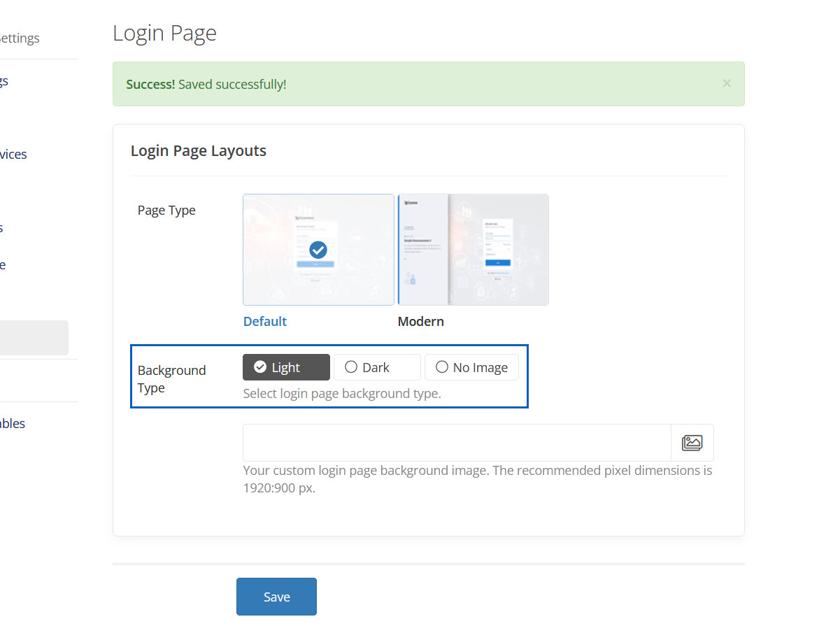
Background Type Light Preview
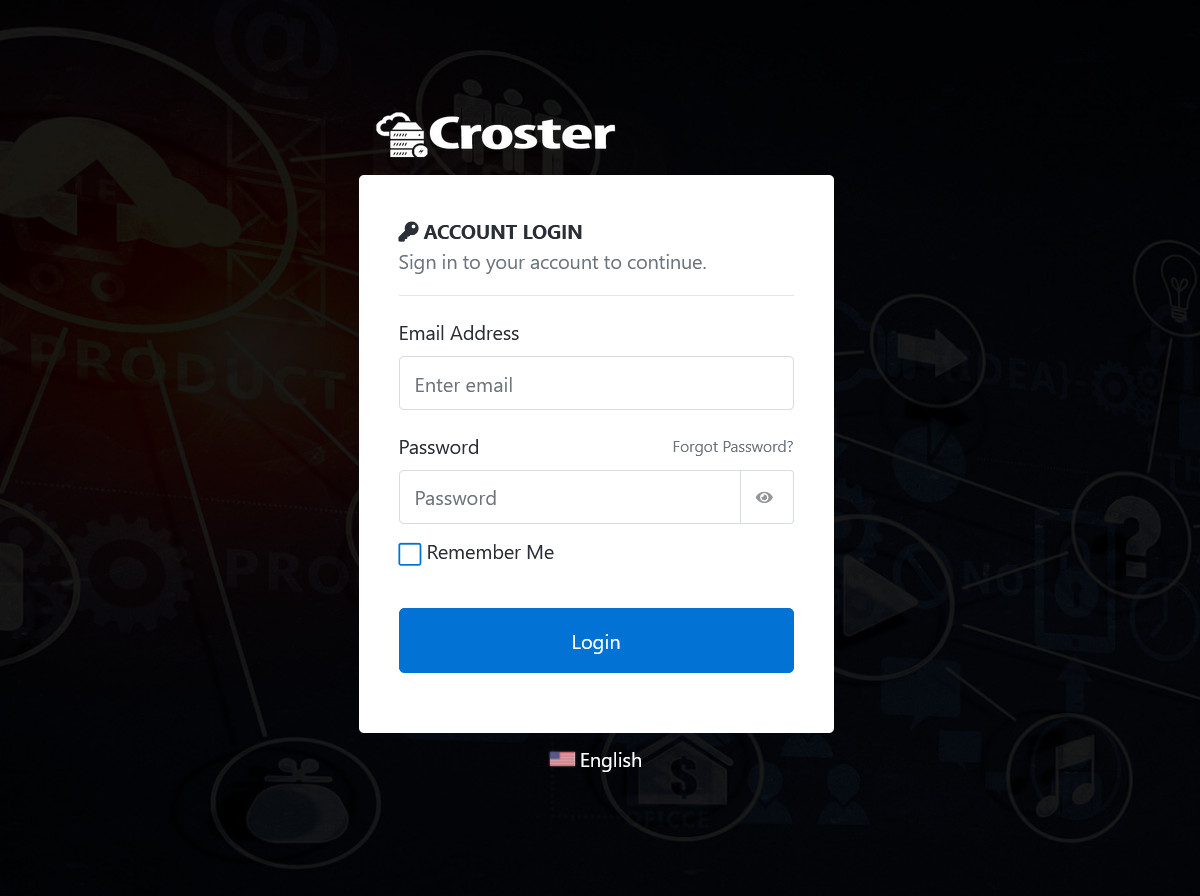
Background Type Dark
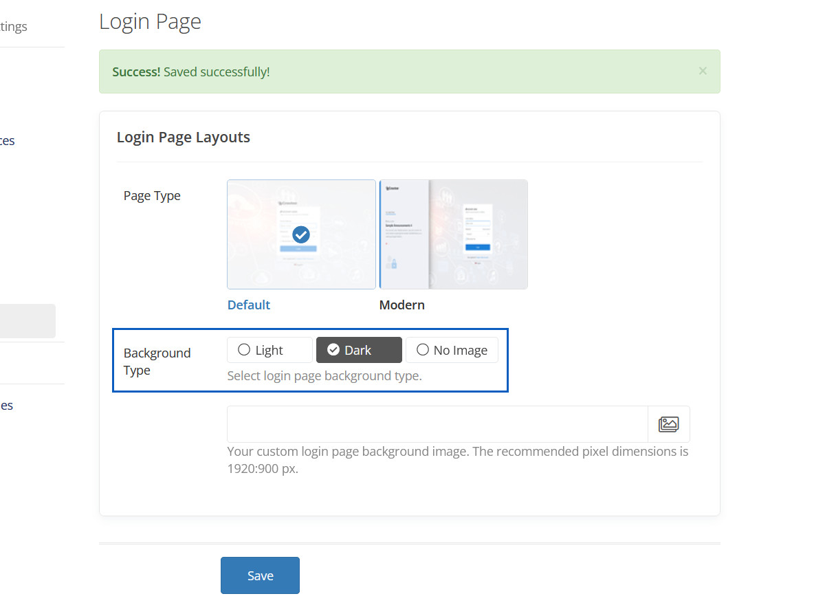
Background Type Dark Preview
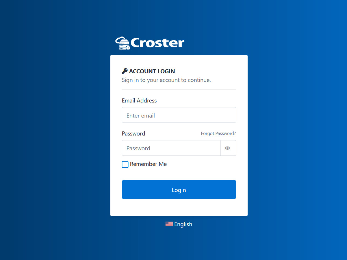
Background Type No Image
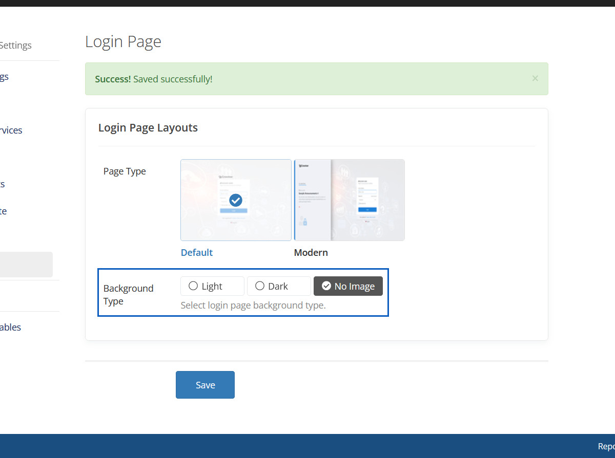
Background Type No Image Preview
Dashboard
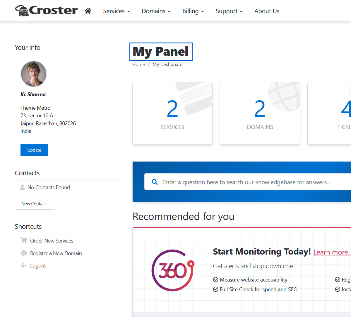
Here you can change dashboard page title.
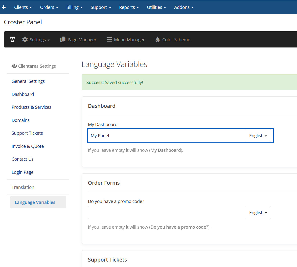
Dashboard Preview
This text will be changed.
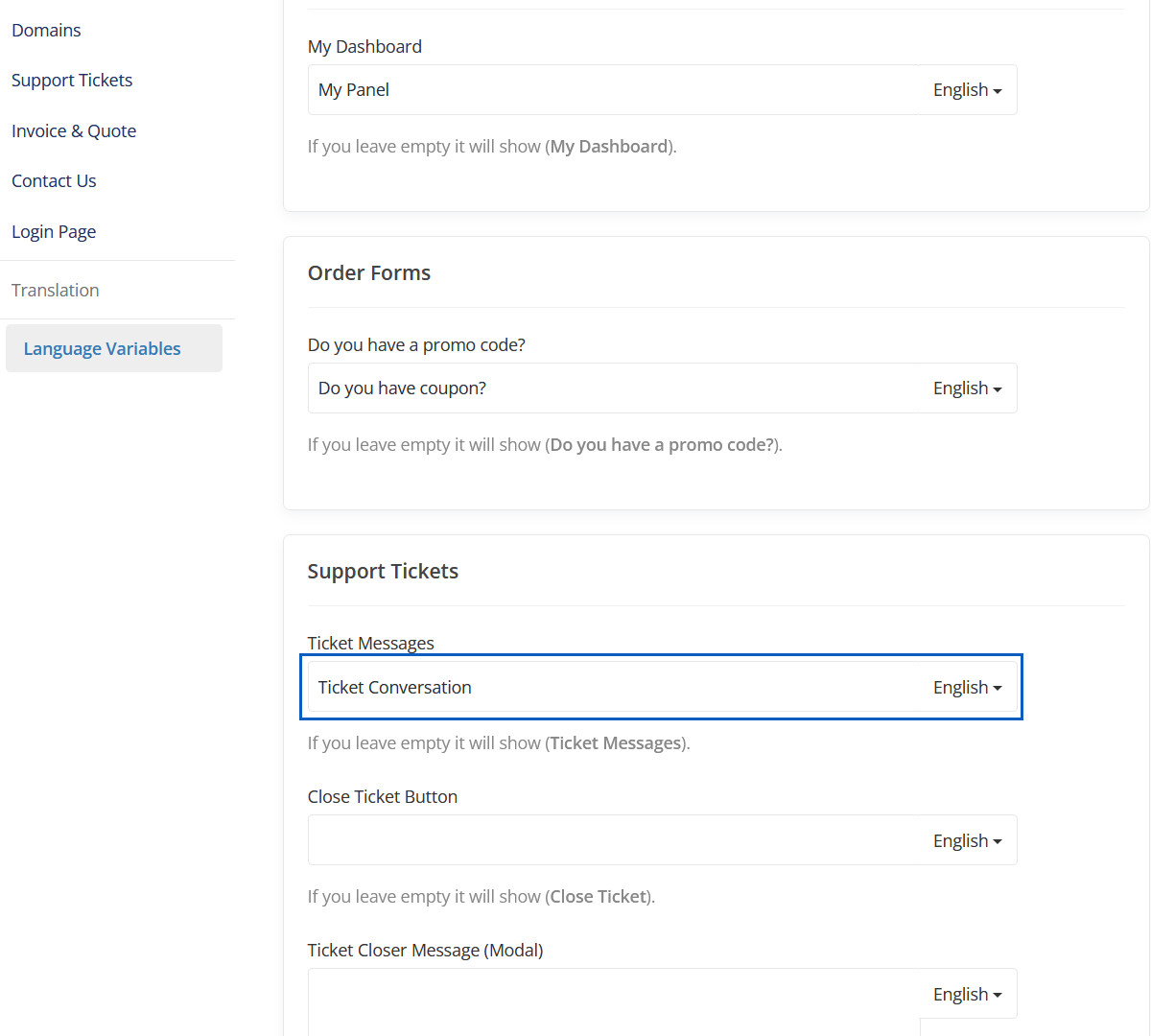
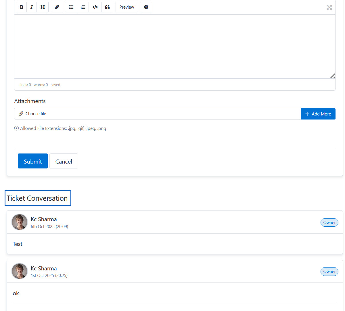
Ticket Messages
Here you can change "Ticket Messages" text.
Ticket Messages Preview
This text will be changed.
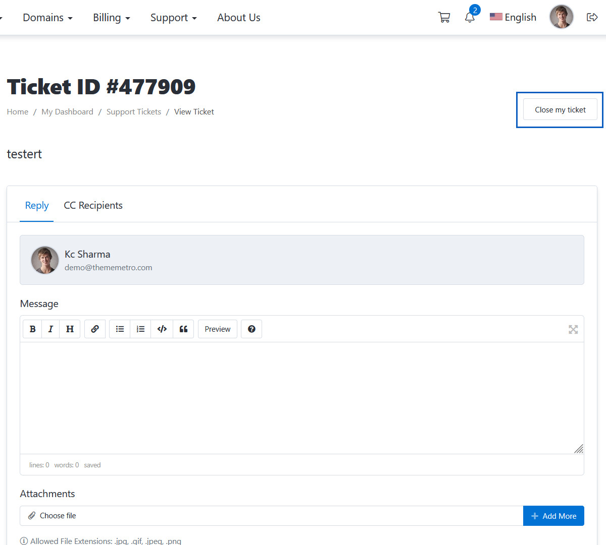
Close Ticket Button
Here you can change "Close Ticket Button" text.
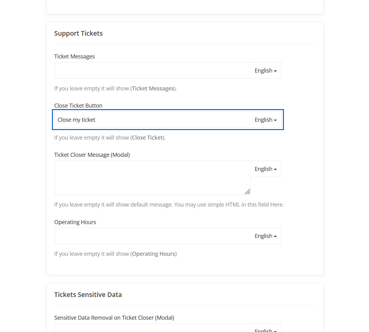
Close Ticket Button Preview
This close ticket button text will be changed.
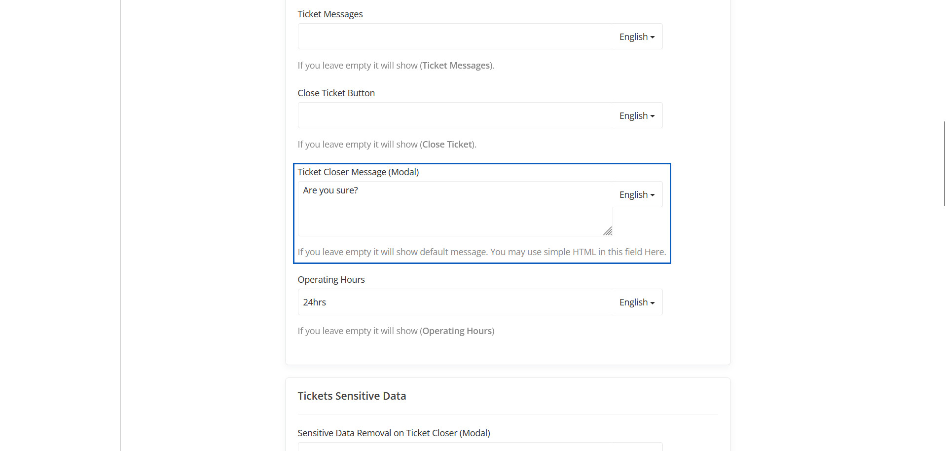
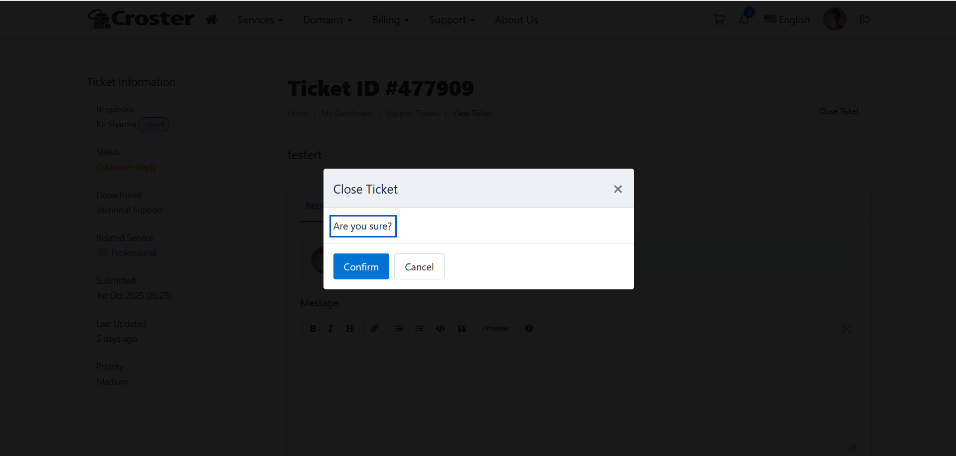
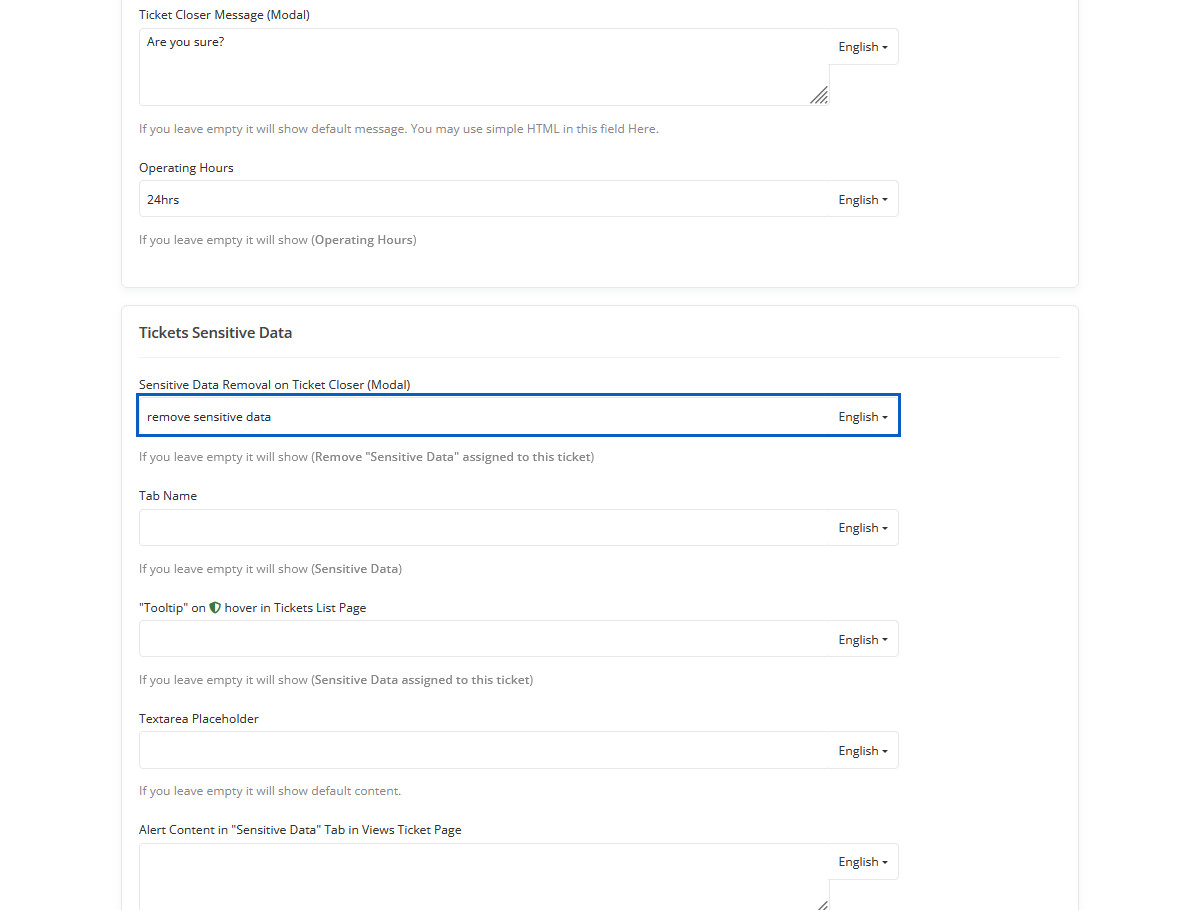
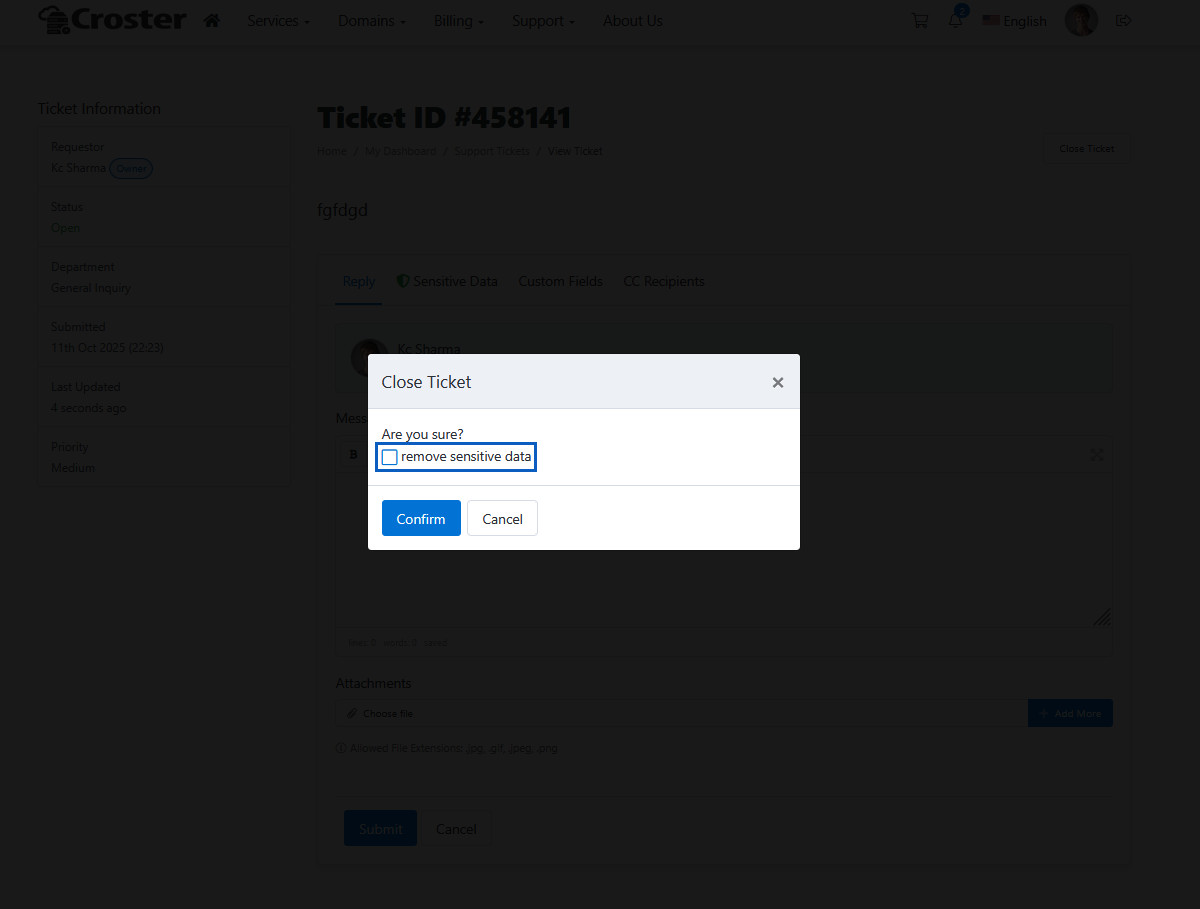
Ticket Closer Message (Modal)
If you leave empty it will show default message. You may use simple HTML in this field Here.
Ticket Closer Message (Modal) Preview
This closer message modal text will be change.
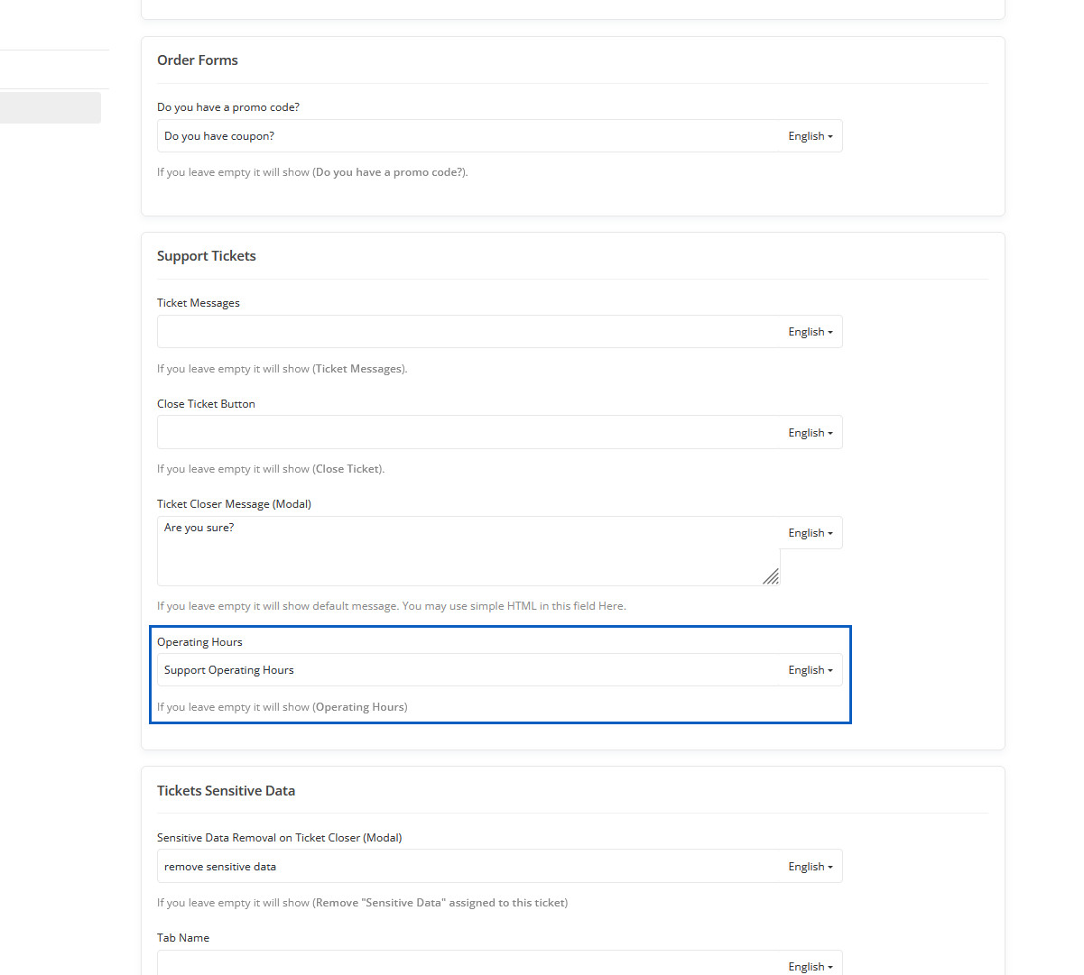
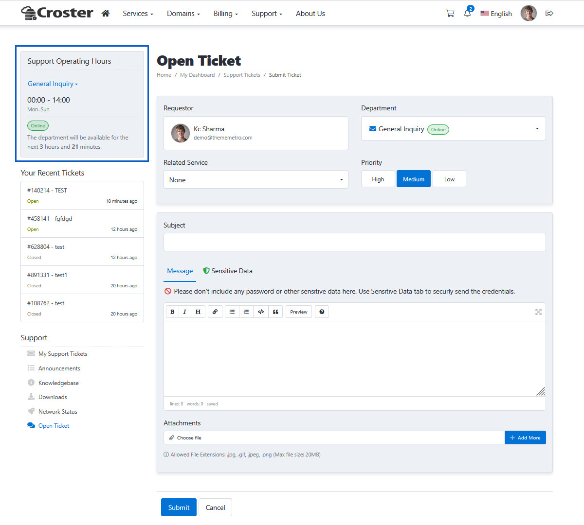
Operating Hours
If you leave empty it will show (Operating Hours)
Operating Hours Preview
Operating Hours will be displayed here.
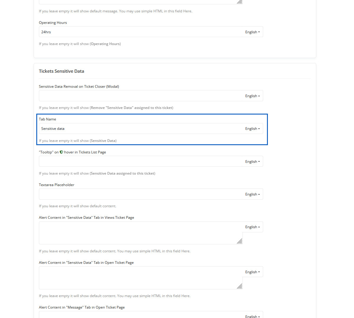
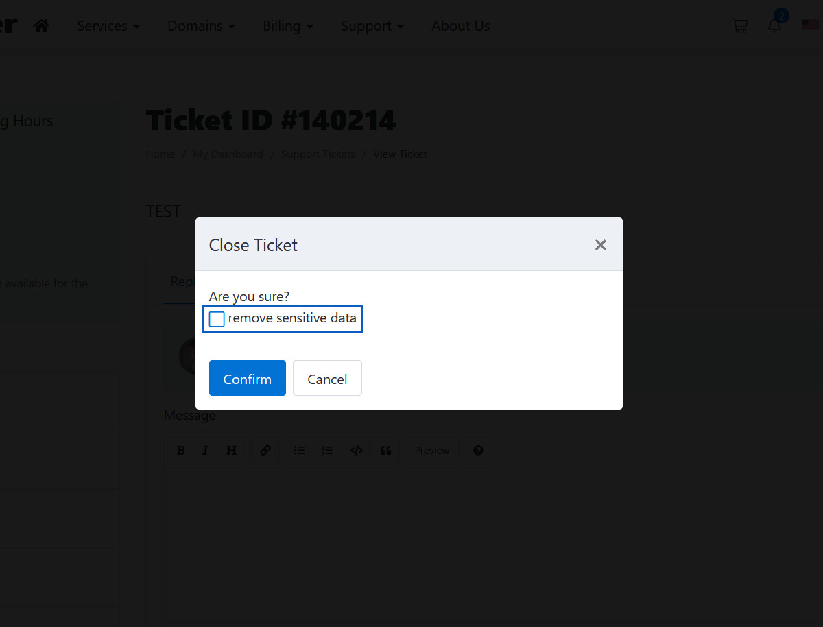
Sensitive Data Removal on Ticket Closer (Modal)
If you leave empty it will show (Remove "Sensitive Data" assigned to this ticket)
Sensitive Data Removal on Ticket Closer (Modal) Preview
When you checked "remove sensitive data" option to sensitive data will be removed from ticket.
Tab Name
If you leave empty it will show (Sensitive Data).
Tab Name Preview
This Sensitive Data tab will be added.
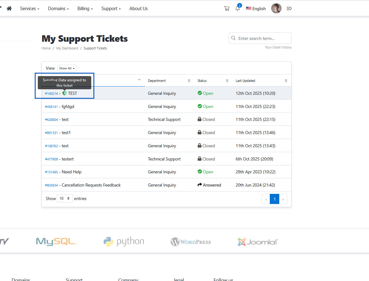
"Tooltip" on hover in Tickets List Page
If you leave empty it will show (Sensitive Data assigned to this ticket)
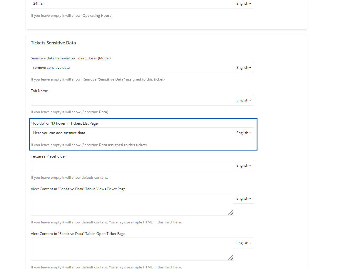
"Tooltip" on hover in Tickets List Page Preview
Here you can see tooltip.
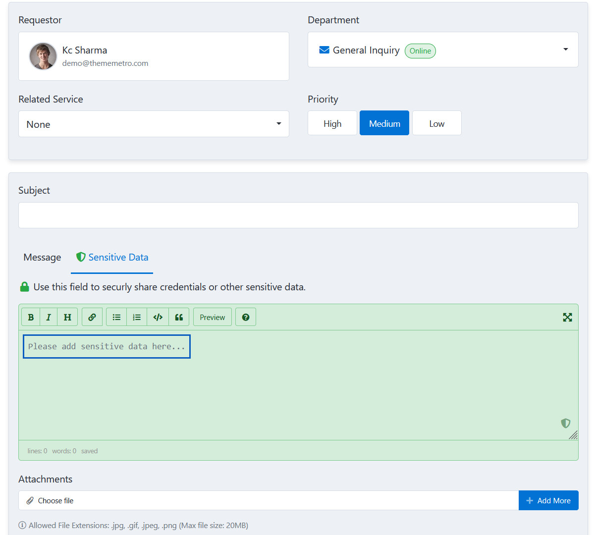
Textarea Placeholder
If you leave empty it will show default content.
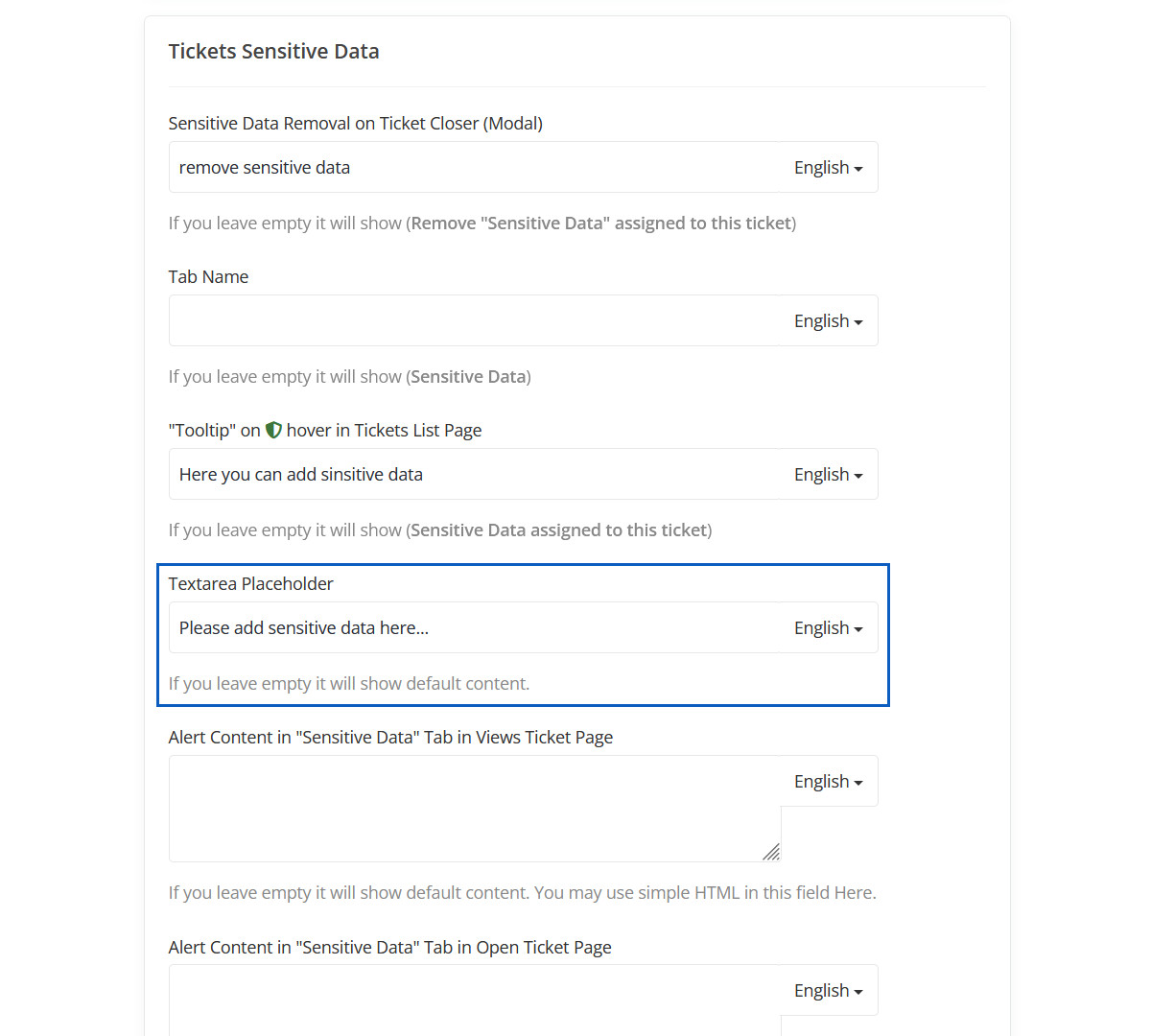
Textarea Placeholder Preview
Here you can see Textarea Placeholder.
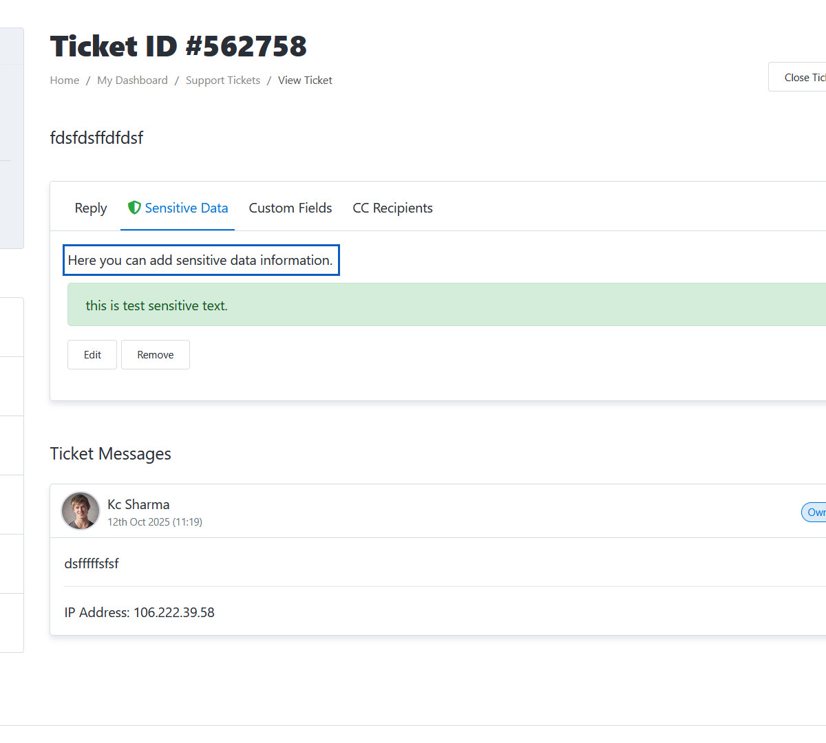
Alert Content in "Sensitive Data" Tab in Views Ticket Page
If you leave empty it will show default content. You may use simple HTML in this field Here.
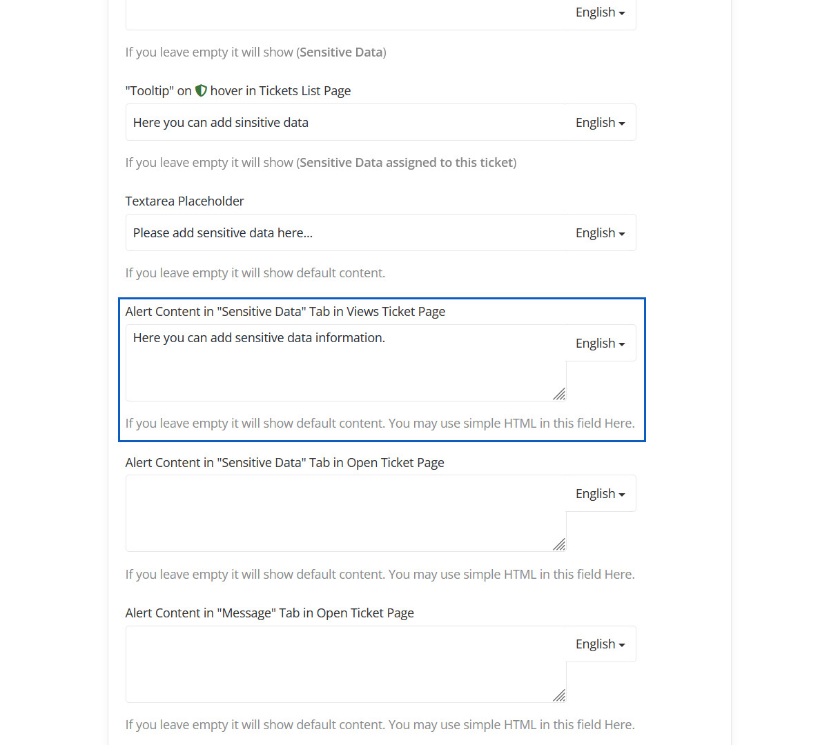
Alert Content in "Sensitive Data" Tab in Views Ticket Page Preview
Here you can change Alert Content.
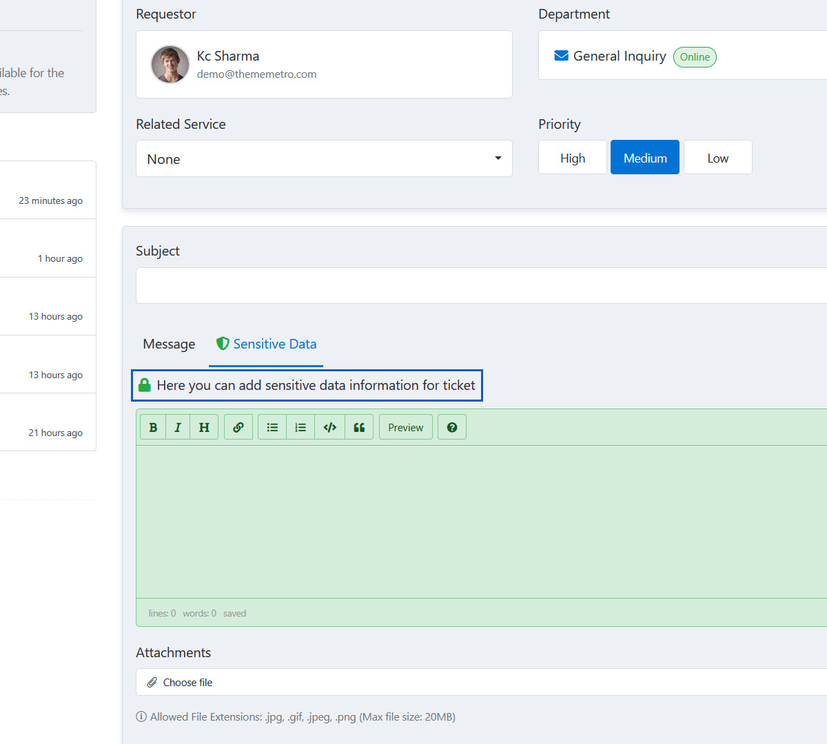
Alert Content in "Sensitive Data" Tab in Open Ticket Page
If you leave empty it will show default content. You may use simple HTML in this field Here.
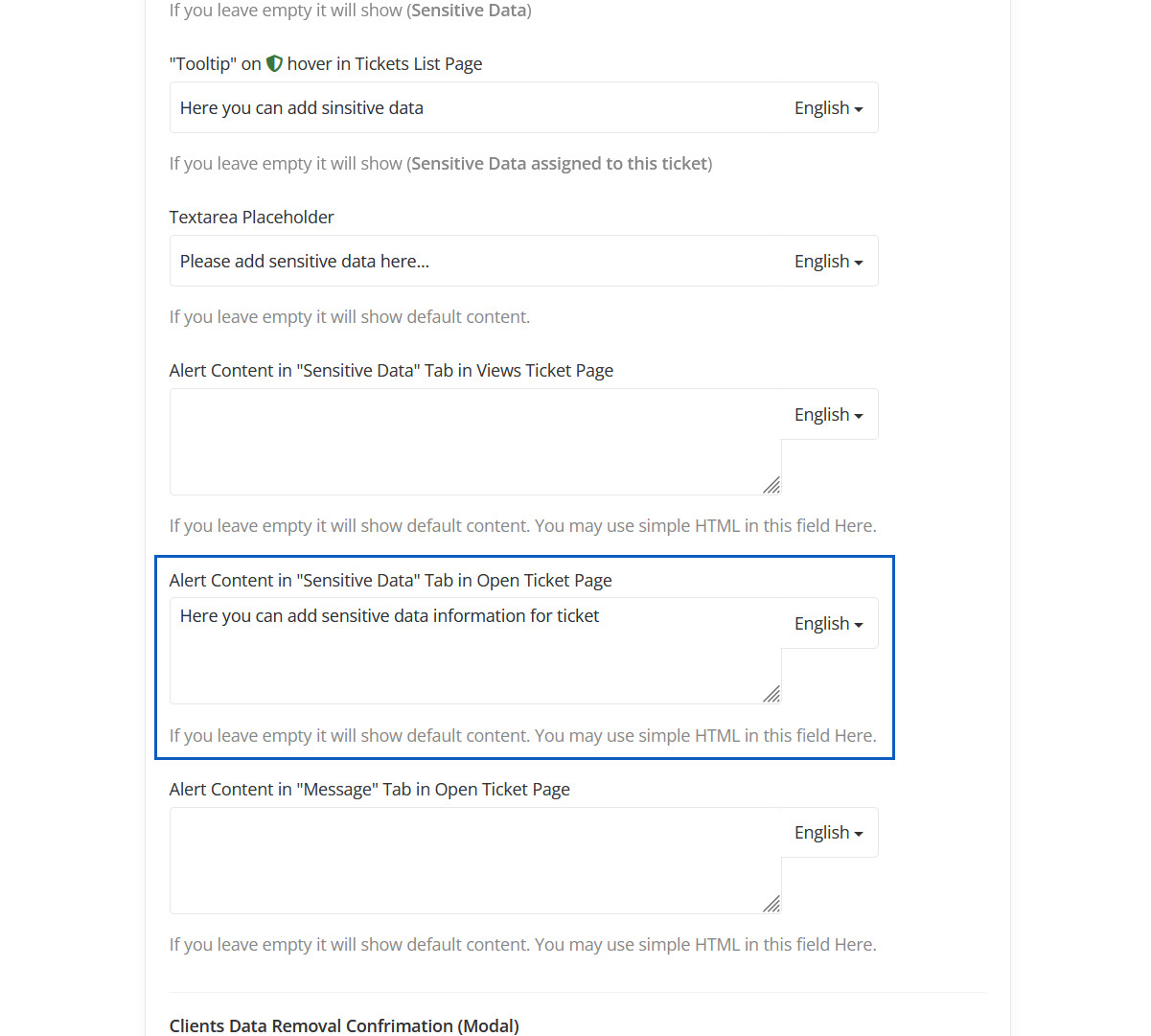
Alert Content in "Sensitive Data" Tab in Open Ticket Page Preview
Here you can change Alert Content in Open Ticket Page.
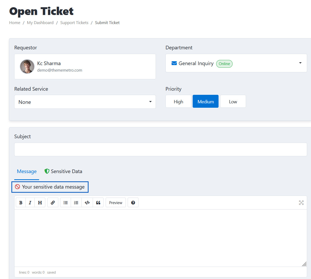
Alert Content in "Message" Tab in Open Ticket Page
If you leave empty it will show default content. You may use simple HTML in this field Here.
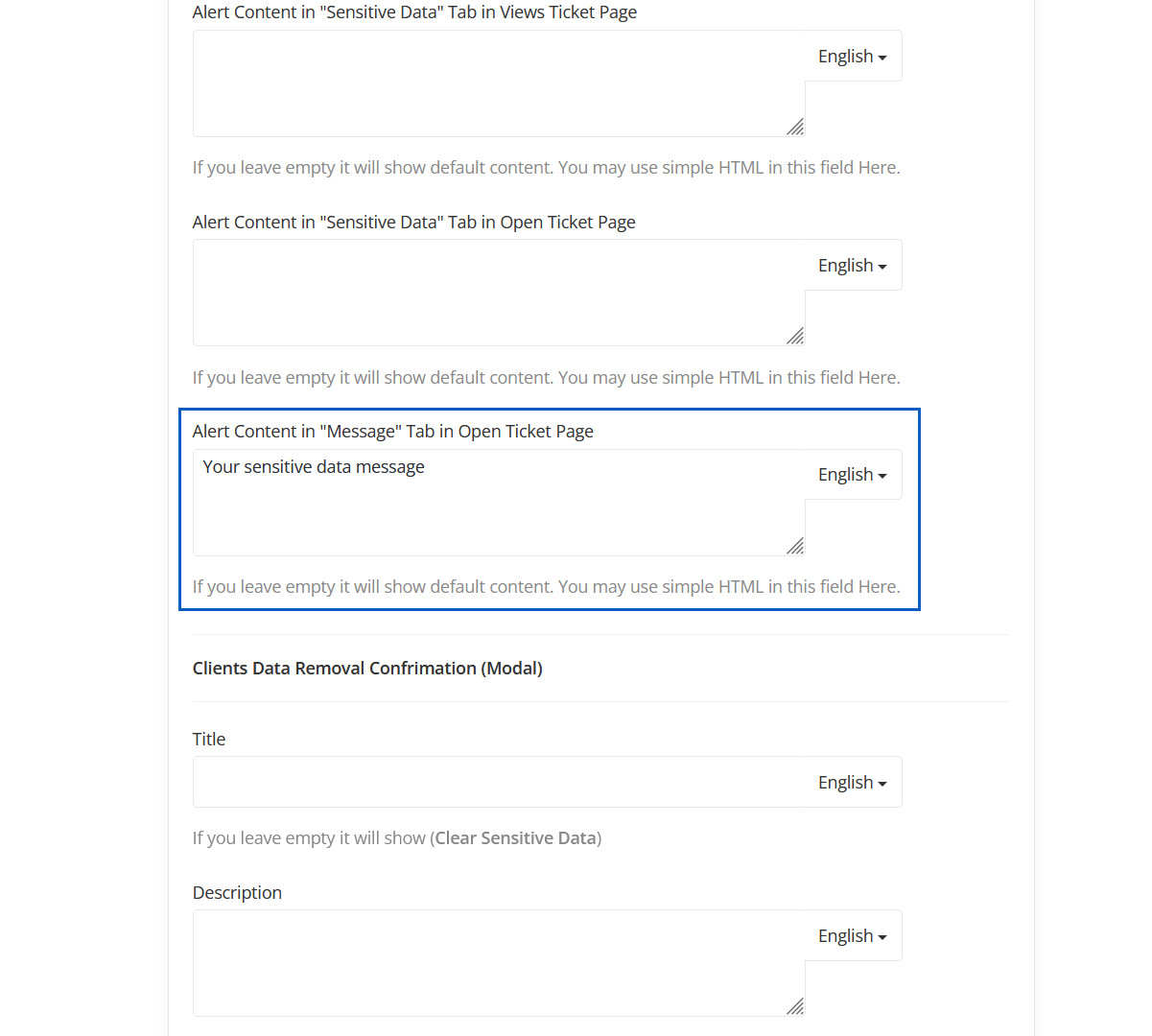
Alert Content in "Message" Tab in Open Ticket Page Preview
Here you can change Alert Content in "Message" Tab in Open Ticket Page.
Clients Data Removal Confrimation (Modal)
Here you can changes "Client data removal (modal)" title and content.
Clients Data Removal Confrimation (Modal) Preview
"Client data removal (modal)" title and content will be displayed here.
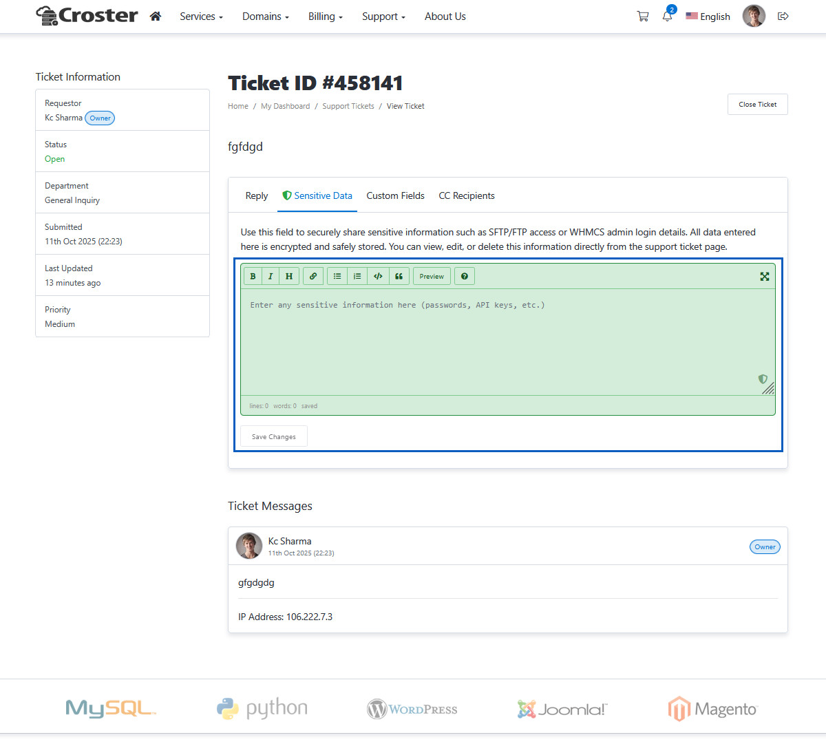
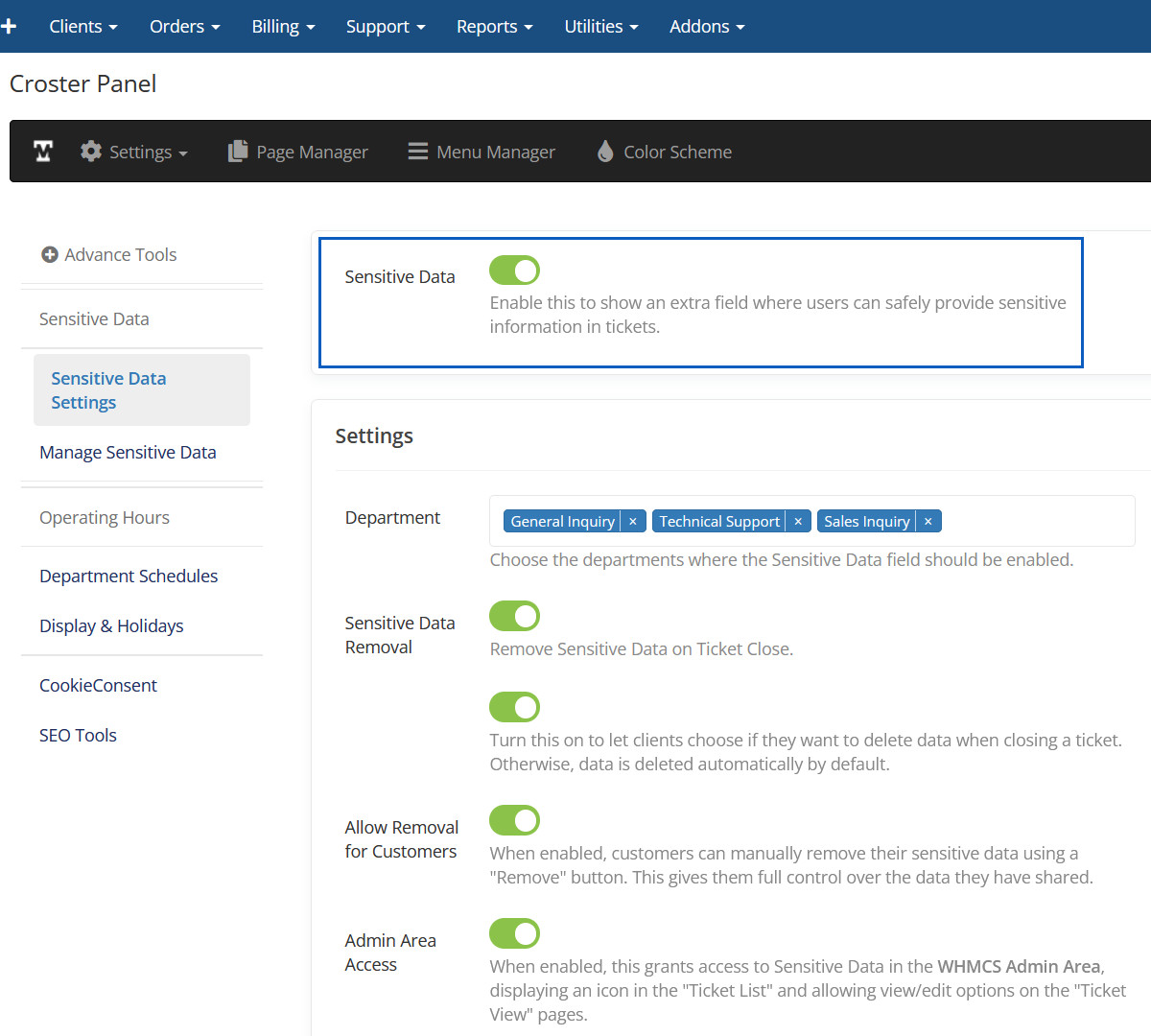
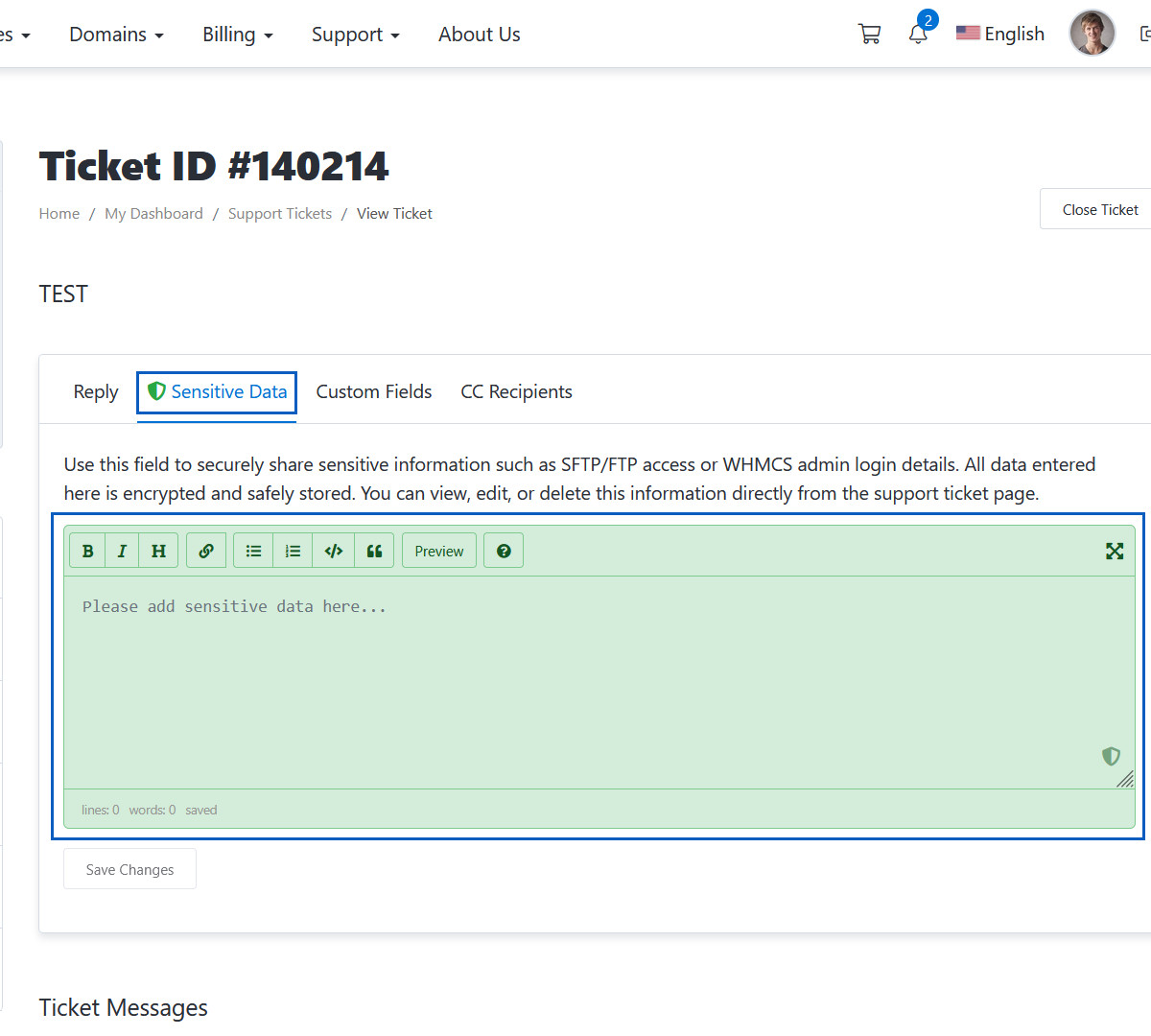
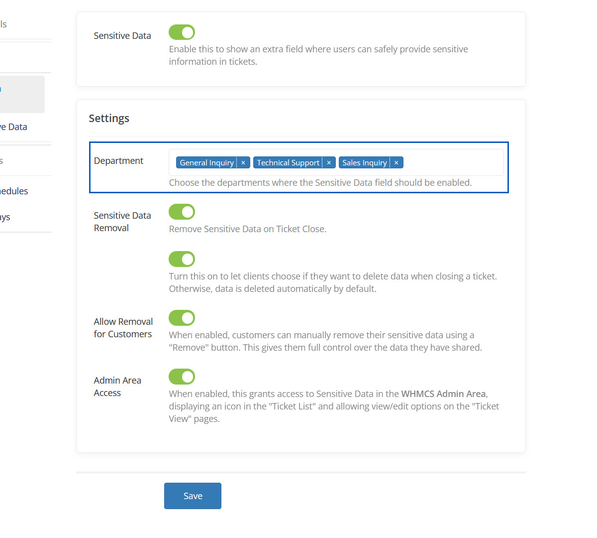
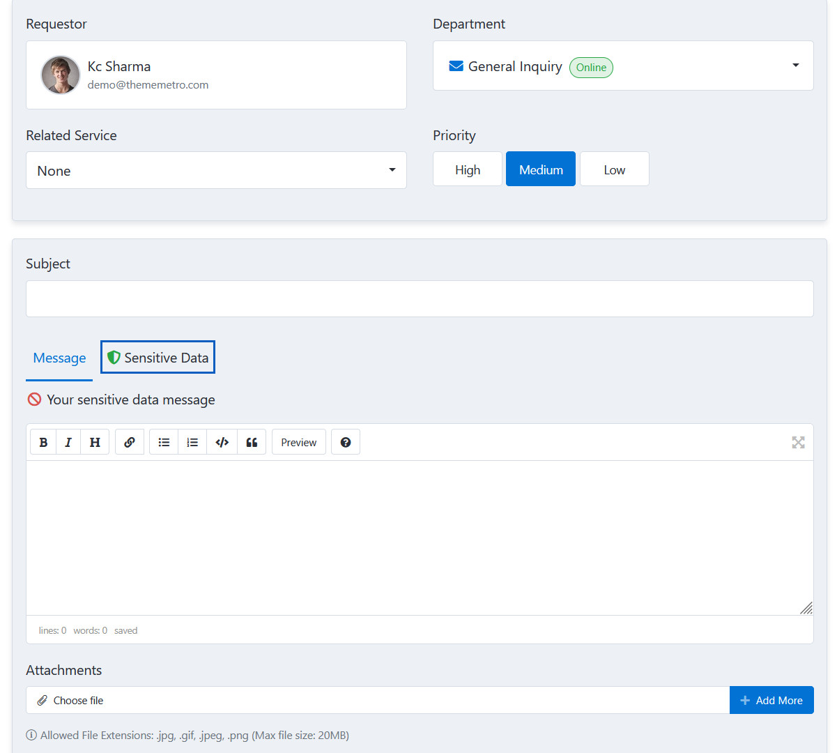
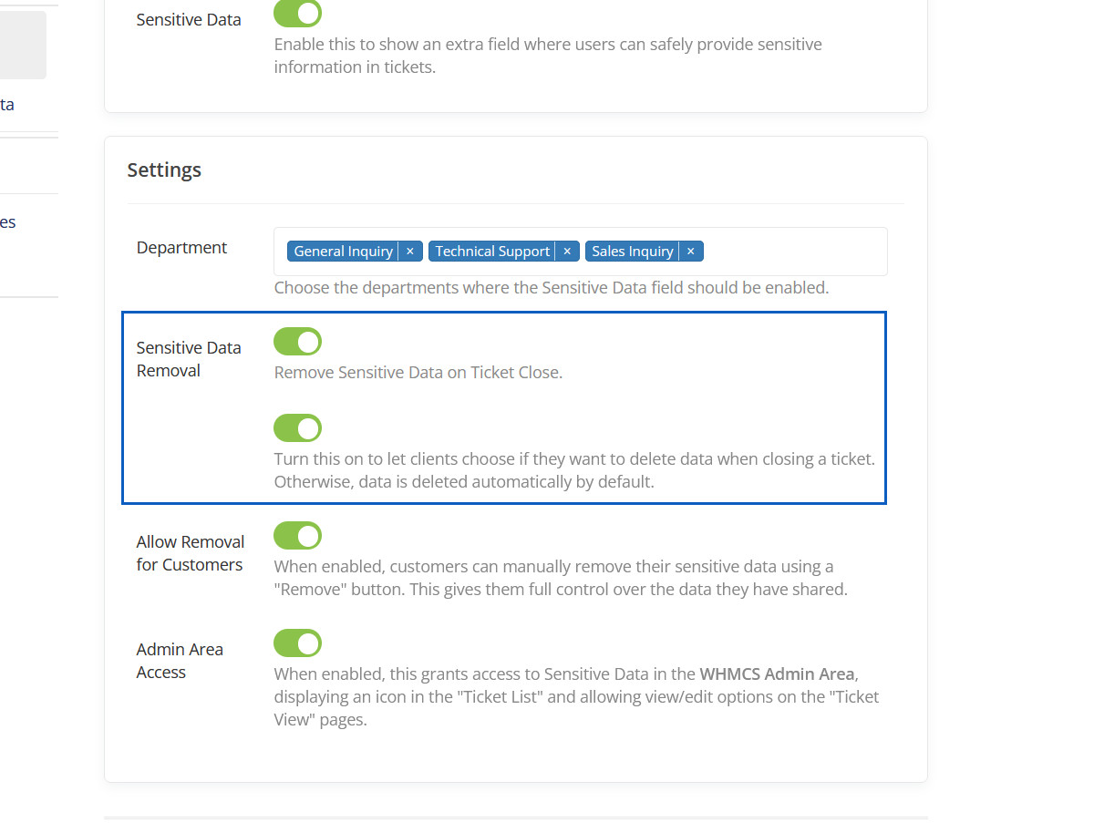
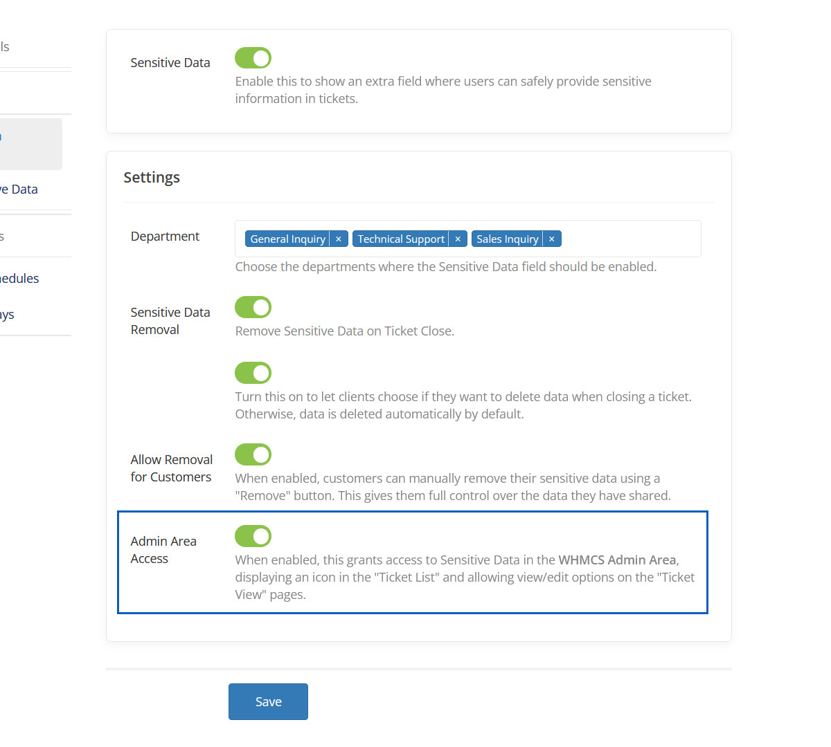
Sensitive Data
Enable this to show an extra field where users can safely provide sensitive information in tickets.
Sensitive Data Preview
Here you can see Sensitive Data Tab.
Department
Choose the departments where the Sensitive Data field should be enabled.
Department Preview
Here you can see "Sensitive Data" in selected departments.
Sensitive Data Removal
Remove Sensitive Data on Ticket Close.
Sensitive Data Removal Preview
Sensitive Data Removal will be displayed here.
Allow Removal for Customers
When enabled, customers can manually remove their sensitive data using a "Remove" button. This gives them full control over the data they have shared.
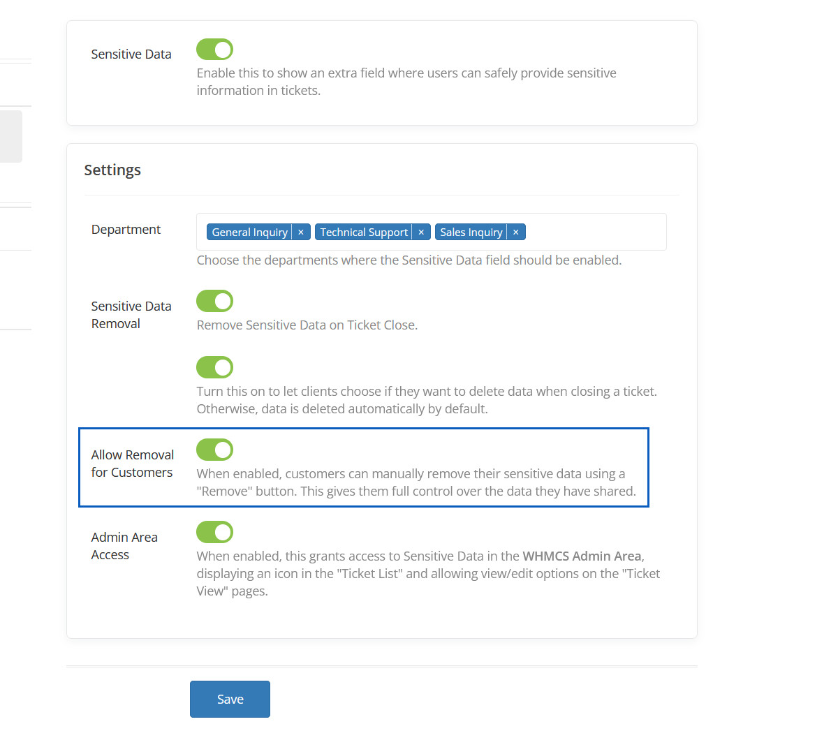
Admin Area Access
When enabled, this grants access to Sensitive Data in the WHMCS Admin Area, displaying an icon in the "Ticket List" and allowing view/edit options on the "Ticket View" pages.
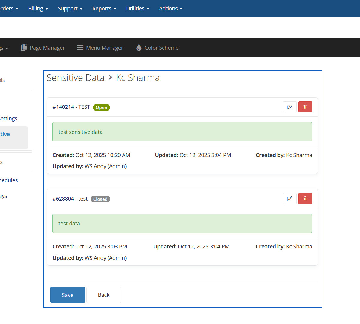
Manage Sensitive Data
Here you can manage sensitive data for all.
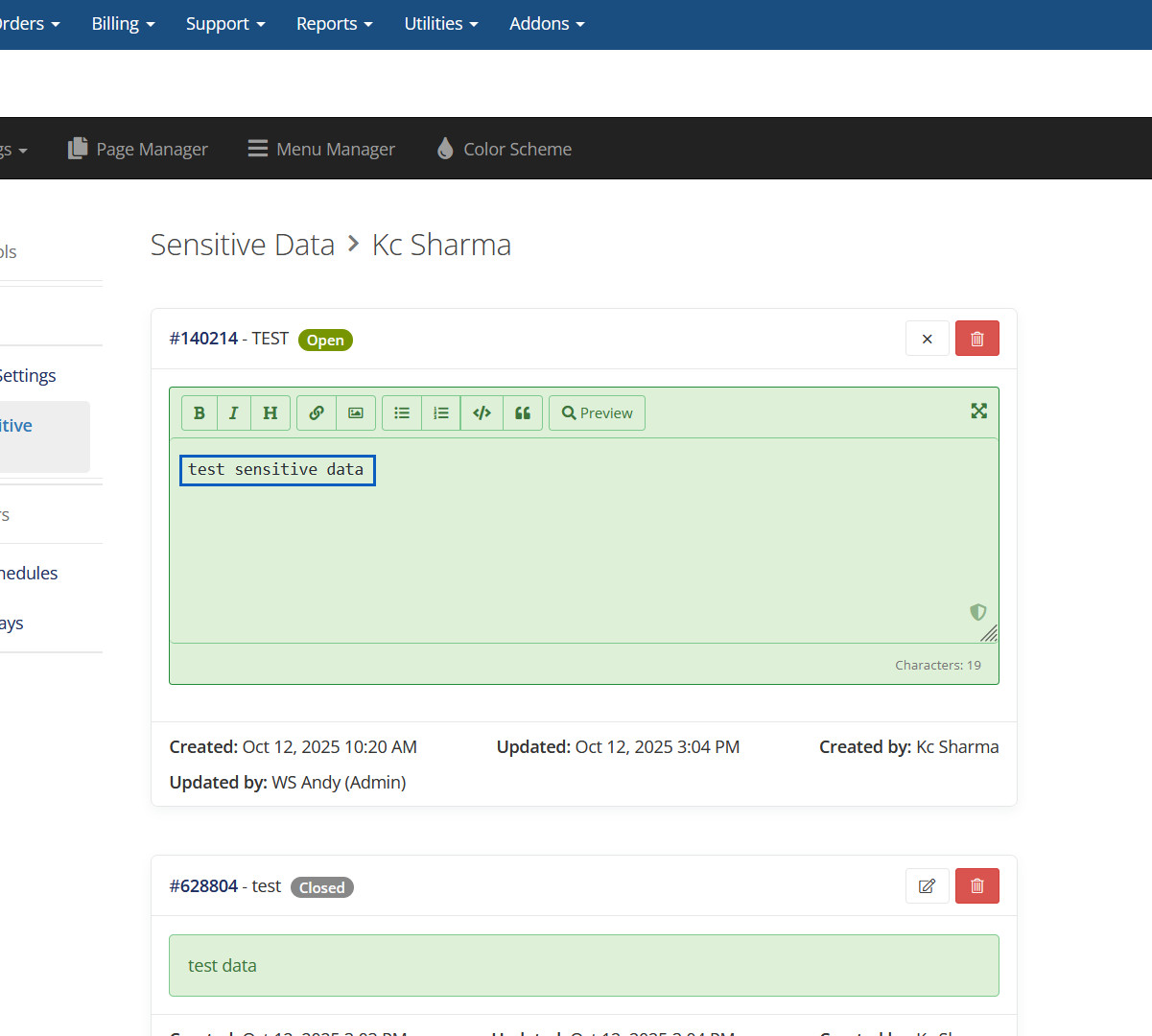
Edit Sensitive Data
Here you can edit Sensitive Data and It will be reflected on front side.
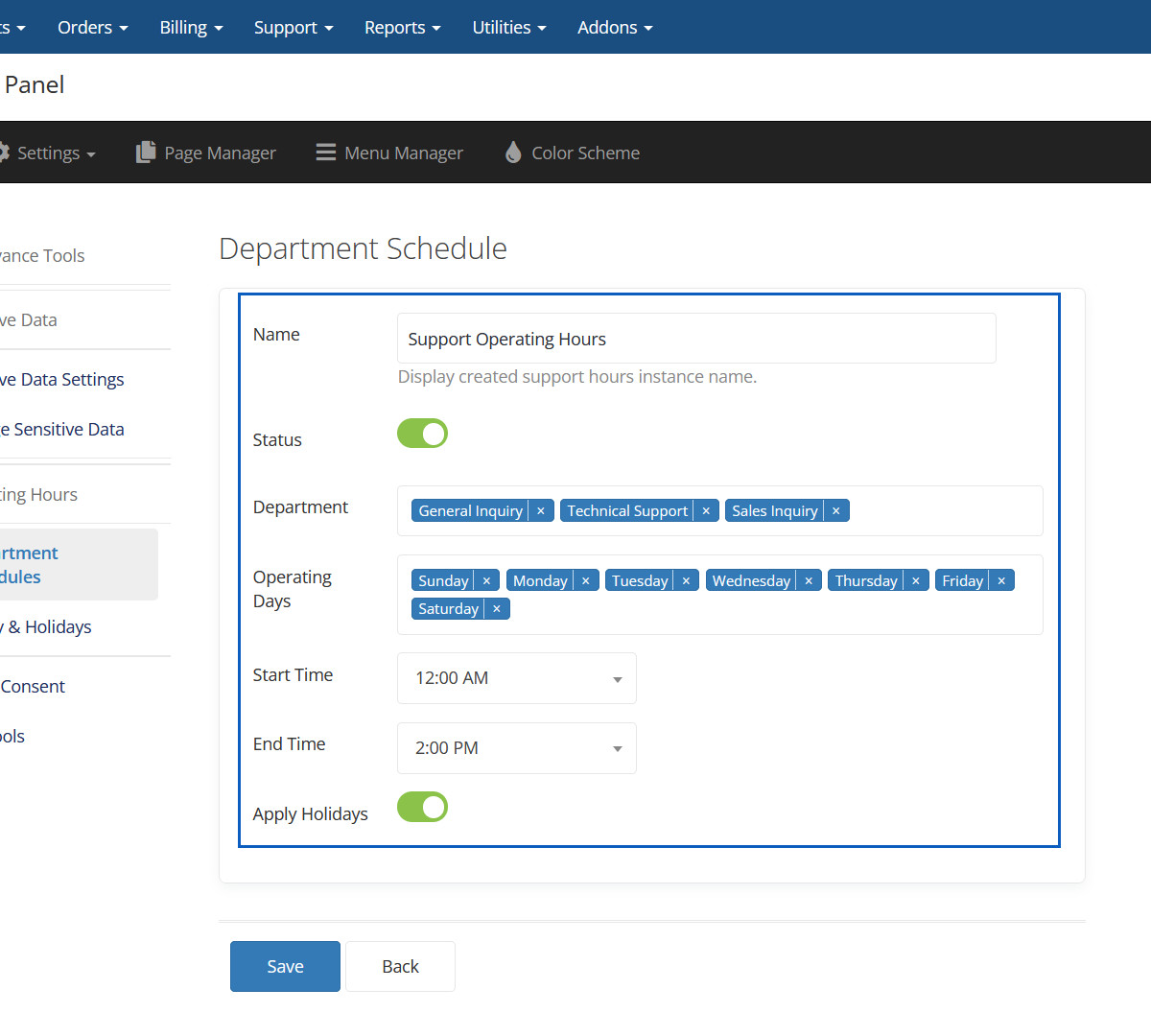
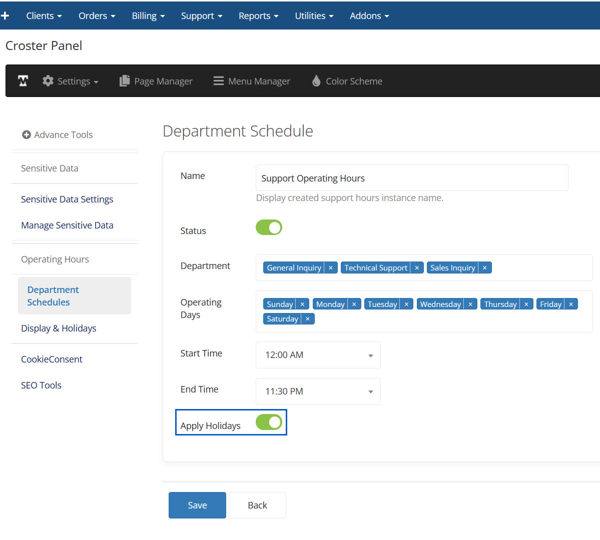
Department Schedules
Here you can create Schedules.
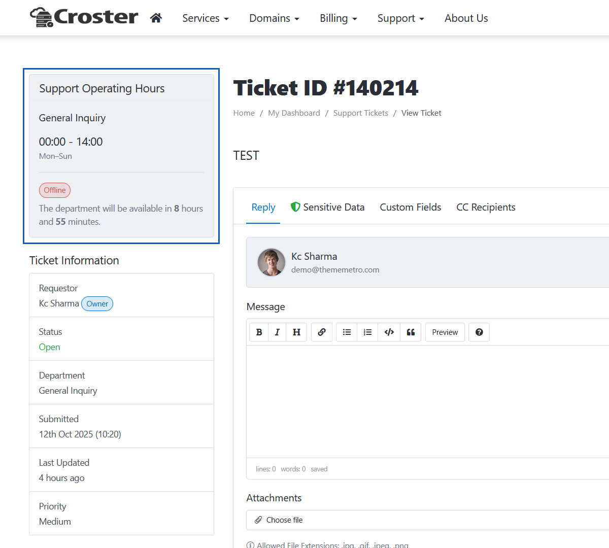
Department Schedules Preview
Here you can see Schedules.
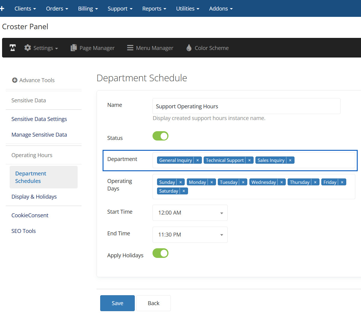
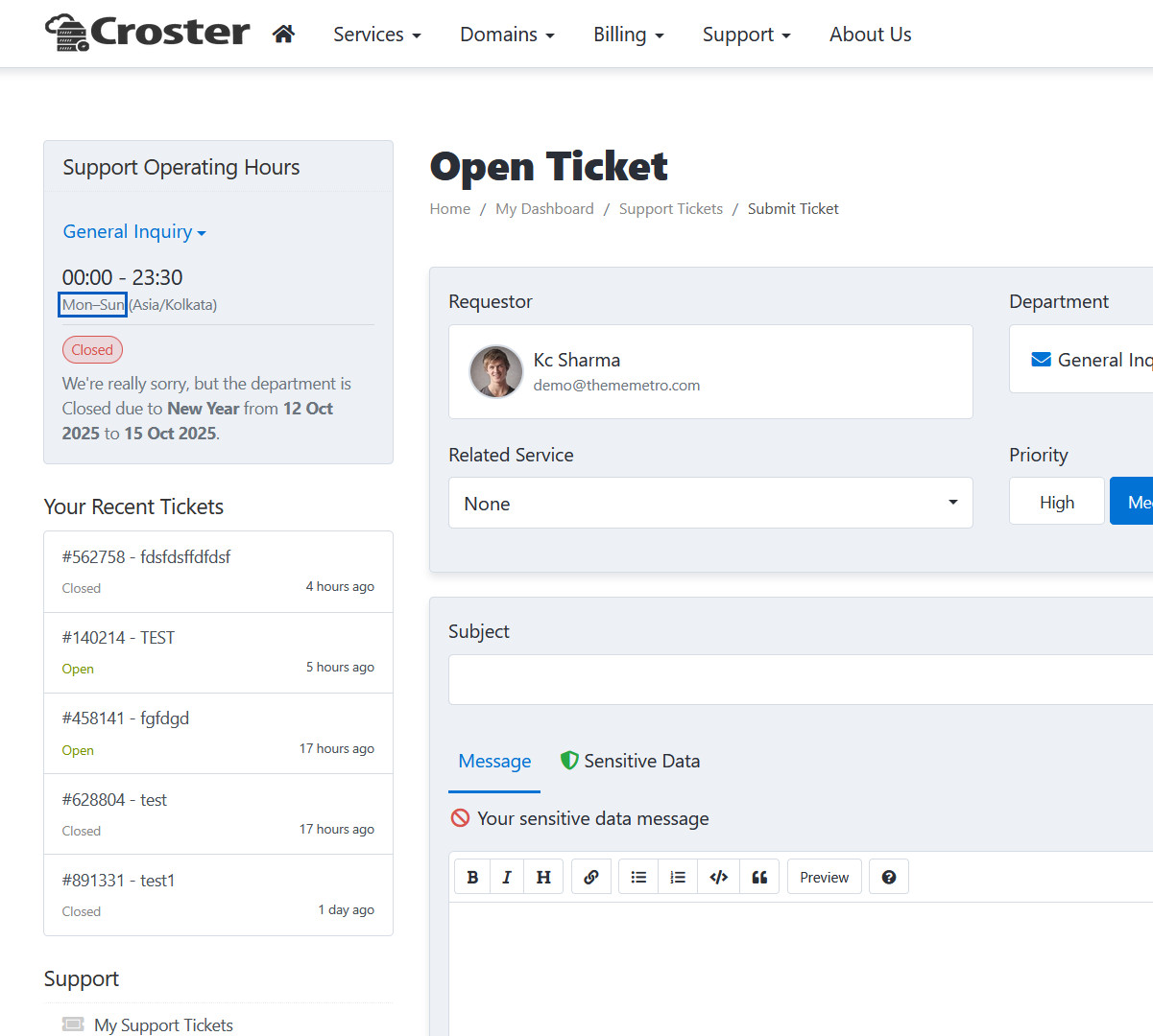
Department
Here you can select departments for operating hours.
Department Preview
Here you can see departments with operating hours.
Operating Days
Here you can select operating days for departments.
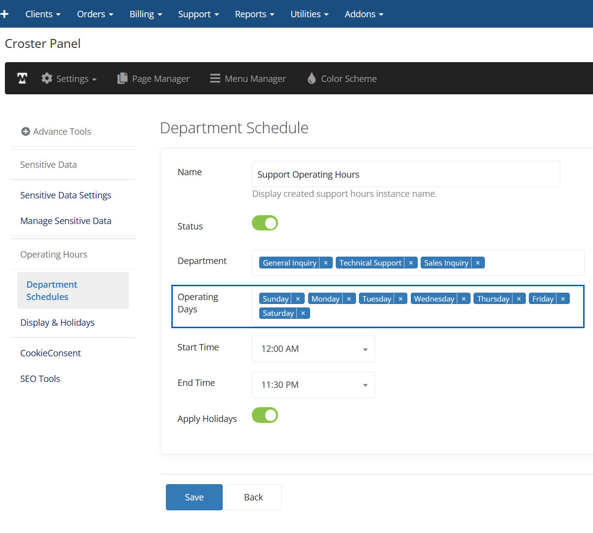
Operating Days Preview
Here you can see selected operating days.
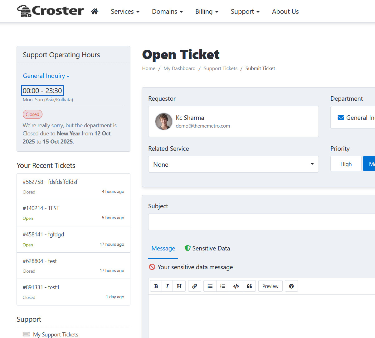
Operating Time
Here you can set operating time for departments.
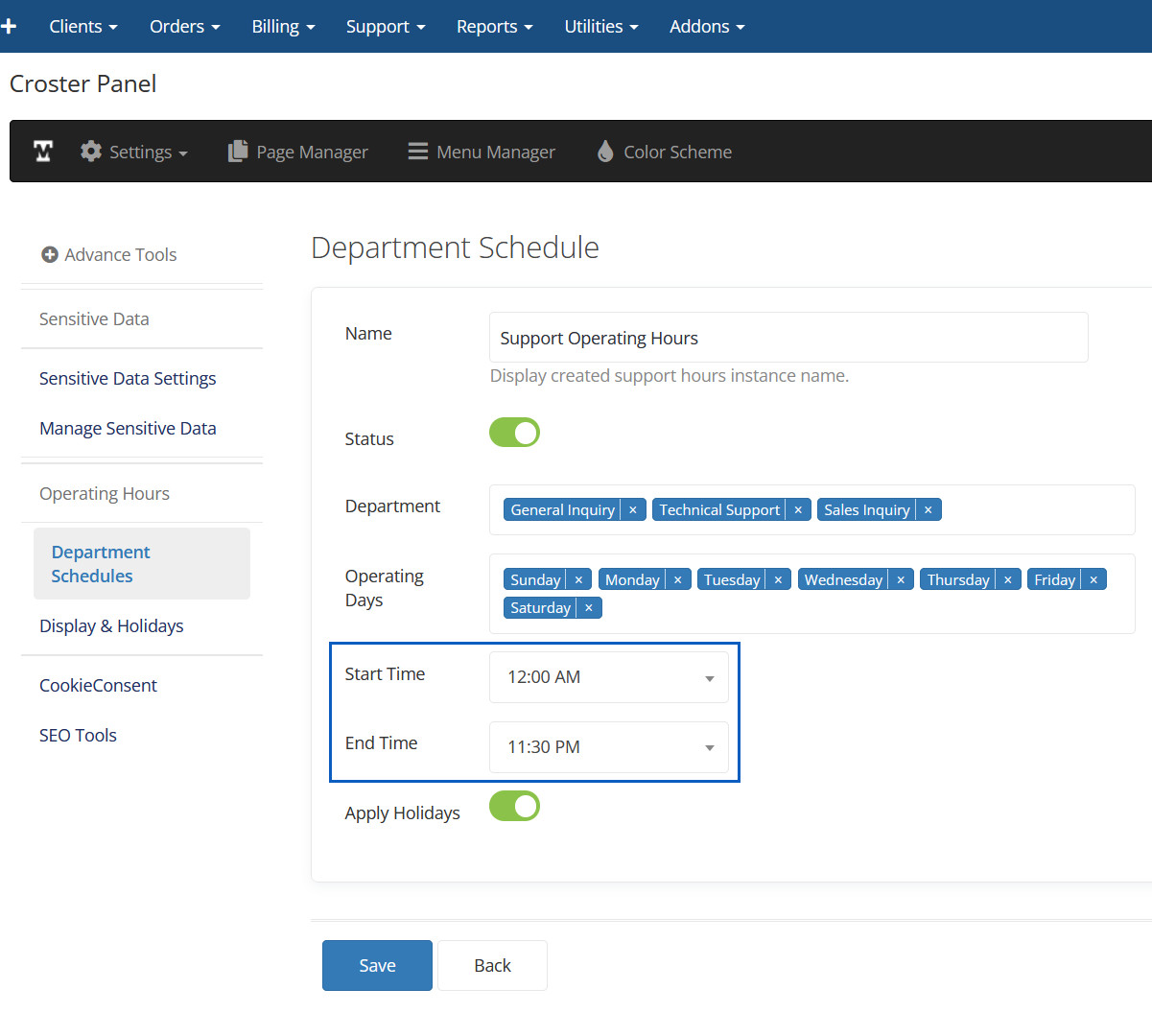
Operating Time Preview
Here you can see operating time.
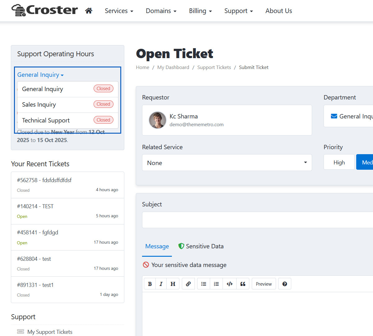
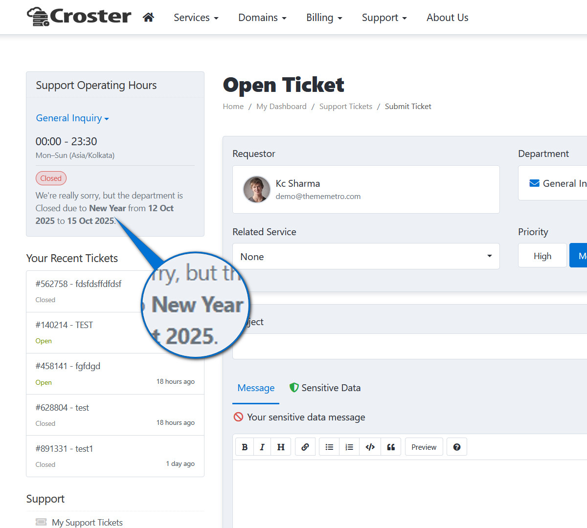
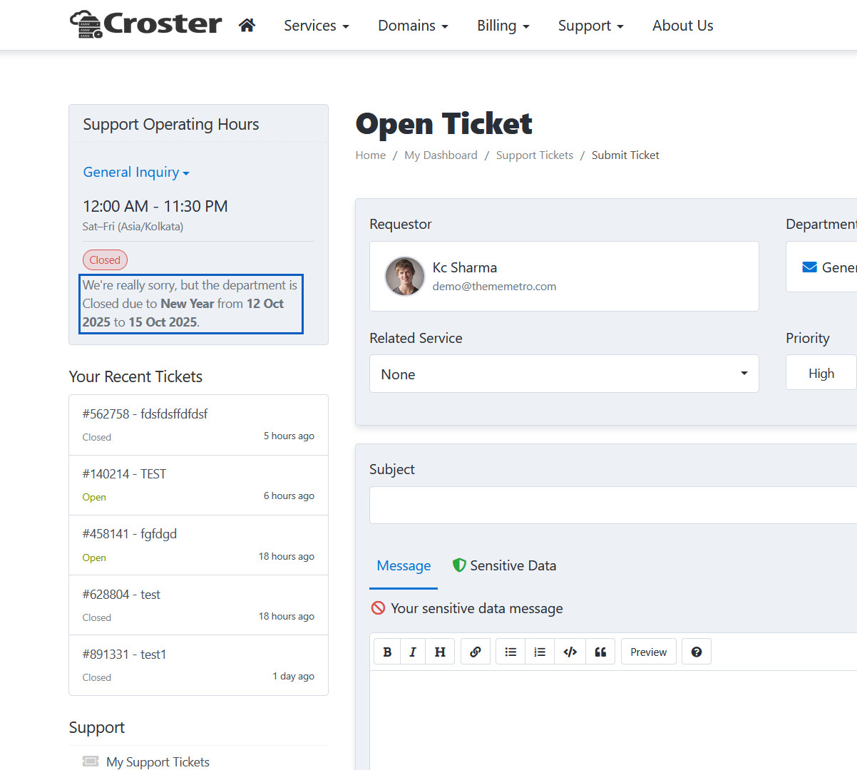
Apply Holidays
When enable this option to display holidays info in operating hours card.
Apply Holidays Preview
Here you can see holidays info.
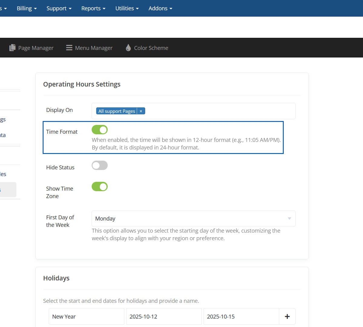
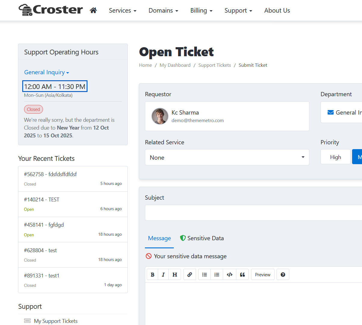
Time Format
When enabled, the time will be shown in 12-hour format (e.g., 11:05 AM/PM). By default, it is displayed in 24-hour format.
Time Format Preview
Here you can see 12-hour time format.
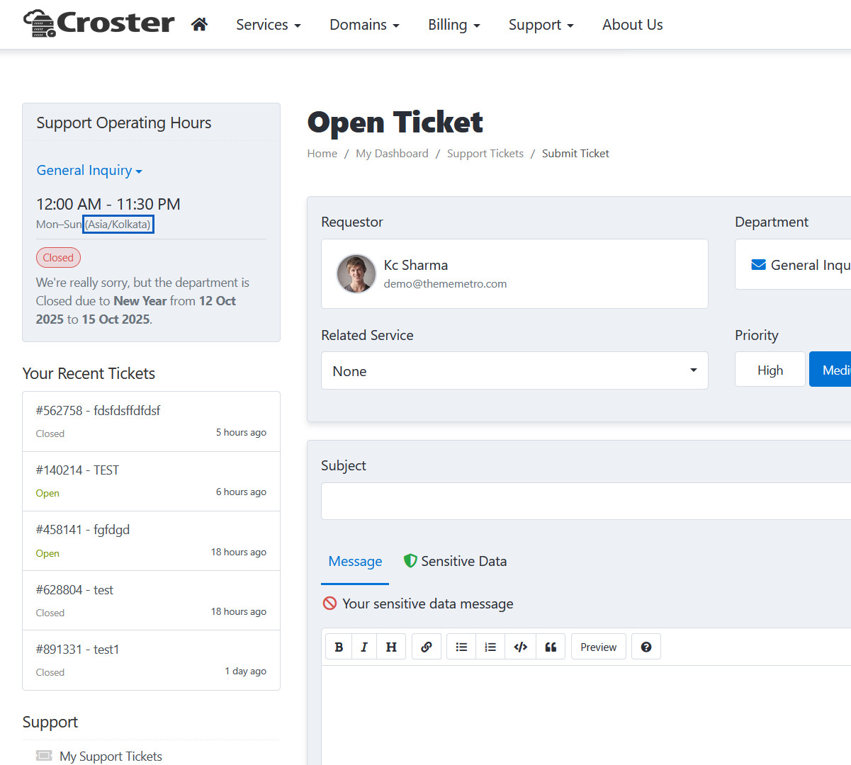
Time Zone
Here you can Enable Time Zone for Operating Hours Card.
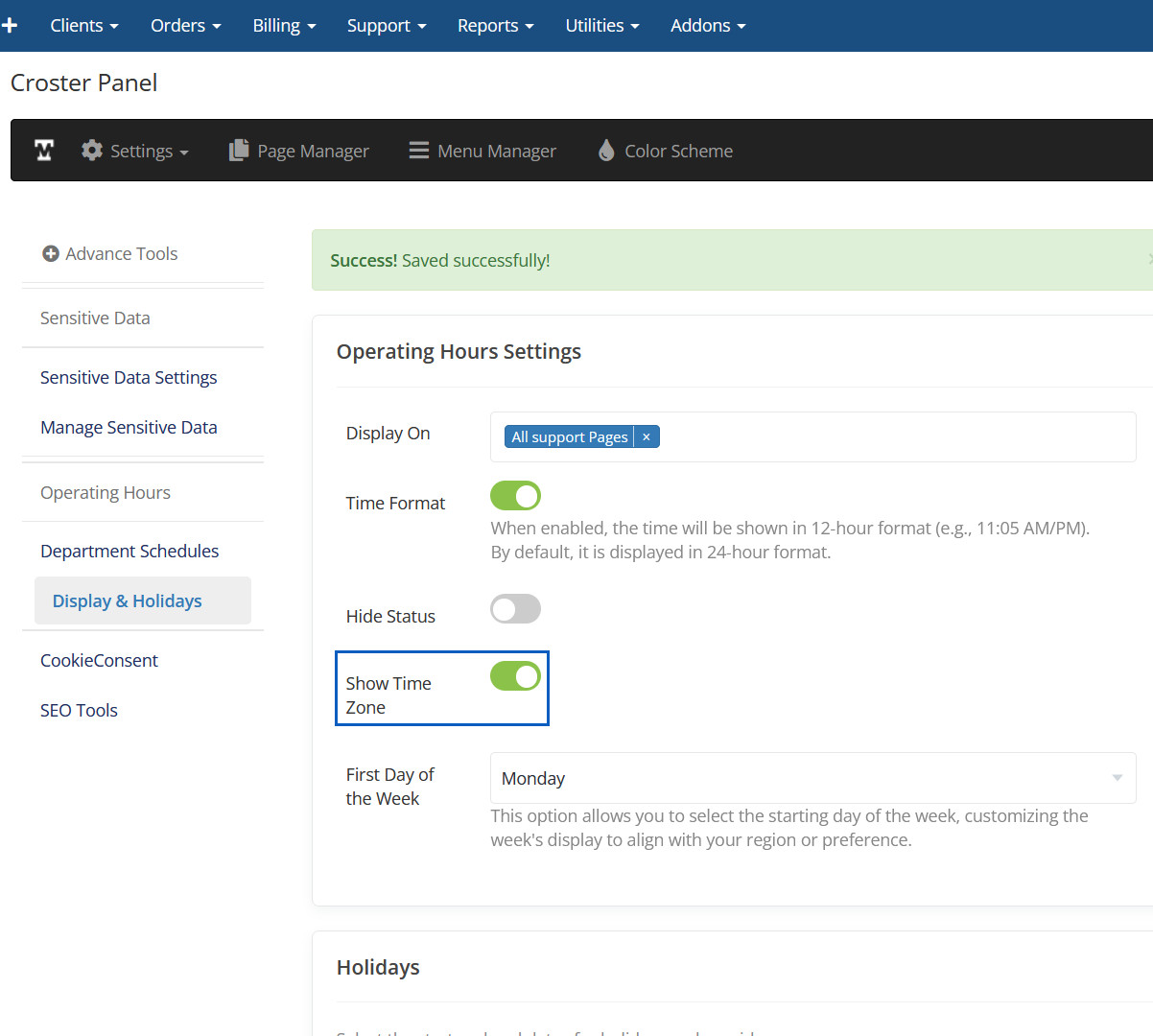
Time Zone Preview
Here you can see Time Zone for Operating Hours Card.
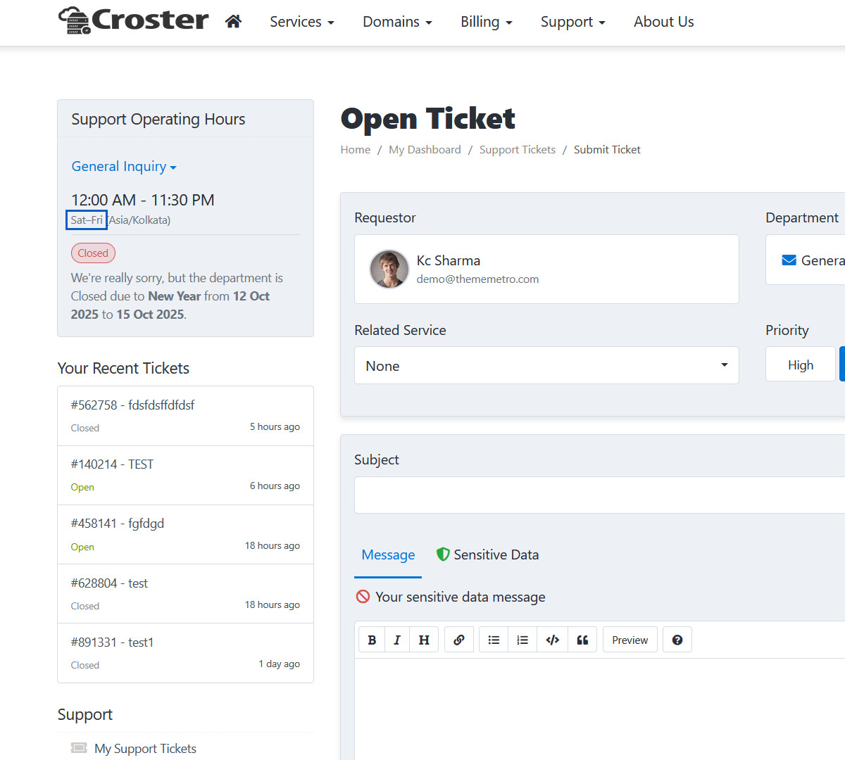
First Day of the Week
This option allows you to select the starting day of the week, customizing the week's display to align with your region or preference.
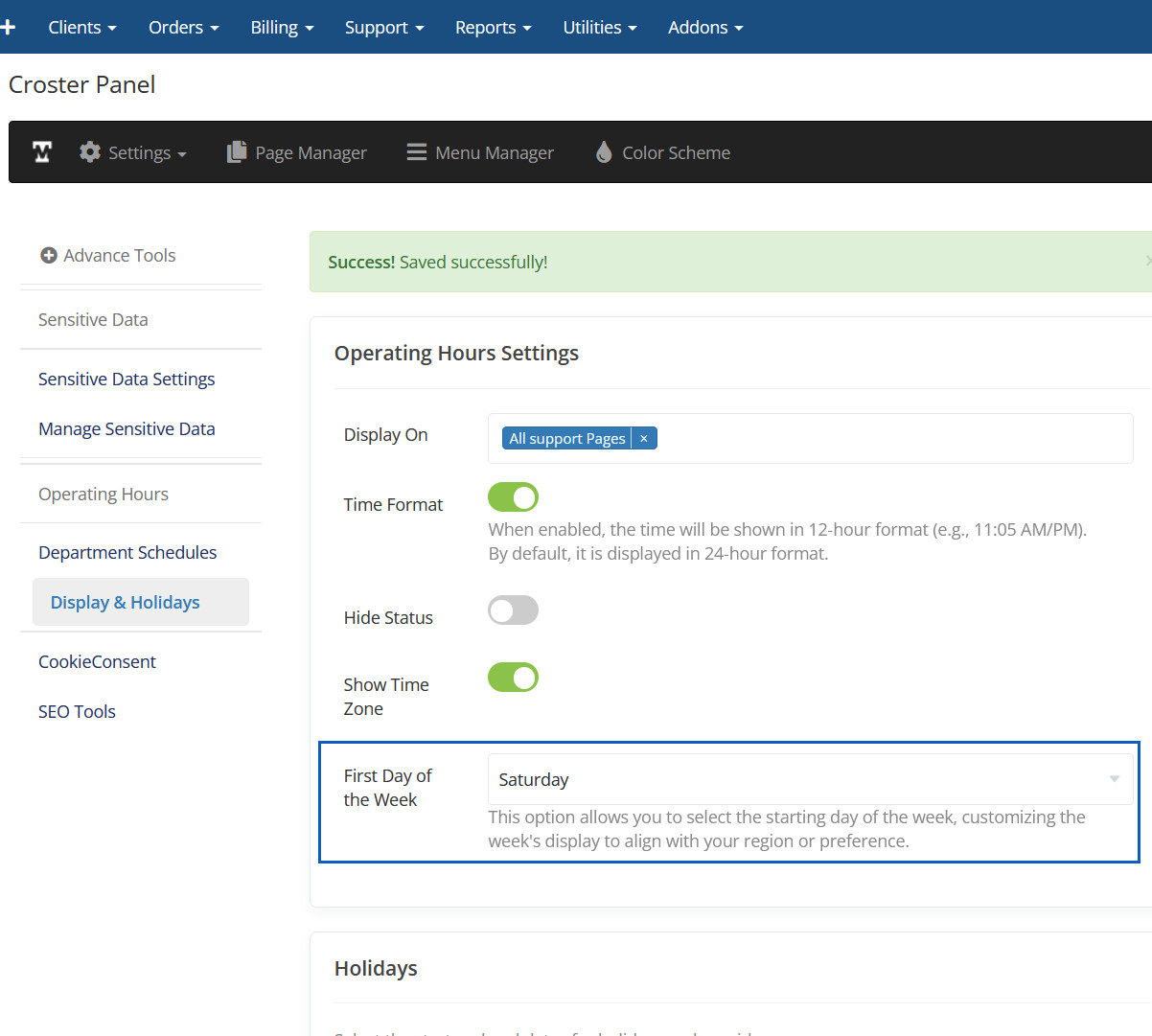
First Day of the Week Preview
First Day of the Week will be displayed here.
Holidays
Select the start and end dates for holidays and provide a name.
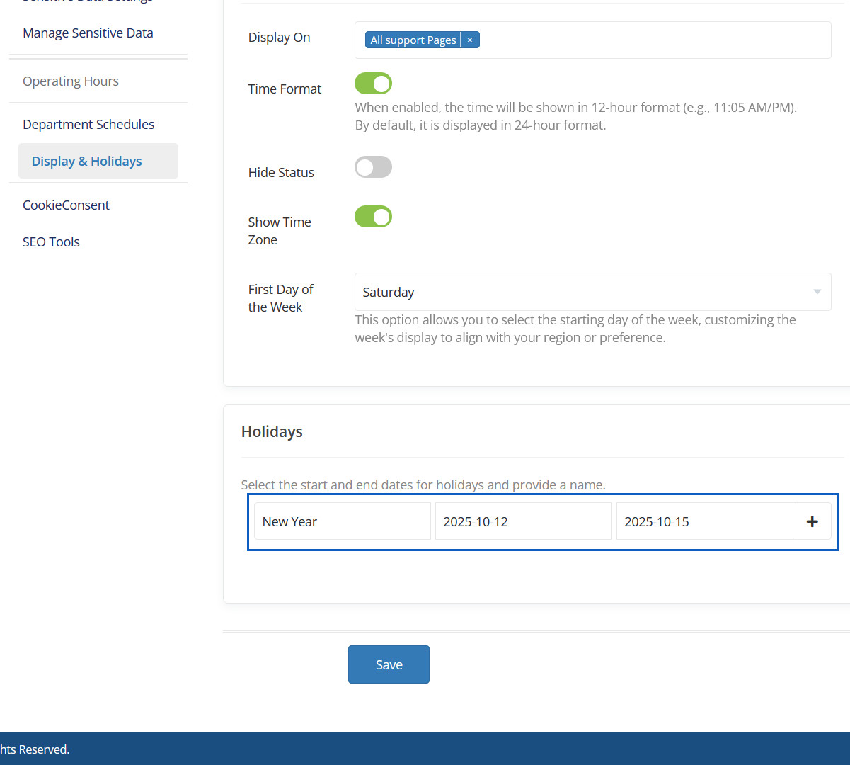
Holidays Preview
Here you can see holidays info.
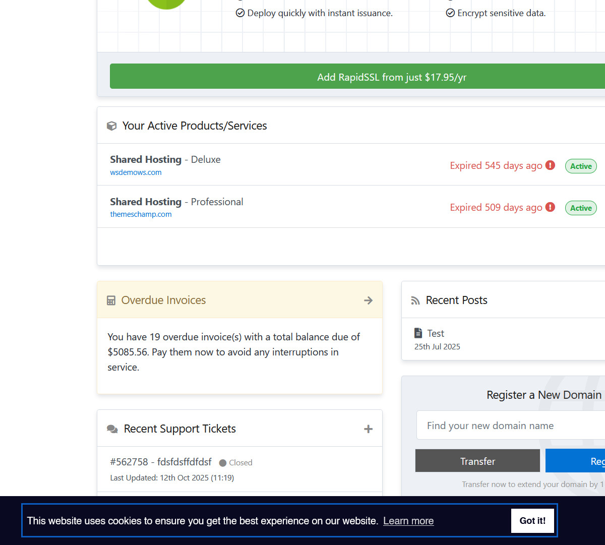
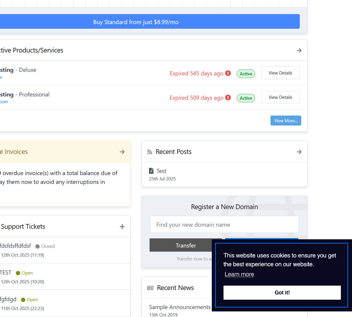
Position Bottom
Here you can set Cookie Consent Banner position at Bottom.
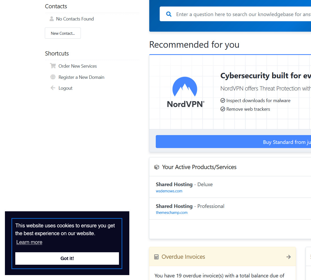
Position Bottom Preview
Here Cookie Consent Banner will be displayed at bottom of page.
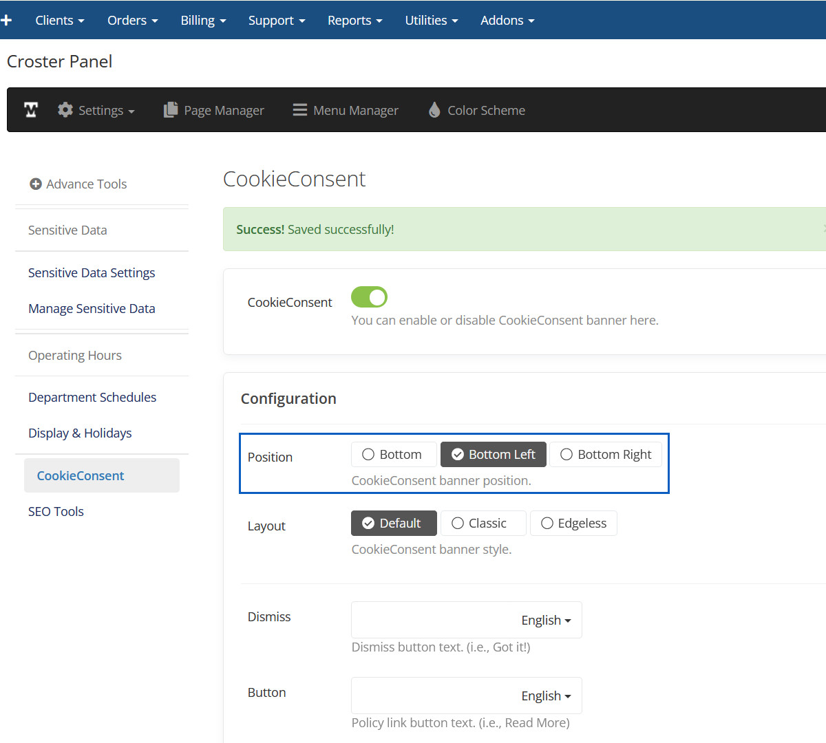
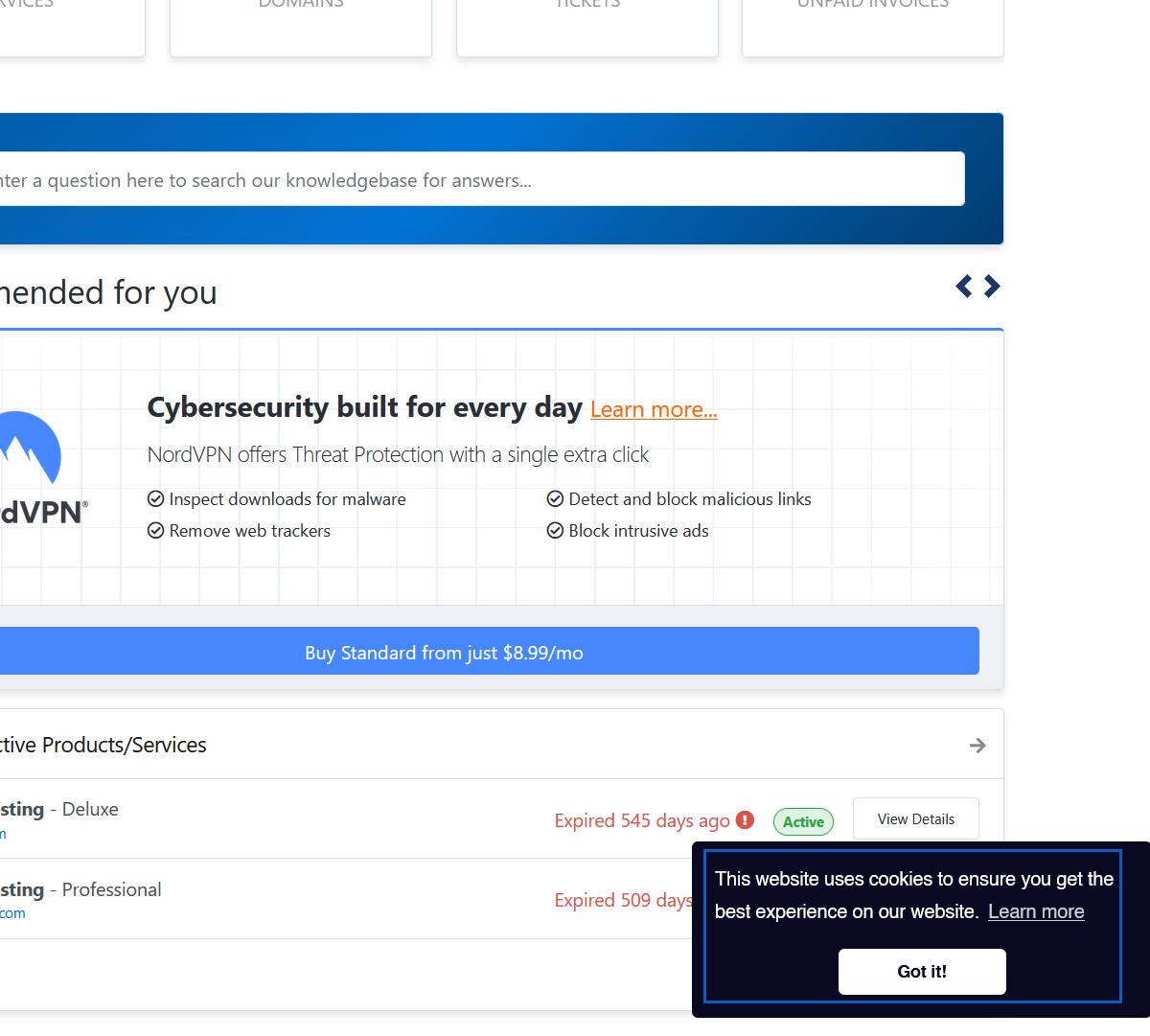
Position Bottom Left
Here you can set Cookie Consent Banner position at Bottom Left.
Position Bottom Left Preview
Here Cookie Consent Banner will be displayed at bottom left of page.
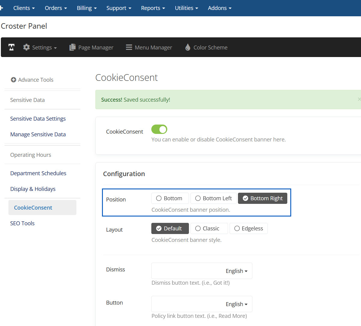
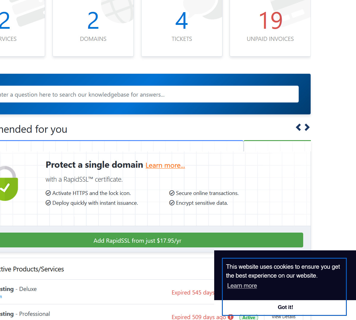
Position Bottom Right
Here you can set Cookie Consent Banner position at Bottom Right.
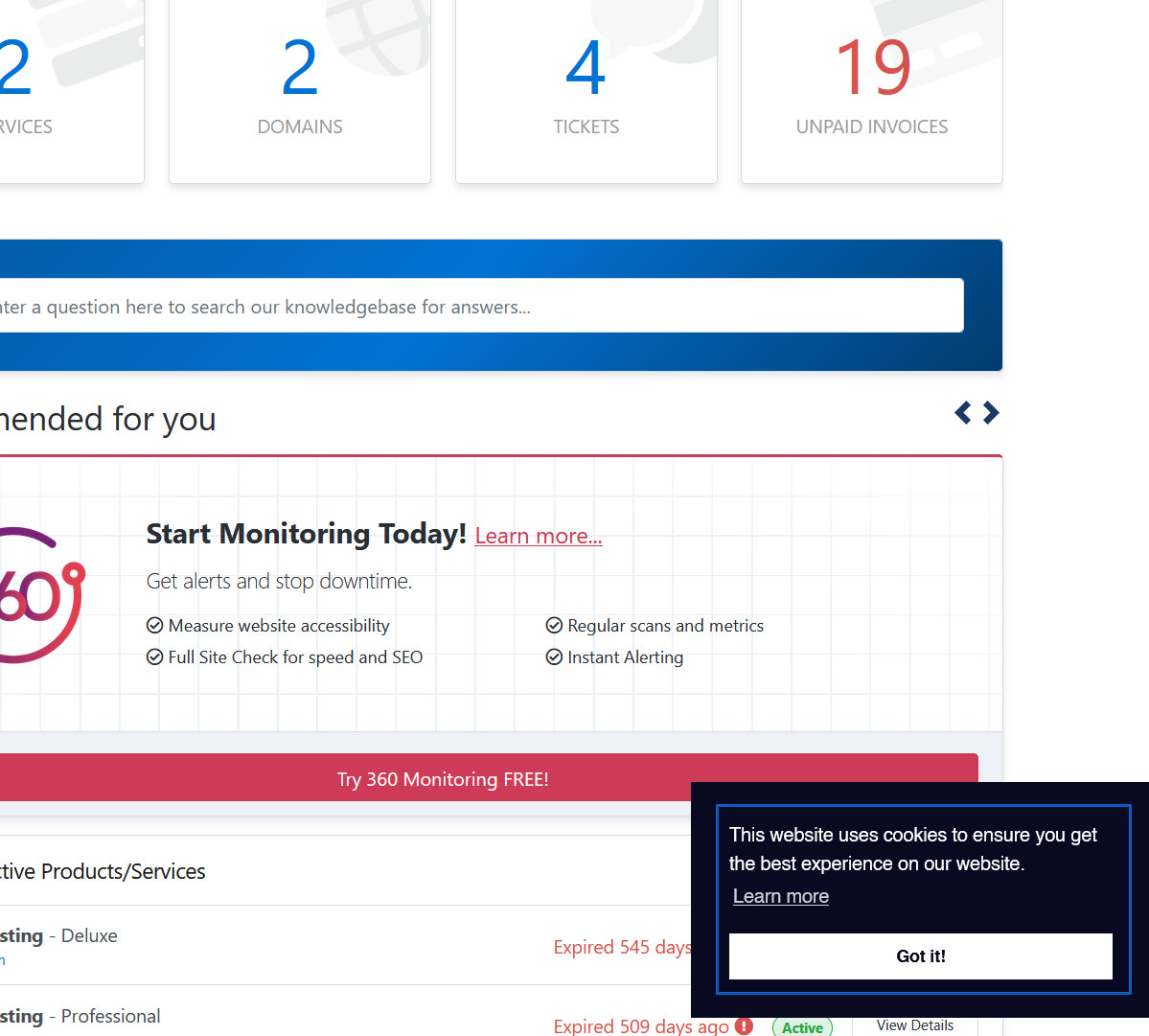
Position Bottom Right Preview
Here Cookie Consent Banner will be displayed at bottom right of page.
Layout Default
Here you can set Cookie Consent Banner layout as Default.
Layout Default Preview
Here you can see Cookie Consent Banner Default layout.
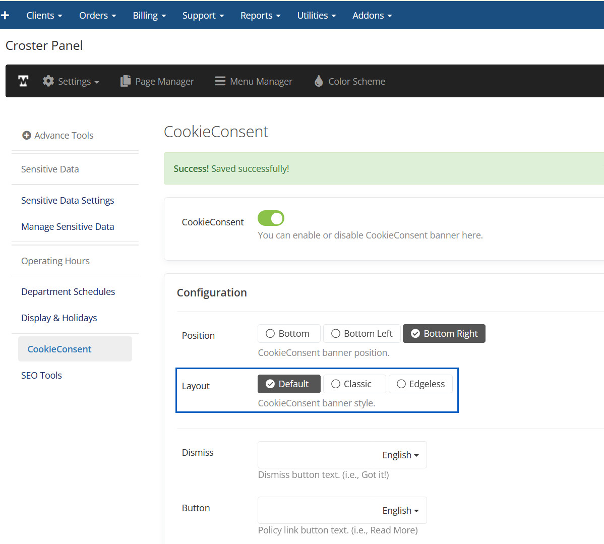
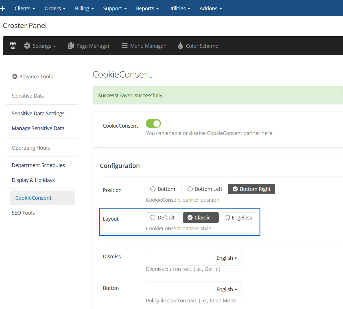
Layout Classic
Here you can set Cookie Consent Banner layout as Classic.
Layout Classic Preview
Here you can see Cookie Consent Banner Classic layout.
Layout Edgeless
Here you can set Cookie Consent Banner layout as Edgeless.
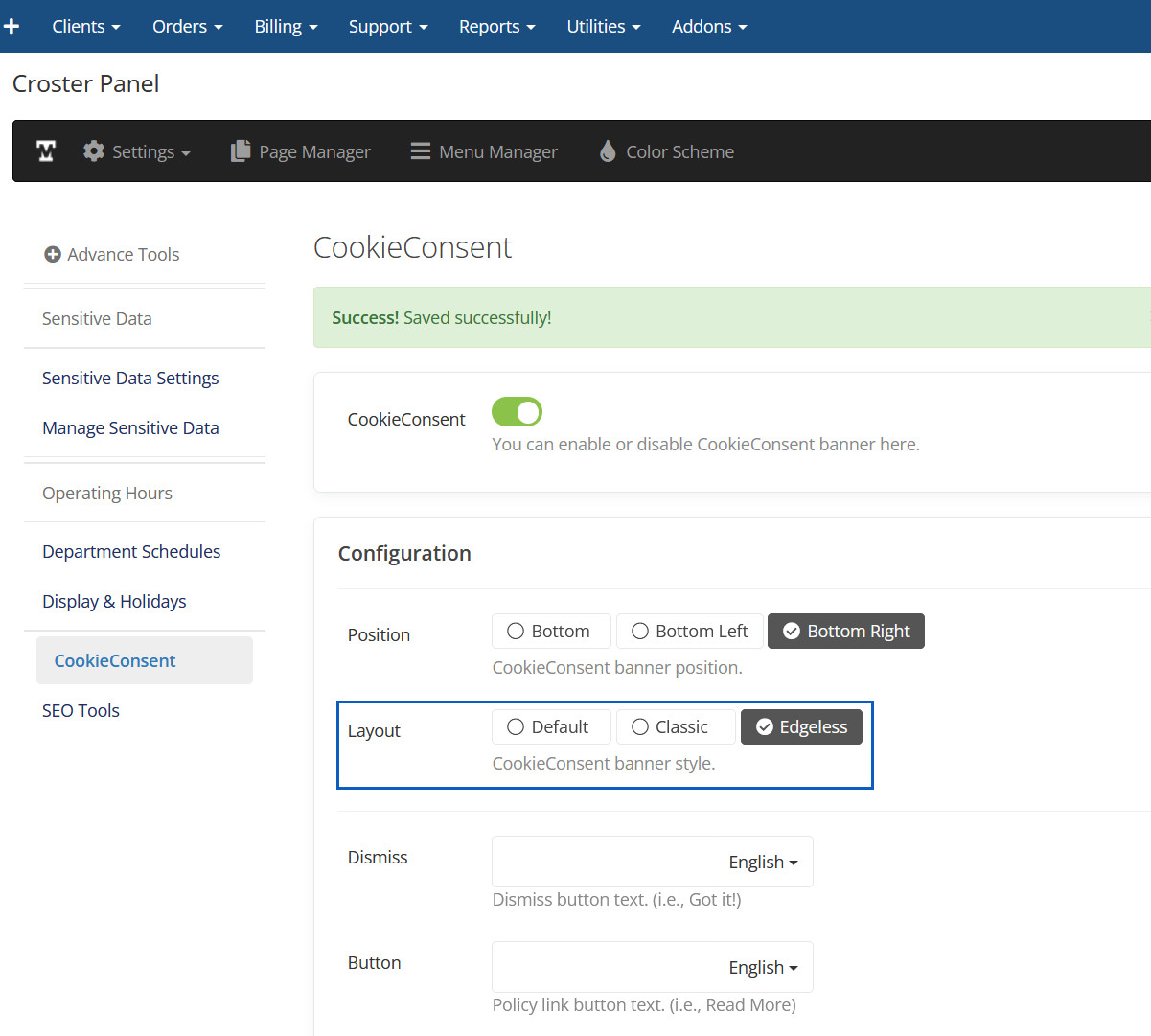
Layout Edgeless Preview
Here you can see Cookie Consent Banner Edgeless layout.
Change Cookie Content
Here you can change cookie content.
Changed Cookie Content Preview
Cookie content will be changed here.
Change Cookie Color
Here you can change cookie Color.
Changed Cookie Color Preview
Cookie Color will be changed here.
It is ideal if you don't have too many configurable options or addons. However, it does not support product bundles or multiple quantities. When activated, all order links will redirect to this.

When activated, some advanced options will appear for configuring this.
By default, only the product name is displayed. When this option is enabled, product descriptions will appear in the order form instead of the product names.

Enable below option, if you want to hide theme header and footer for this order form.

Enable below option, if you want hide only footer for this order form.

Enable this option if you want to hide the Products and Billing Cycle options when they are pre-selected in the product links, so users do not need to select them again, as shown in the example link below:

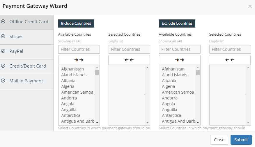
WHMCS ROOT/cart.php?a=add&pid=1&billingcycle=trienniallyShow or hide payment gateways for specific countries, and set minimum and maximum amounts on the order form.

When you click the 'Payment Gateway Wizard' button above, a modal will open to configure payment gateways according to your preference. These settings will apply only to visitors based on their selected country, not to logged-in clients.
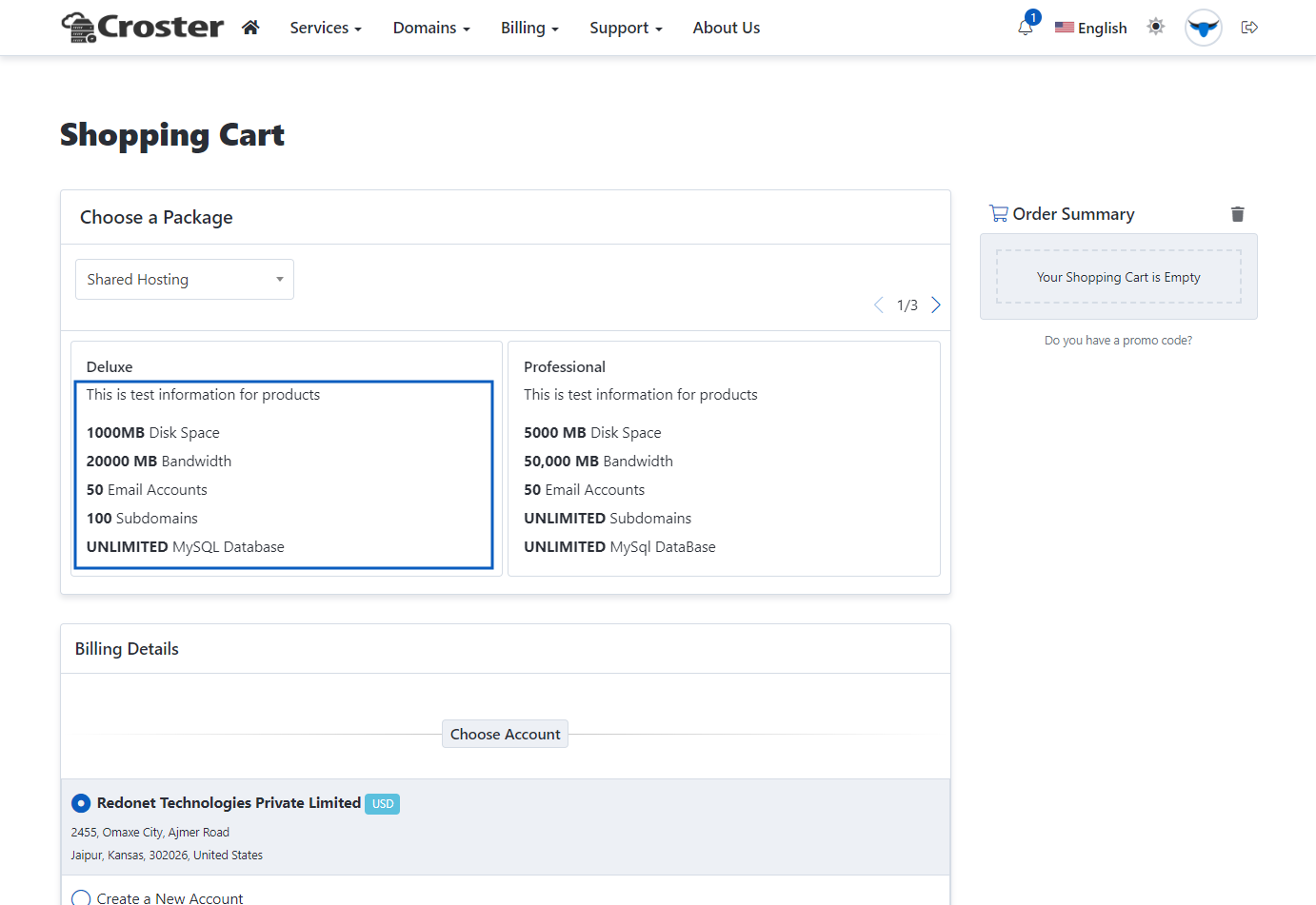
This is the Croster default order form, which is highly customized and functions like the WHMCS Standard Cart order form. The Multi-Step order form includes two types of products and domain layouts: 'Register' and 'Transfer' pages.
Two types of product page templates are included, which you can choose according to your preference.

Style 1
Style 2
Two types of domain 'Register' and 'Transfer' page templates are included, which you can choose according to your preference.

Style 1
Style 2
There are some more advanced options for both types of order forms.
Enable this option if you want to disable the Root Password input for Server/VPS type products.

Enable the first option if you want to disable the Name Servers input for Server/VPS type products. Enable the second option to hide the Name Servers inputs in the domain registration process as well.

Enable this option if you want to disable the coupon code option from the order forms.

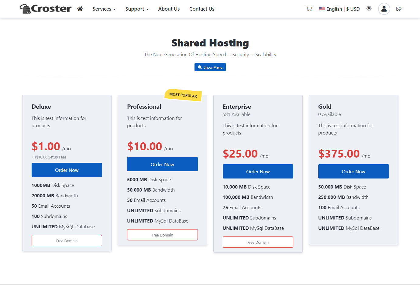
The format of product descriptions within the WHMCS Admin Products and Services interface should follow the examples provided below. Adhering to this format ensures improved visibility and consistency across all sections of our WHMCS theme.
<p>Small information for products</p>
<ul class="custom-features">
    <li><b>Unlimited</b> Website</li>
    <li><b>10 GB</b> Storage</li>
    <li><b>10,000 MB</b> Bandwidth</li>
    <li><b>Unlimited</b> Emails</li>
    <li><b>Unlimited</b> Database</li>
    <li class="features-divider"><span>Premium Features</span></li>
    <li><b>Free</b> SSL Certificate</li>
    <li><b>On-demand</b> Backups</li>
    <li><b>Priority</b> Support</li>
</ul><p>Small information for products</p>
<ul class="custom-features">
<li><i class="fal fa-folder fa-fw mr-2"></i><b>40 GB</b> Storage</li>
<li><i class="fad fa-wifi-2 fa-fw mr-2"></i><b>800 GB</b> Bandwidth</li>
<li><i class="fal fa-users fa-fw mr-2"></i><b>25</b> cPanel Accounts</li>
<li><i class="fal fa-envelope fa-fw mr-2"></i><span class="underline" data-toggle="tooltip" data-placement="top" title="Tooltip message">Unlimited</span> Emails</li>
<li class="features-divider"><span>Premium Features</span></li>
<li><b>Free</b> <span class="underline" data-toggle="tooltip" data-placement="top" title="Now with our Free SSL you get added security and can gain your customers' trust on your website.">SSL Certificates<span></li>
<li><b>On-demand</b> Backups</li>
<li><b>Priority</b> Support</li>
</ul><ul class="custom-features">
<li><b>1 GB</b> RAM</li>
<li><b>20 GB</b> Storage</li>
<li><b>1 TB</b> Bandwidth</li>
<li><b>10</b> Snapshots</li>
</ul><ul class="custom-features type-2">
<li><b><i class="fal fa-microchip fa-fw mr-2"></i>2.4 Ghz</b> (4 Core/8 Threads)</li>
<li><b><i class="fad fa-memory fa-fw mr-2"></i>16GB</b> Memory</li>
<li><b><i class="fad fa-hdd fa-fw mr-2"></i>500 GB</b> SSD RAID 1<span data-toggle="tooltip" data-placement="top" title="RAID-1 disks ensure that your data is protected, through a disk subsystem which records your data on two different drives, this is called 'Mirroring'. If one drive fails, the second drive is used. This ensures that your Dedicated Server never fails."><i class="fas fa-info-circle text-primary"></i></span></li>
<li><b><i class="fad fa-wifi-2 fa-fw mr-2"></i>10 TB</b> 1GBPS Trasnfer</li>
</ul>Below example, the default format of product descriptions within the WHMCS admin Product and Services interface to improve visibility across all areas of the Croster theme, including WHMCS bundled order forms.
Disk Space: 1000MB
Bandwidth: 5GB
Email Accounts: 5
Subdomains: 3
Addon Domains: 1
Free SSL Certiface:
Softaculous Auto Installer:

And a further text description can go here to be displayed before the pricing and highlights...
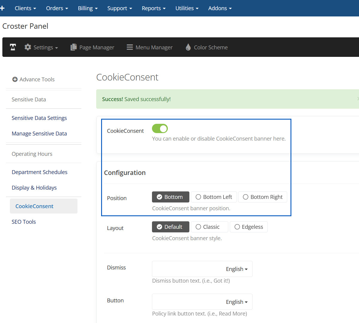
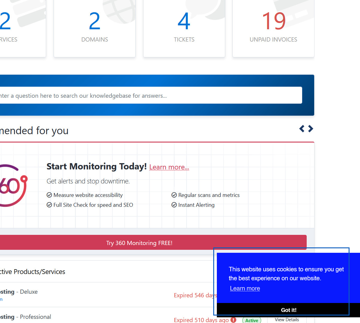
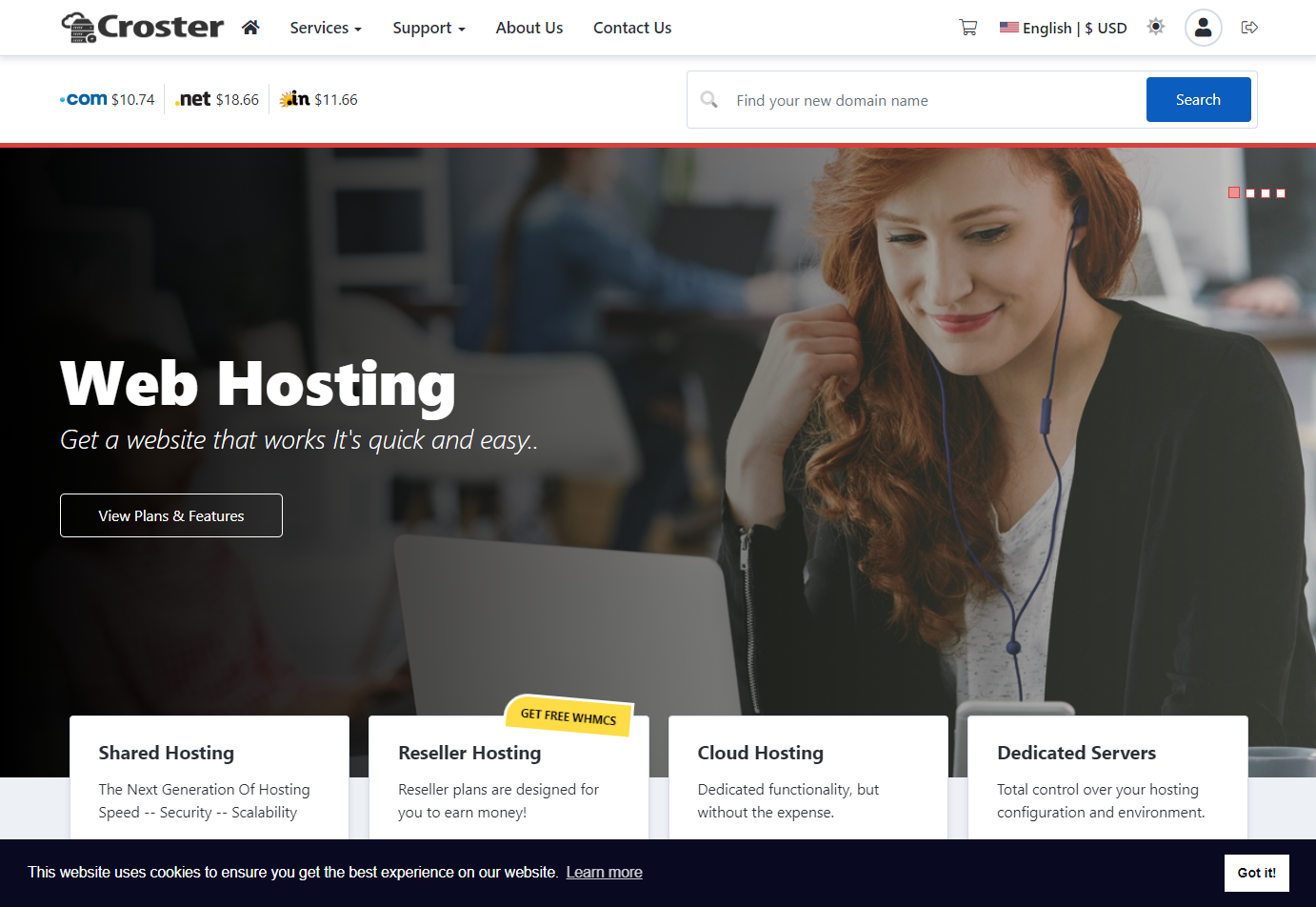
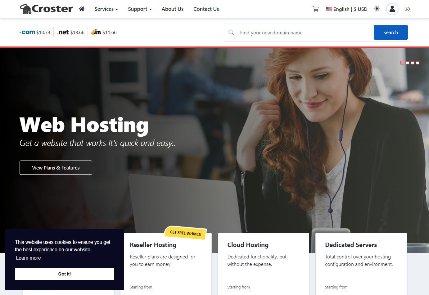
Enable this option to display a Cookie Consent banner on the website.


You can configure the banner easily using the options below.

Default
Classic

Edgeless


Bottom
Bottom Left
Bottom Right
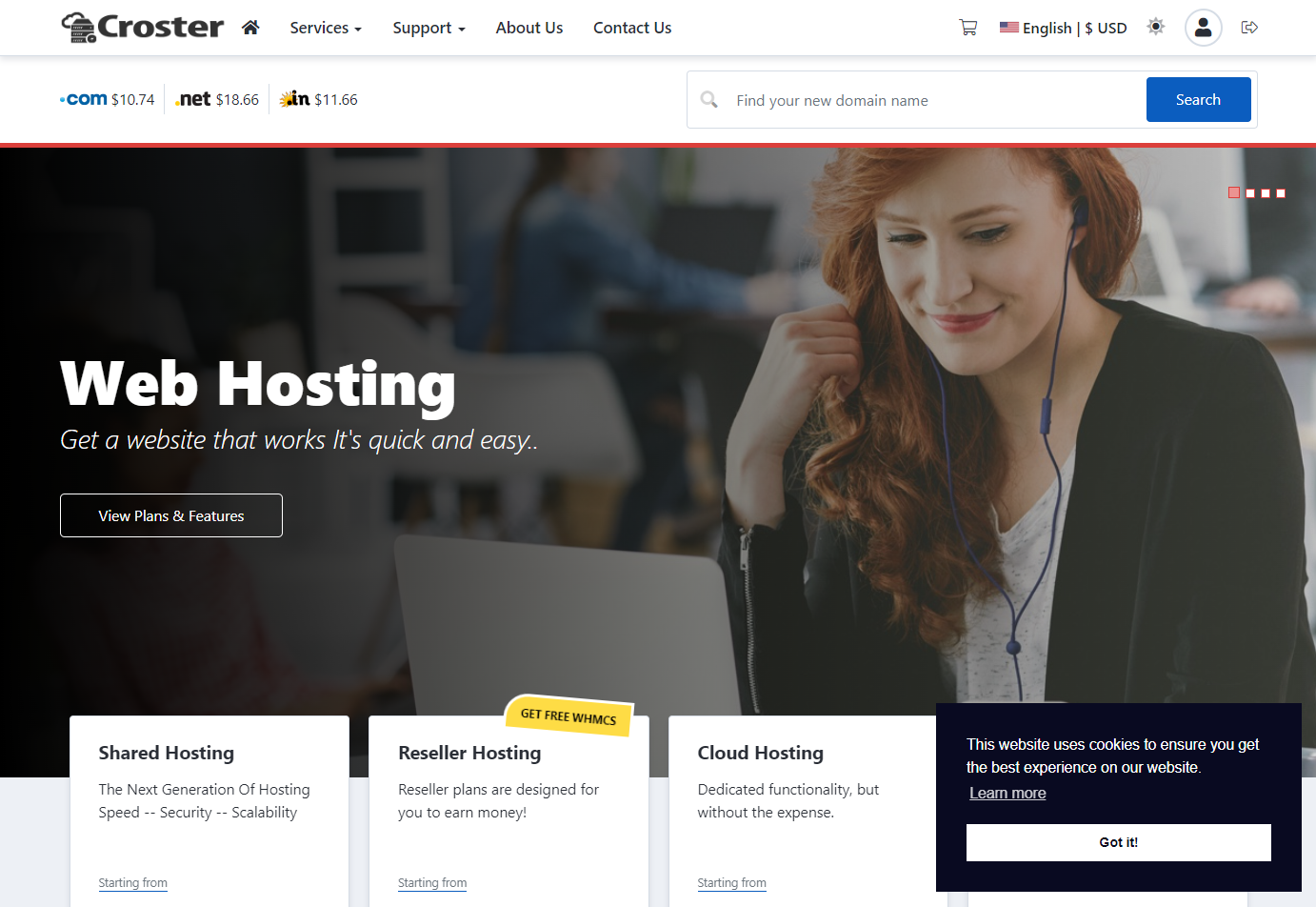
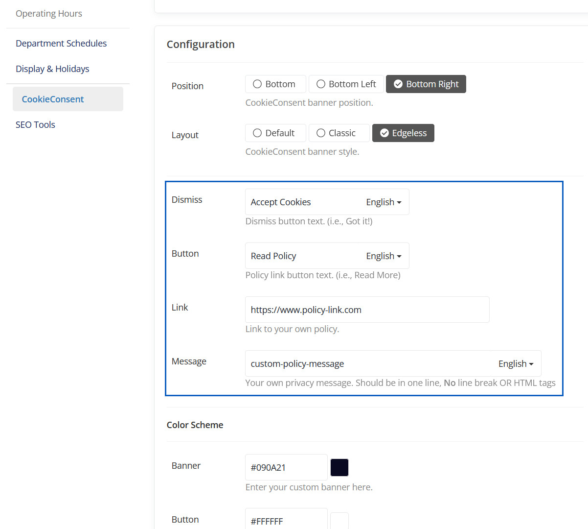
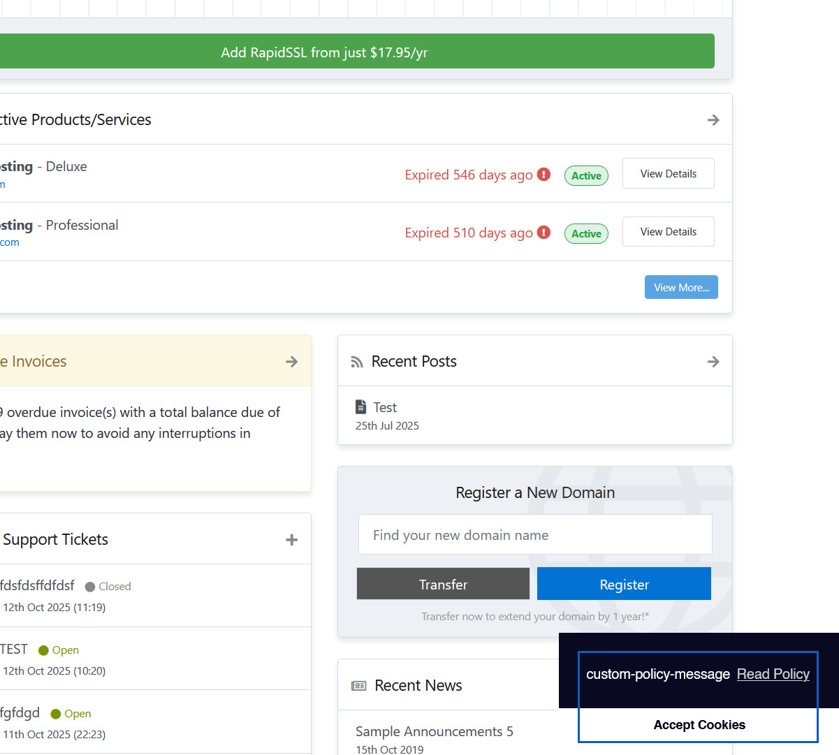
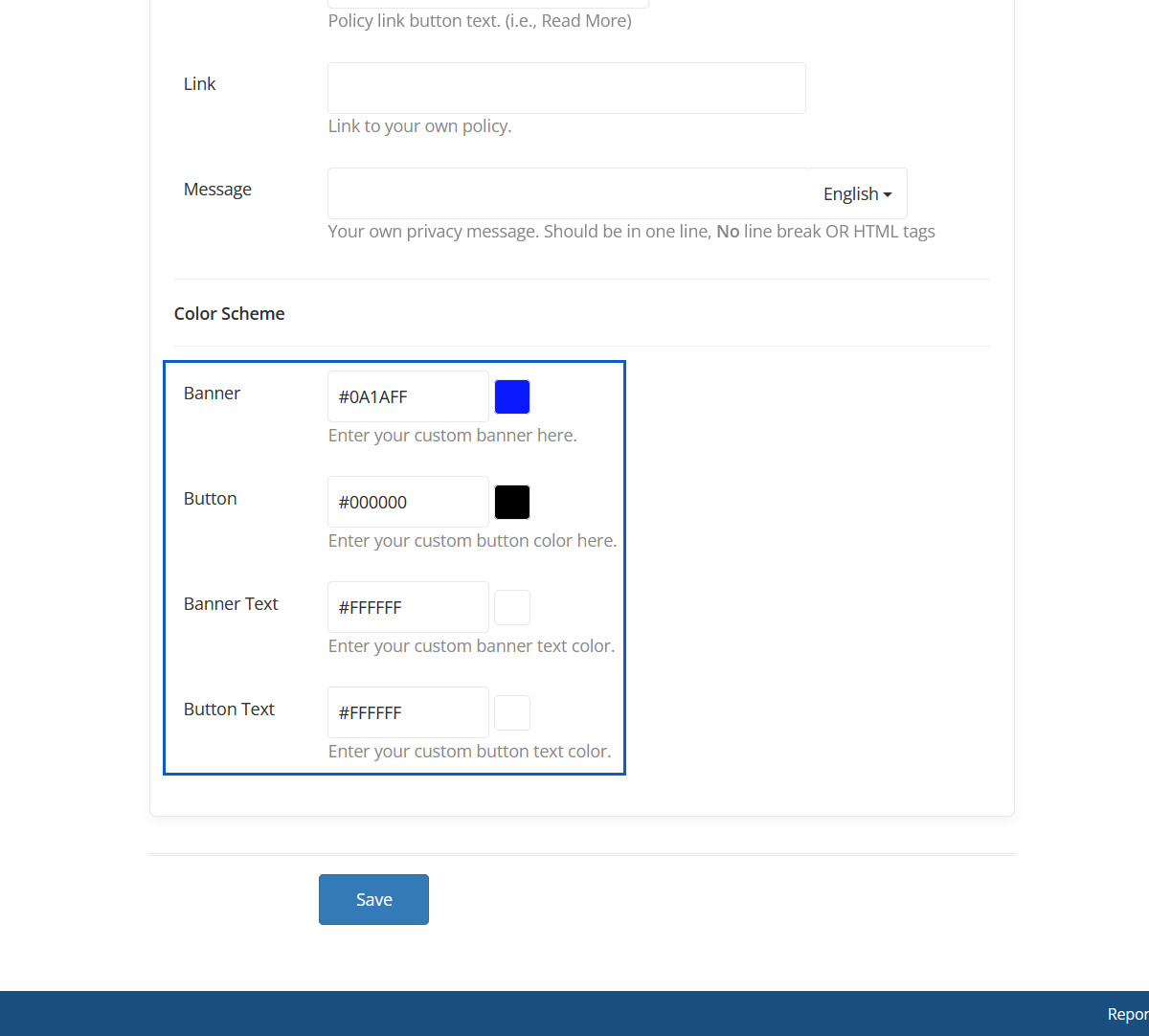
From the input below, you can change the Dismiss button text from 'Got It' to your preferred text.

From the input below, you can change the 'Learn more' text in your preferred text.

From the input below, you can change the 'Learn more' link in your preferred link.

From the input below, you can customize the 'Message' to your preferred text.

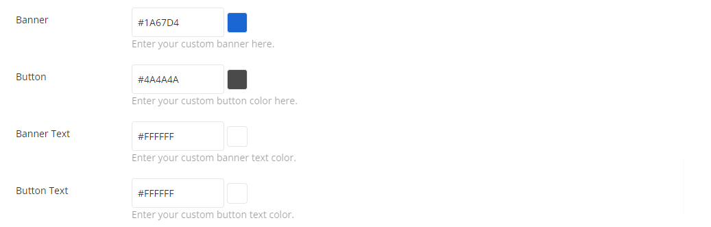
From the options below, you can change the banner color scheme according to your preference.

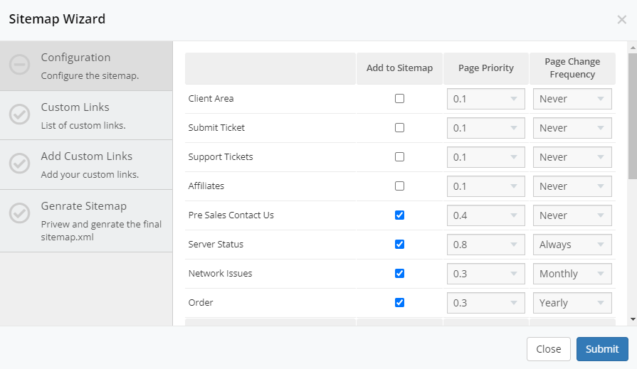
Croster includes a Sitemap wizard to easily generate an XML sitemap for your website.

When you click the 'Sitemap Wizard' button above, a modal will open to configure the Sitemap, as shown below.
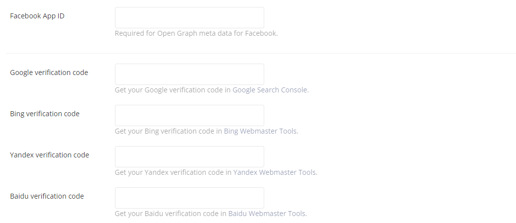
In the input fields below, you can add your Facebook App ID, which is required for Open Graph information on Facebook, as well as any other search engine webmaster tools IDs.
When you enable below option, the origination information is included in Google Schema format for your website.

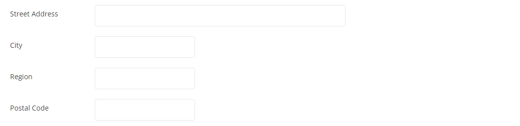
When you enable the option below, the address options will appear.

When you enable the option below, the Social meidla links options will appear.


This article delves into the various section types available, enabling you to design dynamic and engaging web pages. Discover how to leverage these flexible building blocks to create a distinctive online presence that truly connects with your audience.
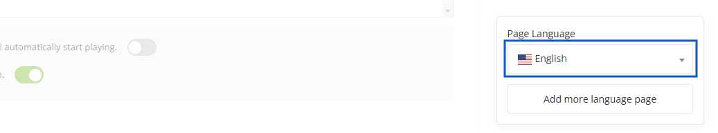
<title> tag, when SEO Title is not provided.From the option below, you can change the language of the page or add another language page for translation.
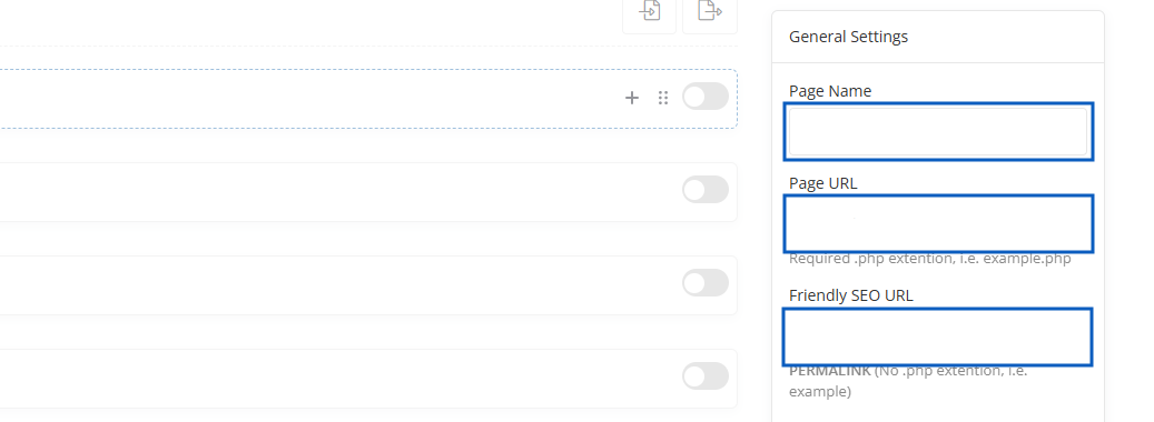
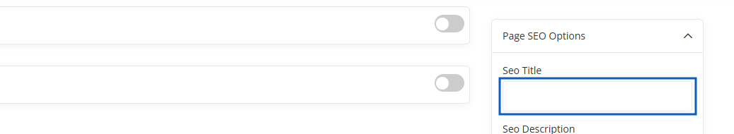
Place page title which will be added to the <title> tag in your page HTML code. This title will be used by search engines, while listing your page in search result.
Croster, will automatically generate additional tags, generated from this title:
og:title - Learn more about Open Graph protocoltwitter:title - Learn more about Twitter CardsA one to two sentence description of your page.

Croster, will automatically generate additional tags, generated from this description:
og:description - Learn more about Open Graph protocoltwitter:description - Learn more about Twitter CardsNo Longer a Ranking Factor for Google, Still Useful for Other Search Engines: Some smaller search engines or platforms (like Bing or Yahoo) might still consider the meta keywords tag, but they also rely on other factors like content, links, and user engagement.


An image URL which should represent your object within the graph.

The tag is part of the Open Graph (OG) Protocol, which is used to enhance the appearance and sharing experience of your content on social media platforms like Facebook, Twitter, and LinkedIn. While it doesn't directly impact SEO rankings, it plays an important role in social media visibility and user engagement.
If you are not sure about this, just add website in this option.

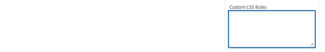
If you want to add custom CSS rules for a specific page, use this option.
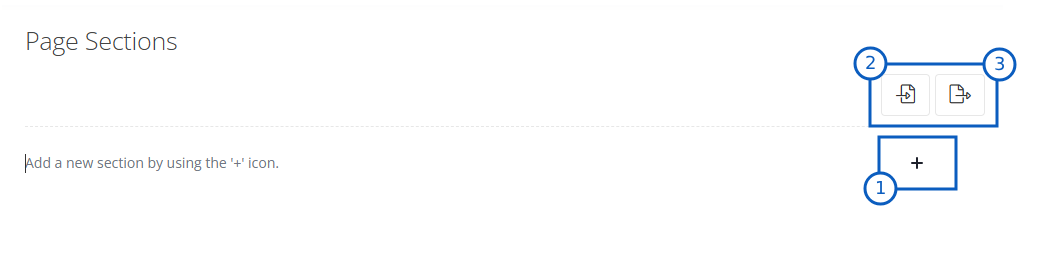
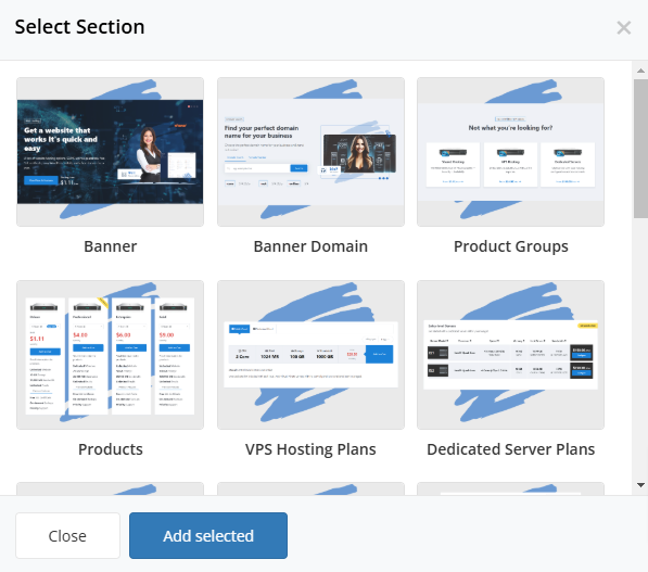

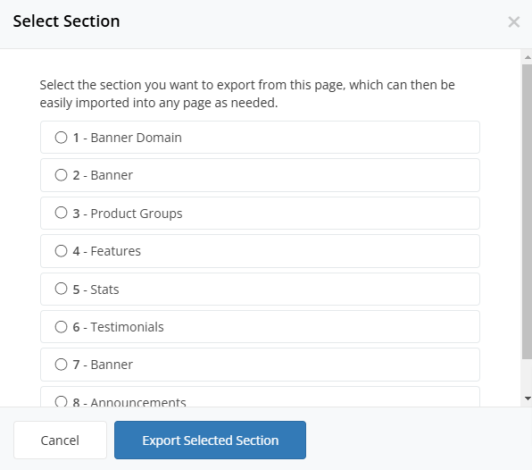
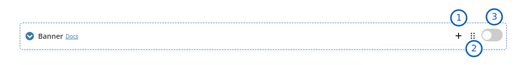
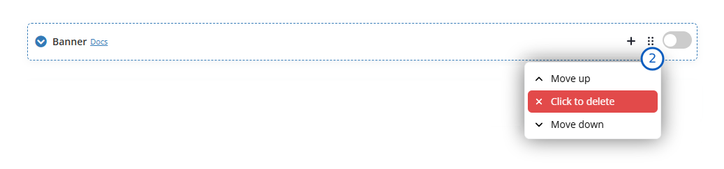
You can manage each section using the options below.
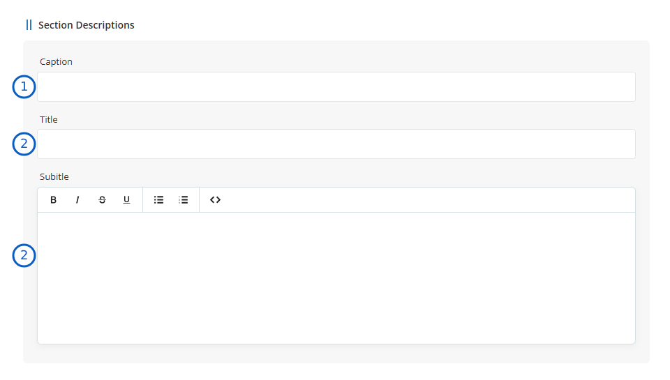
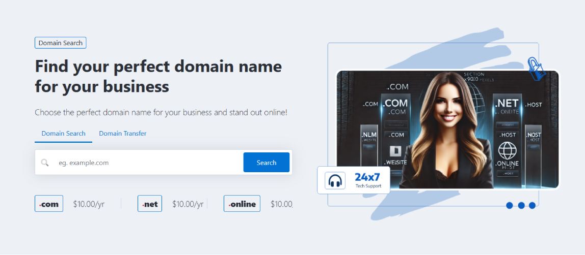
<h1> or <h2> tag depending on the section's position. If the section is the first one, it uses <h1>; otherwise, it uses <h2>. HTML tags are allowed in this field.The infromation from the section above will be displayed as depicted below:
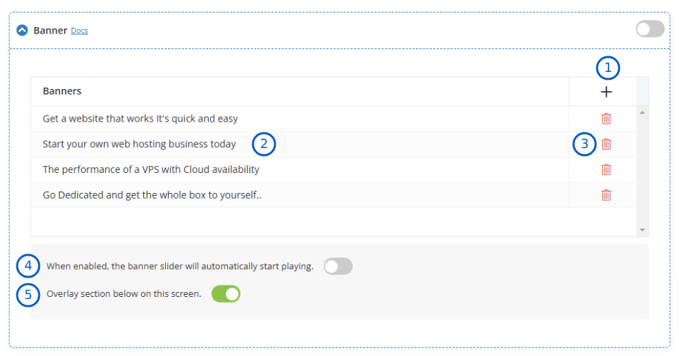
When you add or edit an item, a modal opens, allowing you to modify the banner contents, as shown below.
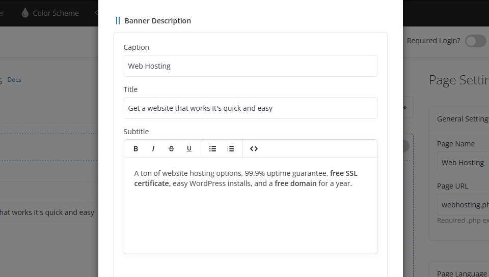
<h1> or <h2> tag depending on the section's position. If the section is the first one, it uses <h1>; otherwise, it uses <h2>. HTML tags are allowed in this field.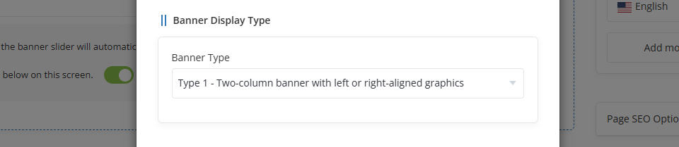
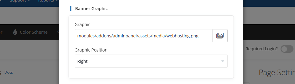
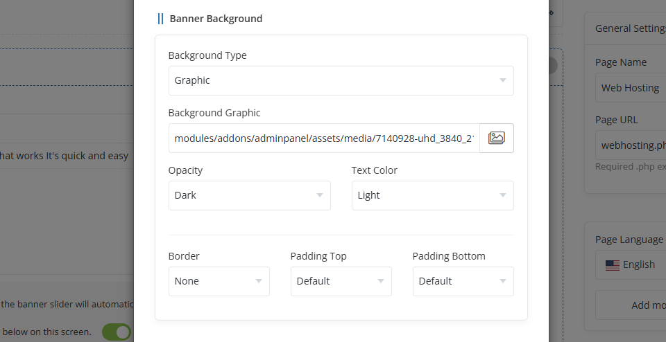
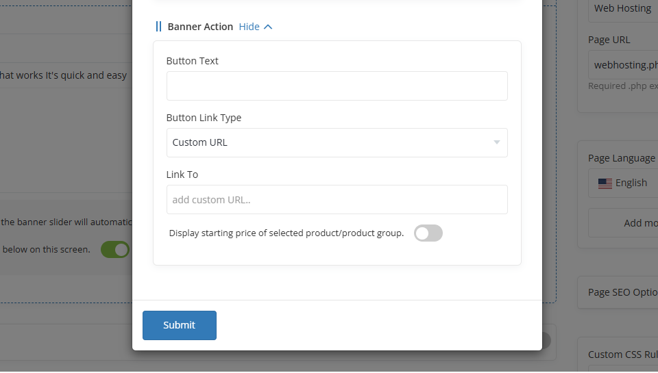
The infromation from the section above will be displayed the banner as depicted below:
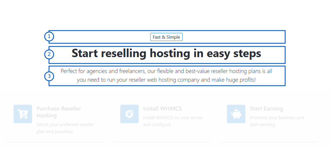
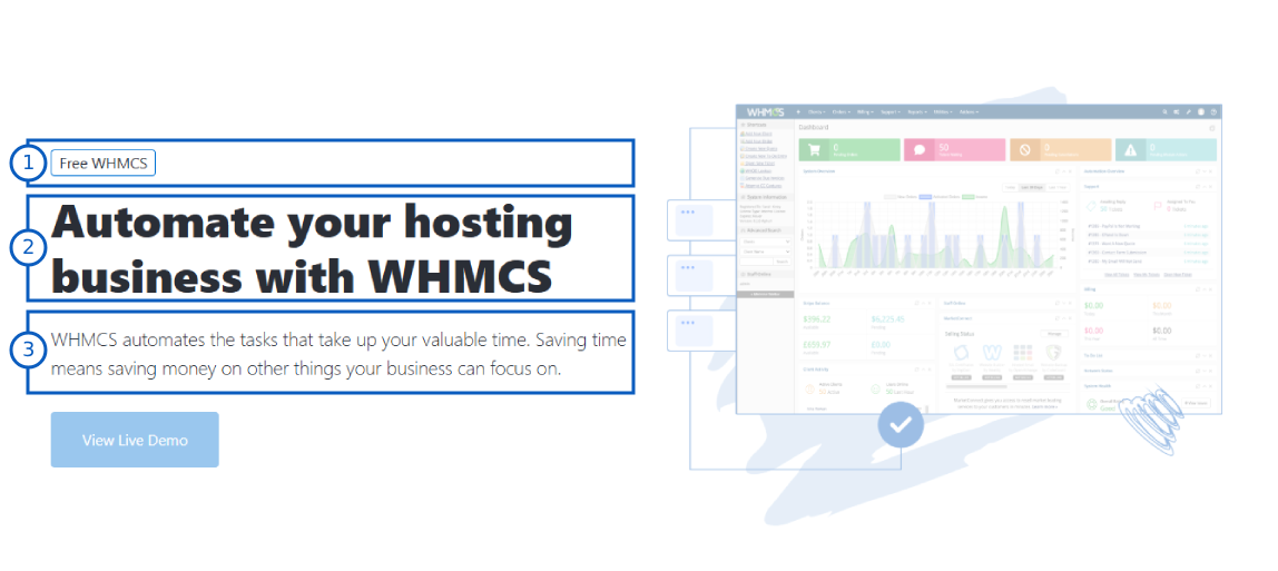
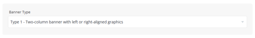
Type 1: Two-column banner with left or right-aligned graphics.
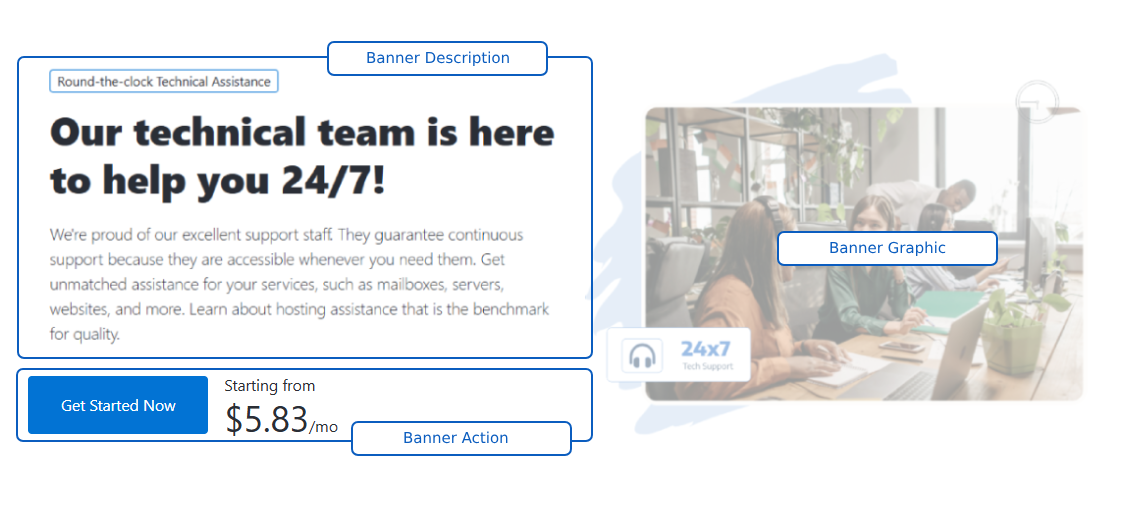
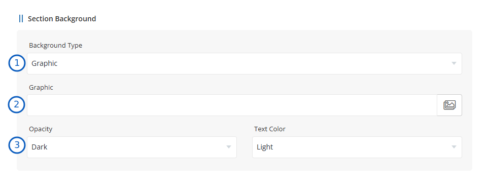
Type 2: Centered single column without graphic, background type is graphic.

Banner Type - From the below option, you can select the desired banner type from the options below:


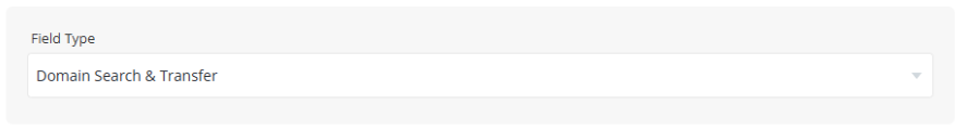
Field Type - From the options below, you can select the desired Domain Field Type:
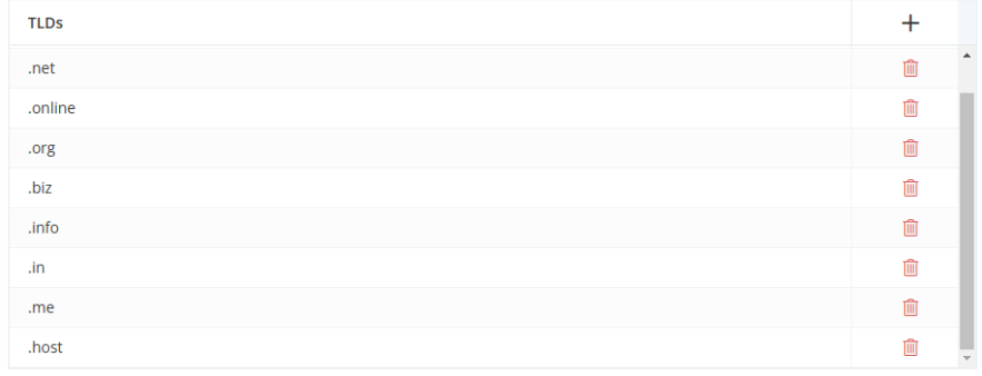
TLDs - By clicking the "+" icon, you can add TLDs to show in banner.
For the remaining options, please refer to the Common Setings.
documentions is in progress...
documentions is in progress...
documentions is in progress...
documentions is in progress...
documentions is in progress...
documentions is in progress...
documentions is in progress...
documentions is in progress...
documentions is in progress...
documentions is in progress...
documentions is in progress...
documentions is in progress...
documentions is in progress...
documentions is in progress...
documentions is in progress...
documentions is in progress...
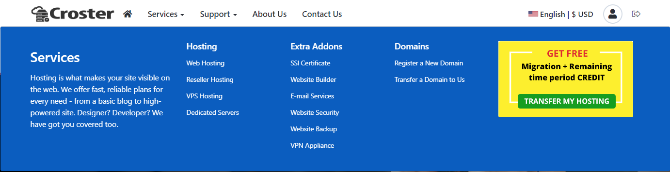
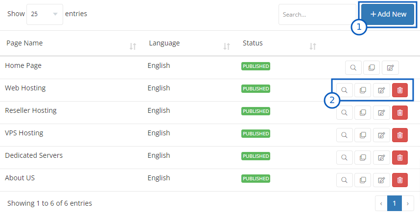
The Croster WHMCS Theme offers a predefined list of menus for each menu type. These menus can be managed under the "Menu Manager" in the "Croster Panel" addon.
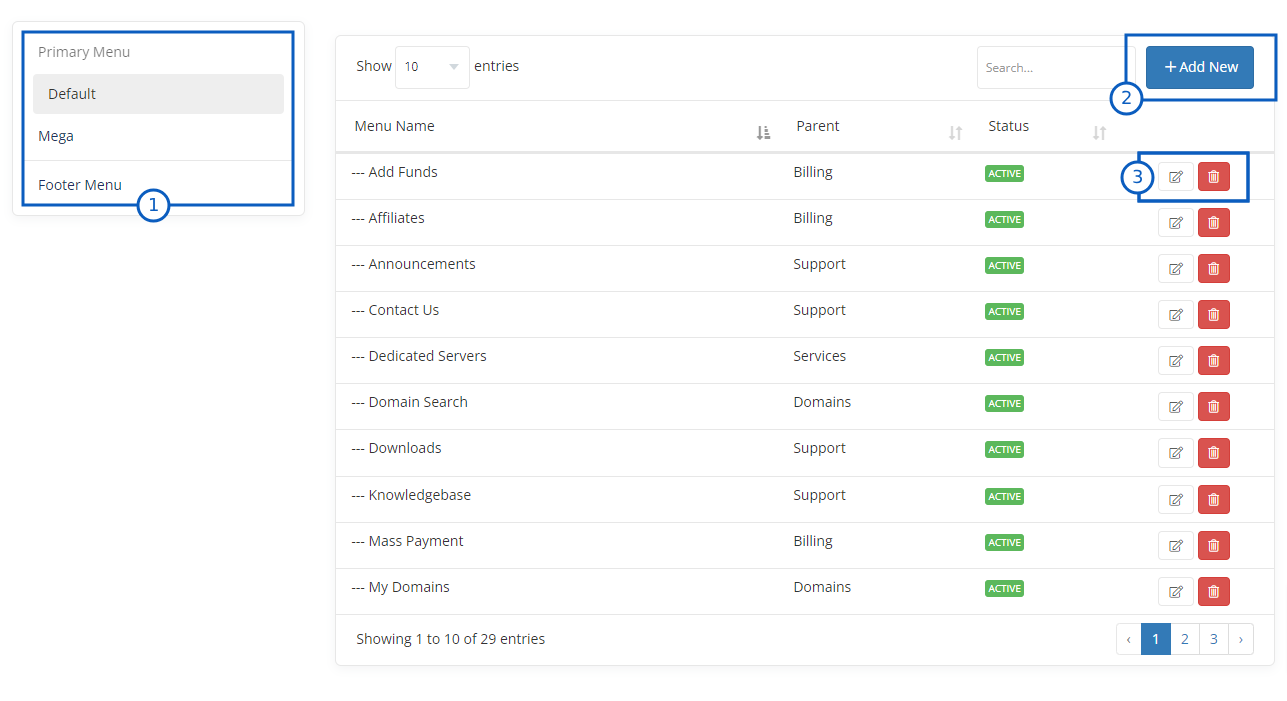
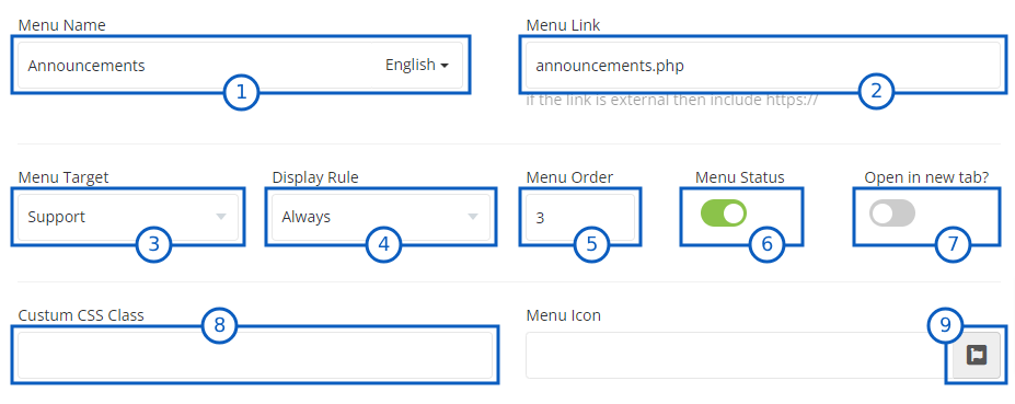
When you click on Add New buttn OR icon you wil get belwo shown section to add or edit new menu items.
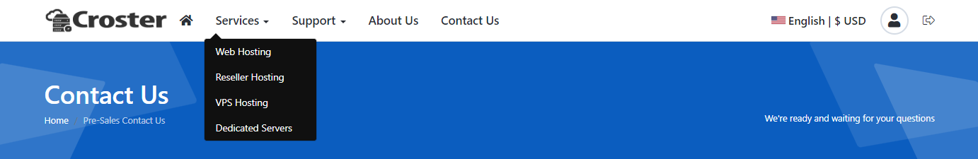
fad fa-life-ring text-dangerWhen you enable the Mega Menu, the main menu style in the website header will be changed to the Mega Menu style.

Once enabled Mega Menu option, you will see management options as follows:
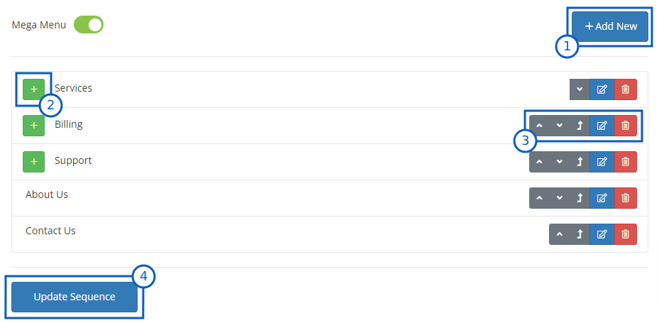
When you click on Add New buttn OR icon you wil get belwo shown section to add or edit new menu items.
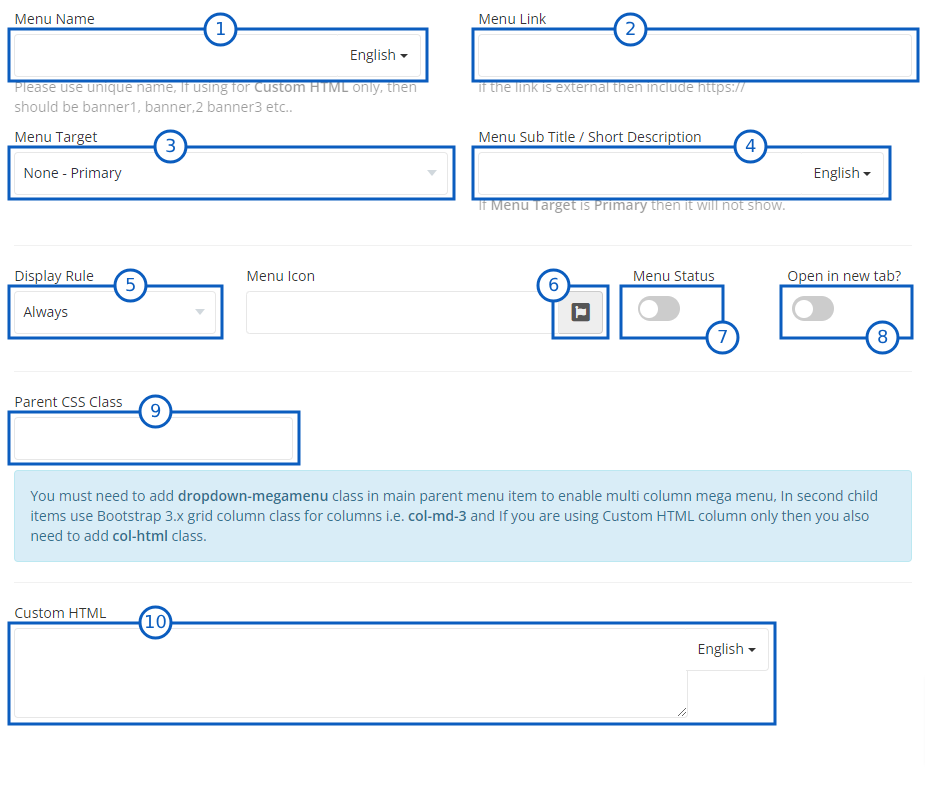
fad fa-life-ring text-dangerdropdown-megamenu class in main parent menu item to enable multi column mega menu, In second child items use Bootstrap 3.x grid column class for columns i.e. col-md-3 and If you are using Custom HTML column only then you also need to add col-html class. For example, you can check the pre-made Services and its child items Service Banner, Hosting, Extra Addons and Domains menu items.
To enable the Color Scheme Setting Panel, please enable the Develoepr Mode.

Once you enable the above options, visit the client area as an admin. There, you will see the Color Settings Panel below, where you can change the color scheme according to your preference.
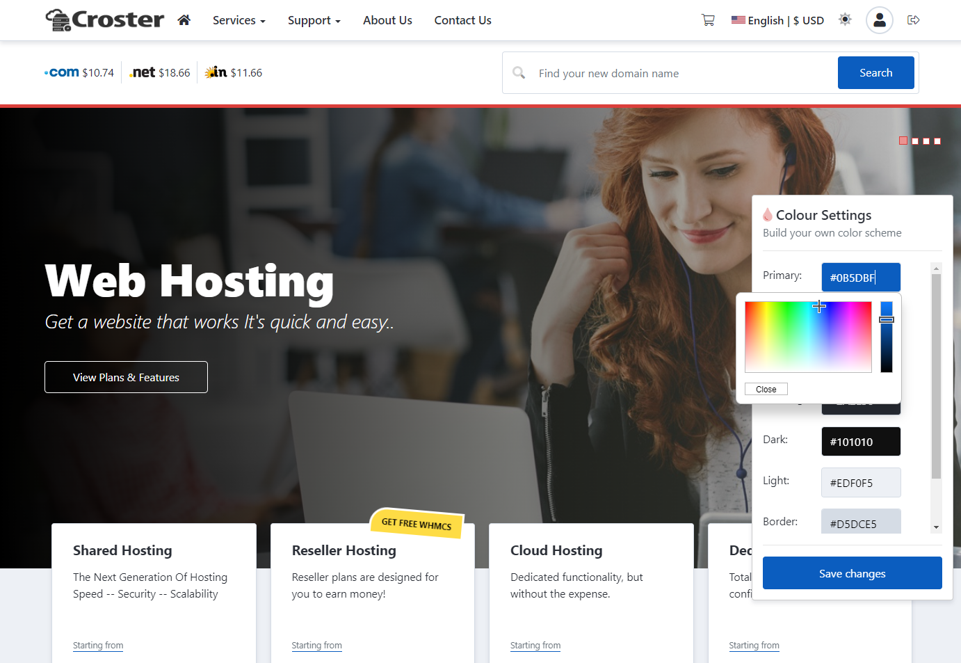
In some server configurations, errors may occur when saving the color scheme.
If none of the above steps resolve the issue, check the PHP or Apache logs to identify the underlying problem. Contact your server administrator for assistance in resolving the issue.
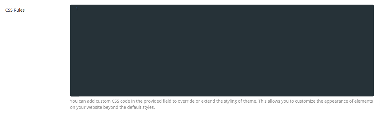
In the textarea input below, you can add your custom CSS code, which will be applied to the entire website.
Released: Oct 17th, 2025
Compatible: 8.13.1
PHP: PHP 8.1, 8.2 or 8.3
Released: May 9th, 2025
Compatible: 8.13.1
PHP: PHP 7.2, 7.3, 7.4, 8.1, 8.2 or 8.3
Compatible: with WHMCS 8.11.2, 8.12.1
Released: April 3rd, 2025
Compatible: WHMCS 8.11.2, 8.12.0
PHP: PHP 7.2, 7.3, 7.4, 8.1, or 8.2
Compatible: with WHMCS 8.11.2, 8.12.0
Compatible: with WHMCS 8.11.1
Compatible: with WHMCS 8.9.x
Compatible: with WHMCS 8.8.x
Compatible: with WHMCS 8.8.x
Compatible: with WHMCS 8.7.x
Compatible: with WHMCS 8.6.x