Common Settings
Below are common settings for all sections and available for all type of sections.
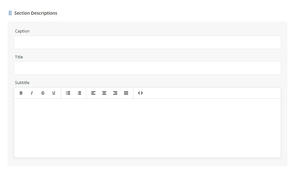
- Caption: By using the + icon, you can add a new section directly below the current section.
-
Title: The section title is placed in an
<h1><h2><h1><h2> - Subtitle: Section subtitle, where content can be customized using small text editor for simple HTML tags.
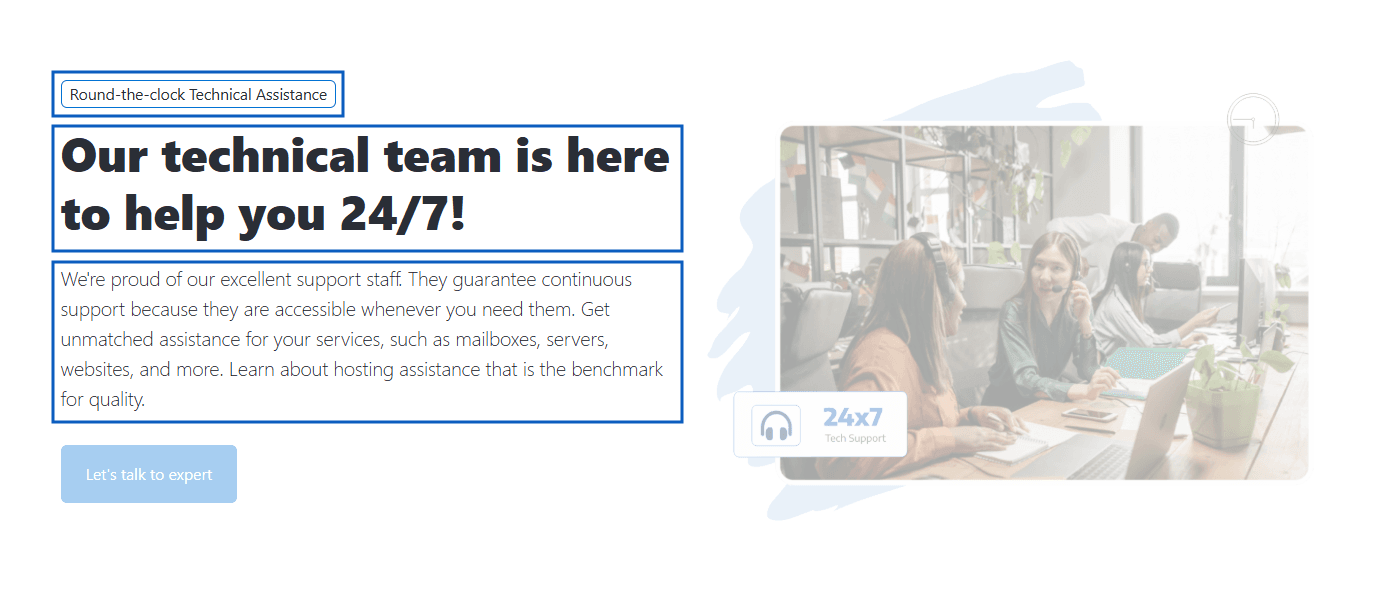
Preview- Section descriptions
Croster provides two Section Styles layouts depending on the section type.
The following sections use the Standard Section Styles layout:
Product, Product Group, VPS Hosting Plans, Dedicated Service Plans, Key Features, FAQs, Testimonials, Team Members, Text/HTML Editor, and News & Articles.
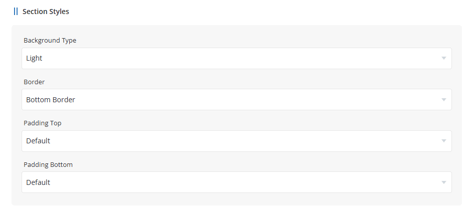
- Background Type - Select the background style "Light" or "None" for used for the section.
- Border - Choose border position "Border Top" OR "Border Bottom".
- Padding Top - Configure the spacing above the section content.
- Padding Bottom - Configure the spacing below the section content.
Paddings are Default (120px), 60px, 30px, or no padding.
All other section types use the Advanced Section Styles layout.
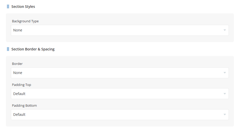
Background Type - Select the background style used for the section.
- None
- Primary
- Light
- Dark
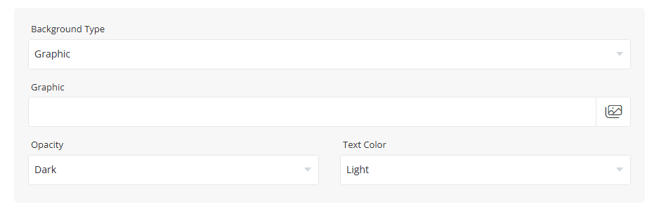
- Graphic
When Graphic is selected as the Background Type, additional settings are displayed, allowing you to select a background image, configure its opacity, and choose the appropriate text color for the section.
Section Border & Spacing
- Border – Choose whether a border should be displayed and its position.
- Padding Top – Configure the spacing above the section content.
- Padding Bottom – Configure the spacing below the section content.
Paddings are Default (120px), 60px, 30px, or no padding.
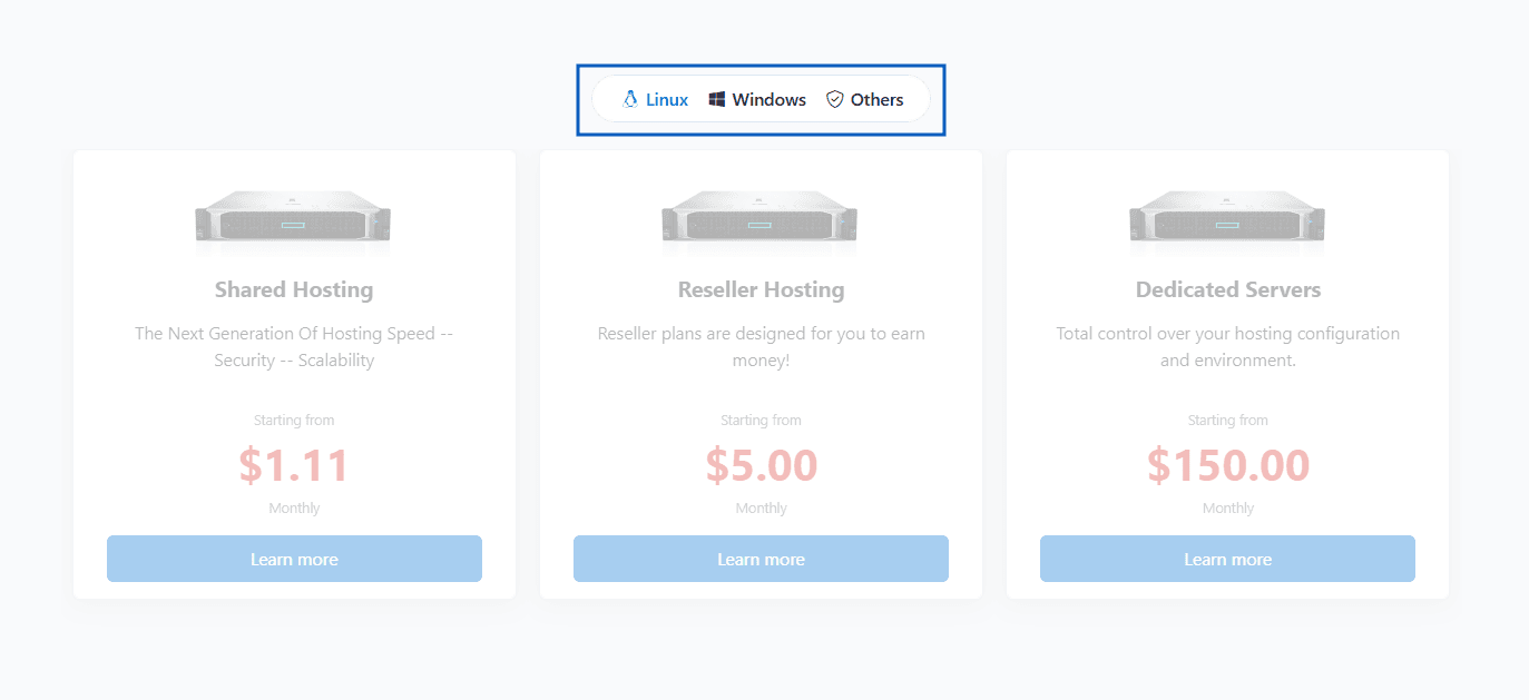
The Tabs control the appearance and behavior of the tab navigation displayed on the frontend. These settings are available in sections that support multiple content groups, including Features, Stats, FAQs, Gallery, Products, and Product Groups.
Tabs allow visitors to quickly switch between different groups of contents.
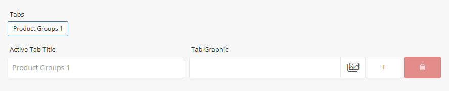
- Tabs -Displays the list of configured tabs.
- Active Tab Title - Enter the title displayed for the selected tab.
- Tab Graphic - Upload or select an icon/image to display alongside the tab title.
- Add Tab - Click the [+] icon to create a new tab.
- Delete Tab - Click the Delete icon to remove the selected tab.
Once a new tab is added, a dedicated content grid will be created for that tab. You can then add and manage products, FAQs, features, gallery items, statistics, or other supported content independently within each tab.
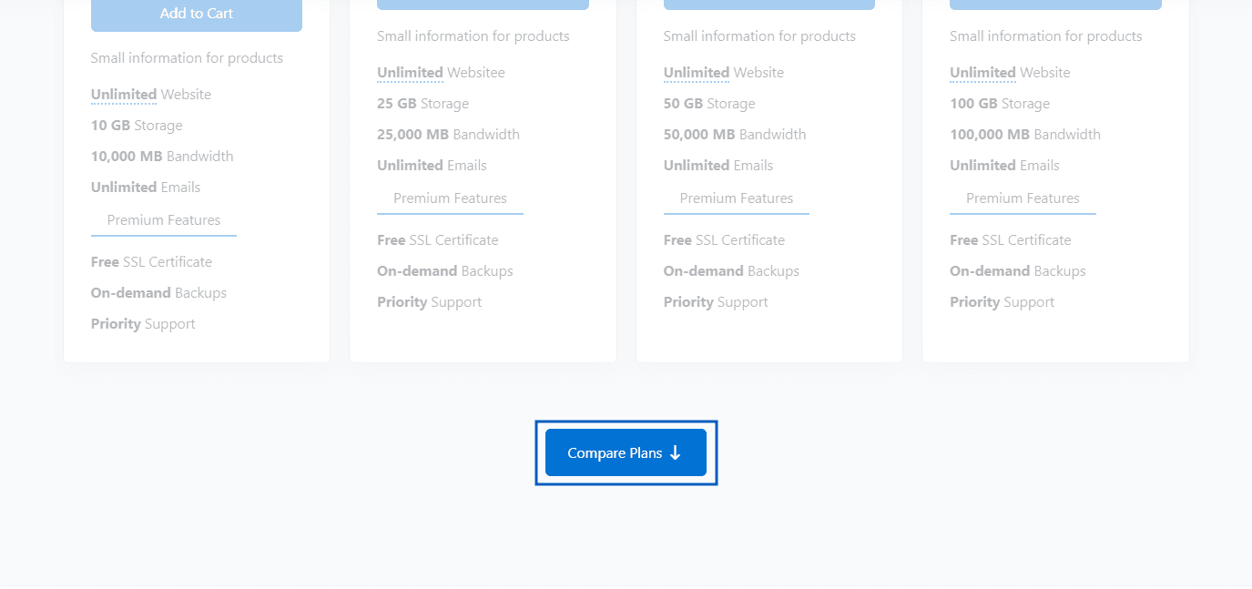
The Section Action settings allow you to create a call-to-action button for the section. You can customize the button text, icon, style, and destination link.
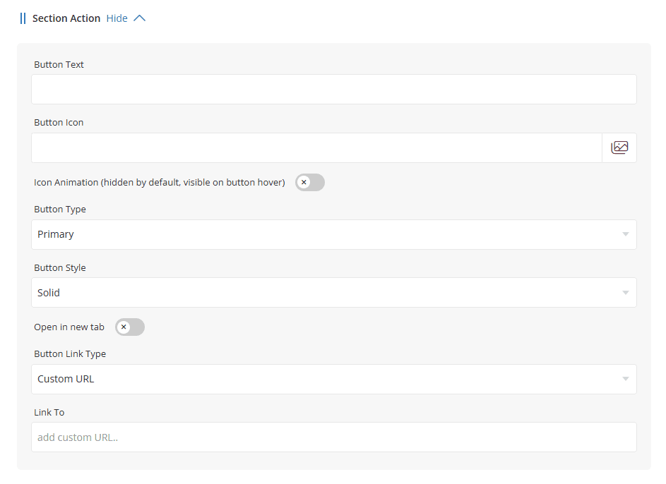
Button Text - Enter the text that will be displayed on the button.
Button Icon - Select an icon to display alongside the button text.
Icon Animation - Enable this option to display the icon animation effect. When enabled, the icon remains hidden by default and becomes visible when the user hovers over the button.
Button Type - Select the button color scheme to use. Available options correspond to the button styles configured in the Style Manager, such as Primary, Secondary, Success, Warning, Danger, Info, and Dark.
Button Style - Choose the button appearance style. Available options may include styles such as Solid, Outline, or other theme-specific variations.
Open in New Tab - Enable this option to open the button link in a new browser tab when clicked.
Button Link Type - Select the type of link that the button should use.
Common options include:
- Custom URL - Link to any external or internal URL.
- Page - Link to a page created in the Page Manager Or WHMCS Pages.
- Product - Link directly to a WHMCS product.
- Product Group - Link to a product group page.
Link To - Specify the destination for the button. The available options depend on the selected Button Link Type. For example, if Custom URL is selected, enter the target URL in this field. You can also use an anchor link (such as #sec-2) to smoothly scroll visitors to a specific section of the current page.
Preview - Section Action
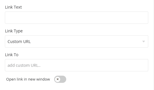
- Link Text/Button Text - In this field, you can add custom text for the button or link.
- Link Type/Button Type - This option allows you to select the link type for the button or link. You can choose from the following options: Custom URL, Page, Product Group, or Product.
- Link To - This option allows you to select a link based on the type chosen in the above section. For example, if you select "Product Group," it will display a list of all active product groups for you to choose from. When Custom URL is selected, enter the desired URL in this field. You can also use an anchor link (for example, #sec-2) to smoothly scroll visitors to a specific section on the same page.