Section Gallery
The Gallery Section allows you to showcase images, portfolios, projects, datacenter photos, products, games, or any visual content in an attractive gallery layout. Multiple gallery styles and tab support make it easy to organize and present images in a visually engaging way.
For a live example of the Gallery Section, please visit the demo website.
The Gallery Settings section provides options to control the layout and display of gallery items within the section.
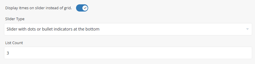
- Display Items as Slider - Enable this option to display gallery items in a slider layout instead of a grid layout.
- Slider Type - Select the slider navigation style used when the grid layout is disabled.
- List Count - Specify the number of gallery items displayed per row or within a single slider view.
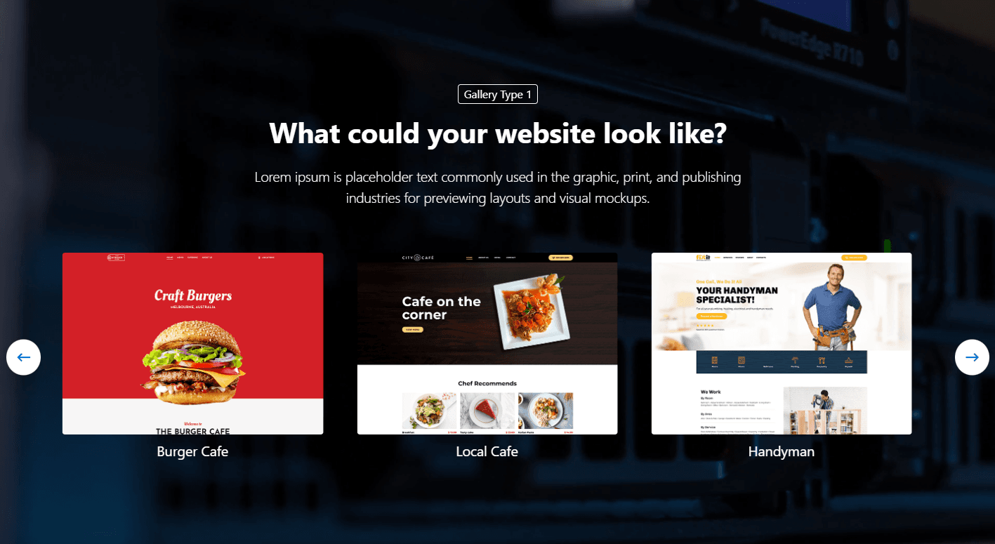
Preview - Gallery Slider Layout
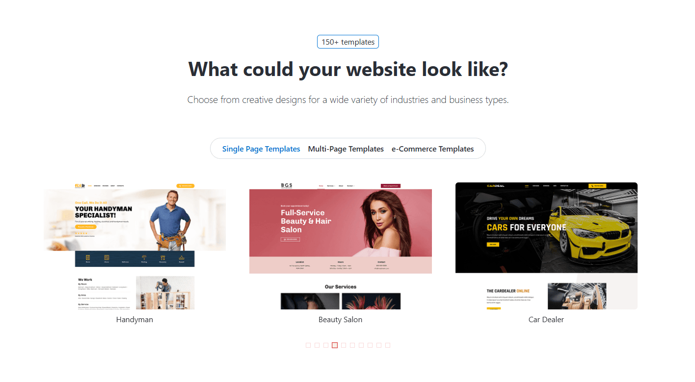
Preview - Gallery Grid Layout

The Gallery Tabs settings allow you to organize gallery items into multiple tabs. Each tab can contain its own set of gallery items and settings. These settings are identical to the section Tabs. Please refer to Common Settings Section Tabs for detailed information.
To add a new gallery item, click the [+] icon. To remove an existing gallery item, click the Delete icon next to the item you want to remove.
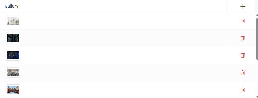
Click the [+] icon to add a new gallery item, or click any existing row to edit it. A dialog box will open, allowing you to configure the gallery item settings, as shown below.
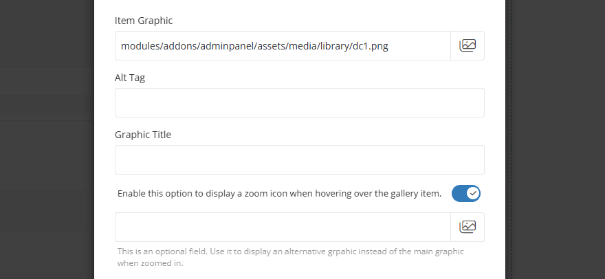
- Item Graphic - Upload or select the image displayed for the gallery item.
- Alt Tag - Enter alternative text for the image. This text is used by search engines and screen readers and is displayed if the image cannot be loaded.
- Graphic Title - Enter the title displayed for the gallery item, depending on the selected gallery type.
- Display Zoom Icon - When enabled, a zoom icon will appear when hovering over the gallery item, allowing visitors to view a larger version of the image.
- Zoom Graphic - Optionally upload or select a different image to display when the gallery item is opened in zoom mode. If left empty, the main gallery image will be used.
- Item Link - For information about configuring Item Link settings, please refer to the Common Settings.
For information about configuring other common options, such as Section Description, Section Styles, and Section Action, please refer to the Common Settings documentation.