Section Banner
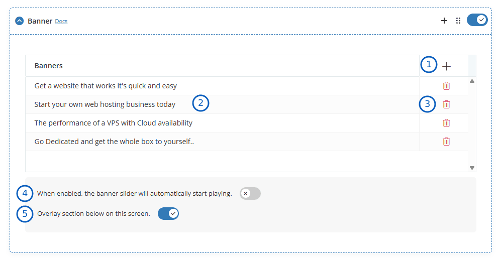
- Add New: By clicking the "+" icon, you can add a new banner. To display multiple banners as a slider, you can add additional banners as needed.
- Edit: When you click on any row, a modal opens, allowing you to edit the banner contents.
- Delete: If you want to delete the banner, you can do so by selecting the delete option.
- Auto Play: When enabled, the banner slider will automatically start playing.
- Overlay: Enable this option to allow the section immediately below the banner to overlap the bottom portion of the banner. This creates a modern layered design effect and helps highlight important content.
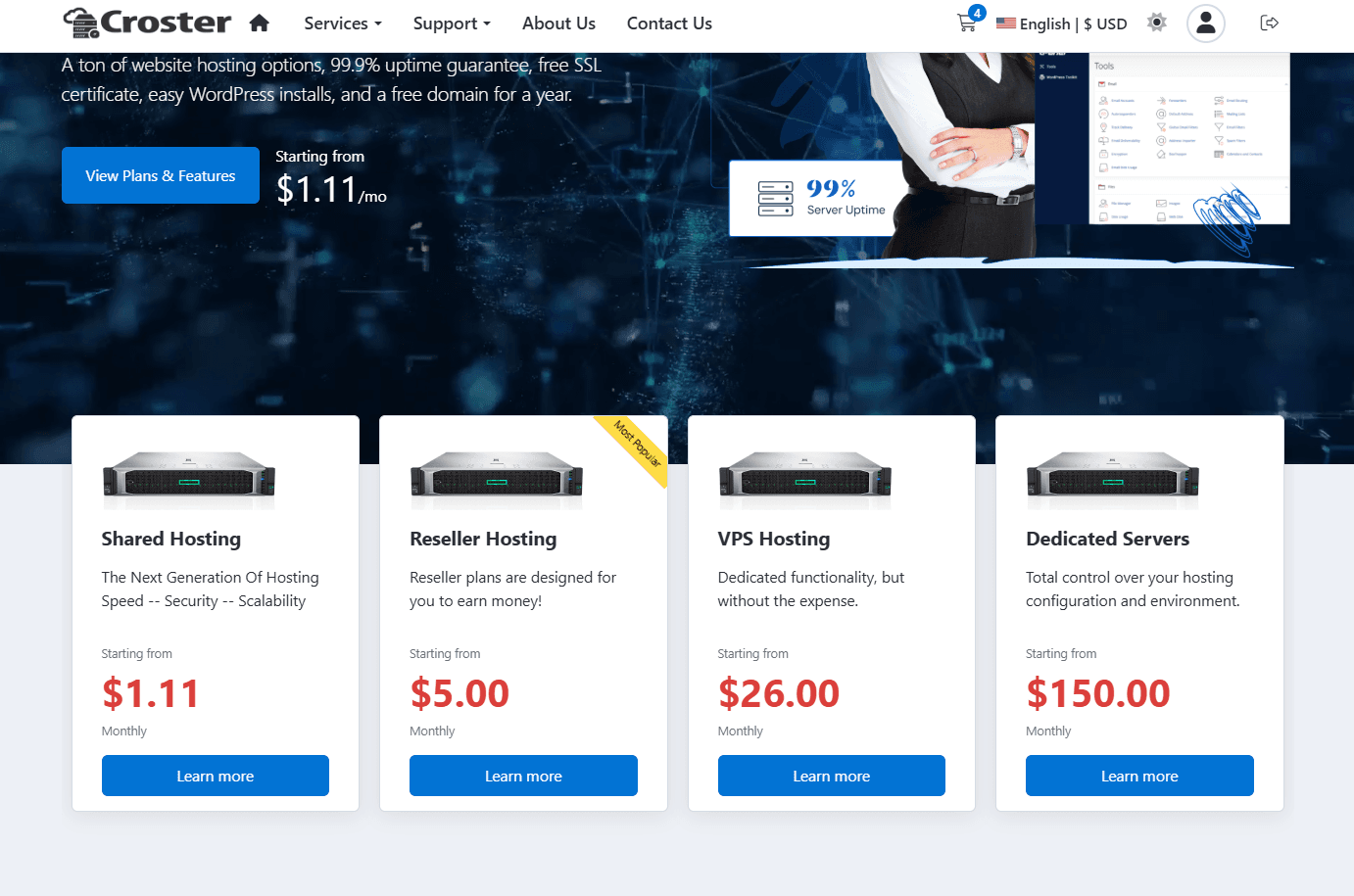
For example, sections such as Products section is displayed overlapping the banner, as shown in the example below.
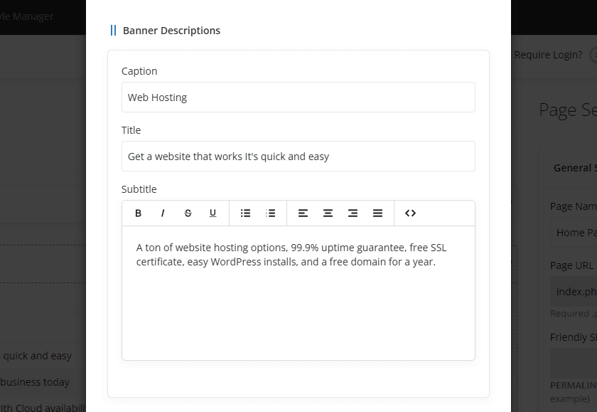
When you add or edit an item, a modal opens, allowing you to modify the banner contents, as shown below.
For information about Caption, Title, and Subtitle fields, see Section Descriptions.
The Display Type setting determines the layout and appearance of the banner content.
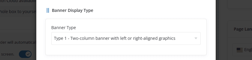
- Type 1 -Two-column banner with left or right-aligned graphics.
- Type 2 - Centered single column without graphics.
To see the both banner Types, visit the demo website.
The Graphic settings allow you to upload and position an image or media file displayed within the banner.
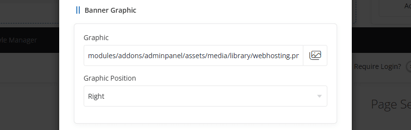
- Graphic: By clicking the image icon, you can add a graphic for the banner. MP4 videos are also supported.
- Position: This option allows you to select the banner position, either Right or Left.
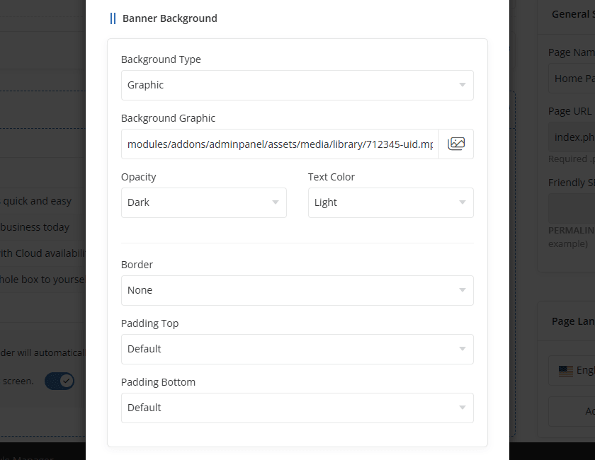
For information about Border and Padding options, see Section Styles.
The Action settings allow you to configure additional banner functionality, including pricing displays, countdown timers, promotions, and call-to-action buttons.
The Display Pricing option allows you to showcase product or product group pricing directly within the banner. This helps visitors quickly view pricing information and promotional offers without leaving the page.
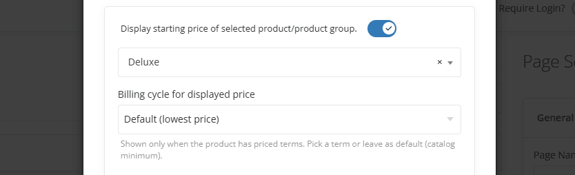
- Display Starting Price – Enable this option to display the pricing of the selected product or product group within the section.
- Product / Product Group – Select the product or product group whose pricing should be displayed.
- Billing Cycle for Displayed Price – Select the billing cycle whose price should be displayed. This option is available only when a product is selected. You can choose a specific billing cycle or leave the setting as Default (lowest price) to automatically display the lowest available price for the selected product.
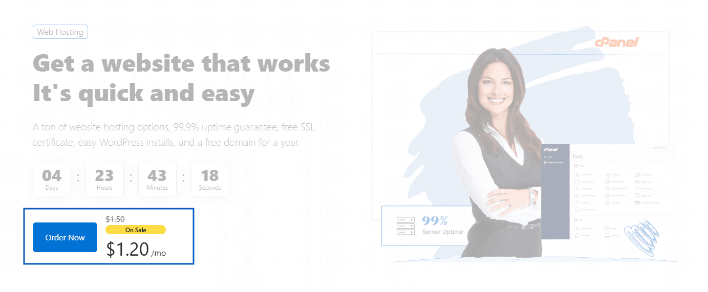
Preview - Display Pricing
The Timer & Promotion settings allow you to display a countdown timer and automatically apply a promotional offer during the specified period.
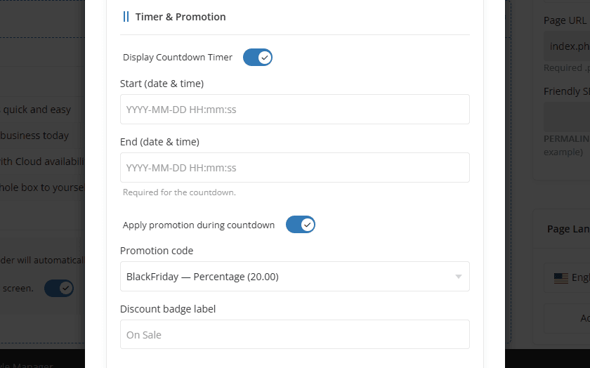
- Display Countdown Timer - Enable this option to display a countdown timer within the section.
- Start (Date & Time) - Specify the date and time when the countdown timer should begin.
- End (Date & Time) - Specify the date and time when the countdown timer should end. This field is required when the countdown timer is enabled.
- Apply Promotion During Countdown - Enable this option to automatically apply a WHMCS promotion while the countdown timer is active.
Apply Promotion During Countdown
Enable this option to automatically apply a promotion code while the countdown timer is active.
When enabled, a promotion code can be appended automatically to product order links, allowing visitors to receive the discount without manually entering the coupon code. This feature works only when the button link type is set to a Product.
Promotion Code
When enabled, the selected promotion code is automatically appended to product order links, allowing visitors to receive the discount without manually entering a coupon code. This feature is available only when the button link type is set to a Product.
In addition, the section automatically calculates the discounted price based on the selected promotion code and displays the updated pricing within the banner, helping visitors clearly see the promotional offer and savings available during the countdown period.
Discount Badge Label
Enter the text that should be displayed on the discount badge, such as On Sale, Limited Offer, or Special Discount. The badge is displayed alongside the pricing to highlight the active promotion.
Preview - Applied Coupon Code
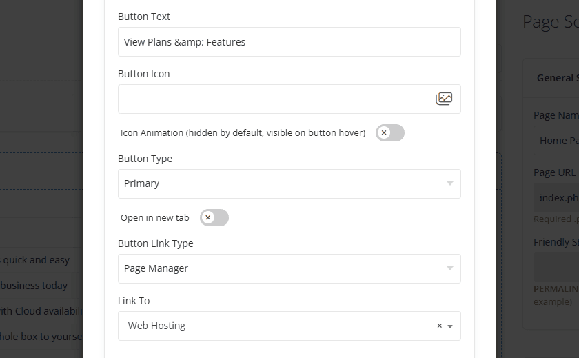
The Banner section supports two call-to-action buttons: Primary Button and Secondary Button. These buttons can be configured independently with their own text, icons, styles, and destination links.
For information about configuring button settings, see Section Action.
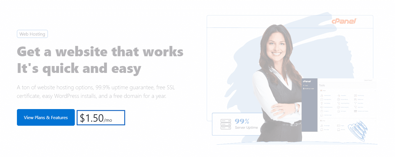
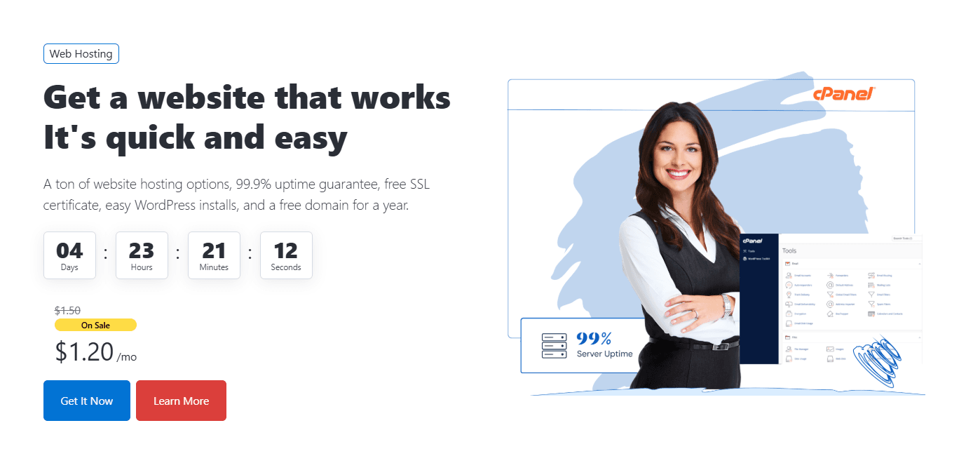
Preview - Included all Banner actions.
To see the available banner layouts and configurations, visit the demo website.