Section Product Groups
The Product Groups section allows you to display WHMCS product groups in various layouts. You can organize groups into tabs, customize their appearance, and control how products are presented to visitors.
Select the display layout used for product groups within the section.
Available Types
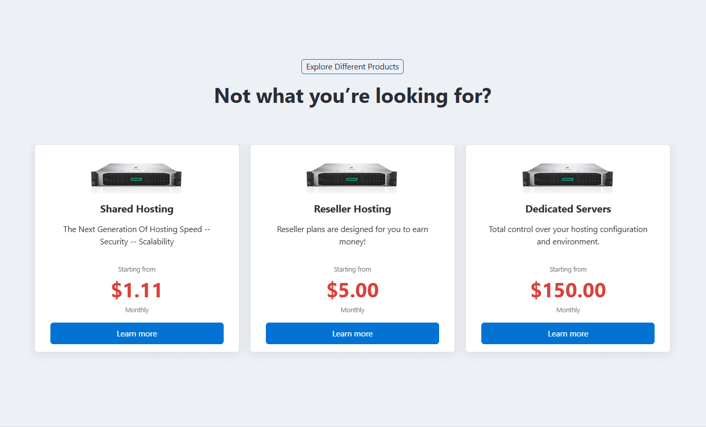
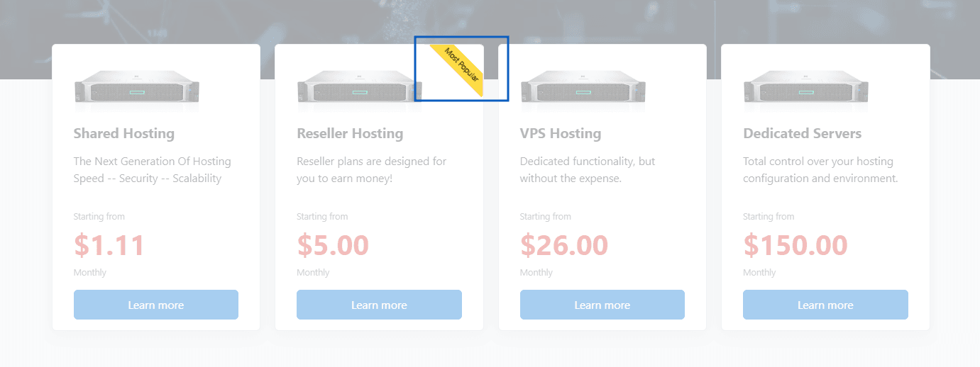
- Type 1 – Group layout with pricing and a "Learn More" button.
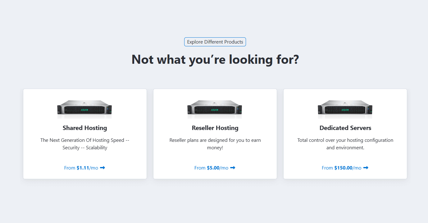
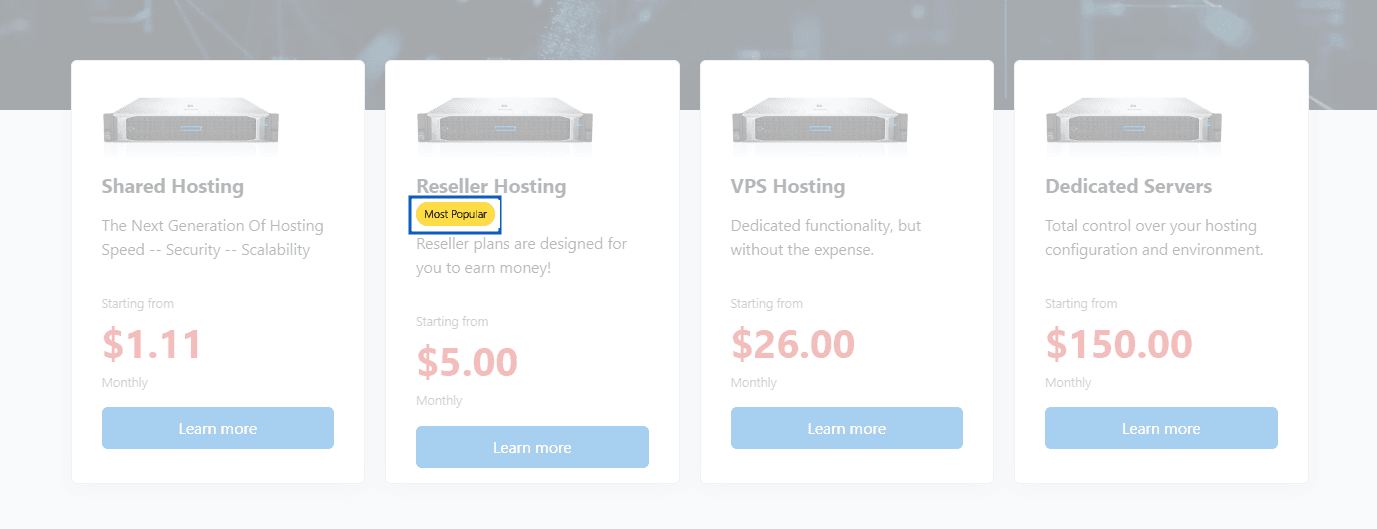
- Type 2 - Group with link style button.
Preview - Type 1
Preview - Type 2
To see the live example of the Product Group types at the demo website.
These settings are identical to the section Tabs. Please refer to Common Settings Section Tabs for detailed information.
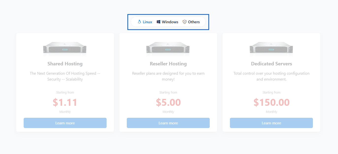
Preview - Product Groups in Tabs
Configure the appearance and behavior of product groups displayed within the section.
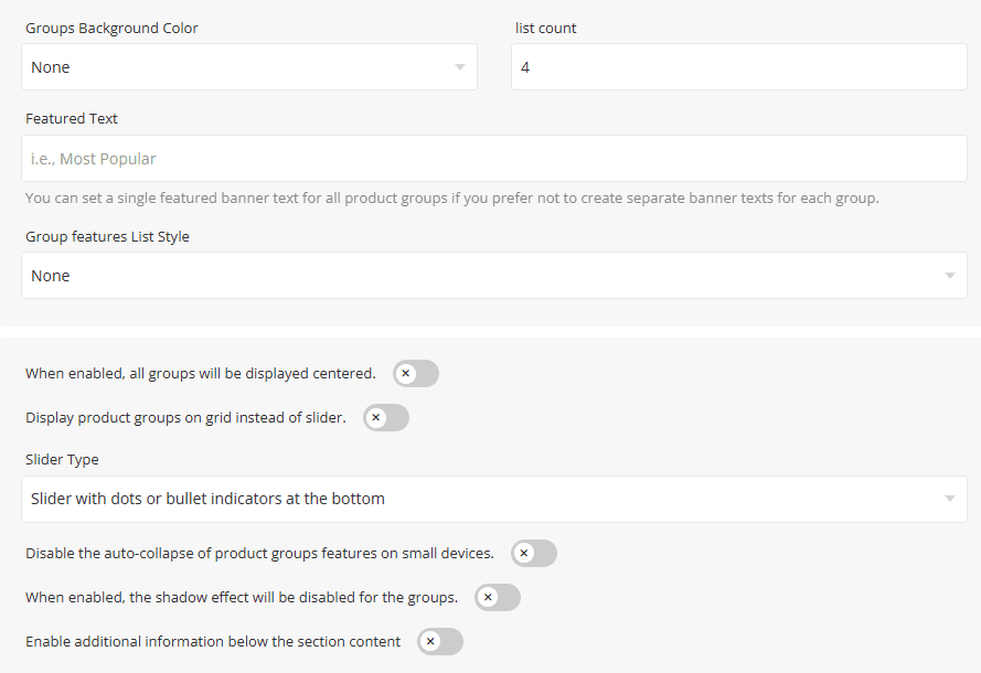
- Groups Background Color - Select the background color applied to product groups. Available options are None, Light, Primary, and Dark.
- List Count - Specify the number of product groups displayed per row or slide.
- Featured Text - Enter a label such as Most Popular, Recommended, or Best Value to highlight featured product groups. This option allows you to define a single featured badge text that will be applied to all product groups. Use this setting if you prefer not to configure separate featured labels for individual product groups.
- Group Features List Style - Select the style used to display product group features. Available options are Check, Check Circle, Check Square and Arrow.
- Center Product Groups - When enabled, all product groups will be displayed centered within the section.
- Display product groups on grid instead of slider - Enable this option to display product groups in a grid layout instead of a slider.
- Slider Type - elect the slider navigation style used when the grid layout is disabled.
- Disable Auto-Collapse on Mobile - When enabled, product feature lists will remain expanded on smaller devices.
- Shadow Effect - When enabled, the shadow effect will be disabled for the groups.
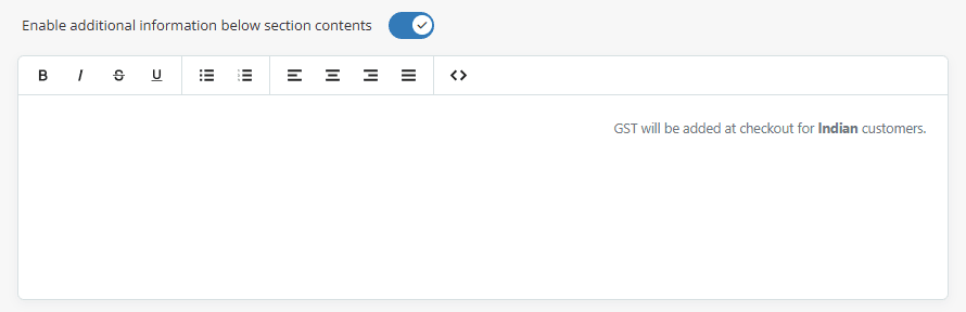
Enable Additional Information – Enable this option to display an additional information area below the main section content.
When enabled, a text editor will appear, allowing you to add custom content such as notes, promotional messages, feature highlights, disclaimers, or any other information you want to display beneath the section, as shown in the screenshot below.
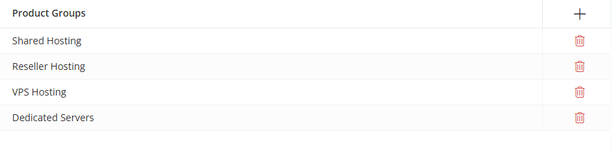
Select the product groups that should be displayed within the section. Click the [+] icon to add a product group and use the Delete icon to remove a product group from the list.
Once you click the [+] icon or any row in the table, a dialog box will open, allowing you to add, edit, and configure a product group, as shown below.
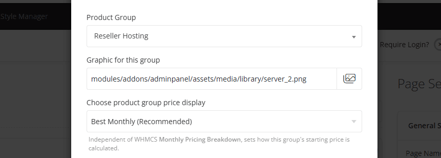
- Product Group - Select the WHMCS product group you want to display within this section.
- Graphic for This Group - Upload or select graphic for the product group.
- Choose Product Group Price Display - Select how the starting price for the product group should be calculated and displayed. This setting is independent of WHMCS Monthly Pricing Breakdown and determines which product price is used as the group's starting price.
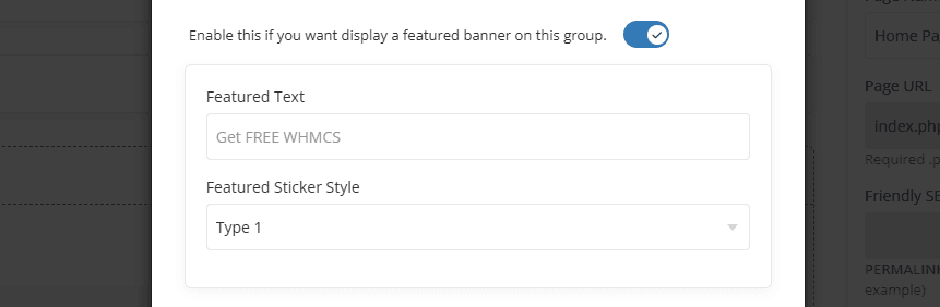
Enable this option if you want to display a featured banner on this product group. Once enabled, two additional options will appear: Featured Text and Featured Sticker Style.
- Featured Text - Enter the text to display within the featured banner, such as "Most Popular", "Best Value", or "Get FREE WHMCS".
- Featured Sticker Style - Select the visual style of the featured banner.
Preview - Type 1
Preview - Type 2
For information about configuring Button Action settings and other common options, such as Section Description, Section Styles and Section Action, please refer to the Common Settings documentation.