Section Products
The Product Section allows you to display individual WHMCS products in a flexible and visually appealing layout. You can showcase product pricing, features, billing cycles, promotional offers, and call-to-action buttons while maintaining full control over the section's appearance and behavior.
Form this option you can select the Product types
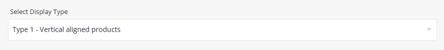
To see the live example of the Product types at the demo website.

These settings are identical to the section Tabs. Please refer to Common Settings Section Tabs for detailed information.
Configure the appearance and behavior of products displayed within the section.
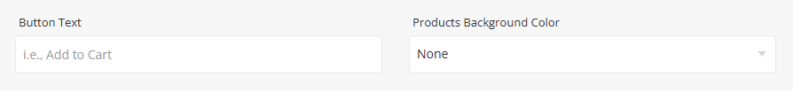
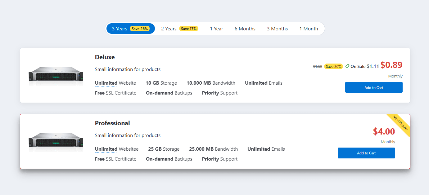
Button Text & Products Background Color - Configure the Button Text and Products Background Color used throughout the section. The selected background color is applied to all product cards and can be set to None, Light, Primary, or Dark. The Button Text is displayed on the action button for all products and is applied globally unless overridden by an individual product configuration.
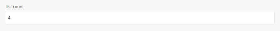
List Count - Specify the number of products displayed per row or slide.
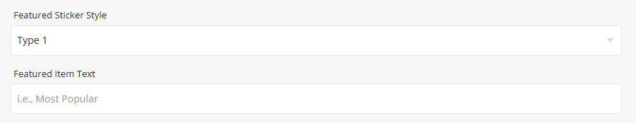
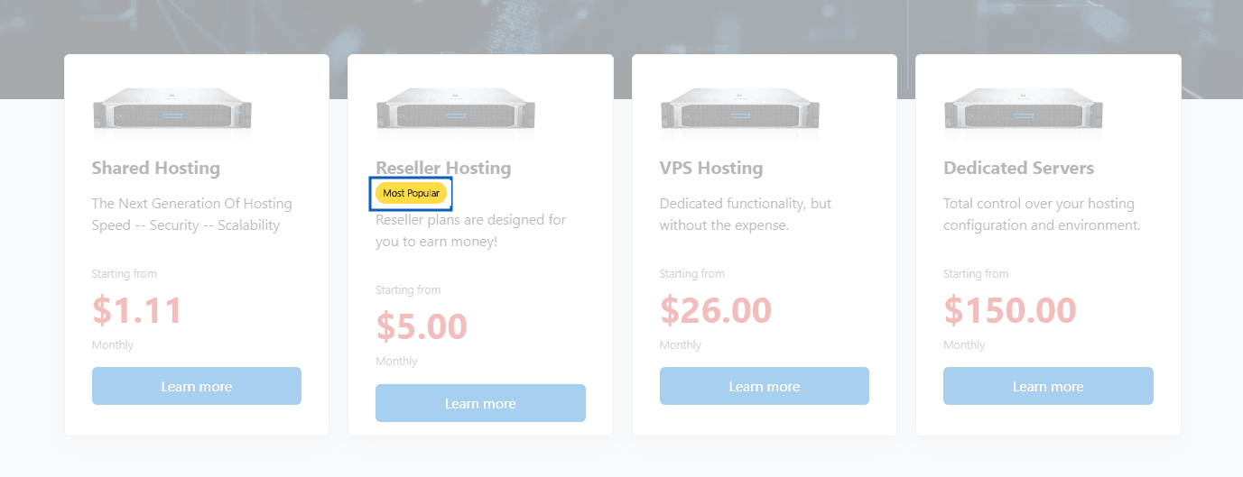
- Featured Sticker Style - Select the visual style of the featured banner.
- Featured Item Text - Enter the text to display within the featured banner, such as "Most Popular", "Best Value", or "Get FREE WHMCS".
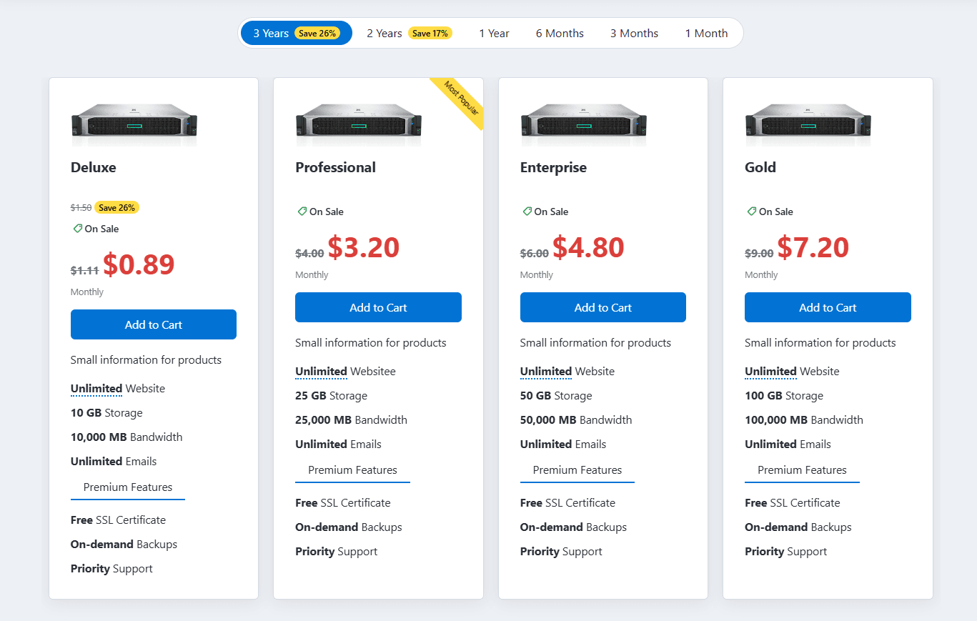
Preview - Type 1
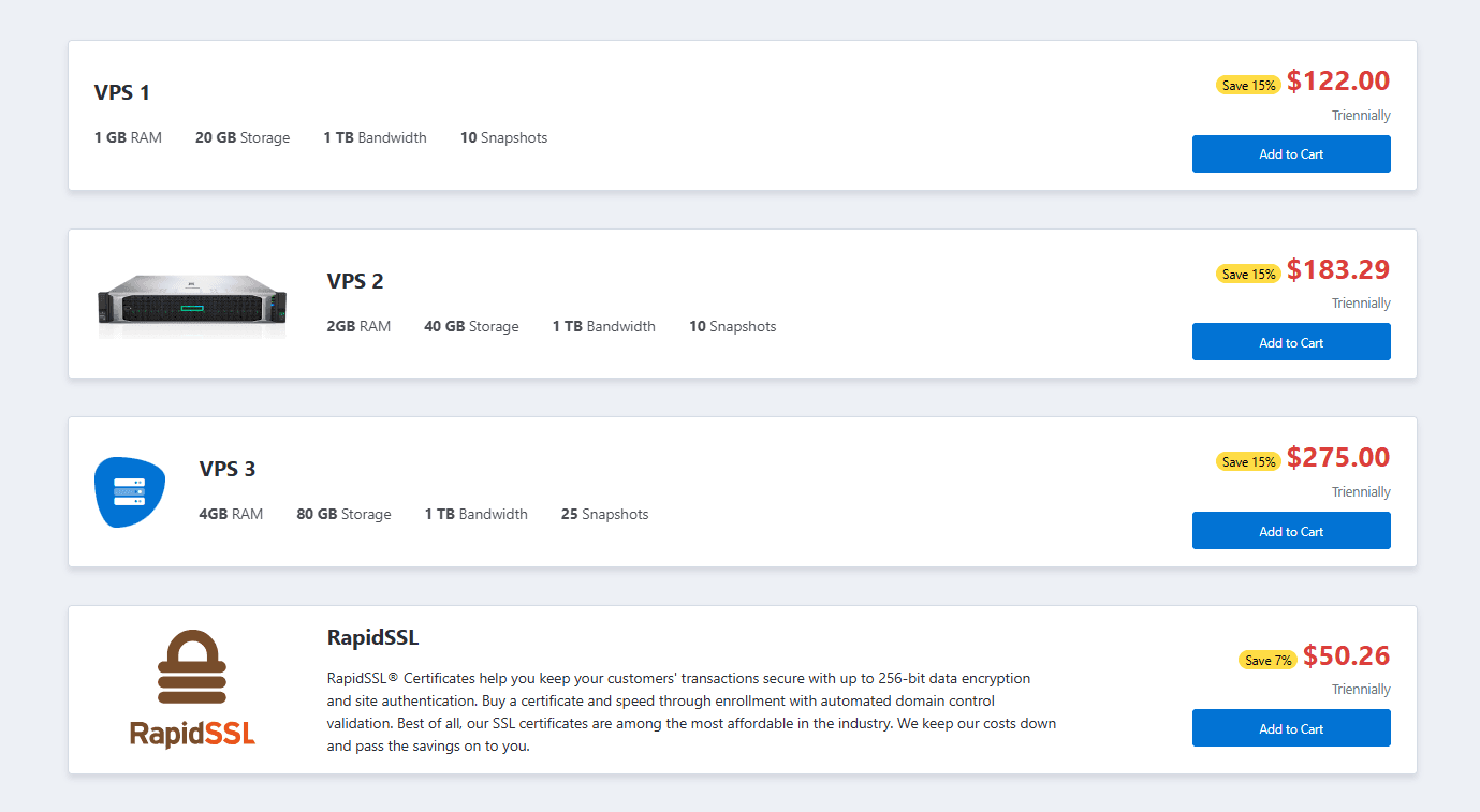
Preview - Type 2
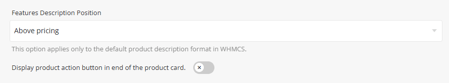
- Features Description Position - Select the position where the product's short description is displayed. Available only for the default WHMCS product description format in Type 1 product layouts.
- Display Product Action Button at the End of the Product Card – When enabled, the product action button is displayed after all product content and features. Available only in Type 1 product layouts.
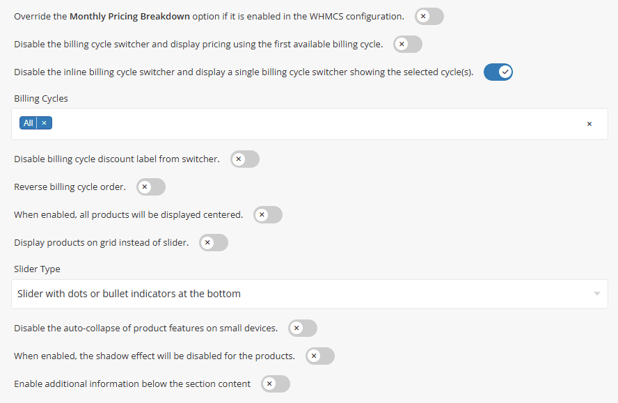
Override Monthly Pricing Breakdown – When enabled, product prices are displayed using the actual price of the first available billing cycle instead of the equivalent monthly price breakdown configured in WHMCS.
Disable Billing Cycle Switcher – When enabled, the billing cycle switcher is disabled and product pricing is displayed based on the first available billing cycle for each product.
Single Billing Cycle Switcher - When enabled, the inline billing cycle switcher is replaced with a single billing cycle selector displaying only the selected billing cycle(s).
The effect before applying Single Billing Cycle Switcher.
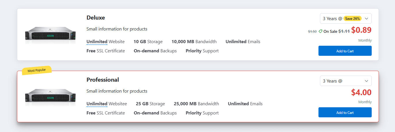
The effect after enabling the Single Billing Cycle Switcher.
- Billing Cycles – Select the billing cycles that will be available to visitors within the billing cycle switcher.
- Disable Billing Cycle Discount Label – Hide billing cycle discount labels displayed within the billing cycle switcher.
Enable the Disable Billing Cycle Discount Label option to hide discount labels from the billing cycle switcher. The result is shown in the screenshot below.

Reverse Billing Cycle Order – Enable this option to reverse the display order of billing cycles within the billing cycle switcher.
Center Product Groups - When enabled, all product groups will be displayed centered within the section.
Display product groups on grid instead of slider - Enable this option to display product groups in a grid layout instead of a slider.
- Slider Type - Select the slider navigation style used when the grid layout is disabled.
Disable Auto-Collapse on Mobile - When enabled, product feature lists will remain expanded on smaller devices.
Shadow Effect - When enabled, the shadow effect will be disabled for the groups.
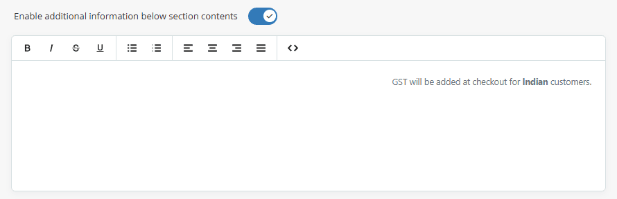
Enable Additional Information – Enable this option to display an additional information area below the main section content.
When enabled, a text editor will appear, allowing you to add custom content such as notes, promotional messages, feature highlights, disclaimers, or any other information you want to display beneath the section, as shown in the screenshot below.
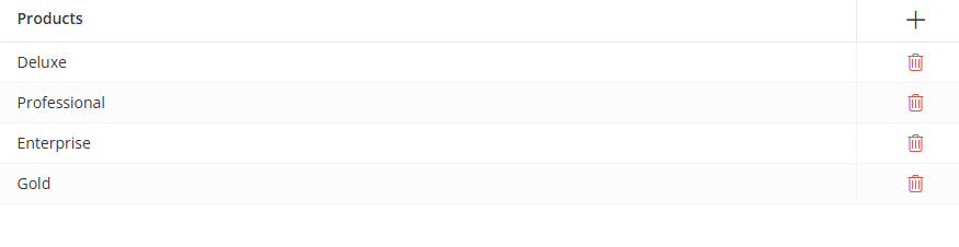
Select the products that should be displayed within the section. Click the [+] icon to add a product and use the Delete icon to remove a product from the list.
Once you click the [+] icon or any row in the table, a dialog box will open, allowing you to add, edit, and configure a product, as shown below.
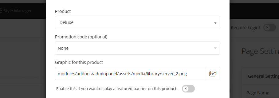
- Product - Select the WHMCS product you want to display within this section.
- Promotion Code - Displays all available WHMCS promotion codes applicable to the selected product. The selected promotion code will automatically apply discounted pricing and be included in the product order link.
- Discount badge label - This option becomes available when a promotion code is selected. Enter the text displayed in the discount badge for discounted products. The default label is "On Sale".
- Graphic for This Product - Upload or select graphic for the product.
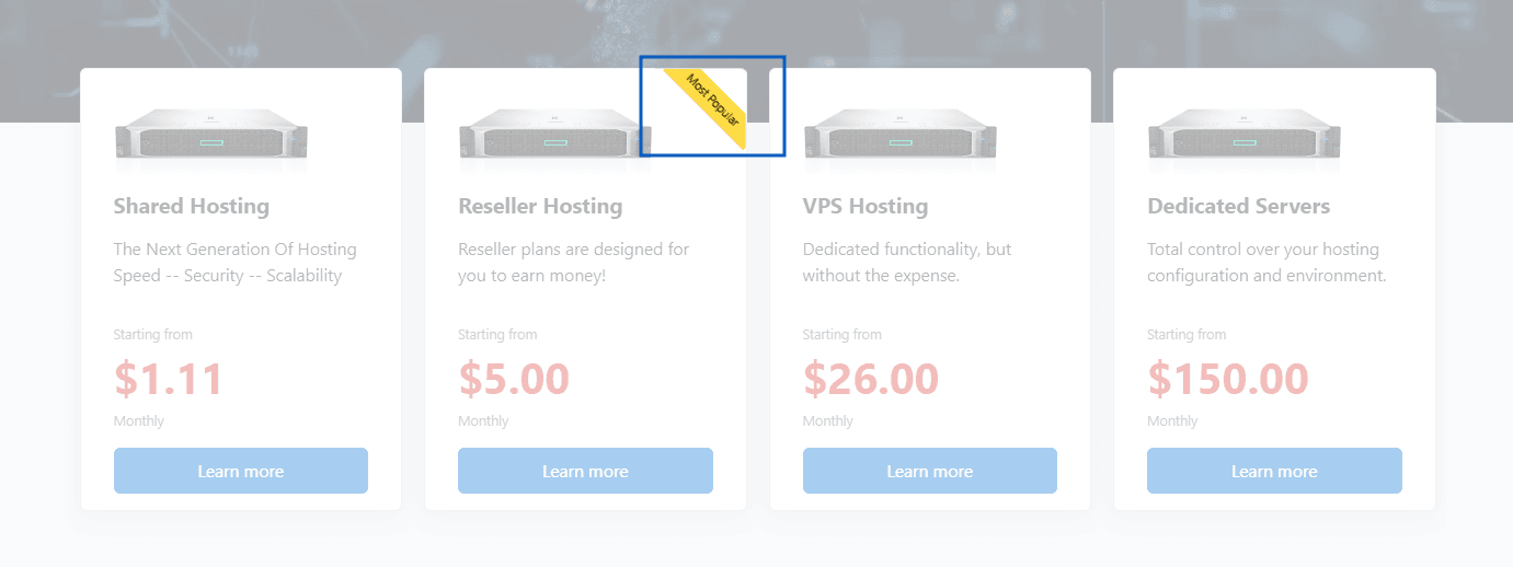
- Enable this option if you want to mark this product as featured. When enabled, a featured banner will appear on the product.
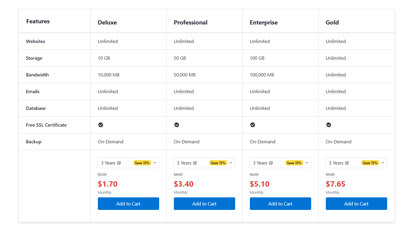
When Product Type 3 – Product Comparison is selected, additional fields will appear in the product dialog, allowing you to add comparison features and values for each product. These details are used to generate the product comparison table. Unlike standard product layouts, the Product Comparison layout does not display product descriptions from WHMCS, so the comparison information must be entered manually.
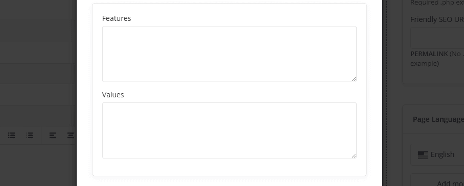
Please use the following format to add Features and Values. Enter the information directly in this section as it will not be pulled from the WHMCS product description.
Features: (must be same for all plans)
Values:
For information about configuring Button Action settings and other common options, such as Section Description, Section Styles and Section Action, please refer to the Common Settings documentation.