Section Features
The Features Section is designed to highlight the most important features and advantages of your products or services. With multiple layout and style options, you can present feature items using icons, graphics, titles, and descriptions to create an attractive and informative section that improves user engagement and communicates value effectively.
For a live example of the Features Section, please visit the demo website.
The Features Settings section provides options to customize how feature items are displayed. Configure feature styles, icons, graphics, layout options, and display settings to match your page design and content requirements.
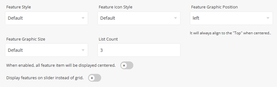
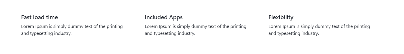
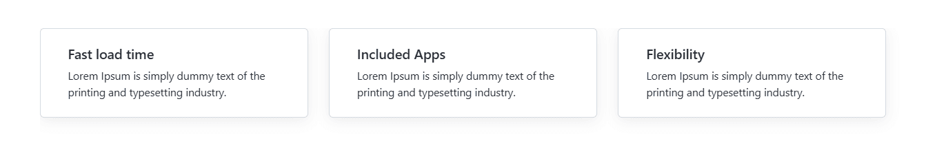
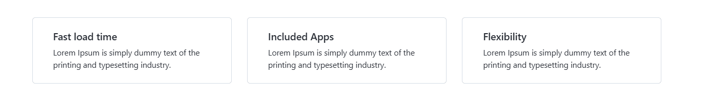
Select the visual layout used to display feature items within the section. Available styles include Default, Boxed, and Bordered.
Preview - Default
Preview - Boxed
Preview - Bordered
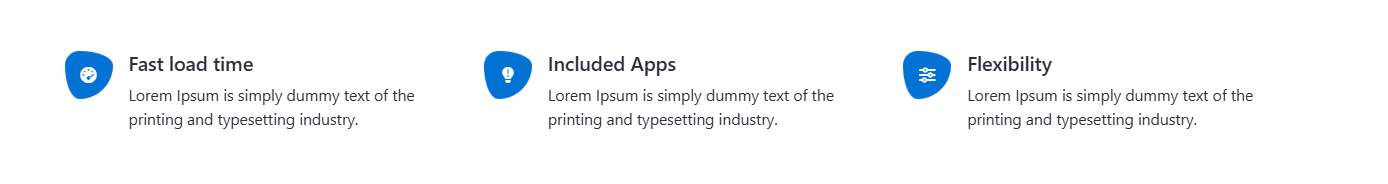
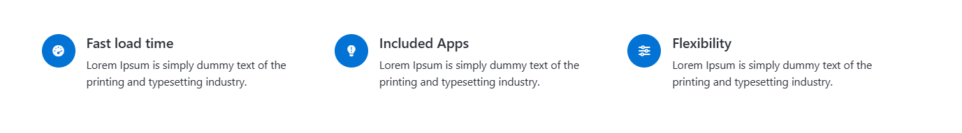
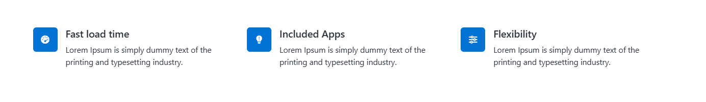
Select the style applied to feature icons displayed within the section.
Preview - Default Icon Style
Preview - Circle Icon Style
Preview - Square Icon Style
Select the position of the feature graphic relative to the feature content.
Available options are:
- Top - Displays the graphic above the feature content.
- Left - Displays the graphic beside the feature content.
Select the size of the feature graphic displayed for each feature item.
Available options are:
- Default - Uses the default graphic size.
- Auto - Automatically adjusts the graphic size.
- Large - Displays a larger graphic.
- Small - Displays a smaller graphic.
- List Count - Specify the number of feature items displayed per row or within a single slider view.
- Center Feature Items – When enabled, all feature items will be displayed centered.
- Display Features as Slider – Enable this option to display feature items in a slider layout instead of a grid layout.
- Slider Type - Select the slider navigation style used when the grid layout is disabled.
These settings are identical to the section Tabs. Please refer to Common Settings Section Tabs for detailed information.
To add a new feature item, click the [+] icon. To remove an existing feature item, click the Delete icon next to the item you want to remove.
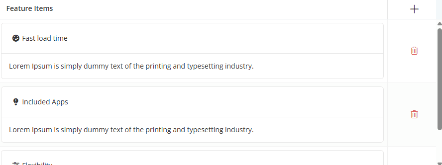
Click the [+] icon to add a new feature item, or click any existing row to edit it. A dialog box will open, allowing you to configure the feature item settings, as shown below.
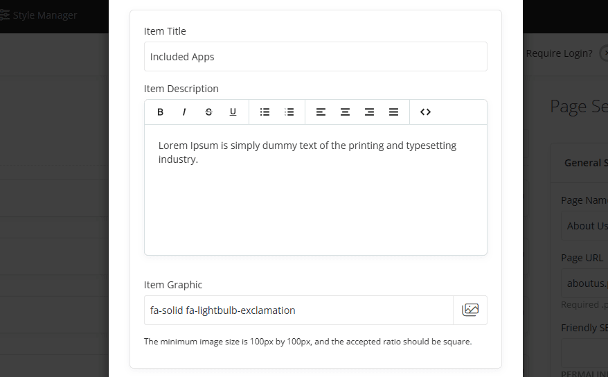
- Item Title - Enter the title displayed for the feature item.
- Item Description - Enter the description or additional information displayed below the feature title. Basic text formatting options are available using the editor toolbar.
- Item Graphic - Depending on the selected Feature Style, Feature Graphic Position, and Feature Graphic Size settings, the graphic will be displayed alongside the feature title and description. For best results, use a square image with a minimum size of 100 × 100 pixels.
- Item Link - For information about configuring Item Link settings, please refer to the Common Settings.
For information about configuring Item Link and other common options, such as Section Description, Section Styles, and Section Action, please refer to the Common Settings documentation.