Style Manager
The Croster Style Manager allows you to customize the appearance of your website without any coding knowledge. Using an intuitive interface, you can adjust colors, typography, sizing, spacing, and various layout settings to match your brand identity.
Simply configure your preferred design options and click Save. Your changes are automatically applied across the website, allowing you to create a unique and professional look with ease.
Croster Style Manager stores all design settings in the database and automatically generates a CSS file containing the corresponding CSS variables. This approach combines the flexibility of database-driven configuration with the performance benefits of static CSS files. When settings are updated, the CSS file is regenerated automatically, ensuring that changes are applied across the website and client area while maintaining optimal frontend performance.
Sets your core brand palette. These colors flow through the rest of the site.
The Colors section allows you to customize the color palette used throughout the Croster theme, Croster includes the following color groups:
- Primary – Main brand color used for primary buttons, links, active navigation items, and highlighted elements.
- Secondary – Secondary accent color used for complementary interface elements.
- Success – Used for success messages, confirmations, and positive status indicators.
- Warning – Used for warning messages and cautionary notifications.
- Danger – Used for errors, alerts, and destructive actions.
- Info – Used for informational messages and neutral notifications.
Each color group includes the following settings:
- Main - The primary color value used throughout the theme for the selected color group.
- Darker - A darker variation of the main color, typically used for hover states, active states, and visual emphasis.
- Gradient From - The starting color used when generating gradients for the selected color group.
- Gradient To - The ending color used when generating gradients for the selected color group.
The Backgrounds & Borders section controls the default background and border colors used throughout the theme.
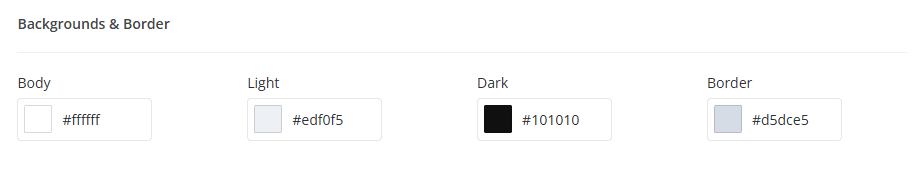
- Body - The main page background color.
- Light - A light background color used for cards, panels, sections, and other interface elements.
- Dark - A dark background color used for dark sections, overlays, and contrast elements.
- Border - The default border color used throughout the theme.
The Typography section allows you to customize the fonts, text colors, and font sizes used throughout the Croster theme.
The Font Family setting allows you to choose the primary typeface used throughout the theme. Select the font family that will be applied to the website and client area. Croster includes a selection of web-safe and modern fonts, allowing you to match the theme to your brand identity.
Note: Changing the font family affects most text elements across the theme, including headings, navigation menus, buttons, and content areas.
The Font Colors section controls the colors used for text, links, and headings.
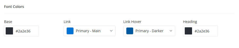
- Base - Defines the default text color used throughout the theme.
- Link - Defines the color used for hyperlinks and clickable text elements.
- Link Hover - Defines the color displayed when a user hovers over a link.
- Heading - Defines the color used for headings and titles, including H1–H6 elements.
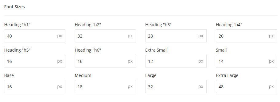
The Font Sizes section allows you to control the size of various text elements throughout the theme.
The General section contains global design settings that affect the overall appearance of the Croster theme. These settings allow you to control logo dimensions, menu sizing, border radius values, shadow effects, and other visual elements used throughout the website and client area.
Configure the dimensions used for the theme logo and side navigation menus.
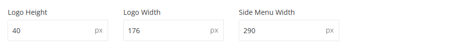
- Logo Height - Defines the height of the logo displayed throughout the website and client area.
- Logo Width - Defines the width of the logo displayed throughout the website and client area.
- Side Menu Width - Controls the width of side navigation menus, including mobile and left-layout navigation menus.
Note: Adjusting logo dimensions may require updating your logo image to maintain proper proportions and image quality.
The Border Radius settings control the roundness of corners used throughout the theme.
- Small - Used for compact interface elements and small components.
- Base - Default border radius applied to most theme elements.
- Large - Used for larger components that require a softer appearance.
- Extra Large - Used for prominent elements where a more rounded design is desired.
The Box Shadow settings control the shadow effects applied to cards, panels, dropdowns, and other interface components.
- Small - A subtle shadow used for lightweight interface elements.
- Base - The default shadow used throughout the theme.
- Large - A stronger shadow used for elevated components and visual emphasis.
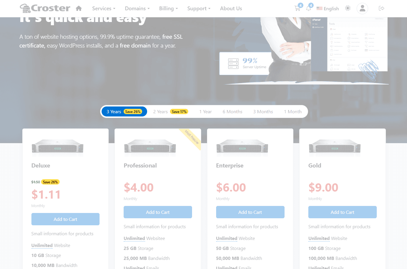
Customize the appearance of the discount badge displayed on pricing and products when billing cycle discounts are available.
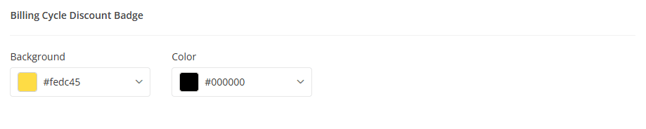
- Background - Defines the background color of the discount badge.
- Color - Defines the text color displayed within the discount badge.
Discount Badges
The Sections settings allow you to customize the typography and product display elements used throughout Croster sections. These options help you maintain a consistent visual hierarchy and highlight important content such as section titles, pricing, and featured products.
Configure the typography used for section headings, captions, and subtitles throughout the website.
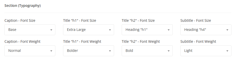
- Caption - Defines the font size & weight used for section captions.
- Title (H1) - The primary section title used for sections titles if those are first section in the page, Defines the font size & weight for this.
- Title (H2) - The secondary section title used for standard content sections, Defines the font size & weight for this.
- Subtitle - Defines the font size & weight for subtitles.
The section title is placed in an <h1> or <h2> tag depending on the section's position. If the section is the first one, it uses <h1>; otherwise, it uses <h2>.
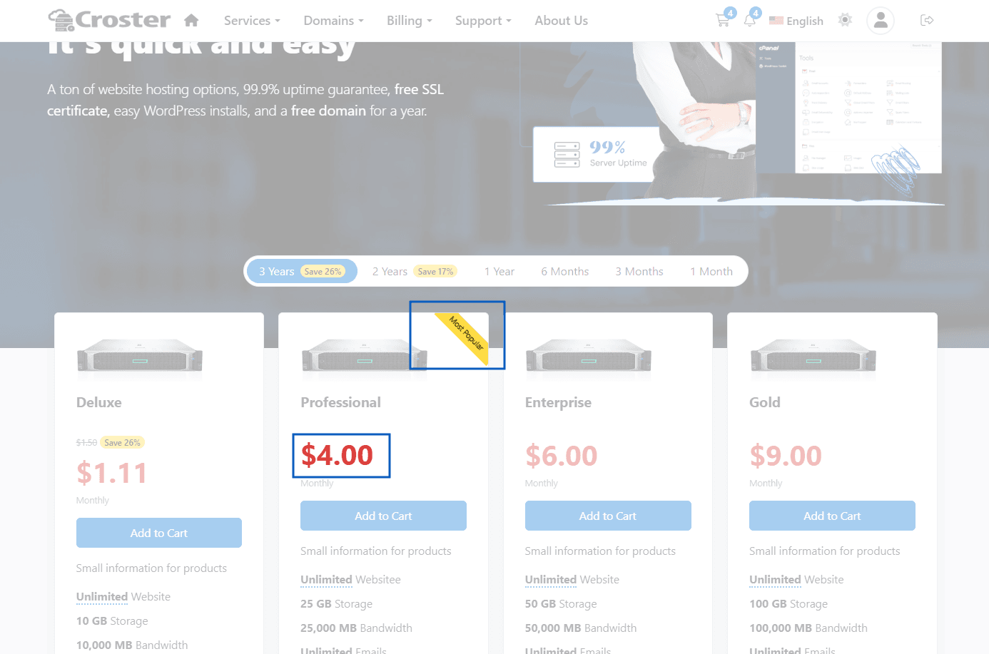
Configure the appearance of product pricing and featured product labels used throughout pricing tables and product listings.
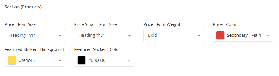
- Price - Controls the styling of primary pricing values.
- Price Small - Used in some products types.
- Price (Font Size & Weight) - Defines the font size & weight used for product prices.
- Price (Color) - Defines the color used for product prices.
- Featured Sticker - Controls the appearance of the featured product badge displayed on highlighted products and pricing plans. Defines the background color and text color of the featured product sticker.
The Buttons section in the Style Manager allows you to customize the colors used for buttons throughout the Croster WHMCS Theme. Croster includes 8 predefined button styles, each of which can be customized independently to match your brand's design and color scheme.
The screenshot below shows the available color settings for the Primary button style. The same configuration options are available for all button styles, including Default, Secondary, Success, Warning, Danger, Info, and Dark.
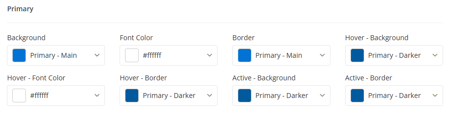
Available Button Settings
- Background – The default button background color.
- Font Color – The text color displayed on the button.
- Border – The button border color.
- Hover - Background – The background color when the button is hovered.
- Hover - Font Color – The text color when the button is hovered.
- Hover - Border – The border color when the button is hovered.
- Active - Background – The background color when the button is clicked or active.
- Active - Border – The border color when the button is clicked or active.
The Dark Mode section allows you to configure the color scheme used when Dark Mode is enabled on your website.
Enable this option to load the website in Dark Mode by default. When enabled, visitors will see the Dark Mode color scheme when accessing the website.

The color settings below allow you to customize the appearance of the website when Dark Mode is active.
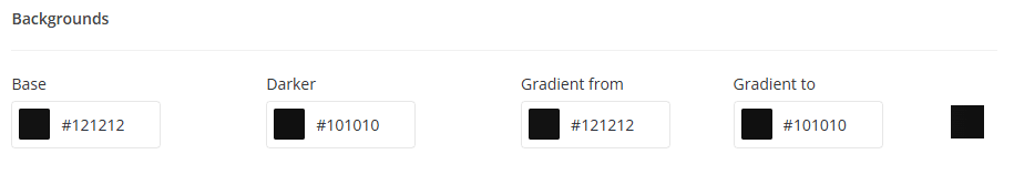
Configure the primary background colors used throughout the website when Dark Mode is active.
- Base – The main background color used across pages and content areas.
- Darker – A darker variation of the base color used for contrast and visual hierarchy.
- Gradient From – The starting color of background gradients.
- Gradient To – The ending color of background gradients.
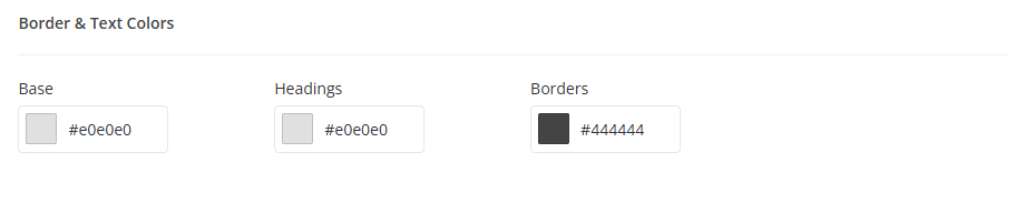
Configure the colors used for text and interface elements.
- Base – The primary text color used throughout the website.
- Headings – The color applied to page titles and headings.
- Borders – The color used for borders, dividers, and other interface separators.
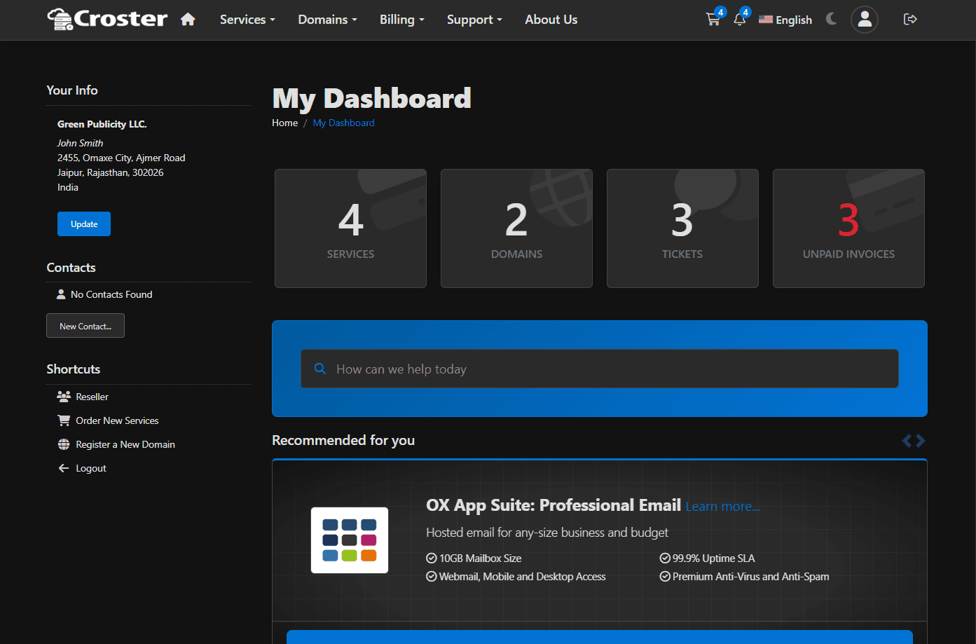
Preview - Dark Mode
If you want to revert Style Manager settings to their original values, click the Reset button located next to the Save button. A confirmation dialog will appear, allowing you to choose what should be restored.
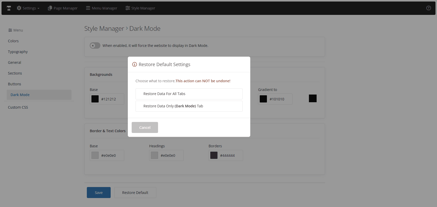
Available Options
- Restores all Style Manager settings to their default values.
- Restores only the tab you're currently viewing; all other tabs keep their values.
The Custom CSS section allows you to add your own CSS rules to customize the appearance of the website beyond the built-in Style Manager options. Any CSS code entered in the textarea below will be loaded globally and applied across the entire website.