Menu Manager
The Croster WHMCS Theme Menu Manager provides a powerful and user-friendly way to manage your theme's navigation menus without any technical knowledge. There is no need to create complex WHMCS hooks.
With Menu Manager, you can easily create, edit, reorder, and manage menu items for:
- Main Navigation
- Footer Navigation
This gives you complete control over your website’s navigation structure through a simple and intuitive interface.
The Croster WHMCS Client Theme includes a predefined set of menus for each navigation type. These menus can be easily managed through the Menu Manager section available in the Croster Panel addon.
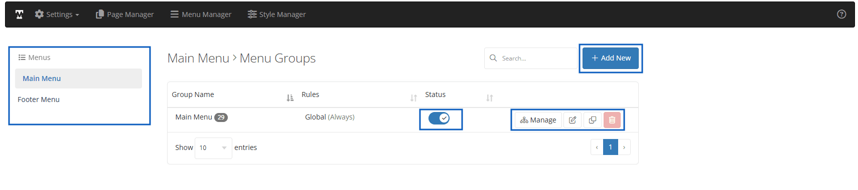
Menus - allows you to choose the menu type that you wish to manage:
- "Main" - a list of menus created for the "main" theme navigation.
- "Footer" - a list of menus designed for the "footer" navigation.
Status - Quick Enable or disable the menu group.
Action Buttons:
- Manage - Manage the menu item of the group.
- Edit - Edit the menu groups Name, Display Location, Display Rules.
- Clone - Clone the current menu group.
- Delete - Delete the menu group.
Add New/Edit Menu Group
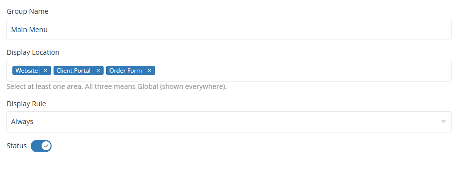
Rules – This option allows you to define exactly under which conditions a specific menu group should be displayed. These conditions, known as rules, can be configured based on your specific requirements, giving you greater control over menu visibility.
Display Location:
- Global - The menu group is globally display in website.
- Website - Visible only public page of the website
- Client Portal - Visible only Client Portal pages.
- Order Forms - Visible only Order Form pages.
Display Rules:
- Always - Display for both "Guest Client" and "Existing Client"
- Existing Client - will be displayed only to "Logged IN" customers.
- Guest Client - will be visible only to "Logged OUT" customers.
In this section, you can learn more about the UI elements that are common across all menu types.
The Menu Items section displays a list of all menu items that have been created for the menu you are currently managing.
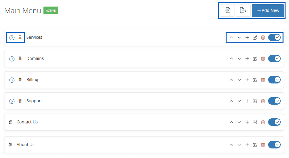
- Import – Use this icon to import a menu from a previously exported file.
- Export – Use this icon to export the current menu, creating a backup that can be imported later if needed.
- Add New - Use this button to create and add a new menu item.
Each menu item has its own features:
- Up/Down Arrows – Used to change the order of menu items, including both parent and child items.
- Plus Icon – Creates a new menu item directly below the current menu item.
- Delete Icon – Permanently removes the selected menu item.
- Switch – Enables or disables the menu item. When disabled, the menu item will not be visible on the website.
Up/Down Arrows – Used to change the order of menu items for both parent and child items. You can also use the drag handle to reorder menu items by dragging and dropping them into the desired position.
Once you click Add New Item, a modal window will open, allowing you to configure the menu item settings.
Allows you to set a name for the currently managed menu. This name will not be shown in the Croster WHMCS Theme.
Select the type of link for the menu item. You can choose from WHMCS Pages, Page Manager Pages, or a Custom Link.
This field will automatically display the page selected based on the chosen Link Type. If you select Custom Link, enter the desired URL in this field.
Select an icon to display alongside the menu item.
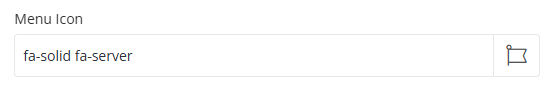
The icon is positioned before the menu name, as shown in the example below.
Choose whether the menu item should appear as a primary item, child item, or under another menu target.
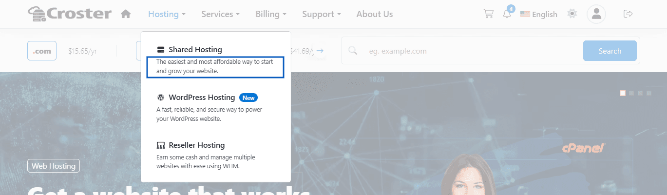
This option allows you to add a short description below the menu item name, providing additional information or context. This option is available only for child menu items and Main menus (Not available in footer menu items).
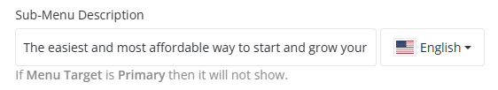
Preview - Sub-Menu Description
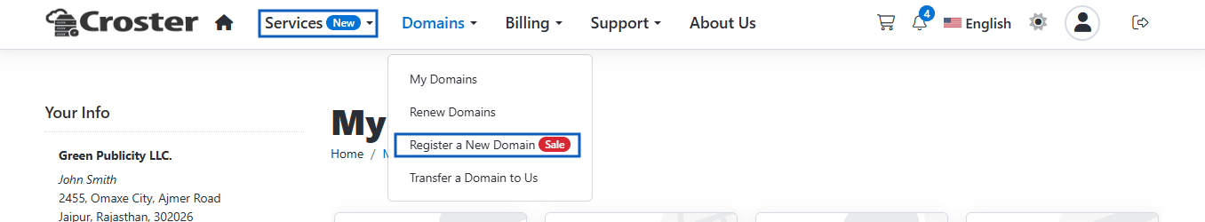
Define the conditions under which the menu item will be displayed. "Always", "Guest Client" OR "Existing Client".
Enable this option to open the menu link in a new browser tab.
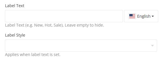
Label Style – Choose the label type for your menu item, You can select from the following available types:
- Primary
- Success
- Danger
- Warning
Label Text – Add a label such as New, Hot, or Sale next to the menu item. Leave this field empty if no label is required.
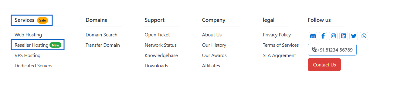
Enter a custom CSS class to apply additional styling to the menu item. For example, add the class menu-extended to display the menu item in an extended layout, as shown in the example below.
To display a divider between menu items, add the class menu-divider to this field. When the menu-divider class is applied, the menu item name will be hidden and a divider line will be displayed instead. This is useful for visually separating groups of menu items within a navigation menu.
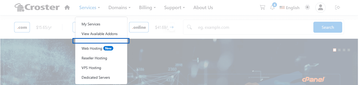
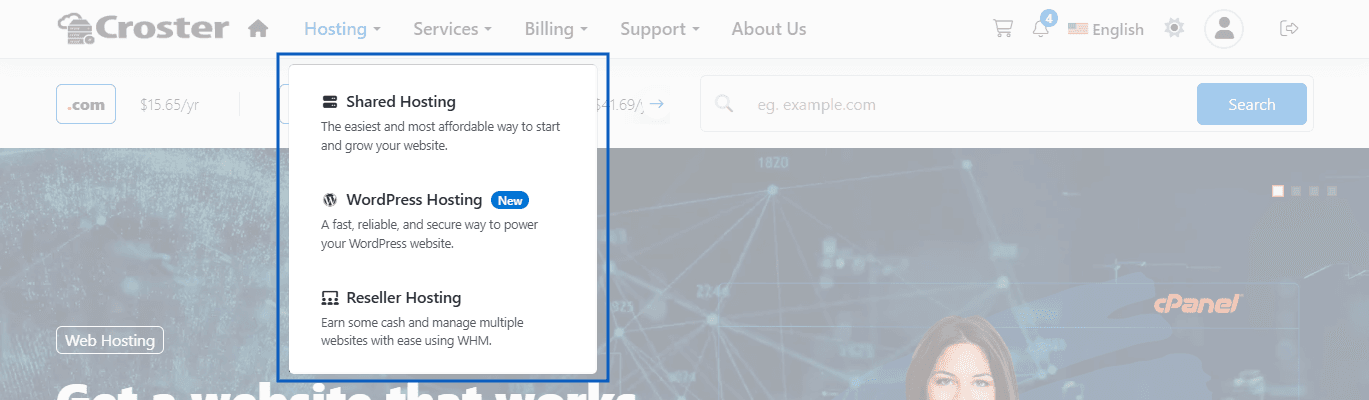
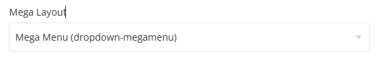
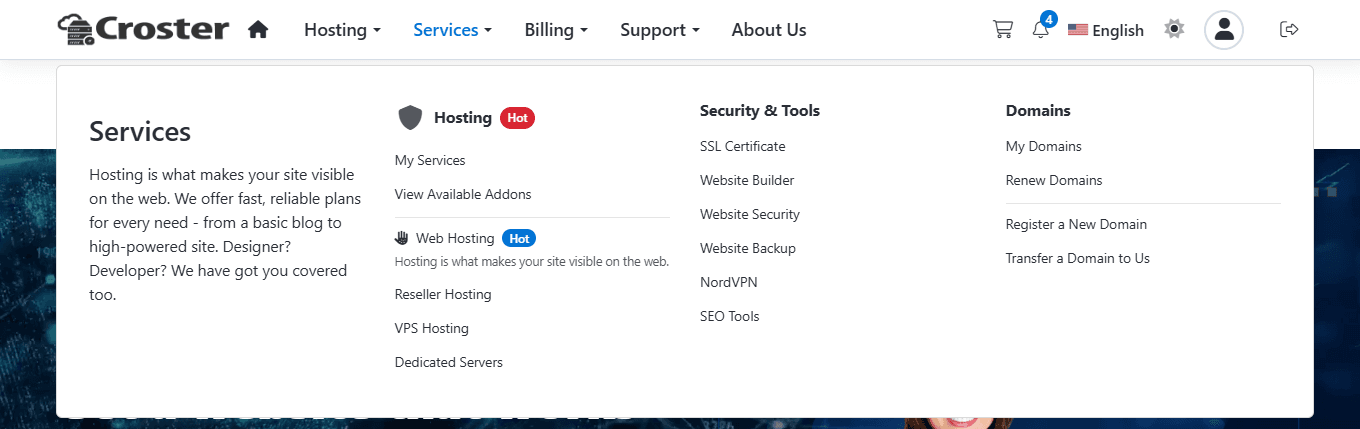
Select the layout type for the menu item. This option is used when creating mega menu structures and determines how the menu content will be displayed.
Available layout types:
- Mega Menu (dropdown-megamenu)
- Column 16%
- Column 25%
- Column 33%
- Column 50%
- Column 100%
Preview – In the example below, the parent menu item Services is configured as Mega Menu (dropdown-megamenu), while its child menu items are configured using the Column 25% layout.
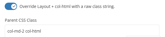
After selecting a Column, you can enable the option below to automatically add the col-htmlcol-html
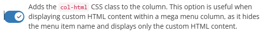
Enable this option to override the default layout and col-html classes with your own custom CSS class string. Any classes entered in the Parent CSS Class field will replace the automatically assigned column classes.
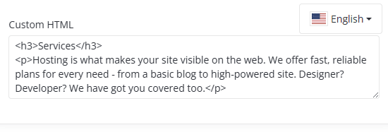
Custom HTML - Use this field to enter custom HTML content that will be displayed within the selected column. This option is available when the column is configured as a Custom HTML column (col-html). You can add any valid HTML markup, such as headings, text, links, buttons, images, or other custom content. The content entered here will be rendered directly in the mega menu instead of displaying standard menu items.
Use the language selector to provide translated content for each language separately.
To help you get started, you can download and import the provided .json example menu file, which demonstrates this mega menu configuration. Importing the file allows you to quickly recreate the menu structure shown in the example below.